|
|
|
|
|
|
|
|
|
|
|
|
| Cropping Guide | ||
 |
Okay, just a little bit of an ambitious project here, and it didn't come out exactly the way that I wanted (I'm still not sure why the edges got cropped out a bit, though I suppose there's a bit of irony in there,) but I think it illustrates the ideas that I was trying to communicate. I've spent years working on my still photography, but just started in video, so don't harsh my gig.
Excuses aside, here's my own video on cropping images: where to do it, what it accomplishes, and thinking about the end result. Some of it might even help with taking the photo to begin with, before even getting to the cropping stage.
Part of the trick is to think about the image in visual terms. We may look at a photo and say to ourselves, "That's an irrigation sprinkler in infra-red light," (okay, maybe not that all too often,) but when cropping, it's a strong vertical/diagonal element with higher contrast, a line that carries us into or across the frame, or maybe even splits it. Even blank space can imply a lot.
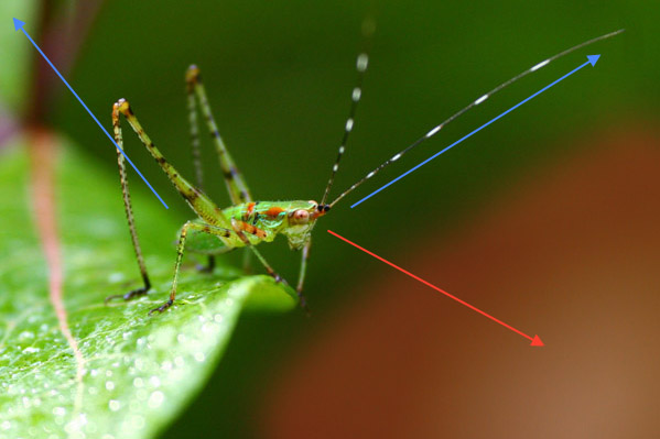 We'll take another look at the opening illustration, and the reasoning behind my choice (which may not be your own.) The blue arrows point out distinctive lines of direction hinted at with the antenna and legs, in this case purposefully 'positioned' to use the corners of the frame. The red haze is highlighting open space, which actually has a purpose in the image as it gapes ahead of the katydid, an abyss or unknown depth, and this is enhanced a bit by the position of the insect's legs right at the very edge of the leaf - it can go no farther. The position of the head seems to point out a direction of attention as shown by the red arrow, out into that unknown open space (this is nonsense from a biological standpoint of course, since compound eyes see in a lot of directions, but instinctively or emotionally, we believe that it's 'facing' in that direction.) There's even a very subtle curve behind the insect, the reddish line formed by both the mark on the leaf it stands upon, and the gap in the leaves – wholly unintentional and not noticed at all when I shot it, but it's a sneaky little barrier behind the katydid; there's no going back. Whether you get the same impressions or not, it at least shows how visual aspects of the frame may contribute to the overall effect, and what to enhance or eliminate by cropping.
Now look at the original. The leaf itself is a very strong element, a distinct shape outlined by much darker background, but we don't really need the leaf to draw so much attention, and we especially don't need that damaged section or the web strand in there – those are distractions. But, we could also crop it to a vertical and leave even more open space ahead of and below the katydid.
Another example: the whole frame as shot, then two versions of crops for different purposes.

Notice how the changing expanse of foreground sand gives a different feel to the image, varying degrees of emptiness or isolation. I also have to point out that, doing these by myself with a timer (yes that's me,) I made it a point not to walk between the camera and my sitting position, and detoured way out to the side to approach from behind my back and prevent footprints.
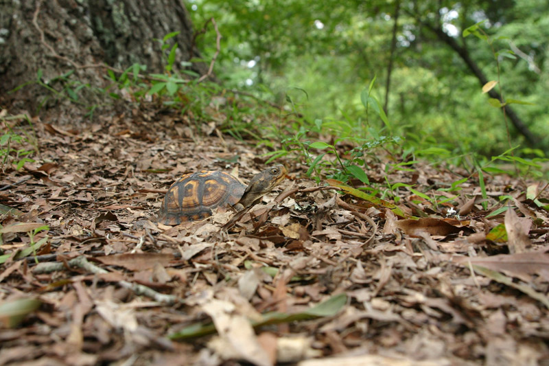
Keep in mind, too, that you can always be creative, especially with web usage. Don't rule out panorama framing or banner images, like the one above which I trimmed to use for the rotating header images on the blog. There are a lot of different ways to crop that one, sometimes emphasizing or de-emphasizing the diminutive size of the turtle. Or perhaps you can cut a single image up into three or more and make a sectioned display to spread across a wall, using each frame to highlight a single subject from a more complicated photo.
I hope that gives you a good starting point, and perhaps some ideas. Good luck!
 |