|
|
|
|
|
|
|
|
|
|
|
|
| Editing Tricks |
 |
| The monochrome image to the right is solely the Green channel of the color image to the left, tweaked by the Curves menu as shown. Note the pointer at upper right of the graph, increasing the brightest point, and the lower part of the curve which is brightening the shadowy portions slightly. See below for a full understanding of these techniques. |
A brief tutorial on color tweaking and channel tricks
This is a little explanation about the properties of digital images, and some ways that you can use these to be creative, given access to a halfway-decent image editing program, anyway. I have always avoided going into great detail about what I do, since I'm using Photoshop and not everyone has that installed, plus it's very hard to translate some of the terms into what other programs use, not to mention that I would have to get familiar with those. But now you can actually use Photoshop online, so if you have access to this page, you probably have access to that as well, and I can be specific.
Digital images, by default, are in a format called RGB, for Red Green Blue, referring to the color 'channels' that make up the image. Every pixel, every 'dot' of the image, is made up of these three colors at varying intensities. While you may have learned in art class that the primary colors are red, blue, and yellow, forget that – this applies to the pigments that could be produced for paints, many years ago, and is not even used for four-color printing (we'll get to that shortly.) Moreover, the cone cells in your eyes that detect color also work in red, green, and blue.
[By the way, you may have options to convert an image to sRGB, or RGB651325 or something – for our purposes here, these should also be considered the same as RGB.]
Each pixel in an image has an RGB value expressed as three numbers. For 16-bit color, each number has a value of 0 through 255, 255 being the brightest, because for digital images, the 'base' state is black. What we're measuring here is light intensity, so light of '0' intensity is obviously not very intense. Thus, an RGB value of 0,0,0 is black, while 255,255,255 is white.
These three numbers are listing the intensities of each color channel in order, red, green, and blue, so pure bright red, the reddest that the camera/monitor/whatever can achieve, is 255,0,0 – highest value in red, lowest in green and blue. Pure blue, on the other hand, is 0,0,255. Simple.
So pure yellow is 255,255,0, or a combination of red and green. Wait, what? Red and green make, like, brown. No no, you're thinking pigments again, and they don't count. In RGB light, yellow is a mixture of red and green. I can feel your disbelief, all the way through the internet, so I'll prove it to you.
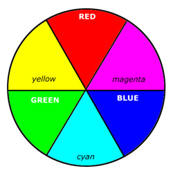 To
the left is a standard color wheel, showing both RGB and CMYK colors
(we're getting to that.) We'll use this illustration a lot, so you're
going to scroll back to it from time to time, but basically, the primary
(additive) colors are labeled in white text, the opposite colors
(subtractive) in black text. The colors in between the primaries are
actually a combination of the primaries on either side, at least as far
as RGB color and monitors and digital images go. But before we go on,
note the colors directly opposite the primaries on the wheel, because
these are the complementary colors, and will have an
affect on how you do color editing. So cyan is the complement/opposite
of red, magenta is the complement of green, and yellow is the complement
of blue. Thus, if you want to increase yellow in an image, you would decrease blue.
To
the left is a standard color wheel, showing both RGB and CMYK colors
(we're getting to that.) We'll use this illustration a lot, so you're
going to scroll back to it from time to time, but basically, the primary
(additive) colors are labeled in white text, the opposite colors
(subtractive) in black text. The colors in between the primaries are
actually a combination of the primaries on either side, at least as far
as RGB color and monitors and digital images go. But before we go on,
note the colors directly opposite the primaries on the wheel, because
these are the complementary colors, and will have an
affect on how you do color editing. So cyan is the complement/opposite
of red, magenta is the complement of green, and yellow is the complement
of blue. Thus, if you want to increase yellow in an image, you would decrease blue.
 To
the right is a quick high magnification peek at an LCD monitor showing
pure white. Other monitors or TV screens might show more of a dot
pattern or a squared grid instead of the bars seen here, but the result
is the same. You can see that there are bars for red, green, and blue,
and they're all equal in brightness – from a normal viewing distance,
these appear white – well, perhaps greyish, since the exposure is
probably less than 'actual' to distinguish the colors better, but
neutral, at least.
To
the right is a quick high magnification peek at an LCD monitor showing
pure white. Other monitors or TV screens might show more of a dot
pattern or a squared grid instead of the bars seen here, but the result
is the same. You can see that there are bars for red, green, and blue,
and they're all equal in brightness – from a normal viewing distance,
these appear white – well, perhaps greyish, since the exposure is
probably less than 'actual' to distinguish the colors better, but
neutral, at least.
 And
now, to the left is a photo of the center of the very color wheel jpeg
seen above, displayed on a monitor and then the monitor photographed at
high resolution – it had been hand-drawn in Photoshop so I didn't get
the black border lines perfectly centered, and I feel terrible about
that, believe me. But you can now see how each color is rendered, even
if it gets a little muddy. Yellow can easily be seen to be mixed red and
green, but leaning way back from the screen or squinting will show it
as yellow. Cyan, on the other hand, is more deceptive, since the green
bars really do look like they're not as green as the neighbors across
the border. Or maybe it's just my own eyes...
And
now, to the left is a photo of the center of the very color wheel jpeg
seen above, displayed on a monitor and then the monitor photographed at
high resolution – it had been hand-drawn in Photoshop so I didn't get
the black border lines perfectly centered, and I feel terrible about
that, believe me. But you can now see how each color is rendered, even
if it gets a little muddy. Yellow can easily be seen to be mixed red and
green, but leaning way back from the screen or squinting will show it
as yellow. Cyan, on the other hand, is more deceptive, since the green
bars really do look like they're not as green as the neighbors across
the border. Or maybe it's just my own eyes...
 So let's talk about a couple of simple editing tricks. The first is using the 'curves' function. Going to the menu bar at the top and selecting Image/Adjust/Curves
will open the curves window, presenting you with an X-Y graph with a
simple diagonal line across the middle. The upper right side represents
the image highlights, or the brighter portions of the image, while the
lower left represent the darker portions. You can click on any point on
the diagonal line and drag it, and make as many click points as
necessary (though if you have more than five you're probably overdoing
it.) Here, I've set two and made a gentle S-curve, increasing the
brightness in the highlights, decreasing it in the shadows – this
basically increases contrast. Making a curve in the opposite direction
would decrease contrast. You can also grab the very end points in the
corners and move them around, sliding them down the side or across the
top, for example, and this will change your values for the brightest or
darkest point in the image. There isn't often any reason to do this
unless you're trying for something unrealistic-looking, but go ahead and
play around to see how it works.
So let's talk about a couple of simple editing tricks. The first is using the 'curves' function. Going to the menu bar at the top and selecting Image/Adjust/Curves
will open the curves window, presenting you with an X-Y graph with a
simple diagonal line across the middle. The upper right side represents
the image highlights, or the brighter portions of the image, while the
lower left represent the darker portions. You can click on any point on
the diagonal line and drag it, and make as many click points as
necessary (though if you have more than five you're probably overdoing
it.) Here, I've set two and made a gentle S-curve, increasing the
brightness in the highlights, decreasing it in the shadows – this
basically increases contrast. Making a curve in the opposite direction
would decrease contrast. You can also grab the very end points in the
corners and move them around, sliding them down the side or across the
top, for example, and this will change your values for the brightest or
darkest point in the image. There isn't often any reason to do this
unless you're trying for something unrealistic-looking, but go ahead and
play around to see how it works.
You'll note, from the 'Channel' tab at the top of the window, that I'm working in RGB, but if you click on that tab, you can select the individual red, green, or blue channels as well. In RGB, all three curves get adjusted at the same time, resulting in overall brightness, but if you do the individual channels, you can change the color register. Here's an example:

The original image is on the left, the tweaked one on the right (you know that it is the image actively being edited by the highlighted title bar at the top.) I wanted the overall color register to appear a bit more like sunrise, so I switched to the red channel and increased it slightly, and then to the blue channel and decreased it as shown in the window, which increased yellow (the complement,) producing an overall faint orange cast. Sorry, I can't show both channels being adjusted, but just accept that the red channel was increased by the same amount the blue was decreased here. It is a minor change – you will note that the curve passes below the center point of the grid – but this small change radically altered the feel of the image. It's important to be subtle, however, most especially in the green channel, which is extremely sensitive. Make small changes, and it helps a lot to leave the image alone for a bit and look at something else, then see how it strikes you when you come back to it. Your eyes can get used to it and de-sensitized, which tends to make you keep pushing the effect stronger, often taking it too far.
There's a little shortcut that I don't use too often, but at times it can be helpful in restoring a more neutral color balance – for instance, when shooting indoors under artificial light, or when shade changed your color register. You will see, under the options in the window at the lower right, three eyedroppers: a black, a gray, and a white one. Click on the black one, and wherever you then click in your image, that will become the new bottommost black point. I suspect you can figure out the white one from that. The gray one is the one I use most often (which is, not much) because it sets the neutral, middle-gray point. In RGB channel mode, click on that, then find a spot in your image that should be medium gray, exactly halfway between black and white – quite often, this is something that you know is white in real life, but is in shadow so technically it's going gray in the image. Seeing colors in an image exactly as they are, without filtering in our heads to correct our impression, is an acquired talent, but worthwhile – this is how all that fuss over the white/gold-blue/black dress came about. If you don't know what I'm talking about that's okay, cherish your innocence. When using the gray eyedropper, it can often be very specific, and you'll find that gray areas can be made up of small blotches of many colors, so the first couple of samples might not correct the color at all the way you intended. That's okay; click again. If you can't find a true neutral gray area, you'll have to do it by hand.
Now let's play around with doing monochrome, or black & white work, using our color channels. It's very easy to go to Image/Mode/Grayscale and change any color image into grayscale/monochrome – and quite often, not get the best results. At the very least, go into curves after that and tweak the contrast to your liking (once the color info has been removed by converting to grayscale, you will have no other channel options.)
But another option, one that can produce some pretty cool effects at times, is to reduce the image to only one color channel, and then convert it to grayscale. To do this, you go to the Channels window, usually in the upper right, sometimes floating around in a separate window panel, and click on that – you'll see a tab for RGB, then Red, Green, and Blue alone. Click on any of them and see what's happened to the contrast in the image.
For instance, in the red channel, anything that is red will appear very bright, while things that are green or blue will be much darker. Depending on your settings, each color channel will either display in that color itself when selected, or in monochrome as shown below.

If there is an effect you prefer from any color channel, delete the other two by clicking within the channel window, then right-clicking and selecting Delete Channel , and convert the remaining selected to grayscale (Image/Mode/Grayscale.) The selected channel may appear in its complementary color before you convert it to grayscale, just to be confusing (for instance, the Red channel may appear Cyan after the Green and Blue channels have been deleted – don't ask me why this occurs.) Just ignore it.
This method, by the way, is very similar to the old technique of using color filters on the lens when shooting with black & white film – seems counterintuitive, but it works in useful ways. A yellow filter is actually blocking a certain percentage of all light colors except yellow, and this is most noticeable for the complements. Thus, a yellow filter will darken blue the most, and may make blue skies really dark against the white clouds. No color is produced from the film of course, the image still being black & white, but the contrast has been altered in preference to the color of the filter. And yes, you can even do this with a digital camera shooting in grayscale mode.
Shooting in grayscale mode with a digital camera. There really isn't a good reason to do this, and several not to. To begin with, you can just as easily do this with photo editing after the fact, so you can have both a color and a monochrome version of the same image. Second, it eradicates the ability to do any of that fun color channel stuff above. Third, not every camera is good at doing true neutral gray, and may have a color cast, especially if the image is stored in RBG, meaning the camera isn't even saving file space by reducing the amount of info the file must hold. In true grayscale, each pixel is only 0-255 in value – there is no RGB, just Brightness. To convert this to the 'monitor' language, however, it must have that value for all three channels, since monitors don't have gray pixels, but those three colors seen above.
CMYK color. This stands for Cyan, Magenta, Yellow, and blacK – you might have noticed these are the complementary colors, with the exception of black, which can't use B as its initial since Blue got there first (I don't know if this was the actual reasoning or not, and don't care.) CMYK is subtractive, which basically means it is what you take away from white to get the color you want. With RGB, we started with a dark monitor, and added light of varying intensities to get color, with all of them at full value (255,255,255) becoming white. With CMYK, usually used in printing, one starts with white paper and adds ink, or subtracts from the white. To make a full color photograph on a printed page, four inks are usually used: cyan, magenta, yellow, and black. Some inkjet printers have, for instance, two different shades each of magenta and blue, since doing pale blue without it means a solitary dot of deeper blue ink in an expanse of white paper – might look good from a distance, but gets noticeably dotty up close.
There isn't a reason to switch to CMYK unless you are being asked to produce an image for offset printing, and then most printers can do the conversion themselves. Go ahead and try it, though – what you'll probably notice is that the image becomes a bit muddier, less bright. If asked to produce an image in this color mode, convert it, then do your editing to make it appear as you like it – this will optimize its appearance in print.
You can do the same thing for monochrome images as above, yet using CMYK instead of RGB, but you may notice little difference in the results, even when you think it should give you almost the opposite effect. This is because we're adding dark ink to a white page, so the darker the image is in each channel, the more color (ink) is being added the white baseline. Or subtracted from – the language is not as intuitive as it could be.

If you compare the Cyan to the Red, in the image further up, and the Magenta to the Green, and the Yellow to the Blue, you'll see very little difference. What this means is, we added Red light to the dark monitor, but subtracted all colors except Cyan from the white page – they are the same thing in principle. Whatever, don't worry about it. Suffice to say that converting to CMYK doesn't expand our options hugely.
Now, notice the Black channel, which isn't very black. This represents how much black ink is needed to make those shadows in the image, darkening the other colors as needed.
Sharpening your image. This is a trick I learned long ago, and can only partially explain it, but it works all the same. First off, don't count on using any sharpening functions in a photo editing program to fix a soft or fuzzy image – they just don't work that well. However, a little selective sharpening can improve subtle details, especially when an image is reduced in size for web display. When reduced, the number of pixels is reduced as well, which limits how much contrast between different colors is available, and some very fine details may disappear entirely. So it can help to tweak your sharpness a little with the horribly named Unsharp Mask. The name is a vestige from the old offset litho days when doing this required a lot of shenanigans, even though it seems completely opposite what we would like it to mean now.
 Here's how to use it effectively. First, size the image down to the dimensions you will use. Then, go to Image/Mode and convert to LAB color –
I have no freaking idea what this mode is intended for, but it works
for our purposes. Then, go into the Channels menu, and now we have three
options: Lightness, A, and B. Select Lightness.
Here's how to use it effectively. First, size the image down to the dimensions you will use. Then, go to Image/Mode and convert to LAB color –
I have no freaking idea what this mode is intended for, but it works
for our purposes. Then, go into the Channels menu, and now we have three
options: Lightness, A, and B. Select Lightness.
Now go to Filter/Sharpen/Unsharp Mask, and you'll get a display like that at right. In the preview window, select a portion of the image that shows high contrast, and then enlarge the preview to 200% – this helps you see when you're going too far. I have personally found that Radius seems to work best from 0.5-1.2 pixels, and Threshold around 5-7 levels. Then we go to the Amount. This is suited to taste, but the preview window is your guideline. Watch for bright spots or 'haloes' to appear around the high-contrast areas – in this example, the lizard's eye. Too many pure white or pure black areas will definitely show in the image, so you'll typically want to back off until just before these appear– if you click and hold inside the preview window itself, your sharpening effect will go away while holding, so you can easily switch back and forth to see the effect. Again, be subtle – you won't need much. Once you have what you want, click OK, switch back to RGB mode, and there you go.
 Here's
the before and after examples – note the detail that has been brought
out in the scales of the face, and around the pupil of the eye. Subtle,
but definitely more capable of grabbing attention. If you go too far,
the sharpening effect will be visible and unrealistic looking, so use
restraint.
Here's
the before and after examples – note the detail that has been brought
out in the scales of the face, and around the pupil of the eye. Subtle,
but definitely more capable of grabbing attention. If you go too far,
the sharpening effect will be visible and unrealistic looking, so use
restraint.
So, there are a few things to play with, hopefully of some use to you in your editing and experimental endeavors. Good luck!
 |