|
|
|
|
|
|
|
|
|
|
|
|
| Calibrating your computer monitor for digital editing | ||
|
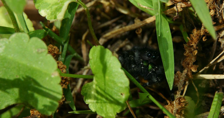
If the spider isn't recognizable or detailed, then you need this page. |
Okay, so you're serious about your digital images, and want the best display and prints for them. The first part of that is seeing them accurately on your screen.
What you need to do is ensure that your monitor is effectively calibrated, so that it shows the proper tones and hues of your images. It is very hard to edit images (or even view them) if what you're seeing is out of whack.
 All
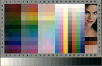
too often, what some website or guide provides to help you with this is
an image with color bars and blocks, which is almost entirely worthless
— it will nearly always look just fine, because you're already used to
seeing everything through the skewed monitor anyway. Comparing a blue
bar against a bordering yellow bar will tell you nothing, because they
contrast too much anyway. The only portion of such things that serves
some tiny little purpose is the bar that transitions from white to black
in grey tones — this at least provides some concept of your gamma
setting. Just not what to do about it.
All
too often, what some website or guide provides to help you with this is
an image with color bars and blocks, which is almost entirely worthless
— it will nearly always look just fine, because you're already used to
seeing everything through the skewed monitor anyway. Comparing a blue
bar against a bordering yellow bar will tell you nothing, because they
contrast too much anyway. The only portion of such things that serves
some tiny little purpose is the bar that transitions from white to black
in grey tones — this at least provides some concept of your gamma
setting. Just not what to do about it.
So first, start with a mostly dark room, especially one with no light either falling on the screen itself, or shining into your eyes from across the room (and clean both your screen and your glasses if you wear them.) Let your monitor stay on for at least 20 minutes, and adjust it (or your viewing angle) to be seeing it from perpendicular to the center of the screen, straight on, as it were. And, you really should be doing all of your digital editing in exactly the same conditions, especially where you're working with shadow detail, since light falling on your screen surface will seriously affect how the dark areas appear.
Open your monitor properties (usually by right-clicking on an open area of your desktop) and find out if your video card provides calibration functions. This is the best method if you have it, but you may not.
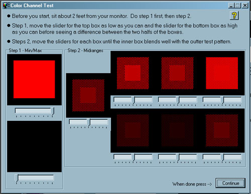
If not, you will want some kind of program to help you adjust gamma levels for overall brightness as well as individual color channels. The best that I've found so far is Monitor Calibration 1.0 from Softpedia, a free Windows program that makes both adjustments and applying them a breeze. However, others may be recommended, and you should use what works best for you.
The other thing that you'll want is some proper images to check against while making these adjustments. Photo Friday's Monitor Calibration Tool is a very simple and effective one for adjusting brightness, contrast, and overall gamma, but it doesn't provide any color guidelines. A much more elaborate system can be found at the Lagom LCD Monitor Test Pages, which also includes ways to determine if your monitor is functioning properly, and even of a high enough quality to obtain the best results. Some of this is much more important to graphics professionals and may be overkill, so don't feel obligated to fret about everything listed there.
 Using
these images as a comparison, adjust your monitor for the best
brightness, contrast, and gamma, and be sure to save the new settings as
a default for the monitor, so you have it constantly in use. Also,
don't stack corrections, meaning that you shouldn't have separate
corrections from your video card, calibration software, and editing
program. Set only one, and it should hold for everything else.
Using
these images as a comparison, adjust your monitor for the best
brightness, contrast, and gamma, and be sure to save the new settings as
a default for the monitor, so you have it constantly in use. Also,
don't stack corrections, meaning that you shouldn't have separate
corrections from your video card, calibration software, and editing
program. Set only one, and it should hold for everything else.
A little tip for gamma corrections: Most methods have you comparing a solid color patch against a barred or dotted patch, and adjusting them until they match. Squint a little when you make these adjustments, and achieving a match should be much easier.
Always make adjustments for each separate color channel, red, green, and blue. The reason I like Monitor Calibration 1.0 is because it not only gives gamma corrections for color channels, but a variety of them for highlights and shadows.
By the way, I've seen some guides that recommend comparing a printed photo against its image on your monitor, which is also entirely worthless. The chances are great that the light falling on the printed image (like from your desk lamp) has its own color cast, which means that the "white" areas of the print may appear much more yellow than the self-illuminated monitor. And if you're doing this as recommended, there should be fairly faint light to see the print with anyway. When you hold this up against the monitor, it's not going to match at all even if you've got everything adjusted correctly.
Another method for adjusting your monitor is to use a color spyder, which is a little optical gizmo that attaches right to your monitor's surface and communicates with its own software to take human subjectivity entirely out of the picture (heh!). This will usually produce the best results, but such methods are expensive, and are probably overkill unless you're either really meticulous or doing professional work, in which case you don't need my advice. However, I have to suggest that, before you invest in a spyder, you sink some money into your monitor first, and get the best that you can afford. I'm not even going to try and guide you in this area since this page will be outdated six days after I put it up, but at least look for the highest contrast ratio and smallest dot pitch that's available.
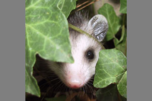
Calibrate your monitor at least every six months, and every couple of weeks is probably better. Monitors age and change as they do so, and anything electronic has the ability to wander a bit anyway. Especially, calibrate before a big print job, before you send a lot of images to a public sharing site or client, and before working on images with crucial tonal areas (like B&W, deep shadows, or detailed highlights like snow and white animals.)
 A tip for getting digital lab prints: I'll let you in on a little secret:
photo labs often try to make their customers happy for some reason, and
may make adjustments to compensate for the photographer's shortcomings.
This means they may have machine settings that automatically adjust
brightness, contrast, and color rendition according to the machine's
'judgment,' actually a basic algorithm. Since, now that your monitor is
adjusted properly, your image is already exactly the way that you want
it, always ask that they switch off all adjustments. If
you're still getting a color cast from your prints, it may well mean
that the lab's machines are out of calibration, and you should
definitely bring this up with them.
A tip for getting digital lab prints: I'll let you in on a little secret:
photo labs often try to make their customers happy for some reason, and
may make adjustments to compensate for the photographer's shortcomings.
This means they may have machine settings that automatically adjust
brightness, contrast, and color rendition according to the machine's
'judgment,' actually a basic algorithm. Since, now that your monitor is
adjusted properly, your image is already exactly the way that you want
it, always ask that they switch off all adjustments. If
you're still getting a color cast from your prints, it may well mean
that the lab's machines are out of calibration, and you should
definitely bring this up with them.
Another tip: Since I do a lot of custom sizes for images, they don't fit in the standard print sizes. I fill the gaps left around the image with a middle-grey tone (RGB values of 128,128,128) which the machine sometimes sees and adjusts for anyway, which is fine, because it's a proper neutral tone. In some cases, it may even be useful to provide a digital file entirely of this color, or a nice gradient from white to black, and instruct the lab to base their adjustments for all of your images on that particular file. If this confuses the technician, find a better lab.
Good luck, and happy editing!
 What's this? What's this? |
 |