|
|
|
|
|
|
|
|
|
|
|
|
| Combining images convincingly |
||
 |
 First off, you want a decent image to start with.
 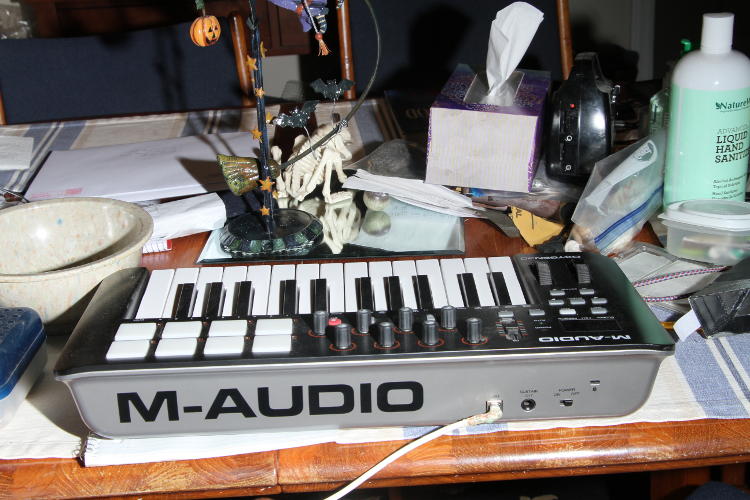 Knowing
that I'd be cutting out everything except the keyboard itself, I didn't
bother clearing the clutter on the table, but this actually led to some
flaws in the keyboard itself. Note that there are reflections of the
neighboring objects on the top panels of the keyboard, both left and
right, mostly caused by the stronger strobe that I used to mimic the
light on the frog. More subtle ones are seen at the bottom edge of the
keyboard from the surface that it rested upon, even showing a bright
edge to the shadowed side because of that white reflection – I wasn't
thinking of these. Now you get an idea of how much effort may go into
product photos to eliminate unwanted and distracting reflections
(especially for things like black cars.) If you look at the finished
version at top, some of them are still there, but others have been
removed. More on this down below.
Knowing
that I'd be cutting out everything except the keyboard itself, I didn't
bother clearing the clutter on the table, but this actually led to some
flaws in the keyboard itself. Note that there are reflections of the
neighboring objects on the top panels of the keyboard, both left and
right, mostly caused by the stronger strobe that I used to mimic the
light on the frog. More subtle ones are seen at the bottom edge of the
keyboard from the surface that it rested upon, even showing a bright
edge to the shadowed side because of that white reflection – I wasn't
thinking of these. Now you get an idea of how much effort may go into
product photos to eliminate unwanted and distracting reflections
(especially for things like black cars.) If you look at the finished
version at top, some of them are still there, but others have been
removed. More on this down below.It's a simple matter of using a polygonal selection tool to grab the keyboard, copy it, and paste it over top of the frog photo, and getting the edges right isn't necessary, because we're going to clean them up in a pretty slick manner. Just leave a little border to work with and avoid cutting anything you might need.
Another note: I'm doing this page after I'd
finished the original, as an afterthought, so some of the edits had to
be reversed out or were already irreversible, so we're not quite
step-by-step here, but you should have enough to work with.
 This
is the addition of the cut-out keyboard and initial positioning and resizing, of
course requiring rotation. Note that the super-prominent logo on the
back panel has already been dubbed out, because it was far too
noticeable and distracting. This isn't as easy as it seems, because if
you look closely, you'll see that the back panel actually isn't
consistently lit all the way across, but starts to drop into shadow
further on the left side. So I used the Clone (or Rubber Stamp) tool to
paint over this, a small amount at a time. This tool takes a sample from
a chosen area of the photo and copies it where your 'brush' is, and it
can be Fixed (always using the same spot to copy from regardless of where the brush is,) or Aligned
(starting from a chosen point but moving in sync with the brush, across
the image) – I almost always chose Aligned, because it can match the
gradient tones from deepening shadows and such. In this case, I started
with the blank areas above the logo as a source, and painted over the
logo a little at a time from the top down, working side-to-side; smaller brush at first, but then I had bigger
blank areas (where I'd already painted over the logo) and could use a
bigger brush to go faster. If you keep holding the mouse button down, it
will eventually sample from an area that you don't want, like the logo
itself, but as you release the mouse button it makes the paint
'permanent,' and you can then resample from that. In other words, short
strokes.
This
is the addition of the cut-out keyboard and initial positioning and resizing, of
course requiring rotation. Note that the super-prominent logo on the
back panel has already been dubbed out, because it was far too
noticeable and distracting. This isn't as easy as it seems, because if
you look closely, you'll see that the back panel actually isn't
consistently lit all the way across, but starts to drop into shadow
further on the left side. So I used the Clone (or Rubber Stamp) tool to
paint over this, a small amount at a time. This tool takes a sample from
a chosen area of the photo and copies it where your 'brush' is, and it
can be Fixed (always using the same spot to copy from regardless of where the brush is,) or Aligned
(starting from a chosen point but moving in sync with the brush, across
the image) – I almost always chose Aligned, because it can match the
gradient tones from deepening shadows and such. In this case, I started
with the blank areas above the logo as a source, and painted over the
logo a little at a time from the top down, working side-to-side; smaller brush at first, but then I had bigger
blank areas (where I'd already painted over the logo) and could use a
bigger brush to go faster. If you keep holding the mouse button down, it
will eventually sample from an area that you don't want, like the logo
itself, but as you release the mouse button it makes the paint
'permanent,' and you can then resample from that. In other words, short
strokes.
The Undo or History functions are your friends here – you will screw up at first. Take your time.
Also note: there's a color change
here. The original frog image actually seems to have kinda
yellowish-green light, and it does, mostly because the flash was
reflecting from nearby large leaves. The keyboard did not initially
match this (see above,) so the color register was tweaked more in line.
Be subtle – it usually doesn't take much.
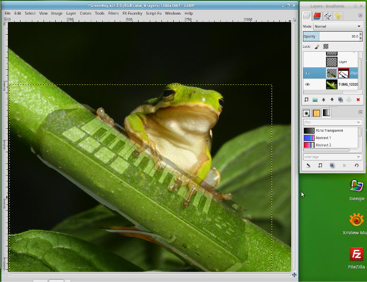
Now the first really handy bit. If you look at the menu shown to the right of the image here, we're looking at the Layers menu, and the new layer with the keyboard is the highlighted and active one. (As I said, these were captured as an afterthought, so other editing tools such as additional layers and the mask, outlined in red, are visible in the menu – just ignore those for now.) The base image of the frog is at bottom, labeled, "7-IMG_12320," while the newly-added layer with the keyboard is labeled "Clipb" (truncated "Clipboard 1".) The eyes alongside indicate that these layers are visible, so the ones above them, grey checkerboards with one labeled, "Layer," are presently not visible.
So note that the Clipboard 1 is
highlighted, meaning it's the active layer (simply click on them to
change,) and in the menu above it, we have Opacity set at 30.0 – this
means that the keyboard is only 30% visible, which shows in the main
image, and you can set this at will with the up and down arrows. In this
manner, you can shift your pasted layer until it fits precisely where
you want it in relation to the original – in this case with the frog's
toes sitting "on" the keys appropriately. Once aligned, you can change
Opacity back to 100%, and because this layer sits on top of the frog,
the toes will disappear. This is where the cool next step comes in.
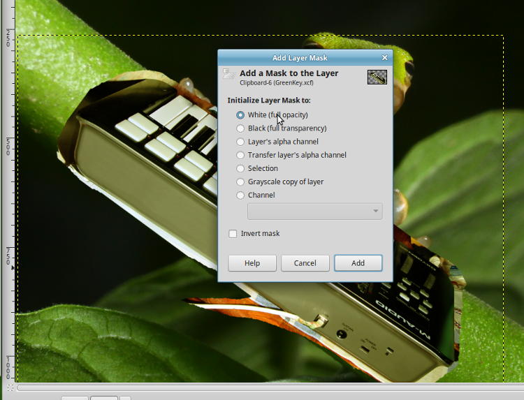
Make sure your pasted layer (Clipboard 1, the keyboard in this case) is selected as active, and go to the Layer menu, scrolling down to Add Layer Mask. It will give you the option shown here (or a variation,) and select, "White (full opacity.)" Nothing will appear to happen, and that's fine, but you'll see the addition of another rectangle for the mask on the Layer menu.
LAYER MASK: This is a selective opacity function for the layer, where you can make it visible or invisible at will, just by 'painting' it with either white or black. This way, you can cut away the keyboard to reveal the frog's toes, precisely and easily, as well as cutting away the raw edges – but you can put them back if you need to by 'painting' with the other color. This means undoing a mistake, or allowing for some future edit or function, is very easy.
An important point: Never use
sharp-edged brushes or selections when dubbing in a new layer – digital
images will have too sharply-defined pixels and the edits will be
obvious. Always use a feathered edge, or an airbrush tool, to alter the
mask, which mimics both rounded, shadowed edges and faint defocus
effects.
So let's start cleaning things up.
 When
doing fine edits, I find that it's a lot easier to view the image from
200 to 400%, to make getting the edges and lines precise a lot easier.
At right, I've selected the Airbrush tool, set the brush at a Size of 20
pixels and a Hardness of 50%, which softens the edges. Rate and Flow
are seasoned to taste – again, correcting what isn't satisfactory is
very easy with either re-altering the mask or simply Undoing the last
edit. Black is selected (see the black and white rectangles in the
middle of the Toolbox, with Black on top) so it is erasing the mask and
letting the original photo underneath show through, and the Airbrush
itself is showing at the edge of the keyboard, cleaning things up.
When
doing fine edits, I find that it's a lot easier to view the image from
200 to 400%, to make getting the edges and lines precise a lot easier.
At right, I've selected the Airbrush tool, set the brush at a Size of 20
pixels and a Hardness of 50%, which softens the edges. Rate and Flow
are seasoned to taste – again, correcting what isn't satisfactory is
very easy with either re-altering the mask or simply Undoing the last
edit. Black is selected (see the black and white rectangles in the
middle of the Toolbox, with Black on top) so it is erasing the mask and
letting the original photo underneath show through, and the Airbrush
itself is showing at the edge of the keyboard, cleaning things up.
However, when you need a nice,
straight line, the mouse is awfully hard to use. You can learn how to
make Paths and Stroke them, which is adding more steps than is
necessary, or you can just do a different method of selection. Just to
let you know, I keep forgetting how to Stroke Paths because I have so
little use for the function – it's more for graphic artists than photo
editing.
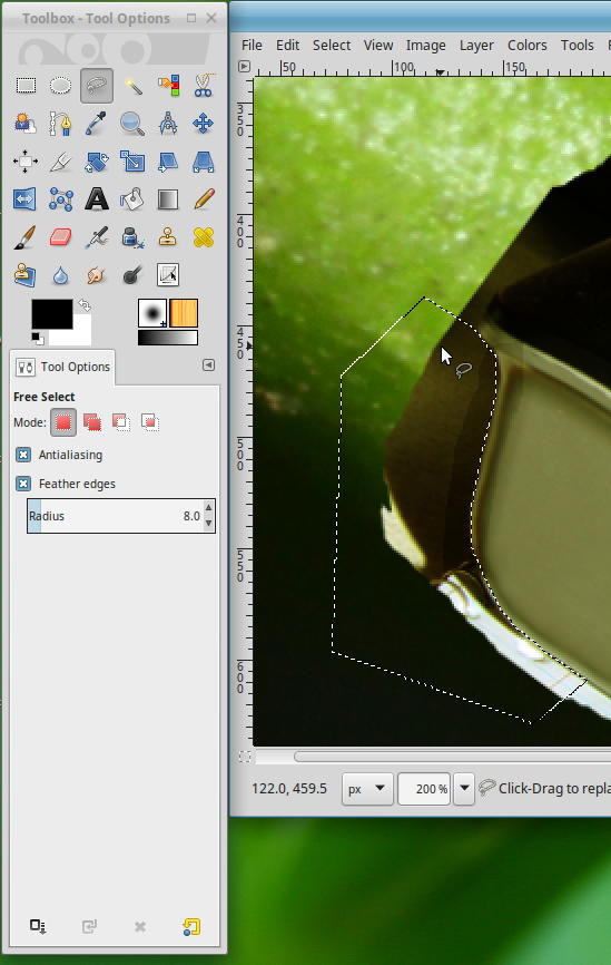 In
this case, I went with the Polygonal Lasso tool, which can either be
drawn freehand (not any easier than drawing a straight line with a
mouse,) or simply clicked repeatedly to connect the dots, as it were.
This makes outlining straight edges to be a breeze, as well as doing
large patches of masking.
In
this case, I went with the Polygonal Lasso tool, which can either be
drawn freehand (not any easier than drawing a straight line with a
mouse,) or simply clicked repeatedly to connect the dots, as it were.
This makes outlining straight edges to be a breeze, as well as doing
large patches of masking.
You'll see that both Anti-aliasing and Feathering are active, with a Feather Radius of 8 pixels – season to taste, this is going to depend on how large the image is, but somewhere in that range is usually sufficient. Both of these help eliminate the hard, pixel-sharp edges that look unnatural; you can see that, at this magnification, nothing is perfectly sharp, so we're mimicking that.
Once you have your selection made, you can either use the Paint Bucket (next to the bold "A" in the Toolbox) or a broad Airbrush to paint over all of the selected area and 'erase' it – I find the Airbrush is less likely to leave the little unwanted spots that the Paint Bucket is prone to. When done to satisfaction, simply Select None (Deselect) and the lasso vanishes. You can still touch up the mask afterward – this is just a fast way of cleaning edges or large areas.
Because of the unwanted reflections
along the edges, from setting the keyboard on light and odd-colored
surfaces, I actually cut away more of the actual keyboard to get rid of
them – it's not like anyone's gonna notice it's a few millimeters
thinner...
The next step is the bit that adds verisimilitude to the image, that extra touch that is easy to miss. Because we're gonna add in those subtle little shadows.
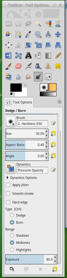
To the right is the Dodge and Burn menu, selected by the black magnifying glass, or spoon, or whatever it looks like to you. This is a carryover from real-life, analog film darkrooms; dodging and burning are selectively lightening or darkening (respectively) portions of the print, and the darkening is what we're after. Again, this is season-to-taste, but you want a moderate effect, not too heavy because shadows like this tend to be very thin. Select a soft-edged brush as shown, Hardness 50.0, Exposure between 50 and 90%. You'll have to look at the photo to determine if you want Shadows, Midtones, or Highlights.
In this case we're adding shadows of the frog's toes on the keyboard, so they really look like they're hovering over it, and the first thing is to ensure that we're now working on the keyboard layer – not the original, and not the mask. If you ever do something and it appears to have no affect, check your layers and confirm that you're working on the correct one. Then, just do some quick passes where you need the shadows: just barely off the edges for anything 'touching,' but getting farther out and more diffuse the higher or farther away the object is. This is not easily correctable, so if you're not happy, immediately Undo the result and try again. It'll probably take some practice.
[By the way, you may have noticed
that the shadows were already present up top when we talked about first
pasting in the layers. Like I said, this was prepared after the fact and
the shadows couldn't be reversed ;-) ]
 You
don't have to worry about overlapping onto the frog's toes, because
that's a separate layer, and they don't have to be perfect – just don;'t
make them too dark. But this little addition is what makes things much
more convincing, though I doubt anyone would believe M-Audio made a
frog-sized synthesizer. Notice that it even appears around the rightmost
toe, but is darker the more you seem to see 'under' the toes.
You
don't have to worry about overlapping onto the frog's toes, because
that's a separate layer, and they don't have to be perfect – just don;'t
make them too dark. But this little addition is what makes things much
more convincing, though I doubt anyone would believe M-Audio made a
frog-sized synthesizer. Notice that it even appears around the rightmost
toe, but is darker the more you seem to see 'under' the toes.
Also, you can see that I did not cut away perfectly against the white keys themselves, but left a slight dark edge, and it looks perfectly natural. However, I just noticed as I type this that the leftmost toe wasn't masked out quite right – I am ashamed.
If you go back to the top, you'll also see that two of those control knobs on the top panel are blocking the toes, and the toes to the far left, not really on the keyboard, still throw a faint shadow. You may be amazed what just looks right once you start.
And a final pair of touches, partially because I left in a detail that I should not have.
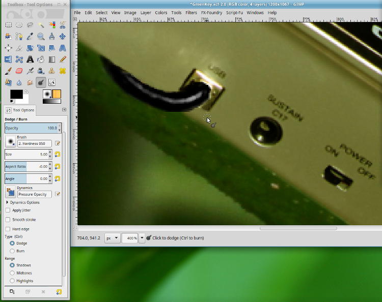
The real USB cable to the keyboard is a customized affair of mine, because where it sits requires a right-angle bend and I could find no USB cables of that nature – so I cannibalized one and made it. But it's ugly, with hot glue holding the wires together where I stripped the housing away. So in the image, I Cloned over the whole thing and painted in a black cable, which required just a tad editing to look right.
Real wires, even pure black ones,
have a shine to them and will reflect light back from the source, so
once I painted in the black shape of the wire (actually, very dark grey –
never use pure white or pure black in an image,) I used the Dodge tool
this time (lightening) to make these reflections.
 Much
smaller brush this time, and multiple passes on the 'highest' point that
would reflect the most light. It did not have to be a perfect curve,
because wires tend to be a little lumpy and this shows from the
reflection. A couple of strokes in the right area, and a hand-painted
blob takes on the appearance of a wire. The edges are just a tad sharp
in places, showing you why it doesn't look right, but I'd spent enough
time and I wasn't worrying about a detail that most people wouldn't even
look at closely (I know, excuses excuses.)
Much
smaller brush this time, and multiple passes on the 'highest' point that
would reflect the most light. It did not have to be a perfect curve,
because wires tend to be a little lumpy and this shows from the
reflection. A couple of strokes in the right area, and a hand-painted
blob takes on the appearance of a wire. The edges are just a tad sharp
in places, showing you why it doesn't look right, but I'd spent enough
time and I wasn't worrying about a detail that most people wouldn't even
look at closely (I know, excuses excuses.)
Oh, and I'd never thought to switch the damn thing 'on' for the photo, so I moved the switch into the On position – yes, the black switch really did bounce a little light onto the grey housing above it, and I copied that over.
All that for a silly-ass joke, right? Sure, but I like it, and things like this are a challenge, developing skills that can come in handy for more serious pursuits, like putting Bat Boy behind the wheel of a Mini Cooper (or, you know, fixing an image ruined by a stray detail or unwanted subjects in the background.)
And you know, I didn't photograph a baby alligator sitting on a dollar bill, below – the bill was dubbed in later, including the shadowing that makes it appear to be underneath the gator's leg, not to mention the reduced contrast to make it match the hazy light conditions of the swamp. It's the little things...
Hope this helps you with your own efforts. Good luck!
 What's this? What's this? |
 |