|
|
|
|
|
|
|
|
|
|
|
|
| White Balance | ||
|
|
||
| The inset shows a sample of the side of the observation deck (left) and the boardwalk in foreground (right) — these are the same wood, same weathered grey color, but in sunrise light and open shade. |
What is 'white balance?' How did it get off-balance? What do I do about it?
White balance is a basic function of digital photography, and knowing what it does can help you produce better results from your images.
The first part is, the light we encounter every day is often differently colored — our eyes (or our brains, really) compensate to a large extent, but cameras don't always do so, or at least, not the way we want them to.
Bright sunlight is pretty much what we consider white light, neutral, without a color cast — or as we all learned in school, all colors of light. However, if it passes through more of our atmosphere like it does at sunrise and sunset, some of the colors get blocked, filtered out in the air. The first to go is blue, then green — the greater the humidity, the more filtering occurs. However, clouds themselves block different colors, primarily yellow and red.
 It
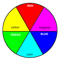
helps to know the RGB color wheel, shown here. Not only does this
illustrate how digital cameras capture light, it also helps show what
happens when you filter out a particular color of light. RGB stands for
"red, green, blue," the primary colors of light (not red, yellow, and
blue as you might have learned in art class or wherever — those are
based on pigments, and they work fine for mixing paints, but
not for understanding light.) These are the only colors captured by a
digital camera, and even displayed by your monitor. The colors in
between (cyan, magenta, and yellow) are known as reciprocals, or
opposing colors — they are made up of the two colors on either side, so
yes, yellow (in the RGB world) is a combination of red and green. I've
done high magnification photos of a monitor and it's perfectly true. The
reciprocal is whatever color is directly opposite on the wheel, so cyan
is the reciprocal of red, magenta is the reciprocal of green, and
yellow is the reciprocal of blue.
It
helps to know the RGB color wheel, shown here. Not only does this
illustrate how digital cameras capture light, it also helps show what
happens when you filter out a particular color of light. RGB stands for
"red, green, blue," the primary colors of light (not red, yellow, and
blue as you might have learned in art class or wherever — those are
based on pigments, and they work fine for mixing paints, but
not for understanding light.) These are the only colors captured by a
digital camera, and even displayed by your monitor. The colors in
between (cyan, magenta, and yellow) are known as reciprocals, or
opposing colors — they are made up of the two colors on either side, so
yes, yellow (in the RGB world) is a combination of red and green. I've
done high magnification photos of a monitor and it's perfectly true. The
reciprocal is whatever color is directly opposite on the wheel, so cyan
is the reciprocal of red, magenta is the reciprocal of green, and
yellow is the reciprocal of blue.
Decrease any color, and the the light or image gets a color cast of the reciprocal — reduce blue, and it appears more yellow. Thus, when clouds filter out the yellow and red light, everything appears more blue or cyan. Blue light, by the way, bounces around more because of its wavelength, so when direct sunlight is blocked, blue light is what makes it way into the shady side of things.
Artificial light usually has a color cast too. Incandescent bulbs, often referred to in photographic circles as "tungsten," have a distinctly yellow cast — the lower the wattage, the more yellow it is, and this is easy to see. Fluorescent bulbs, on the other hand, have a green cast — this really does defeat our eyes, but it shows up well in images, and was used extensively in motion pictures from the 1990s such as The Matrix.
These color casts, by the way, are often recognized subconsciously by us. We see the yellow/orange/red tones of sunrise and sunset as 'warm,' and generally view them in a positive manner — this makes these times of the day good for scenics and portraiture. While the blue cast of overcast days we see as 'cold,' and generally the mood is less optimistic, even forbidding.
Using white balance to correct these. There are usually several WB settings on digital cameras, with some small variations:
![]() Daylight —
Essentially, this one assumes the light is white, already balanced, and
so no corrections are made to the image. You can also consider this one
as 'neutral.'
Daylight —
Essentially, this one assumes the light is white, already balanced, and
so no corrections are made to the image. You can also consider this one
as 'neutral.'
![]() Open Shade —
Such as, as illustrated, the shady side of a house, or under a single
tree or awning. The yellow and red are reduced in these circumstances,
so the light appears to have more of a blue cast. The camera, to
compensate, shifts towards yellow and red.
Open Shade —
Such as, as illustrated, the shady side of a house, or under a single
tree or awning. The yellow and red are reduced in these circumstances,
so the light appears to have more of a blue cast. The camera, to
compensate, shifts towards yellow and red.
![]() Cloudy or Overcast — Shouldn't
require any further explanation, but this may also apply to deep shade,
like under a thick forest canopy or sheltered on all sides by tall
buildings. The light is even more blue in these conditions, so the
camera shifts towards yellow and red to an even greater degree.
Cloudy or Overcast — Shouldn't
require any further explanation, but this may also apply to deep shade,
like under a thick forest canopy or sheltered on all sides by tall
buildings. The light is even more blue in these conditions, so the
camera shifts towards yellow and red to an even greater degree.
![]() Incandescent/Tungsten — Indoor lighting, the older style 'hot' bulbs that are now vanishing;
it applies to the standard bulbs as well as halogen bulbs. Such light
is typically quite yellow, so the camera shifts towards blue. The newer
LED bulbs are hard to judge, since they come in a variety of color
'temperatures.' Usually they're close to white, but sometimes blue and
sometimes yellow — Auto White Balance is probably the best setting to
use if you're unsure.
Incandescent/Tungsten — Indoor lighting, the older style 'hot' bulbs that are now vanishing;
it applies to the standard bulbs as well as halogen bulbs. Such light
is typically quite yellow, so the camera shifts towards blue. The newer
LED bulbs are hard to judge, since they come in a variety of color
'temperatures.' Usually they're close to white, but sometimes blue and
sometimes yellow — Auto White Balance is probably the best setting to
use if you're unsure.
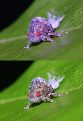 |
At top, a
situation were Auto White Balance failed — the green leaf overwhelmed
the frame, which the camera interpreted as a color cast, shifting the
image towards magenta. At bottom is what it should have looked like. |
![]() Fluorescent —
This applies to nearly all types of fluorescent bulbs, except for those
specifically designated as "full spectrum" (so yes, use this setting
for "daylight" fluorescent bulbs as well.) Fluorescent bulbs are
surprisingly green, so the camera compensates by shifting towards
magenta.
Fluorescent —
This applies to nearly all types of fluorescent bulbs, except for those
specifically designated as "full spectrum" (so yes, use this setting
for "daylight" fluorescent bulbs as well.) Fluorescent bulbs are
surprisingly green, so the camera compensates by shifting towards
magenta.
![]() Flash/Strobe —
Flashes and strobes are very close to white light, but with a faint
hint of blue (I believe this is to compensate for indoor incandescent
light, where a flash is usually used.) This setting produces very little
change, but a faint shift towards yellow and red.
Flash/Strobe —
Flashes and strobes are very close to white light, but with a faint
hint of blue (I believe this is to compensate for indoor incandescent
light, where a flash is usually used.) This setting produces very little
change, but a faint shift towards yellow and red.
![]() Auto White Balance —
This one is variable. Generally, the camera samples the light from the
entire frame, and if there appears to be a color shift in a particular
direction, it will shift it in the opposite direction for the resulting
image. The idea is that is doesn't matter what kind of lighting, or if
it's something new or weird, the camera detects it and corrects. In
practice, it's not hard to shoot an image that has a bias towards one
color because that's the color of the background or subject, and the
camera may be fooled by this. For general shooting and snapshots, travel
images, and so on, AWB isn't a bad choice, but for particular or
demanding photography (portraiture, advertising, macro,) or in
situations where there's obviously a lot of one color, this setting is
not dependable.
Auto White Balance —
This one is variable. Generally, the camera samples the light from the
entire frame, and if there appears to be a color shift in a particular
direction, it will shift it in the opposite direction for the resulting
image. The idea is that is doesn't matter what kind of lighting, or if
it's something new or weird, the camera detects it and corrects. In
practice, it's not hard to shoot an image that has a bias towards one
color because that's the color of the background or subject, and the
camera may be fooled by this. For general shooting and snapshots, travel
images, and so on, AWB isn't a bad choice, but for particular or
demanding photography (portraiture, advertising, macro,) or in
situations where there's obviously a lot of one color, this setting is
not dependable.
![]() Custom White Balance —
This one is trickier, and intended for experienced photographers. When
used, it samples the colors from a test frame that you take with the
camera, and sets its color register from that, maintaining it for all
subsequent photos on the CWB setting until you set it to something new.
This is good for mixed lighting, or something odd that you're unsure of,
such as what color register an LED bulb is producing. It works best
when the test frame is filled with a known neutral subject, such as a
white piece of paper or a photographic grey card — such a subject must be taken in the exact same light (and preferably, position) as the subjects you want to use the CWB setting on.
Custom White Balance —
This one is trickier, and intended for experienced photographers. When
used, it samples the colors from a test frame that you take with the
camera, and sets its color register from that, maintaining it for all
subsequent photos on the CWB setting until you set it to something new.
This is good for mixed lighting, or something odd that you're unsure of,
such as what color register an LED bulb is producing. It works best
when the test frame is filled with a known neutral subject, such as a
white piece of paper or a photographic grey card — such a subject must be taken in the exact same light (and preferably, position) as the subjects you want to use the CWB setting on.
Keep checking you camera settings! This goes for all settings, especially ones where you tried to produce a special effect, but it's easy to forget that you set the white balance for overcast days, and a few days later all the pics you take are kinda orangey. Get in the habit of checking these over before you shoot.
 But, do you really want to correct the color cast anyway?
This is an important question, since neutral is not always the best
choice for your color register. Seen at left is a comparison — the long
bar along the right side is a digitally produced neutral tone, while the
labeled boxes along the left are sections of actual photos of a
photographer's 18% grey card, shot in full sunlight under the white
balance setting indicated. The three numbers at the top are the RGB
values of each, while the RGB value of the neutral strip to the right is
140,140,140. As you can see, the AWB setting did a fine job this time,
while the Daylight setting provided a faint cast towards red (value 153,
compared to the green and blue which were both 146.) This might have
been due to there really being a faint color cast to the sunlight
because of humidity, or simply a setting or variation of the camera.
But, do you really want to correct the color cast anyway?
This is an important question, since neutral is not always the best
choice for your color register. Seen at left is a comparison — the long
bar along the right side is a digitally produced neutral tone, while the
labeled boxes along the left are sections of actual photos of a
photographer's 18% grey card, shot in full sunlight under the white
balance setting indicated. The three numbers at the top are the RGB
values of each, while the RGB value of the neutral strip to the right is
140,140,140. As you can see, the AWB setting did a fine job this time,
while the Daylight setting provided a faint cast towards red (value 153,
compared to the green and blue which were both 146.) This might have
been due to there really being a faint color cast to the sunlight
because of humidity, or simply a setting or variation of the camera.
Note that, since these were all photos of the same neutral grey surface, you can decide to impart a color cast if you like, purposefully shifting your image away from neutral lighting.
Why? First, and most usefully, those lovely sunset colors should not be corrected, but left as they are — the same goes for candlelight and campfires. Let those warm tones dominate the frame. But you might also want to do the same for overcast days if you're aiming for a particular mood, if you really want to convey the idea of a cold, rainy day for instance. To maintain the conditions that exist, use the Daylight setting.
[Note: Don't be fooled by the AWB at the top of the examples, thinking it's the most neutral — these pics were taken in bright sunlight, and it was intended to compensate back to neutral anyway. Had the card been purple, it still would have been compensated back to grey.]
But, you might also want to force a color cast, making a day appear more overcast than it really was, or perhaps enhancing the color of a subject. The example to the left shows you how the color will be shifted when you use any of these settings (with perhaps some minor variations depending on the camera.) Again, compare them to the neutral strip along the right.
Custom White Balance is where you can create your own color cast, by using a colored subject instead of a neutral grey or white one to set the CWB. You probably don't want to use anything too radical, but sample chips of interior paint colors might work very well, since they tend to be muted and pleasant. You will need the reciprocal of the color cast you want to create, because the CWB function is going to see the color you choose and try to make it neutral grey; thus, if your sample is yellow, the CWB will create a blue color cast to 'balance' it out.
To be honest, though, milder color casts are easier to do with digital editing after the fact, which gives you more control and doesn't require either a lot of different color samples to use to set the CWB, or the unpredictability of using CWB under lighting that already has a cast. Like all editing, keep your changes subtle — it's easy to get fooled by watching the changes as we make them and end up going overboard, so make small changes, then leave the image alone for a bit and divert your attention elsewhere; see how it looks when you come back to it.
Color temperature — This is trickier, and it also goes counter to the common terms we use. Some cameras will actually have settings for color temperature, and most studio lights are spoken of in these terms. Color temperature is measured in kelvin, or simply "K," and actually refers to the color that any object will glow when it reaches that temperature. You've seen red-hot iron, and red-hot glass? If they're the same shade, they're the same temperature — seems odd, but that's the way it works.
The cooler the temperature, the more yellow, then red, the light; the hotter, the more blue. Sunlight is considered roughly 5500K, with some variance. Incandescent lights are often in the 3000-3500K range, and the LEDS that are noticeably blue may run 6000-7000K or higher.
This is reversed from how we think of colors, where yellow and red are 'warm,' and blue is 'cold.' There isn't a firm distinction in photography between when someone is talking about common usage (firelight colors are warm) and color temperature (blue lights are high temp,) so you have to pay attention to the context. This is just to let you know the distinction, and to try and prevent confusion.
CMYK — CMYK stands for "Cyan, Magenta, Yellow, and blacK" (they couldn't use B because Blue had already claimed it.) It is a different, complementary colorspace to RGB — you already noticed it's made up of the reciprocal colors to RGB. Basically, if you're going to print something through a mass production offset print process, most full-color images are produced with four color inks — many home inkjet printers do the same. CMYK works better to produce colors from inks because they stack and mix better, that's all. Feel free to work in whatever color space you prefer, just know that if an editor wants to print your image, they may want it in CMYK. When you convert, you might notice a slight color shift, so make sure you then tweak your colors back to the preferred appearance while in CMYK.
That's about it. Hopefully, you now know everything you need to use white balance to your benefit. Good luck!
 What's this? What's this? |
 |
