


I could easily have been doing this as installments over the past, like, year and a half, but if I’d started, the gods of fate probably would have caused it all to peter out quickly. So we’ll have a couple of posts now, after things have played out a bit.
Starting premise: my friend Dan Palmer started talking to me about a new playing card deck that he was creating, similar to one we’d worked on a decade before; he gets the concept down, but it’s up to me (if I choose to do so, which is of course a given,) to do the graphics work. Up front, it all seems simple, but the finer details soon reveal that a lot of thought has to go into things.
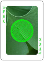 To begin with, we needed background images which in essence were the three primary colors, Red, Green, and Blue, and ideally would be apparent what they were when examined, but not distracting and mostly just being a background color. Within these criteria, however, they could not clash with or disguise the symbols which would lay over top of them, also in those primary colors, which meant that whatever we chose for ‘Blue’ could not be too close to the 16-bit RGB value of 0,0,255, because the symbol would disappear against the background if this was too close. They also could not have any shapes within that might be mistaken for shapes of the symbols and thus make it confusing in any way what the card represented. This might seem like we’re being nit-picky, but it’s easy enough to glance too quickly at a card and make a mistake when you’re involved in playing a game. Not too long into the design process, we realized that the RGB value for Green (0,255,0) was actually too bright to be used, and switched to 20,217,20 instead. The background color decisions kicked back and forth for a short while, and in fact, we ended up switching the Red image after the first test printing of the deck.
Then came the fun of representing two characteristics of the card symbols. One set was Filled (solid,) Partial, and Hollow (outline,) and we played with Partial for a while before settling on a simple diagonal line pattern – easy to be told at a glance even at a distance, difficult to mistake for any other. Note, too, that each of the characteristics had to begin with a unique letter, because they would be represented by such in the card margins and, again, couldn’t be mistaken for any other.
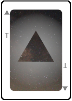 Also needed were cards to represent shapes of the symbols without any color at all, trickier that it sounds at first. So, a grey Circle, right? No, because that appears to be a Filled Circle, or even a Hollow one, so we needed a circle without any internal pattern. Eventually, we settled on a curious gradient shadow around the outside of the shape, over top of a starfield background, kind of doubling down on the ‘void’ concept. Because I do things like this, the center of the starfield image is actually the ‘center’ of the Milky Way, or at least the direction that it lies in Sagittarius.
Worst of all were the images to represent True and False, and I’ve even posted about this before. To date, we still haven’t really settled on how to visually represent these without resorting to tired cliches, and without having any misleading shapes or colors in there. For instance, in the running were solar and lunar eclipse photos, but they’re both circular and, in the case of the lunar eclipse, red. At one point I found an image of a nearby tree during a heavy snowstorm and thought the opposite would be in full leaf in high summer (we’ll let you figure out which one would be True,) but searching through my image folders, I found I didn’t have any such matching shot. No problem – it was summer, so I’d go get it right away. Only the tree was dying now and looked terrible. Scratch that.
[What we’re using now is an abstract cloud shot, mostly yellow, and its monochrome counterpart – we have yet to find or create images that seem to indicate “True” and “False” on appearance alone, but that’s why the margins have it spelled out.]
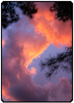 Among all of this sits what every designer and commissioned artist has to accommodate: the desires of the client. I submitted countless images for just about every aspect before we settled on what’s in use now, generally starting off with three or four choices but, for some, this went on for a while. Specifically, the image for the card backs was a challenge, since it had to be abstract and non-oriented, not easy to mistake for any of the face images, and not dominated by any one color. Eventually we settled on a sunset clouds grab shot that I actually obtained one evening while the selection process was ongoing. “Green,” however, was intentional manipulation, since Dan is a big fan of ginkgos and I knew he wouldn’t reject that one.
There was one mistake that we made, somewhat unavoidable in the circumstances. We’d done an initial printing of a few decks, and even a couple of very large, demo decks. But then I changed the background image for Red, and it looked fine on both of our monitors, so we sent it off for a larger quantity printing right before the conference. Only to find that the printing wasn’t quite in agreement with what we saw onscreen, which happens fairly often – you should always have proofs done for print jobs, but we were getting these done online, overseas I believe, and there wasn’t time for a proof and then a large order. So the red symbols don’t stand out well enough against the red background – they’re visible, but the contrast is low enough that from a distance they’re far less distinct. Now, we have redundancies built right into the deck: the cards all have identifiers right in the margins as seen above, so gameplay is only slightly hampered, but they could have been better.
There’s still more to the saga (sordid story, tale of horror,) but that will wait for another post. Once again, you can go to the site that we set up for the deck, but it’s terrible right now – we needed it for the conference and didn’t have time to do a full treatment, and still don’t. But it will give you a good idea at least.