“Bokeh” is one of those photographic terms that’s a little obscure, defined at times in different ways, and has a varying impact on composition. Basically, it refers to how the out-of-focus portions of the image look, especially the highlights. In the case above, it applies to the branches in the background, which we know are branches because we have a focused example that has the same colors and patterns; without it, we might be struggling to know what those were, and see little of value to them. Yet they’re an appropriate background, filling in the blank space and keeping the focused branch from being isolated, but they’re not otherwise distracting. And that’s the main point of bokeh: its presence helps the image, but it remains only subconsciously recognized (unless we talk about it, as we’re doing now.)
To achieve it, we need only one thing: very short depth-of-field, to permit the background to go soft and indistinct. Some people swear that specific lenses are the best, even necessary, for ‘proper’ bokeh, but this is hogwash – you just have to know how to use them, and I suspect that a lot of the reputation of lenses (most often, Leica brand) is mere confirmation bias. To get a really short depth-of-field, however, you need slightly specific conditions, to wit, a much greater distance from the focused subject to the background, than from the focused subject to the camera; your subject should be as close as possible, and so this often (not always) means macro or closeup work. And of course, the other factor for a short depth-of-field is using a large aperture, preferably wide open, and so this is easier with ‘faster’ lenses that feature a wider maximum aperture, such as f1.2, f1.4, or f2.8. But again, this is not necessary.
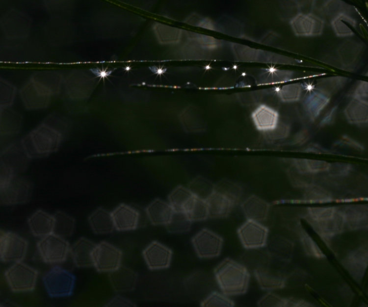
You can easily achieve short depth without a wide aperture, just with that distance disparity, but here’s what can happen: the bright portions of the image that are defocused end up shaped like the aperture opening, in this case pentagrams because the lens used had only five aperture blades. This is a most noticeable case, because the bright reflection from the raindrops that are out of focus stand out well against the dark background, but even without both the bright spots and the dark background, defocused elements still retain a portion of that blocky shape and can make the bokeh blotchier, so it’s better to be shooting wide open where the bokeh is affected by the shape of the lens barrel itself and will be round. However, a lens with more aperture blades, and/or curved ones, can help with this.
Note, too, that the smaller aperture used here (it was not recorded in the EXIF info, but probably at least f8, more like f16,) produced star patterns from the focused highlights on the drops, another compositional trick that has its uses, though it was overpowered and defeated by the noticeable pentagrams.
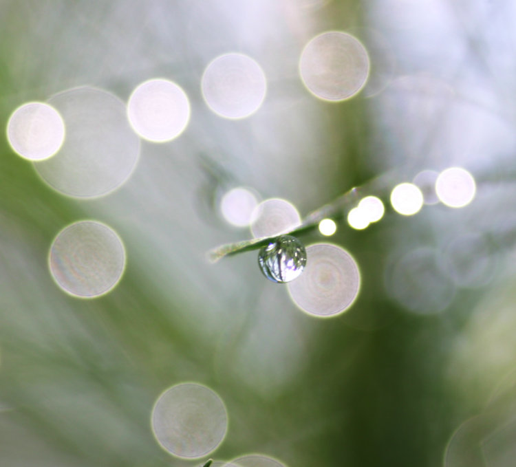
This was taken in the same session but now wide open, very short depth-of-field, and this makes me think I was using an f2.8 lens, probably with an extension tube to get even closer focus. The circles look quite crisp, but also pay attention to the rest of the background. The other needles there leave faint traces of their lines across the frame, especially against the open sky, and this might be considered a little ‘busy’ or it might simply be considered appropriate. Either way, the effect is subtler than the other elements and so doesn’t draw much attention.
Notice, too, the effect with distance, as the circles get bigger and dimmer, but this is distance from the focus point; it can also take place with drops (or other elements) that come closer to the camera. And by the way, a dirty lens will often show distinct and fairly sharp shapes within those circles, so if you’re specifically after bokeh, it’s best to do a cleanliness check.
 Here’s an animated gif (pronounced, “JEM-uh-nee“) comparison of two images shot back-to-back on a tripod, just different apertures. No real macro work here, nor specifically close, but the distance between elements is large enough. [I also used a handheld flashlight for one of the frames, which added highlights that did nothing for the image.] This begins to show another factor that affects bokeh, which is background contrast: the varying brightness of the leaves back there produces more blobs, and since the difference in distances isn’t as great as the image above, they have more distinction, not overrunning each other as much. For really nice smooth bokeh, the background should be as low contrast (in brightness or color variation) as you can achieve. This would have made the focused, foreground leaves stand out more and have a more distinct demarcation between them and the background.
This also shows a trait that is very hard to predict, and only occasionally appears in the viewfinder when composing the shot: you can see things blocking the bokeh circles in the frame that has shorter depth. The lights that produced the bokeh circles aren’t actually blocked by those intervening branches or leaves, but they are when defocused, leaving sharp silhouettes across them. Sometimes this is distracting and takes away from the overall composition, sometimes it isn’t, but if you really don’t want them, you should probably shoot several frames with slight differences in position between them, and this is one of the few circumstances where chimping at the image in the LCD of the camera afterwords can tell you something useful.
A more egregious example of bad background contrast is below.
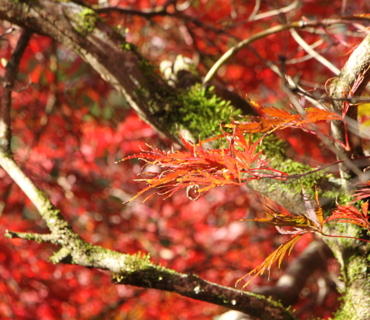
So, two factors that produced the wrong kind of bokeh here: not enough distance between subject and background, and most especially, way too much contrast in that background. Bright sunlight will often do this, so it’s something to avoid or at least be aware of, but really, even in low contrast light, the colors themselves, from the moss and the branches, would be clashing. Overall, this is a situation to avoid, since no amount of tricks or technique would render decent bokeh in such conditions.
Yet, there’s a simple trick to improve it: crop tightly to enlarge a smaller portion of the image. This will increase the apparent blurriness of the background and set it further apart from the sharper elements. It won’t always work (and not very well with this one,) but it can sometimes improve the overall appearance of your composition and the bokeh therein.
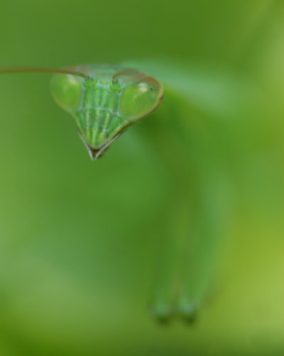 This is an extreme example, and even though unrecorded in the info, I recall this lens – this is the Mamiya 80mm macro, likely with the coupled extension tube, wide open at f4. The color of the mantis matched the background so closely that there is only the faintest difference in hues between them, and the depth so short that everything went out of focus within a very short distance. The bokeh now provides only the barest of impressions of the back and the forelegs, producing a quite abstract image very simply. Luckily, most of the face of the mantis was flat to the camera so it wasn’t going out of focus from mouth to antenna too badly. But you can’t get much smoother bokeh than this.
And no, this is barely cropped at all, but it did indeed require a fast and dedicated macro lens to achieve. Longer focal lengths tend to help, because the shorter, wider focal lengths increase depth-of-field, making it much harder to achieve that crucial separation.
Bokeh is naturally an ideal element in portraiture, providing something nondescript and non-distracting for the background, and I can’t give you any decent examples because I don’t do portraits and I rarely feature anyone without express permission anyway, but we can do a similar example:
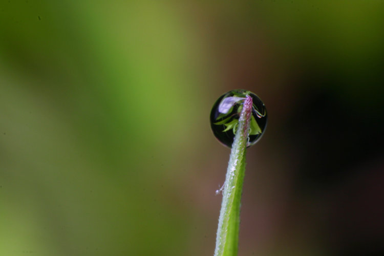
This, however, shows a small mistake, one that’s easy to make yet I should still know better. Even well out of focus, the background benefits the subject much better when it permits the subject to stand out distinctly and draw the viewer’s attention more, and contrasting color or light helps this. With the dewdrop lensing the background so well, especially the darkness surrounding the plant, it would have been better shifted slightly left to fall against the brighter leaves/bokeh there, instead of bordering a dark patch – it just would have been that much more distinct. There’s even a triangle of deeper green among the lighter, and the drop could have been positioned so that this ‘pointed’ to it. However, if I read the conditions right (since I don’t recall the circumstances of this image at all,) I was also using a flash, and so this appears in the image much different from what I was seeing through the viewfinder, and thus I remain completely blameless.
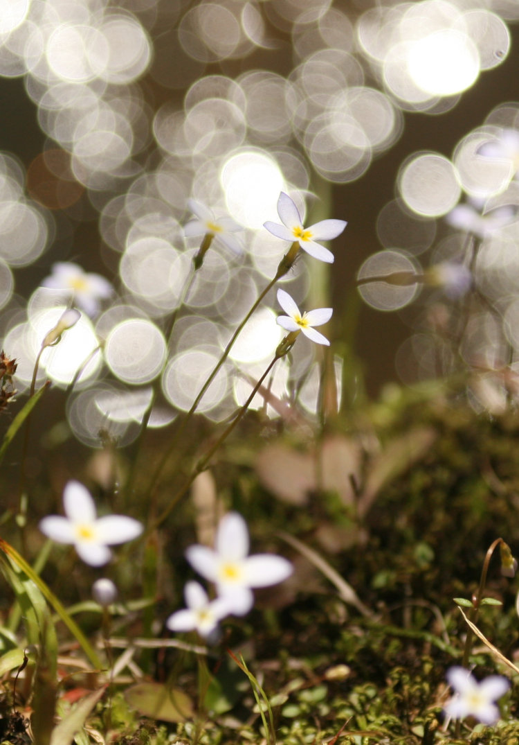
I’ll close with two of my favorite abstracts demonstrating bokeh handily, and while they both look digitally edited, these are exactly as shot save for cropping; they’re what can be done with short depth-of-field. Both are macro, one much tighter than the other. The first is simply dewdrops in a dense cobweb, with the backlighting causing numerous internal reflections from the drops. The second is flowers on a streambank with the glitter trail of sunlight off the water directly behind.
Good luck with it!