 So our next topic of discussion on the subject of composition is “depth” – what it does and how to present it.
Depth is one of those things that is subtle, but very effective, most especially in landscape photography. Drawing the viewer into the photo, making them feel that they have a window into your image, rather than a flat “painting,” can give a much better impression. Photographs are, by nature, two-dimensional; you cannot change viewing angle for your monitor right now and get a different perspective, or dodge to the side and see what was hidden behind a tree. But we can fool the viewer into interpreting depth in our images, and this makes them more dynamic. Many beginning photographers take “straight on” images, lining their friends up together in a wall in front of the camera and shooting at eye level – this is what makes snapshots. But if you think in terms of providing depth to the image, you can create a much better photo with only a tiny amount of effort.
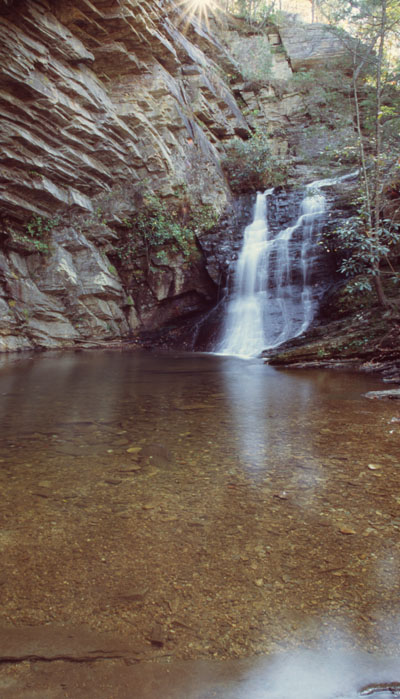
We read minimal clues when we look at images, things like objects getting smaller with distance, parallel lines appearing to converge (think roads and railroad tracks,) and a very sneaky one, the curvature of the view as we look downwards versus straight ahead, as seen here. Going for a lower vantage point and a wider-angle lens (I believe this was 24mm on film, which is 15mm on most digital SLRs,) we seem to be seeing straight ahead in the center of this image, but actually downwards into the water towards the bottom of the frame – and we really are, due to the optical effect of wide-angle lenses. You can enhance this by aiming slightly downwards to bring more of the foreground into the image, to make that distance and change in perspective apparent. If you asked most people what the subject of this image is, they’d say, “the waterfall,” but that only takes up 15-20% of the image. The subject is more the setting itself, the placid pool in the rocky alcove, and the waterfall only adds charm rather than taking over the image. For this, I used a small aperture of f22 for a high depth-of-field, keeping the very close stones in the bottom of the pool, as well as the distant waterfall, in tight focus. This provided the added effect of blurring the moving water, since I needed a slow shutter speed to let in enough light past that small aperture for a proper exposure. Naturally, the camera was on a tripod for this.
But you can induce depth exactly the opposite way, too, by using a wide aperture and thus cutting your depth-of-field down very short. This means that subjects within your frame with only a small separation of distance between them can have different focus – your main subject is in tight focus, but something only a short distance behind it or in front of it goes out of focus, making the idea of depth even more distinct. You can see an example of this (and more about how to do it) on this page. You can also exaggerate this effect by using a longer focal length, or by getting very close to your subject. Both of these result in higher magnification, and depth-of-field drops shorter with more magnification, plus it gets shorter with closer focusing distances. Alternately, wide angle lenses give the greatest depth-of-field, most especially at long focus distances.
Anything that either draws a line or shows distinct reduction with distance perspective works very well for inducing depth in the image – the two fisherman in this image demonstrate this nicely. You can also use, as mentioned above, roads, fences, and even fields of distinct objects like flowers, which will give the viewer specific shapes to see reducing with distance. Getting closer to any of these will exaggerate the effect, making them loom larger in the bottom of the image and increasing the disparity of sizes within the frame.
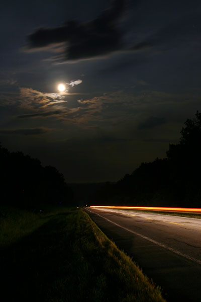
 This leads us to another compositional element: leading lines. Our eyes naturally follow implied paths, which curiously could very well be an evolutionary trait, helping us spot the easiest passages and game trails. But in images, it means we track such lines with some expectation of seeing something at the end of them, and as a photographer you can use this trait. Here, I had plenty of positions to take on this road, but I chose this particular side because it placed the moon almost directly above the converging lines of the road and verge, and even has some subtle help from the treelines. Timing it to let a car go past gave greater emphasis to the road and provided some light down there – otherwise, if I’d exposed to let the moon light up the road surface, the moon itself would have been far brighter and glaring. Overall, the subtle message is a destination under a brilliant moon… gosh, look at me, I’m playing around being artsy. You don’t even need a subject at the end of your leading lines, if you want there to be mystery or even the idea of going nowhere, if that’s your message. Just remember that the viewer follows them, so use them judiciously.
By the way, I just wanted to point out that the two images I’ve used so far have their own balance, a subtle emphasis towards one side or another, and thus they were placed alongside the text appropriate to leading into the text, rather than away from it. Meanwhile, if you remember the Rule of Thirds post, you might notice that the roadside image hews pretty well, placing the road in the lower third and the moon almost precisely at the focal intersection of the upper left cross – but the waterfall image doesn’t fit well at all, breaking the rule more than it fits. So, did you like one better than the other before I mentioned this? It’s no use asking you to consider them now that I’ve tainted your subconscious with what’s “good” and “bad”…
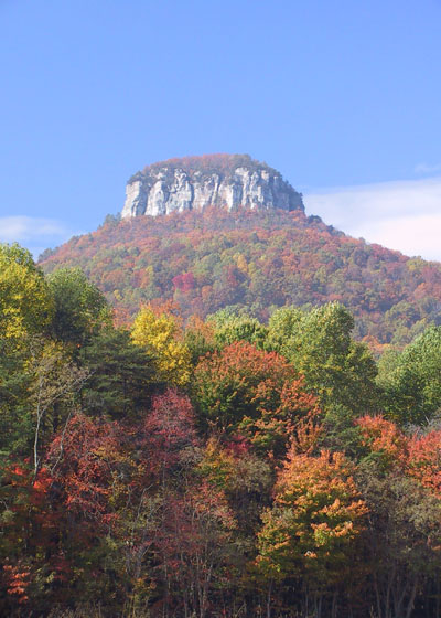
 Getting back to depth, there’s a pair of effects illustrated here that can be used as well, in the right conditions. Atmospheric haze increases with distance, so images over a significant distance can show depth if you capture the bluish haze that separates, for instance, distant hills, and you can select light and weather conditions to enhance this, such as early morning as the fog is lifting. Notice how there is a distinct foreground row of trees, with the hill and the peak behind them in a slightly different color due to haze. Additionally, autumn colors not only provide a rich, pleasing palette, but often serve to distinguish individual trees from one another, once again increasing that feeling of depth. Had this image been taken in high summer, the trees would all have been the same color and would blend together, reducing the idea of depth. But here you can almost judge exactly how far away the peak is, can’t you?
As another aside, I mentioned in a previous composition post that being aware of the clouds can make a difference, and waiting for them to be right for the subject is time well spent. For this one, I waited for the clouds to provide a break around the peak, because I found the image stronger with a blue sky background rather than a cloud back there, and it provides some contrast to the reds and oranges of the foliage.
Three of my favorite examples of depth in images (well, my own images, anyway) can be found here, here, and here. As with any compositional element, there are circumstances where it works better, and others where it does not, or isn’t really needed. It’s an easy thing to play with, and can be induced from plenty of photo opportunities, so have fun with it!


