


By that, we mean, “Post-processing,” which some may argue doesn’t really apply as composition, but it all depends on how you use it, doesn’t it?
I’ll lead off with saying that getting the image that you want in-camera, while your chosen subject is right there in front of you, is not just preferred, you want it to be an integral part of your shooting – it’s really hard to go back and get something that you missed. Even if the location is close by, the light will have changed, the foliage will be different, and so on. Examine all the possibilities that you can think of while you can – experiment, change positions and angles, try different settings or metering methods, whatever it takes. And don’t trust the preview on the little LCD to tell you anything crucial; take more images with little variations to be sure.
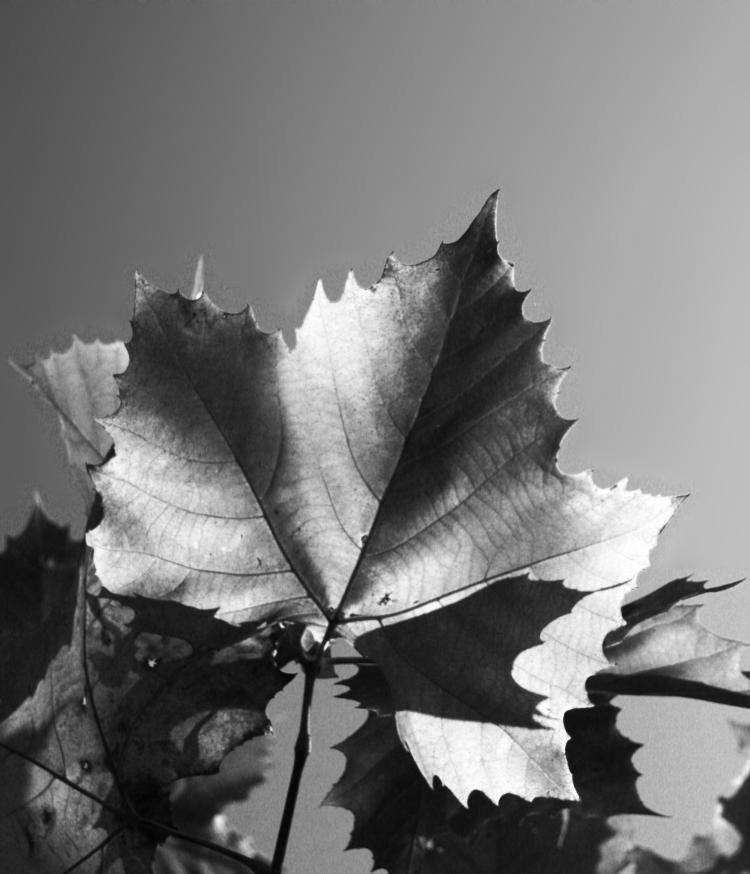
But the way you treat the image afterward, back home at your computer, can have a significant effect on your images as well, and there are certain skills that should be developed for this. Composition is not just what you have in the frame, but also what you leave out, and even the positioning in the frame will determine whether something is your main subject or not. I have a whole page and video on cropping, so I won’t repeat too much here, but there are definitely times when the original image isn’t strong enough as taken, yet can become entirely different with a little creative cropping. On occasion, you will suddenly discover the possibilities within that never occurred to you while taking the photo – including sometimes finding a hidden subject.
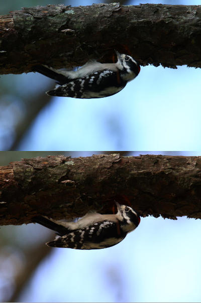
End usage dictates a lot of this, too. We might see the potential in shooting the image vertically, but then a desire for something horizontal pops up, or we need to fill a particular space, or a client wants a specific frame size. Weddings and portraiture especially have demands for 8×10 or 11×14 formats, neither of which fits the standard 2×3 (8×12, 11×16.5) ratio of the typical SLR frame, so we need to know how to accommodate these, without ever forgetting to leave enough space to crop down while we’re actually shooting the images. When a client wanted a selection of images in panoramic or banner form, something that I had rarely ever considered aiming for, I was forced to find out how many images that fit their other criteria could also be turned into panoramics. But it led to the banners at the top of the pages here now.
It’s well worth it to have decent photo editing software on your computer, and learn how to use it for the most common needs of course. Is it necessary to have the bestest and most elaborate package? Not ever, in my experience – I’ve used Adobe Photoshop right alongside lightweight and freeware packages like GIMP, as well as several ‘consumer’ programs, and presently use GIMP for all of my needs. Many packages are intended for graphics professionals doing elaborate creations, with only a fraction of their tools and filters aimed towards photography itself, so why pay for things you won’t use? Below I’ll break down different tiers of functions, for better than 90% of the edits you would perform.
But first off, Optimize your monitor. Making sure that your display is as accurate as possible will help you in editing, and really, if you’re doing anything with photography (or artwork, or design, blah blah,) you really should have this locked in. My old page on adjusting your monitor is here, but I fear that it is sadly outdated now; I would at least recommend finding both a ‘typical’ image with a great range of colors and light levels, and a good gamma image that gives step transitions between full white and full black – these allow you to know when your display is as good as it can get. Recheck this at least every six months, because monitor settings wander, and of course after any graphics hardware or software updates. Also, make sure that your viewing/editing position is as close to straight on to the monitor surface as possible, since most monitors present a color and gamma shift when viewed at an angle.
Some basic functions you should definitely have in your arsenal:
Cropping and Resizing. Already covered in detail, and really, any program can perform these more than adequately. The biggest difference that I’ve seen has been in upsampling, making an image larger than the original, and there are variations in the algorithms used for this. If you end up doing this a lot, it might be worth the search for software that produces the best results for you.
 Color correction. Again, typically covered by most programs quite well, though using this effectively becomes almost an art form in itself. Many programs have a Curves function which allows you to strengthen or weaken colors within particular brightness ranges, which might seem confusing until you learn how it works. Briefly, I’ll point out that sunlight and shadows actually have different color registers, and you can mimic or reduce the effect of these as needed: for photos taken in bright sunlight, the shadows will lack some of the red and yellow color registers that are present in the highlights, so you may want to reduce this effect, or accentuate it, depending on the image and usage itself.
But there’s also the bare fact that most artificial light has a color cast to it that you may not desire, or you’re trying to improve skin tones, or you simply need more contrast or saturation. There is no way I could provide a decent guide to this, especially not in a single post, but I’ll offer two bits of advice. 1, Practice, a lot – it’s not a simple thing to learn. And 2, Make Subtle Changes, less than you think you might need, at least at first. We get used to seeing things and can keep pushing changes farther than they should go, thinking that it continues to improve; instead make smaller changes, then set aside the image and work on something else for a short while. When you come back, see if you still think it needs tweaking, and in what direction – initial impressions count for a lot here.
By the way, while many programs have something called Auto-Levels, not once have I ever seen it do a good job. It might help you visualize where a color shift is happening, but like most automatic tools, it’s not very good – you can easily do it by hand much better.
Cloning/Rubber Stamping/etc. I think every program calls it something different, but the gist is, copying a very small portion of the image over into a different area, mostly to cover up dust on the lens/sensor, dust or hairs on the scan, and the occasional trash that sneaks into a photo – I’ll do it for display prints with a bit of high-contrast schmutz that was present, like a yellow leaf that draws too much attention. Doing this well is harder than it might seem at first, because we tend to tune out the color and gradient shifts that occur across a surface or in the sky, and thus copying from the wrong area leaves an obvious bright or dark smudge, no better than the dust we were trying to eliminate. While it takes practice, it’s very handy, especially when dealing with old images or doing restorations.
Resolution Control. This is mostly for printing, since online usage should be solely by pixel dimensions, but printing requires a certain resolution – my general rule is 300 pixels per inch for the finished size. Having the ability to do this easily makes your work flow a lot faster, but it’s not that hard to do some simple calculations for end usage as well. Do not confuse the dots per inch (DPI) of most consumer printers with pixels per inch, since they are not interchangeable – DPI mostly relates to each color ink that gets laid down, and to make all the colors in a decent print from 3 to 8 ink colors, some layering and combining is required, so DPI will always be higher than PPI, which relates only to the fine details that we want to see.
Sharpening. There are a lot of filters/functions to accomplish this, and umpteen different ways to use them – doing some online searches and experiments will help. The most common one is the confusingly-named Unsharp Mask, which is sufficient for most uses, but the finer details can be tricky. My basic rule is, first get to your final resolution, whether it be for printing or web use, whatever. Then enlarge the image on your screen to 200% or better, and perform your sharpening tests there. If halos are forming around high contrast areas, you’re going too far and need to back off a little. Just remember that no digital tricks will correct bad photos – sharpening is for light enhancement only.
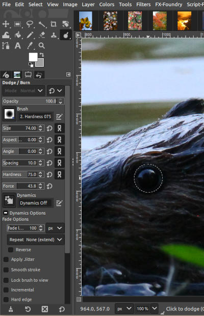 Dodging/Burning. This is a method of selectively lightening or darkening very specific portions of an image, usually in the shape and size of whatever ‘brush’ you like. Definitely handy to draw attention to, or away from, areas in the image that got too little or too much light, very easy to do with nature photography. But so you know, perhaps one out of every 35-50 images seen on these pages have been treated in this way – sharpening takes place only a little more often, about half of those just to compensate for reducing details in the web resolution version of an image.
Those are the basics, which I’d insist on having and knowing. Now a few advanced functions.
Layers and Masking. These are invaluable for compositing, retouching, laying in text, and so on. Doing work on a different layer can allow you to turn it on and off, or even make it semi-opaque, as needed. Masks are even better, because they allow you to do this selectively, in only small portions of the frame, and can alter it repeatedly. Very slick.
Paths and Stroking. Essentially, a method of doing precise work, such as painting a straight line or specific curve, without trying to do this with a mouse or touchpad. I do this very infrequently and keep forgetting the steps, but in certain specific cases it’s a huge help.
By the way, graphics professionals and artists swear by drawing tablets, but all will admit they’re a tough thing to get used to initially. I don’t do it enough, or elaborately enough, to merit both the expense and the space needed, but I’ve tried them in the past – I can see the benefits, and also agree with the learning curve. If you’re just doing photographs, you likely won’t see the benefit, but if you’re doing anything freehand like painting or drawing or even selective dodging/burning, you might get a lot more use from one.
High Dynamic Range, or HDR. A method of combining two or more images that have exposures in the range that you prefer. Often enough in photography, we can expose for the highlights, like the sky color, but in doing so lose the shadow details, because photos just don’t capture the range that we can see with our eyes. So HDR takes an exposure for the highlights, and another for the shadows (and so on,) and combines the best bits of each. This used to be done by hand with those layer masks, but now some programs do it automatically. I personally consider it cheating, and it very often looks fake to anyone familiar with how light works – useful, perhaps, in advertising, but mostly what is shows is the inability to use light properly or seek the correct conditions. You do you, however.
I guess my basic rule is, if there’s a specific illustrative or informative goal, then fine, go for it. But if you’re intending to do ‘art’ or showing off your skills, well, you’re not, are you? You’re just showing off the software that you use. Learning to do it without digital tricks is much more skillful.
Other creative/artistic filters and effects. By these I mean the pre-packaged effects like Mosaic and Canvas and so on. On rare occasions, using one of these in a limited manner might help you create a vision, but realize that everyone familiar with the same program will probably recognize the effect instantly, and will know that all you did was click an option – this includes 90% of art directors and contest judges. If you’re trying to do something unique and talented, that takes some effort. Use the computer to help you, but don’t count on it to do anything.
That’s all I can think of right now, but it’s probably enough.