


Another take on the subject this time; instead of comparing older and newer images, I’m going to show the alterations done to a single older image. I suspect this is the only image of mandrills that I have, and I can’t even recall where I took it, since I’m pretty sure the NC Zoo hasn’t ever had them and I’ve never been anywhere on the African continent.
Anyway, the original:

This was before the routine cleanup that negative/print film requires, and you can see the dust and degradation from the original scan – nothing too hard to clean up, but that grain is another matter. This was a pretty high ISO film, and it shows: even with film, the higher the ISO, the lower the quality, and while it handled the reduced light of the enclosure and even produced some decent colors, the grain was simply overwhelming. For giggles, we’ll take a look at full resolution:

Even as a small print, this was noticeable, but as an enlargement it simply wasn’t going to do. It was a shame, because I liked the semi-cloned poses of the two mandrills, a faintly cubist effect, and thinking in those terms also brought up pointillism, and I decided to try something.
[Pardon me for digressing slightly and further for potentially butchering the definitions, but I feel clarification might be in order for some. Cubism is the technique of showing two or more perspectives simultaneously, such as a face-front and a profile, what Picasso is best known for, while pointillism is creating the image from dots instead of strokes or lines, a little like a mosaic.]
With that in mind, I cleaned up the original, converted to greyscale, and then burned in the surroundings to make the mandrills almost floating in dark space. In that space, I added grain to match the original, giving it a little more of an old film effect, one of the interesting things about our culture. The older films were terrible and grainy compared to now, but we’ve gotten so used to it that converting a grainy image to greyscale simply makes it look more ‘natural.’ Meanwhile, the eradication of the surroundings draws more attention to the mandrills, and the similar poses gives an impression (to me at least) of two different ages, the senior years lurking in the background, and the greyscale enhances this idea too.
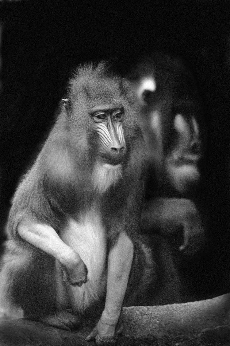
Even the position of the wrist of the one behind seems to support this idea, more crooked and less fluid, and the shadowed brow helps too, implying sunken and even squinting eyes. Is there the suggestion of a hunch? It just seemed to work, and cleaning it up to concentrate on this faintly surreal aspect helped it along. Because of this, I added it to the Black & White gallery on the main site, though the version you see here is a remaster done recently.
And then, considering this post and the impressions that I was getting, I did another version, a little layer masking (there are tons of videos out there that explain and demonstrate this, but it’s easy to do in most of the Photoshop versions and in GIMP.)

The selective color effect is a bit trite now, but it seems to work for this concept. This now largely defeats the purpose of converting to greyscale, since the grain remains in the color portion, but the greyscale portions gain a more unreal impression, more of the imagined/dreaded specter of old age sitting just behind. Without seeing the original, it would be easy to believe that I pasted two images together to convey this idea, though granted, most people wouldn’t choose to illustrate the idea with mandrills. Their loss, you know?
* * *
I just have to add this, because I’m me, but I suspect that we’re actually seeing a female and a male here instead of different ages, which puts an entirely different spin on the whole image, and one that I’m not going to comment on in the slightest…