


Many years ago I worked for an idiot landscaper, one that insisted the tiny little splash of color on his business cards had to be a precise shade of green – none other would do. Apparently he believed this made some difference, though somehow he never made the effort not to be an asshole; I would have thought that might make more of an impression, but what do I know? Anyway, that’s beside the point – I only bring it up to demonstrate that I’m not that bad in comparison.
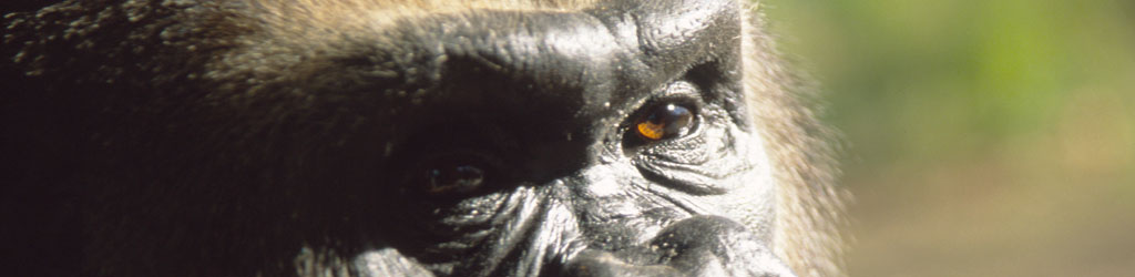
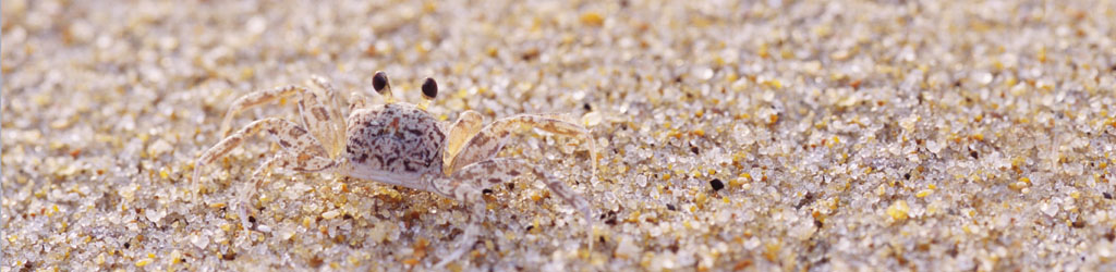
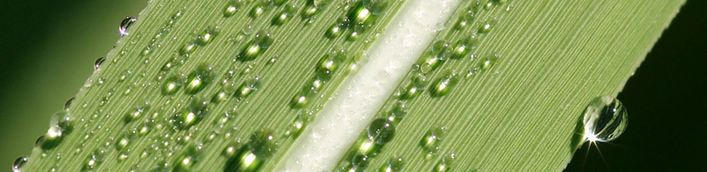
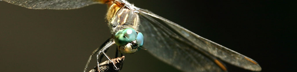
I was about to print some more business cards of my own just now, and decided to create some new designs and tweak the old ones. I have gone with photos of course, actually having real photo prints made and cutting the cards out myself, which allows me to have several different designs at once without incurring a ridiculous set of printing fees. While I have two logos of sorts that appear on my letterheads, these are photos converted to line art; on the cards my ‘branding’ is just a particular font that I use over top of the background image, one that presents a set of problems all its own.
The font is Eras Demi ITC – it came along with some software long ago, but is not typically included in everyone’s package, and I had to search for it to install it within my computer’s TrueType fonts so all of my programs could access it. I do my photo editing in Photoshop CS2, which allows text to be added easily. Making business cards is no sweat then, right?
Not so fast. I use the font in italic form, but there’s something weird about this particular one. The option to alter it to either bold or italic, which can be found for most fonts, does not exist for this one – in Photoshop, anyway. I can do it easily in Word, for some reason. So, in order to use it, I have to type out what I want in Word, then copy it and paste it into Photoshop.
It pastes in with its own baggage, which is the background color, generally white. So I have to delete that to have just the font. This introduces the fun of anti-aliased images: in order not to produce ugly jagged edges, the pixels on the border of the text are blended with the background color to give a smoother appearance. When I select the white background to delete it, there still remains a thin border of pixels of varying shades of grey. Change the parameters of the selection to try and get rid of these, and it can actually end up turning the text slightly transparent for some godawful reason. Leaving the borders looks ugly.
Not only that, but if I decide to change the color while in Photoshop, the fill tends to eradicate this anti-aliasing and get a bit blotchy and jagged around the edges, looking even worse. So I try out a few colors to see what stands out the best against the background image, then carry that color into Word and set the text therein. To help with the anti-alias edge issue, I usually ‘highlight’ the text in a medium-grey tone, so the background is more neutral and doesn’t produce much in the way of border problems.
But wait! For reasons known only to Microsoft, the highlighting function accounts for normal fonts, but not slanty italic fonts, so it often ceases inside of the right side, where the leaning text overlaps the edge that a proper, upright text would remain within. Add some spaces, doesn’t matter, nothing happens – who would want to highlight empty space? So to have this background color extend past the end of the font completely, I end up adding three spaces and a period, which fools Word into thinking there’s more to the sentence. This, of course, has to be deleted out as well once it is pasted into Photoshop.
I actually have Illustrator CS2 installed on this machine, but no matter – it doesn’t recognize Eras Demi as a potential italicizable font any more than Photoshop does. I’ve also tried using Open Office because I really don’t like Word, but it has its own collection of quirks that makes exporting text painful.
“Use a different font, you idiot!” I heard you say earlier. I would, really – I’ve been through dozens; none of them have the look I like, either being plain or (and you’re familiar with this if you’ve ever gone seeking fonts for a particular use) unbelievably goofy-looking. There is apparently a strange subset of people who spend time making text look quite bizarre, and worthless for any reasonably normal function.
 What this means is, creating new business cards is a remarkably tedious process for something that really shouldn’t take that much time. I honestly consider all of the serif fonts like Times New Roman – those that need curlicues and bases hanging off all of the letters – to be ugly, so this is the price I pay for that opinion. I would also dearly love to find a distinctive semi-serif font, one that allows an easy distinction between uppercase “i” and lowercase “L,” but there are few of those around too.
The other issue I have with this font is that few computers have it installed, and most text-editing programs embed the type of font in the document as a tag – take the document you created and print it from a computer that does not have Eras Demi ITC installed, and it will be replaced by whatever the default font is, usually Times New Roman. This makes my letterhead look really hideous unless I purposefully save the document as a PDF, which makes the whole thing an image instead.
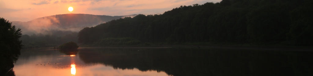
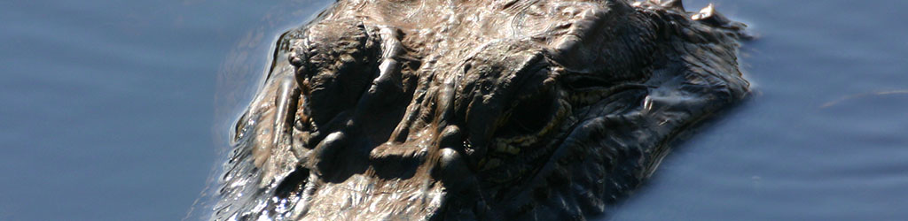
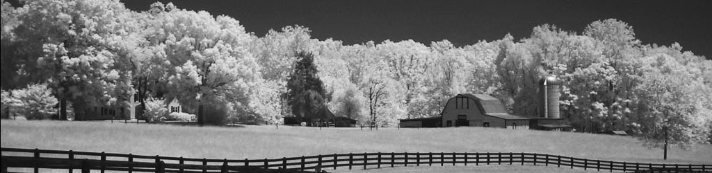
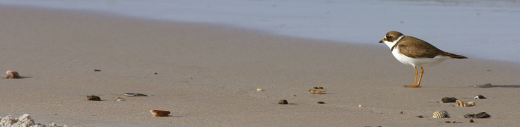
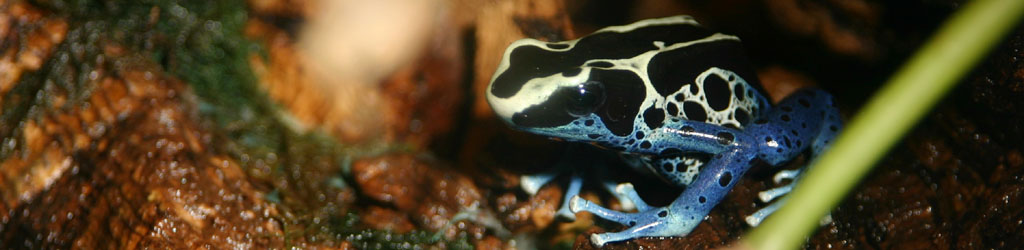
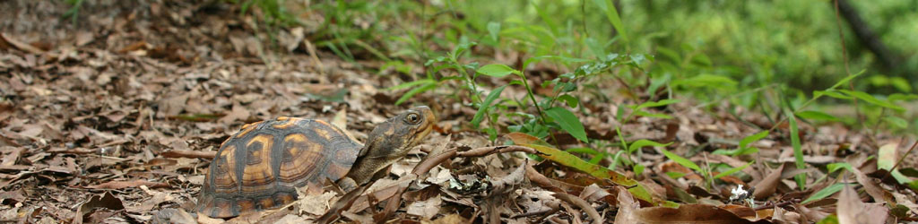
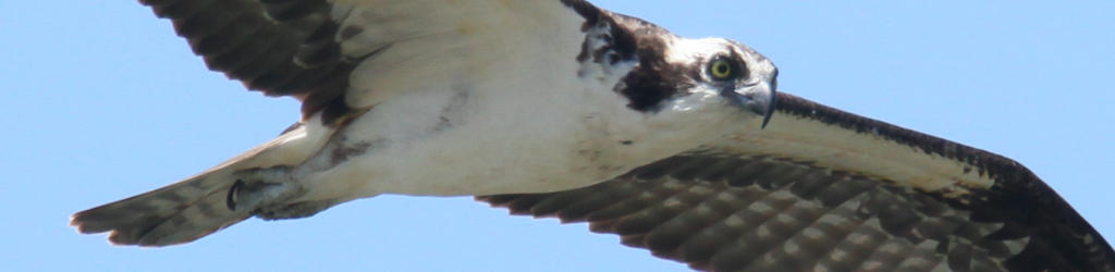
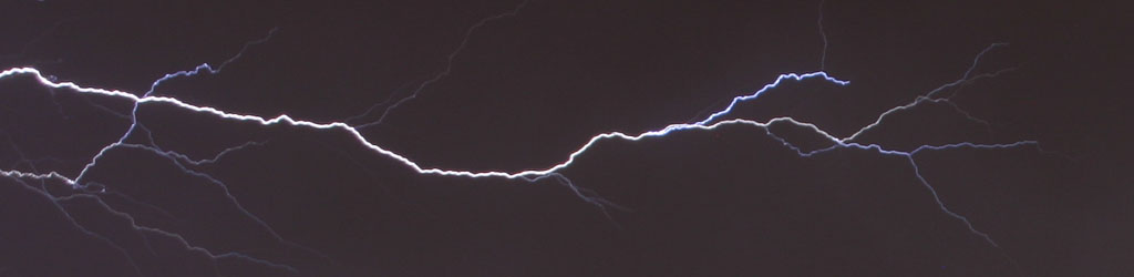
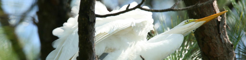
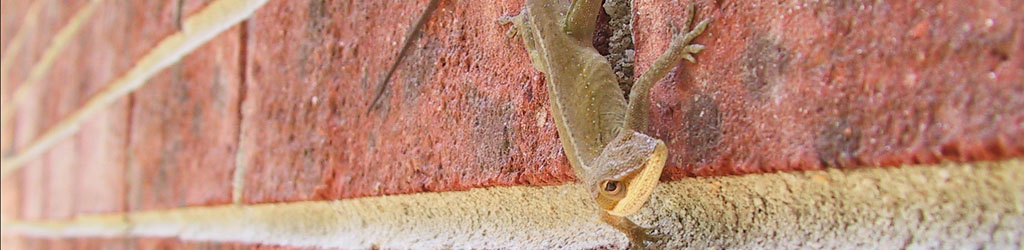
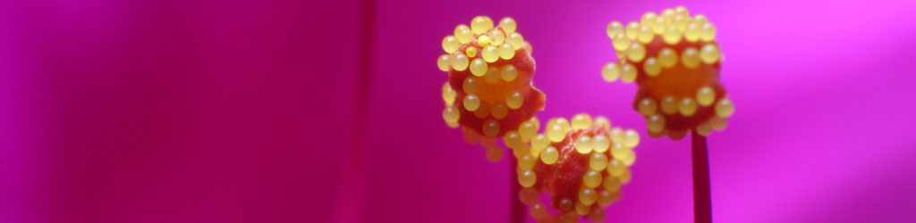
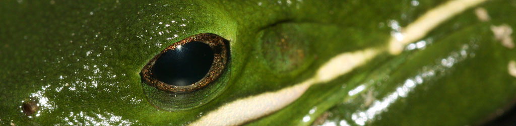
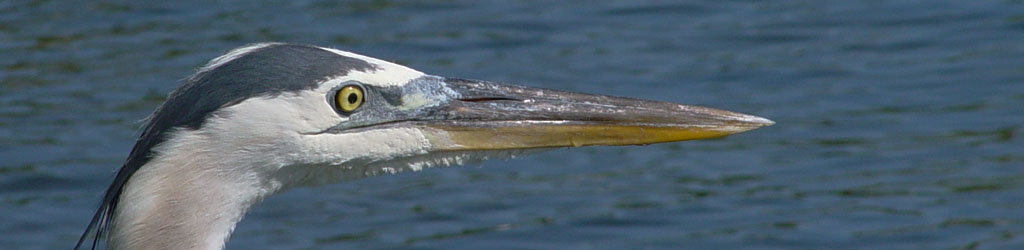
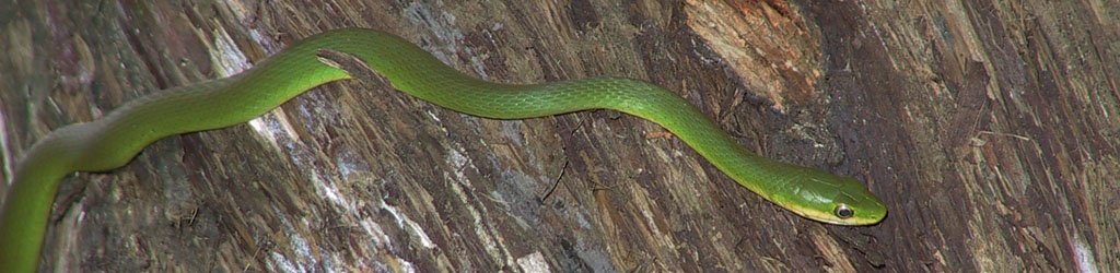
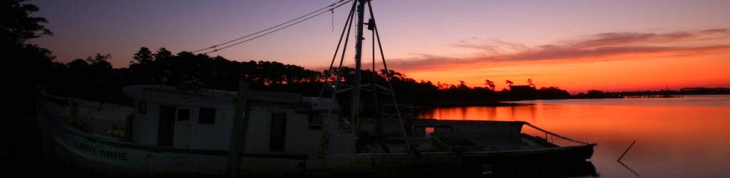
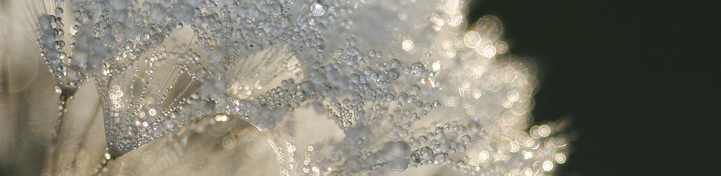
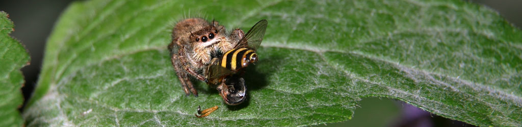
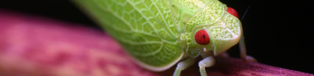
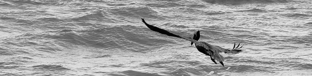
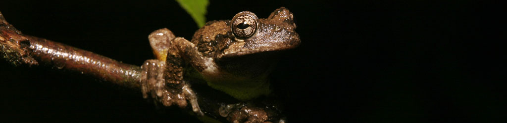
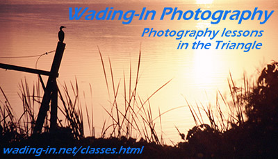
So every place you see that “Wading-In Photography” or “Walkabout” banner, here or on the home page or on my business cards and handouts, it’s an image, because you probably don’t have the font installed. And getting it there took more stupid fussing than it ever should have. I have no real idea how much this kind of thing affects people, but I’m hoping most find my choice at least a little snazzy looking. At least tell me you do, so I think the effort is worth it…