


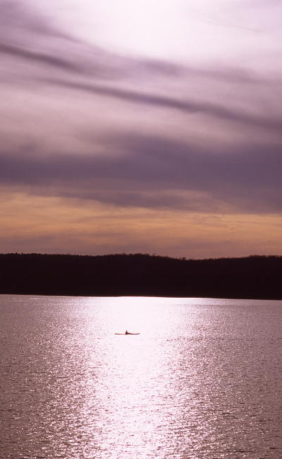
 The image here was originally shot on slide film, many many years ago, and I think I’d scanned it for the Sunday Slide posts that took place back in 2017, but never used it then, and it’s been sitting in the blog folder ever since (far from being the oldest in there, too.) The thing is, I’ve always liked it, but felt there was something just a little amiss. It’s the kind of abstract that largely stands by itself, yet didn’t quite feel strong enough to throw up as a random pic, nor was it considered for any of the end-of-month abstracts because I try to use something current for those.
Now, a word about my habits. When scanning slides, I was always striving for the most accurate rendition of the slide itself, for multiple reasons. The first is, representing it without any editing or tweaks shows the real image captured, the skill of the photographer and all that – no corrections after the fact, no ‘retouching,’ blah blah blah. But there was also the matter that any of my slides could be sent off to a publisher or editor, and if I misrepresented them in any digital media, this implied that I needed to correct my work, and might even lose the sale if they found the original was not what they were after. So I’m comfortable saying that this is as close to the color register of the original slide as I could manage, with all the little variables that come in there like current monitor calibration and the color of the light source used to view the slide itself – really, ‘accuracy’ is a fudged concept throughout photography, no matter what.
And with all that, there’s a definite magenta color cast to it, though whether this is perfectly accurate, the water reflecting the colors of a sullen sky, or if the film itself had undergone a color shift through excessive heat or something, I cannot say. But this is what was preventing me from feeling very comfortable with the image; some people might like the color register, but to me it looked more like the white-balance was off, or that I’d done a bad job scanning the slide (perish the thought!) So there it sat in the folder, just… not quite right.
Things change. With digital images, little alterations (and some not-so-little) are easy to do and thus no longer frowned upon, and an unwanted and perhaps unrealistic color cast is a liability of film, not a trait. After all, anyone can pick their own base color and contrast and saturation settings in-camera, to say nothing of post-capture editing, and while there are those that can easily recognize an unrealistic color register in an image and know it was altered, there also remains no reason to retain an unrealistic hue when it’s so easy to correct. Even if it isn’t actually unrealistic.
What I’m saying is, a mindset that I’d developed with good reason many years ago was suddenly found to be almost pointless, and I shrugged and tweaked the color register the other day – shameless retouching, from an earlier standpoint, but trivial corrective editing from a current one. And what a difference it made.
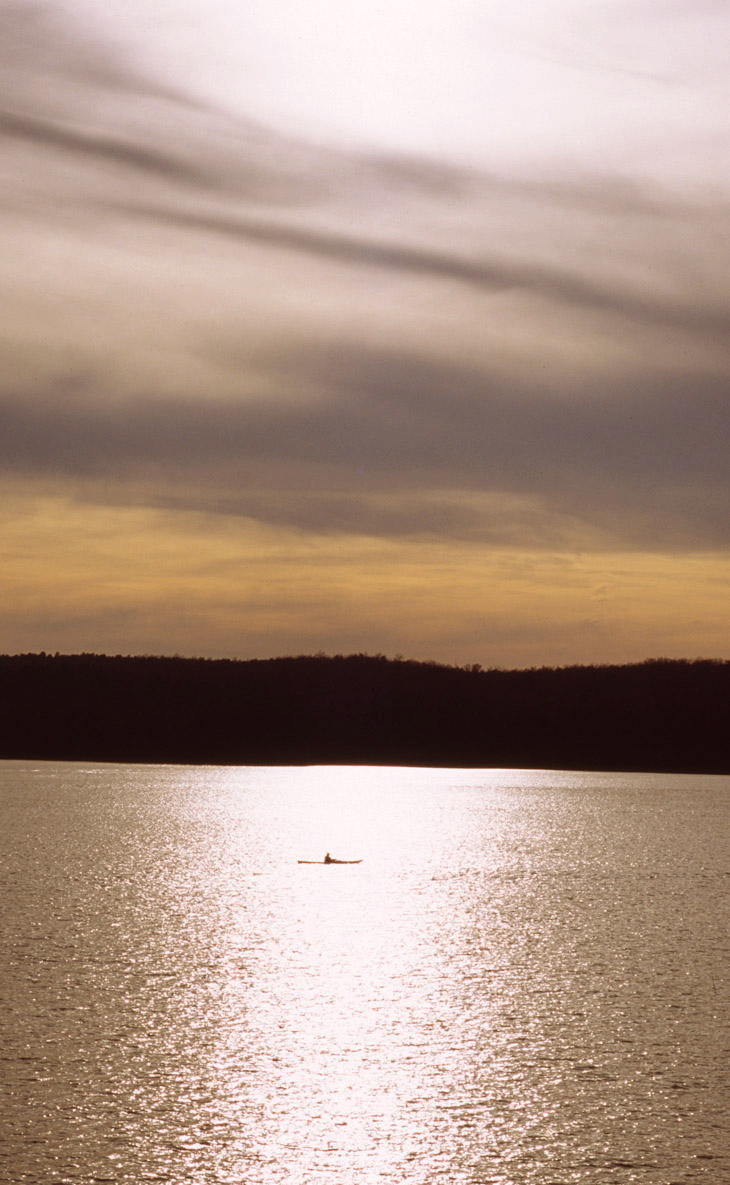
Maybe it’s because I really don’t like magenta, or maybe it’s because I couldn’t help but feel the color register was off and this grated on my editing skills, but this version feels a damn sight better – the clouds themselves certainly look more like what we expect. The idea, to me at least, has become more a deeply-hazy day rather than an impending stormy one, which fits more with that glitter trail. The isolated position out in the middle of the lake seems a little less dire.
And as I type this, I realize that there’s a subtle aspect that affects how I, and I alone, view it. Because I know where the nearest dock was, the precise distance, and in which direction – but you don’t. So your impression might be entirely different from mine.
Which is one of the things that I find cool about photography. Different people get different impressions, and the photographer’s is always tainted by their knowledge of the conditions and locale, things not evident from the image itself. Dismissing them can be difficult – actually, it’s probably impossible – but recognizing what the viewer doesn’t see or know or feel can help with determining what images will be stronger.