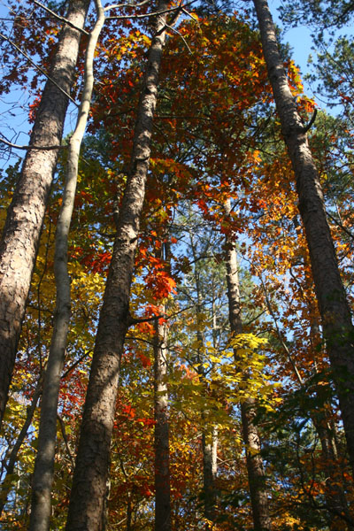
 This autumn has proven to be one that I’ve rarely had the chance to take advantage of: a fairly good display of colors, peaking during clear weather, with no storms or even high winds to strip the leaves from the trees. So while this area has few vantages that provide the best display of colors – generally something that overlooks rolling hills with a wide variety of deciduous trees – I have to say I bagged a decent selection of images, from several different locales.
Once again, though, bright sunny days are not always the best to pursue certain subjects, and vivid colors are among them – contrast can go too high and details can get washed out. Sometimes, it’s better to be in the muted light of heavy haze or even overcast, or in the deeper shadows of a full forest canopy – it all depends on what’s in front of you. For reference, see a couple of the closer leaf shots from a year ago. The colors aren’t quite as vivid yet they have a richer tonal range, more subtleties and a bit more variety.
Many areas that anyone might find themselves within aren’t ideal for nice scenic landscape images – there isn’t a good selection of differing tree species (and thus colors,) there are too many distracting elements or ugly bits of urbanization or industrialization, and so on. So sometimes creative framing can save the shot, finding a position that maximizes the impact of the good elements you do have and eliminates anything that doesn’t work.
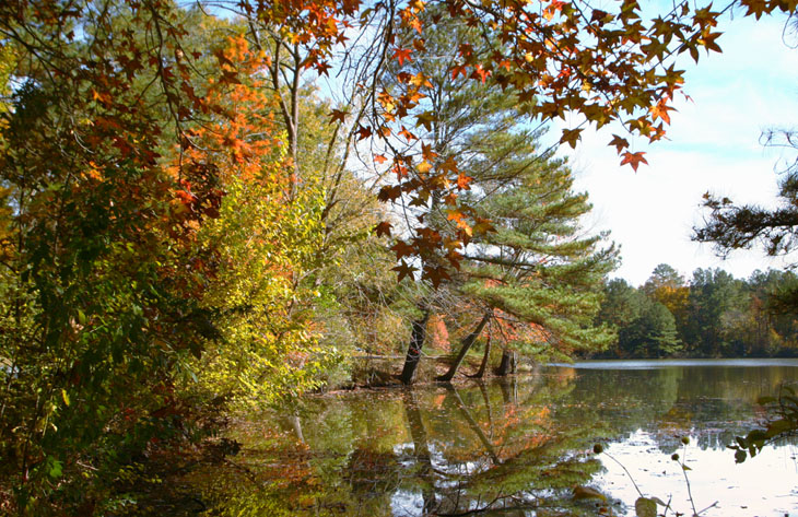
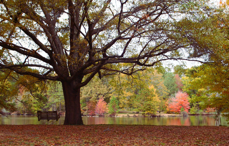
For instance, this image was taken within a housing development, at an angle that eliminated all houses, poles and wires, and bright blue recycling bins. The few colorful trees, spread out along the lakeshore, were grouped together into the frame by my shooting position, and the uglier longneedle pines between were captured in a way that their sparse, lopsided branches helped fill out the composition – if you look at the far lakeshore, that’s actually more representative of how the trees were laid out and how much color was to be found. On occasion, I’ve seen a single tree that I like and wandered about, crouching and dodging, to try and use it with some other element to the advantage of both. Sometimes it works, sometimes it doesn’t – but you never know without trying.
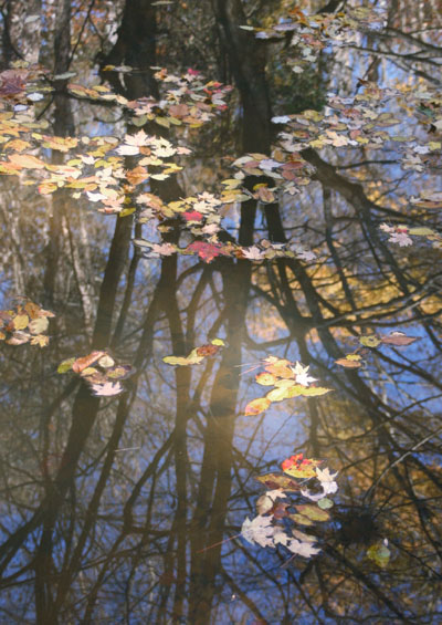 I am probably a little too hooked on using reflections and floating leaves, but hey, I like ’em. The idea of ‘peak’ colors is a little misleading; there is often a point where you can see the maximum amount of colors, but usually a number of species have hit their most colorful much earlier, while most others are still green, and these early bloomers greet ‘peak’ with empty branches. Sometimes this can be worked into the composition, sometimes it’s a patch of distracting, somewhat anachronistic bare trunks. For this one, I decided to use those branches as a backdrop for the leaves passing by, and the blue sky and yellow leaves set off one another nicely.
I mentioned this before in the compositional post about water, but an awful lot of the time people just never notice the reflections at all, which is a shame, because they can be a really potent element. Always, always look to see what water is reflecting, because it might give you some great ideas, but also know that the two-dimensionality of images, the same thing that can make layers of foliage blend together into an indistinct mess, can make the reflections much stronger and more obvious than they seem when observing them in person. Depth-of-field has a lot to say too, because when we focus the lens onto reflections, it’s not at the distance to the water itself, but bouncing off the water and all the way up to the subject being reflected, which is usually a whole lot farther away. This means that you can choose to have either the reflections in focus, or the leaves on the surface (or the reeds growing within the water) in focus, but not both, even with the smallest aperture your lens can achieve. The selective focus can draw attention easily to one or the other, but it might also trash your plans to have them appear together. Also note that with a wide-angle lens, the depth-of-field characteristics might make the difference in focus trivial and virtually unnoticeable, so now the reflections may just make for more clutter in the composition. Observe carefully and experiment.
This next image I’m putting up fairly large (as far as the blog format goes) because I want some of the details to be clearer.
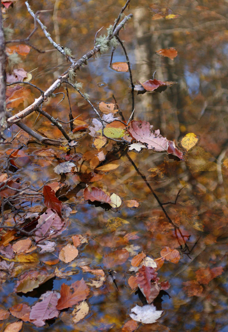
Here the water is half-reflective, half-transparent, giving an overlay of sky and foliage atop layers of leaves just beneath the surface. I also need to note that this is mixed lighting; the trees in the reflection are receiving full sunlight, but the water itself and the floating leaves are actually in shadow. This worked out rather well, since water always darkens reflections, so the exposure came out pretty well balanced.
A polarizing filter can be a handy tool in such cases. Light reflecting from non-metallic surfaces (which mostly means water and glass) will be polarized, so orienting a polarizing filter can reduce or even eliminate the reflections – you can adjust their strength in your compositions. It’s almost magical to watch what’s under the surface suddenly spring into view…
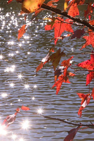 So while I’m on the subject of reflections, we’ll look at another variation. The reflection of sunlight near the horizon off of rippling water or wet sand is called a glittertrail, and naturally is a useful element in itself. A very small aperture (in this case f22) turns these little spots of intense light into starbursts. I liked the color intensity of the backlit leaves, but didn’t know what else to do with them until I shifted too far to the side and started blinding myself with the glittertrail – aha! I really wanted a stronger, more prominent leaf for this composition, but the wind was pretty stiff this day and whipping the leaves madly (which also contributed to the well-spaced sparkles off the water,) so this is what I got. If it motivates you to try a variation, fantastic – remember me when the royalties come rolling in.
I should also mention that sunlight coming into the lens in this manner is not only very prone to producing flare and ghosts, but very likely to trick the exposure meter as well. It’s not a bad idea to bracket widely to ensure you got the exposure that you like, or if you can determine what it should be (for instance by aiming off to the side just enough to eliminate the direct sunlight,) switch to full manual mode and override the meter entirely. The sun riding lower in the sky as we get close to winter means a lenshood should be almost constantly affixed to every lens, but that won’t do a damn thing for aiming right into the sun or its reflections.
We come to the point in the blog post where I ask, what’s wrong with this picture?

If it helps, we still haven’t left the same topic I’ve been rambling on about for the past several images. If that’s not enough, look carefully at the bottom of the frame.
I did this on purpose, because it’s not often you get conditions this ideal, so if you’re still struggling, I’ll tell you: it’s upside-down. See? It’s obvious now, isn’t it?
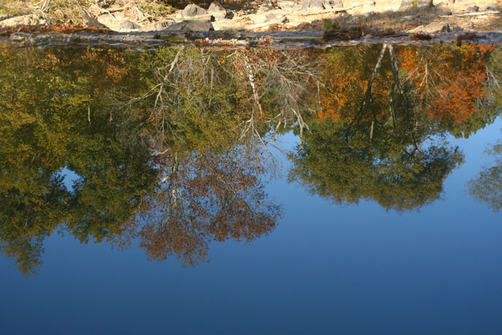
 That’s so much better, right? Uh, no? This is actually looking down from a small hill at the reflection of the trees and sky in the inordinately still water above a spillway, the lip of which forms the edge between the trees and the bright rocks, which are on the riverbed well beyond the reflection and the spillway itself. Here’s a variation that makes it a little more obvious, though I imagine it might still seem a bit mind-bending until the perspective falls into place.
In this image, it’s easy to see a particular trait that I mentioned earlier, that of the reflections being darker than the original – how pronounced it is depends on the sun angle (and to some extent the contrast settings of the camera.) Basic rule: if you want both to appear in the image, expose for the original, especially considering the sky. If you expose for the reflection (for instance, by aiming more at the water than the skyline itself when obtaining an exposure setting,) you will likely overexpose the sky and bleach a lot of the detail from it. I also have to reveal here that those who like doing that HDR stuff almost always miss this trait, and make the reflections too bright in comparison to the sky, a dead giveaway to any experienced photographer or editor.
I have one more scenic shot I’m going to put up in this post, but before I do, I have to give a shout-out. Most of these images were taken on an outing with a student, and I don’t talk about students much because I’m respecting their privacy – not everyone wants to have a web presence. But this one has said he doesn’t mind.
 So while out shooting during yesterday’s session, a large leaf dropped and perched atop my camera, and the indefatigable Al Bugg (yes, same first name, and yes, we’re often not sure which one of us we’re addressing in conversation) captured the portrait. That’s the ‘heavy kit’ I’m wearing, everything on belt packs with supportive suspenders – ready for just about anything. Go ahead and laugh.
Meanwhile, I’ll close with perhaps my favorite shot (so far) this fall – if I’d had a couple to perch onto that swing I’d have done so, but no one was around at the time. I’ll leave you to ponder the difference in mood with the swing being empty, but I’ll point out that only two trees are displaying good color, while the one that supports the swing has already passed peak. Did you notice either of these before I mentioned them?