


There is a plethora of different aspects that are going to come up in this post, which is perhaps amusing, because the topic is rather trivial. Bear with me a moment.
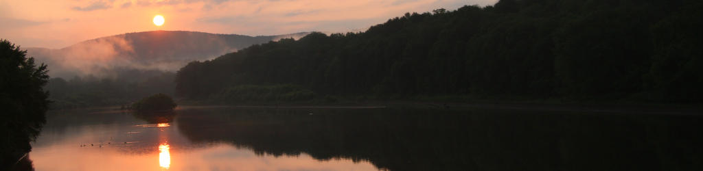
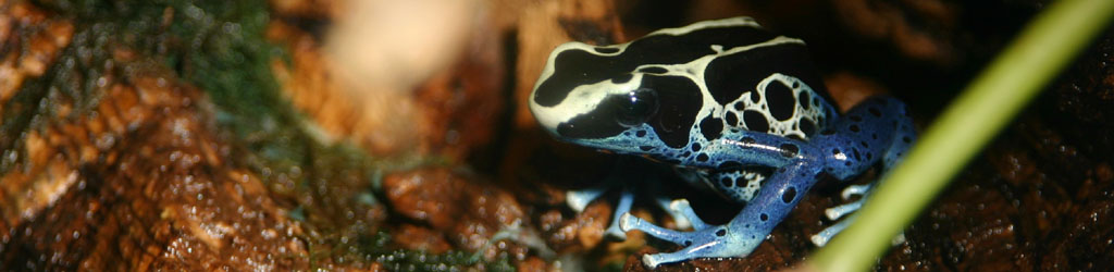
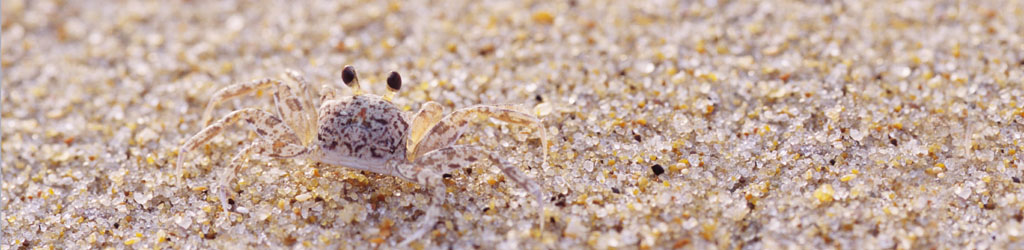
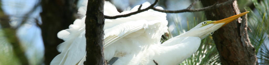
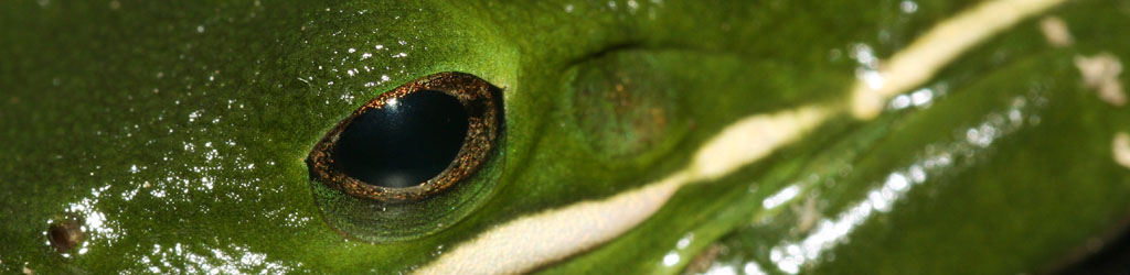
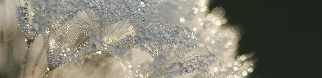
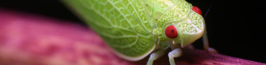
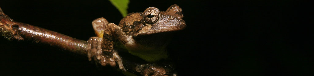
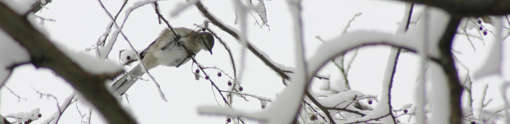
But right now, look at that image up there and tell me what’s wrong with it, or what “doesn’t work” or what have you – I’m talking from an aesthetic standpoint and not whether the species are anachronistic or anything. Does anything strike you as wrong or inaccurate?
Okay, how about now?
Whoa, that’s noticeably different, isn’t it? Okay, fine, but… which one’s accurate?
“How am I supposed to know?” you protest indignantly. “I wasn’t there! I don’t know which one is the original, or what the camera settings were, or what the sky really looked like. Let’s be real!” And I accept that answer even though I think you could have been a little more polite about it. But even if we met all those criteria, you probably couldn’t provide a useful answer to begin with.
So okay, let’s assume that you were there, and I could show you the LCD immediately after taking the photo, or better yet, threw it over to a high quality monitor that was meticulously color-corrected and quite bright. Would you be able to tell accuracy then? Probably not, to be honest – no monitor made yet comes even close to the huge range of light levels that we encounter in real life. And this says nothing about the sensor capturing the image, either, which is limited because it really only captures a matrix of red, green, and blue values. Granted, so do our eyes, but the variations that they’re capable of perceiving are far greater than 36-bit color. Plus there’s the idea that my eyes might see colors entirely different than your eyes do – and there’s really no way of determining this effectively. It comes down to being entirely subjective, so the idea of “true” color is pretty much a myth.
Which brings us to these two images, one of which is altered from how the camera produced it, which itself might have had its own settings regarding saturation, contrast, and even ‘neutral’ point. If we concern ourselves with not presenting ‘Photoshopped’ images (and I usually do,) we wonder what’s acceptable to mess with, and how far? Sure, this is just a blog, so no big deal either way, fartistic license and all that yaya, but on the other side of the coin, I’m marketing my images, and to a certain extent editing is frowned upon. With my slides, I make the effort to hew as closely as possible to the original, because I don’t want someone deciding to publish my images based on what they see on my website and then finding out that the slide isn’t the same at all. Of course, we’re getting farther and farther away from that being any issue at all, because most places are working full digital now anyway, and a lot of them wouldn’t even be able to digitize the slide themselves.
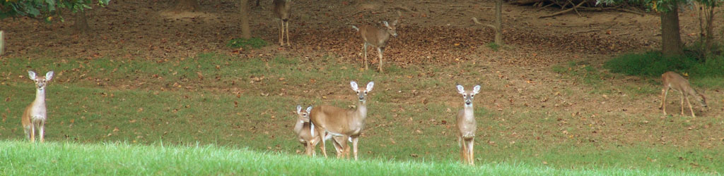
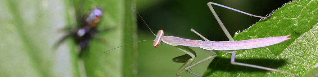
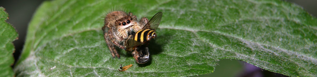
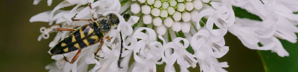
For a lot of my purposes herein, I’m illustrating something in particular – this is not art, but journalism; we’re not after what looks the best, but showing how something really is. Is the mantis truly that vivid in coloration? Is this what someone can expect when they see it on their own? Again, where does one draw the line? The more I type, the more I can imagine you thinking I’m wound a bit too tight, especially when using those images up there as illustrations (yes, even I find the difference trivial in their case.) But it’s also very easy to get into the habit of ‘tweaking’ everything I put up here for ‘best effect’ or whatever, and soon having a site where nothing looks authentic or convincing – colors too vivid, contrast too distinct, all the backgrounds cleaned up to remove all the imperfections. Which is another aspect, one that hearkens back to my film days: getting the image right, in-camera, is a skill all its own, which requires paying close attention to the entire frame, and knowing how the depth will render or how the lighting will work. If I have to ‘fix’ everything, am I a photographer or merely an editor?
[There are probably people who could get a little miffed over my phrase, “merely an editor,” but this reflects how I see it, anyway: I find greater importance in wielding the camera over the editing program, even while both are important skills.]
So, as my own ethical outlook dictates that I try to keep things accurate in most cases, I still have to recognize that there’s really no such thing, and I have to settle for realistic or believable instead, even as I’m influenced aesthetically/emotionally with how much better an image might look if I give it a little nudge in some particular direction. But as for having any set of rules, any lines that I avoid crossing in any given circumstance? Nope, not gonna try to take it that far. I’ll just fret idly over it for no really good reason.
* * *
A word of advice (which I’ve offered before) for any edits that you do end up making: be subtle. It is very easy to tweak colors, notice a distinctive difference, and tweak them even farther, and there’s a certain lack of objectivity as we do this – we compare against the previous state and not against any standard of realism (which is impossible for us to produce in our minds as we look at the image.) But then we come back to that image a little later on, having cleared our minds, and find we took it a bit too far, and it no longer appears plausible or unedited. Make small changes, and then come back a little later on and see how they look.