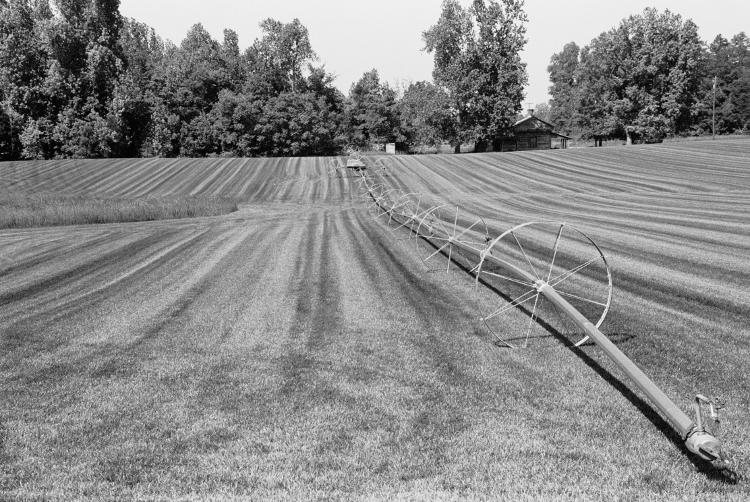
This week, we have, ‘the other side of the story.’ Or perhaps, ‘what it really looked like,’ except that it’s not because it’s in monochrome and I still have color vision. Maybe it should be just, ‘what a photographer might get up to when experimenting.’
Thirteen years back, after discovering that my digital camera then could do infra-red shots with the sole addition of a filter, I’d taken a day to go out and do a bunch of shooting while the film camera was loaded with B&W film. I have only a vague recollection of where I was at the time, since I was touring around in the northern part of the county where I didn’t often go because, really, the only thing that’s up there is farmland, and it doesn’t even lie along the route to something else. Of course, now I’m going to have to pore over a map and try to determine exactly where I was…
Anyway, the reason I’m featuring this here is that it’s the counterpoint to this image, which was in infra-red. It demonstrates the significant difference between the two, an almost-but-not-quite negative inversion; this is because foliage reflects IR very well while a clear blue sky reflects/transmits practically none, and of course the sprinkler itself and the barn in the background got their own contrasting effects. Actually, I’m a little curious now as to why the barn shows so darkly in the other version, because most buildings have a mid-range, grey effect, but it might simply have been from the contrast alteration that I did for fart’s sake since the sky in the original wasn’t quite that dark either. And I have to admit that, since I was experimenting, I didn’t really think to shoot the same scene in color for the third perspective; I didn’t know how well the IR version would come out, and that it would become one of my gallery shots (though I now tend to favor the vertical crop of it more, I think.)
But I think it also shows that I was concentrating more on the IR version, because that one’s framing is much better than this – the trees were not cut off in that one as they were here. Perhaps I recognized that the contrast in simple monochrome really wasn’t significant enough to make the photo striking, but in infra-red it kicked it a lot better.
This, by the way, is a little foreshadowing of a project that I’m in the middle of. Hopefully, anyway. If it works out, you know you’ll see it here – well, not right here, but elsewhere on the same blog.


