


Back in August 2017, I mentioned trying to find the original image for a one-color logo that I use for Wading-In Photography, curious that I hadn’t seen it in the slide pages. I kept this in the back of my mind, watching for it as I went through the bird images yet not actually finding it, and I’m sure all of my readers have been on the edge of their comfy computer chairs waiting to see what the original image looked like.
Well, finally, you can now stop fretting, because I found it yesterday as I was looking for something else. Turns out that not only was it a negative (thus pre-dating the switch to slide film,) but one from the pre-Canon era, taken likely with the Olympus OM-10 and 75-260 lens, so back before 1997. I hadn’t thought at all that it was that old, but there we go. And I remember nothing about the process of creating the logo, but the reasoning behind it, likely anyway, became apparent as I scanned the frame. Which was this:
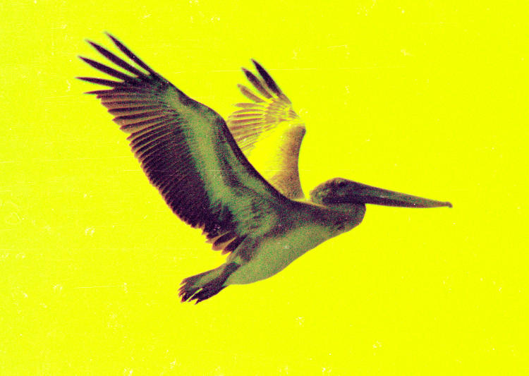
That is not bad scanning – I can color-correct most negatives even before the scan, and certainly afterwards. No, I’m inclined to say this was bad processing, or a bad batch of film, though I haven’t compared other frames from the same roll to see the effect, but the blue layer seems to be almost completely missing.
 [Because it’s a negative, technically this would be the yellow layer, because negative, get it? The complementary/opposite color in the RGB spectrum is what shows on the film, blocking the other two colors from passing through to the print paper in the enlargement exposure, which is technically also a negative – that’s how the process works. We see here what shows just in the (positive) blue channel of the frame, the darkness meaning virtually no blue to be found despite the fact that, even if the sky were overcast white, that would mean an equal amount of blue, red, and green in each channel, but by all rights it should be more, so this layer should have been close to white in the background. Very odd.]
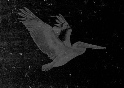
 I made several attempts to bring this towards normal, but there wasn’t actually enough blue in the frame to even enhance, and I would have had to have added it myself, manually. This made the photo an obvious candidate for monochrome, and the whole pelican’s position spelled, “logo” to me, so it was a simple matter to render it thusly. I also believed, until yesterday, that the actual position of the pelican was more level in the frame, beak pointing downwards a bit because that’s how they fly, but I see now that I rendered it as taken; the position came from how it banked and/or how I was aiming. Now, I doubt back about 20 years ago (when I first had a film scanner) that I was doing channel-clipping, and had simply rendered it into monochrome and then applied a halftone filter, but this time I did the channel separation thing and selected the green channel as being optimal, then boosted contrast as seen here.
From there, it was simply a matter of applying the appropriate halftone screen. Except, GIMP doesn’t actually have a halftone screen; all of the iterations of Photoshop that I’ve used did, but GIMP only has a half-ass filter to render it looking like newsprint, and this takes a lot of playing around with to make look right.
[Explanation, also in the linked post: Halftone screens are a filter physically laid over a regular photo to render it into dots, because the offset print method doesn’t handle greys at all – it’s either black, or it isn’t, and many laser printers are much the same. So by reducing the image to dots, it’s the density of the dots that mimics shades of grey, and while it produces a grainy effect, it actually renders greys a hell of a lot better from offset presses and laser printers than just trying to embed a greyscale image in the document.]
Eventually, I got something that looked pretty good – but then as I resized it down to use within the post, I got a moiré (MWAR-ay) pattern from the interference with the pixels of the image. I had played around enough and wasn’t going to keep fussing with it, because really, it was only to illustrate a quick post, because winter.
[Explanation of moiré: Anything with a regular dot or line pattern, seen or reproduced through something else with a dot or line pattern, will often have interference as the dots/lines almost match up, but not quite, and they end up getting double-sized. In this case, the halftone pattern rendered smaller started interfering with the natural pixel pattern of the file itself, producing regular blotches as we’re about to see below. Four-color processes, where a color image is printed on an offset press, requires four separate images, one for each RGB color and black, and each has to be halftoned, so each has to have the screen rotated by a certain degree to not produce this pattern in the final printing. If it sounds like I’m getting complicated, know that I haven’t even gone into CMYK additive/subtractive issue yet.]
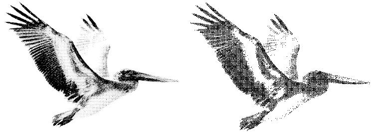
Anyway, here are the two images: the just-rendered rescan on the left, and the existing logo on the right. With a bit more work I could probably have had them match, but this was only out of curiosity and not worth the effort; there is a kind of science to adjusting the contrast (I use the Curves function) to retain some of the beak detail and not drop the belly into pure white. Meanwhile, using the original sized logo in a document (such as my letterhead or envelopes) eradicates the moiré pattern so it’s not blotched in patterns like this – it just came from reducing it for display.
And now you know the whole story. Sleep well.