


Just playing around this week, because I didn’t dig out anything of interest and comparison from the archives – been that kind of week. Still, these will be visibly different, so you can’t take away points for not meeting the bare criteria.

We open with a dramatic and contrasty image, though I admit I should have dropped the exposure down slightly to keep the snow from bleaching out in so many places, but there’s nothing I can do about it now, so we’re living with it. The berries, however, have become more enigmatic, because this is channel-clipping once again, taking advantage of a digital trait by eliminating two of the three colors that all images are composed of (those being Red, Green, and Blue, whence comes the term, ‘RGB’) – all of the subtleties and variations come solely from varying the intensity of these three. In this case, we’re looking at only the Blue channel, and the berries are so dark because there is very little blue in their natural color. Which doesn’t narrow it down too much, even though in this image they kinda look like blueberries, but they’re far from it.

One of these days I’ll stop being lazy and figure out what these are, since we have several trees of them nearby and they’ve formed the subject of countless images. But that is not this day. Or even any day previous to this, which is narrowing it down steadily.
Regardless, since monochrome images are best with distinctive contrast, the Blue channel was the best one to use here. Not so much with the next one, so this is not the Blue channel below.

This one, unfortunately, looks not-quite-authentic, the wings of this eastern tiger swallowtail (Papilio glaucus) becoming a bit too bright in this channel, but perhaps giving the impression of being backlit. A little too contrasted? Your call, but this is the Red channel, though that isn’t readily apparent when you see the original.
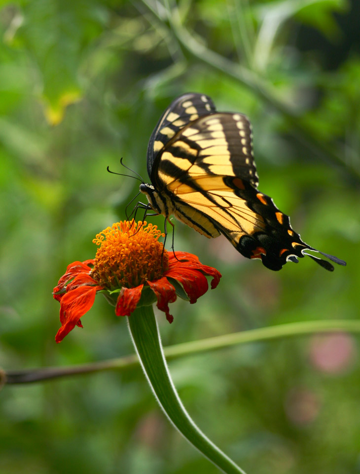
Were you expecting yellow wings? In the RGB color space, yellow is a combination of red and green – strange but true – but since there’s a lot of green in the background, using the Green channel brightened that up too much and didn’t have the contrast that this does, while naturally the red flower lost its vibrancy.
Now for one from this week, at least.

Definitely muted this time, with little differentiation from the background – this is the Green channel. Why did I use that when the surrounding foliage is green and thus would be brighter? Ah, there was a specific reason, which we get at least a clue of when we see the original.
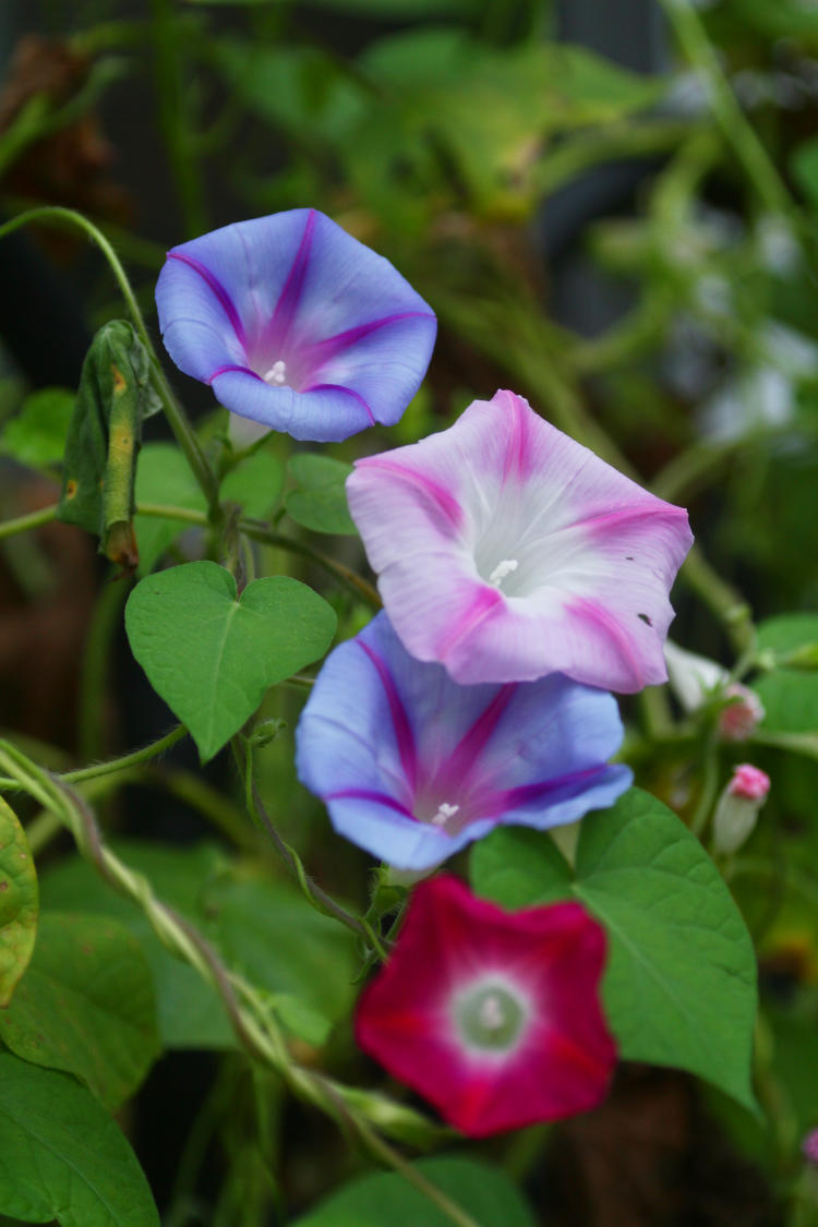
Yeah, I agree, it’s better in color, but let’s look at this. The various lavender hues of the blossoms meant that both the Red and the Blue channels were well represented and fairly bright in the monochrome versions, but the magenta ‘spokes’ were what made Green the choice; magenta is the opposite of green in RGB, and so they became the darkest and thus distinctive in the Green channel, instead of the blossoms being only subtle variations in brightness with the other two channels.
Still, not as much contrast as we like to see from monochrome images, so I performed a final tweak.

This was a minor Curves adjustment, boosting the brightest portions of the image all the way up to full white, and slightly reducing the shadow levels. Very simple, and the Curves function is something that every photographer should have at least some grasp of.
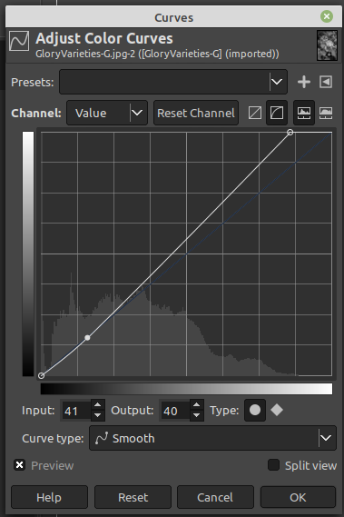 Here’s how it looks – this is from GIMP, but most other programs are very similar. The mountain range at the bottom of the graph is a representation of how many pixels in the image fall into each brightness value – black at the left, white at the right, so you see a very sharp spike at the left edge, a good portion of black pixels, and none of white – this is what made the original muted and a little dark. [You can do this for each color channel as you like, but the default is ‘Value’ as it shows at top left, which means overall brightness, and since we’ve eliminated the other colors for this image anyway that’s all that we have to work with: 256 shades of grey, super kinky.] The bold diagonal line across the image is the adjustment curve, only slightly curved here. I moved the upper right endpoint to the left slightly, lining it up with the brightest pixels on the ‘mountain’ below, which means that they got moved up all the way to white. This skewed the whole diagonal (the ‘average’) away from the original values, the faint blue line, and so over to the left more – which are the shadowy portions of the image – I brought those back down to where they had been, just clicking on the line and dragging it. This increased contrast a little because the first move had increased all brightness. Make sense? Seriously, just play with it sometimes if you don’t already – it can greatly improve your images.
Which reminds me: one of these Visibly Different posts will be about darkroom versus digital editing, which will take a few specific images to illustrate – that’ll likely be more towards winter. You’re coming here regularly, of course, so you won’t miss it…