


Our opening image this week comes from Florida in 2004, a grab shot as a brown pelican (Pelecanus occidentalis) launched itself away upon sighting me. The day was near-overcast and windy, and the pelican was just emerging from under deep shadows of the causeway bridge, visible as the blue banding in the lower half of the frame. I was never enamored of the shot, thinking it looked like a processing error from the odd color registers, but then wondered, since it was almost monochrome anyway, if perhaps it should be helped along that route? The subtleties of the waves couldn’t hide the nice textures, and there was no mistaking that it was a pelican anyway, so why not?
Some cropping and selective contrast adjustments produced something that soon became one of my monochrome prints:
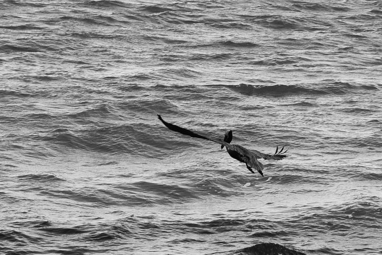
This is one of the ways in which digital editing has it all over darkroom work, because using the Curves function allowed me to change the contrast in very specific registers within the image, boosting the subtle differences in the waves to bring the textures out while keeping the pelican’s contrast largely the same. The stormy mood of it became a lot stronger without the color, and of course I could position the pelican where I liked within the frame, making the angle of those wings work better in the composition while minimizing that high contrast breaker right beneath. There are really only two things in the entire frame, a banking pelican and the rough waters, but the contrast helps both of them convey more of the mood, and the missing shoreline now suggested that it could be anywhere at sea.
And then, just now, I did another small variation:

This would be too far in most cases, yet now it’s no longer a photograph, but virtually a pen-and-ink (don’t ask me why that’s an artistic term, like you’d be using a pen without the ink) rendering, trying out how it looked as a vertical composition as well. The sea is beyond forbidding, almost palpable and monstrous, becoming an equal subject with the pelican rather than a setting. You get the impression, or at least I do, that the pelican is nowhere near high enough above something that looks like that.
Anyway, I thought it was an interesting set of results from an image that I almost discarded for not passing muster. I’m like one of those teachers in a made-for-TV movie that sees the potential in a juvenile delinquent and saves them from themselves. Or is that being too dramatic?