Just a couple, but with a bonus that’s truly exciting and interesting, I can assure you.
[Hopefully, the critical thinking espoused herein has helped you not to fall for that feeble little tactic, if you weren’t already immune to it.]
Anyway, the fuzzy moon:
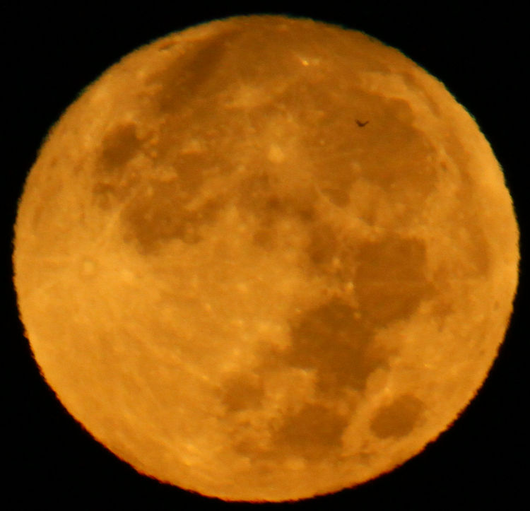
When I first examined this sequence of moon shots, I was magnifying to full resolution to determine which was sharpest (not ‘sharp,’ mind you, because clearly none of them were,) and apparently missed this little detail when doing so, driving it offscreen while I looked at crater definition. But one of them featured a very distant bird silhouette – too indistinct to determine what species, though only a handful fly at night anyway, and given the proximity to the lake, I’d give a little extra weight to ‘heron.’ Not much, though.
But this definitely is:
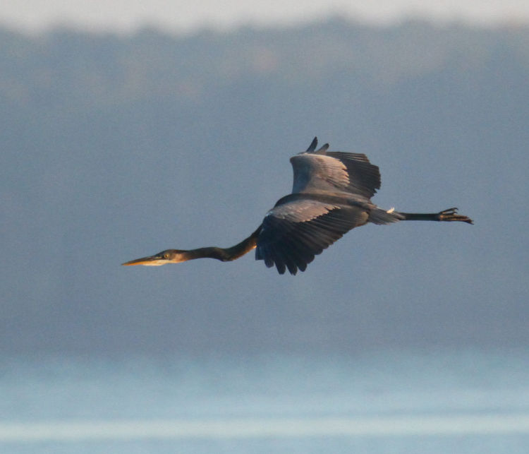
The same morning but of course much later (an hour and seven minutes, according to the EXIF info,) this great blue heron (Ardea herodias herodias) circled around us and cruised in for a landing, not long after sunrise. The sun was almost directly behind the heron and very low, so a small patch of sunlight got past the wings to highlight the head momentarily, and I know it was momentarily because I have other images in the sequence where it did not. This wasn’t planned at all – I was simply tracking the heron as it glided in, partially because nothing else was going on.
Now, I admit that I have been far too quiet on the blog, and have been having trouble getting motivated to post much; credit the weather and approaching winter, the lack of decent subjects to chase (I have been photographing almost nothing, but a few will come up shortly,) being busy with other projects, and still having issues with the computer, and still trying to track these down – it’s something weird, likely due to a ‘security’ update, but as yet it hasn’t become apparent what. What I have done, however, was complete all of the Tripod Holes posts for the rest of the year, and in doing so, I came across the bonus thing. Actually, I should be flogged for even using that word here.
So for one of the images chosen, I found that I no longer had the original negative scan on my system – not lost, just purged for space – and I rescanned it. The results, however, were decidedly off in color register, and so I dug out some old data CDs where I was pretty sure the original scan could be found. I was right, and it was much better than what I’d just done – this is a little worrisome, in that it might mean the Minolta Dimage Scan Dual III is going wonky, and choices for a replacement that can run on Linux are few. But the post is ready, and that’s all that matters right now, right?
What I also found was the original scan for an image that became some of my ‘branding,’ specifically on letterheads and envelopes – looked like this:
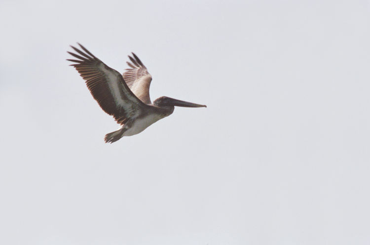
All well and good – except that, a few years ago, I’d rediscovered the negative and attempted to scan it, and produced this:
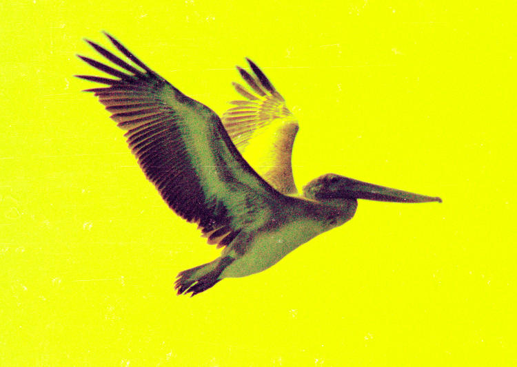
That’s terrible, and at the time I blamed it on the negative and/or original processing, but seeing this makes it clear that the original was not that bad. Something happened in the more-recent scanning process, which might have been a failure of the machine, or simply a bad setting someplace that I hadn’t caught – not mistaking negative and slide settings, which is easy enough to do because I switch back and forth frequently, but those results are markedly different. Yet I’ve also scanned a whole stack of slides and negatives, not too long ago, and everything came out just fine. So it’s a mystery for now, and one that I’m watching carefully.
For giggles, I also tweaked this older scan for more optimal color, even though it may have been a faithful representation of the conditions at the time of the photo.
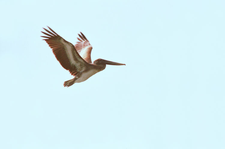
Definitely a bit brighter and richer, but the sky also became blotchier and a little unreal-looking. It would be easy to blame this on jpeg compression, except the original scan above doesn’t show it despite being reduced to the same size and compression settings. This came from trying to coach more blue/cyan out of the sky when there was too little in there to begin with, and the change in values also became greater between values, producing this faintly hand-painted look. It’s one of the hazards of digital editing (and yes, I’ll admit that someone more experienced might have produced better results, but also that I’ve been doing this for years and so the warning to the inexperienced still stands.)
Now, this shows decently on my monitor, and perhaps not too much on others – or perhaps worse. It also serves as a warning that editing is not an easy ‘fix,’ and may become quite obvious depending on who views it. Better to ensure that you have it right the first time than to count on correcting it later.
All right, all right, I’ll do better content in another post shortly. Sheesh…


