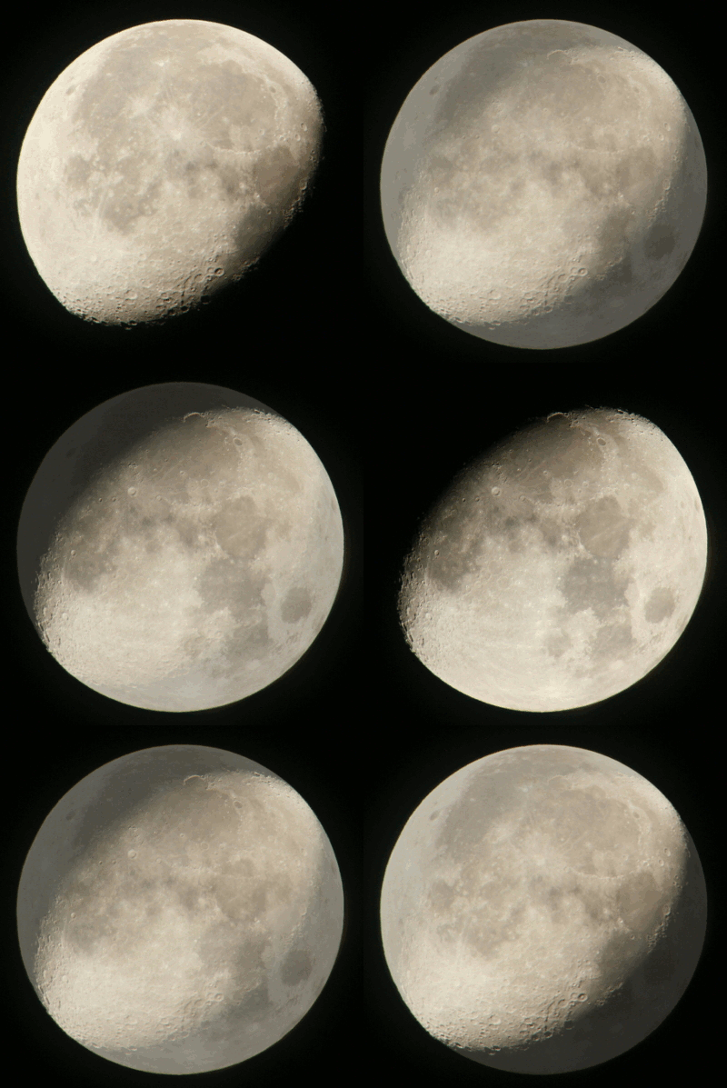
… I get up to things like this.
So, okay, I got two different detailed photos of a gibbous moon, one waxing, one waning, taken 10 days apart. And of course, at different heights in the sky, so angled differently, as shown here in the original orientations.

Now, some landmarks. If you look at the left version, there is a dark almost-circular, almost-centered spot in the visible face, which is Mare Serenitatis, the Sea of Serenity – directly beneath it is Mare Tranquillitatis, the Sea of Tranquility, where Apollo 11 landed. Now we turn to the right version, and those two Mares are both sitting on the terminator, the line of shadow, rotated quite a bit – Mare Tranquillitatis is half in shadow. We’ll come back to this in a sec.
One of the things that I wanted to show was that full moons are usually boring, while not-full moons are more dramatic, showing greater detail and geology. To that end, I chose a particular spot visible in both photos and overlapped them in an animated gif (pronounced, “MOO-vee”) that morphed between the two.
 For the most part, it works quite well, especially when you pay attention to that large crater with the prominent central peak (Theophilus.) With the light almost dead on to it, it appears as a faint circle, only revealed as a sharp crater by having some shadows to throw. This, by the way, shows the Apollo 11 landing site, just about centered in the frame. No, you’re not going to see anything (especially not with a 1000mm focal length) – Theophilus is 100km across, slightly less than the width of New Jersey.
You may notice that some of the craters don’t line up perfectly, and this is evidence of a particular trait of the moon, which is libration. The moon is in a synchronous orbit, mostly; it always has the same side facing Earth even as it orbits around Earth, trying to hide the flowers behind its back. But it’s not perfect, and thus ‘wobbles’ a little, which is called libration. It’s not really enough to notice from naked eye observations, and even detailed photos won’t illustrate it very well – until you do something silly like trying to overlap two photos of the moon in different phases.
Or even worse, animating it.
 It took no small amount of playing around to line these up this way, believe me: first resizing the two photos by the same amount, then rotating a bit at a time to get the poles to match (near as can be determined by the shadows,) as well as shifting by small increments to get the overlap this good so the sphere, never actually visible, nonetheless appears complete – and realizing that, in ten days, the moon had also progressed enough along its elliptical orbit of Earth to change size a little, requiring re-scaling one of the images. The result looks pretty damn well like the progression of the shadow – except the details of the moon itself all shift enormously, well illustrated by the changing position of those two Mares. Or you can see someone else’s animation here.
This was, in fact, a major hurdle in doing that first gif above, because that spot was rotated further around the sphere from one photo to the other, warping and compressing the positions of the craters, and I had to do a lot of fiddling in the editor to get them as close as they are – not recommended to anyone who doesn’t have time and patience. It’s one thing to emulate the perspective change when you try to make text look like it’s on the oblique surface of a cooler, but another to cope with the shift along the surface of a sphere.
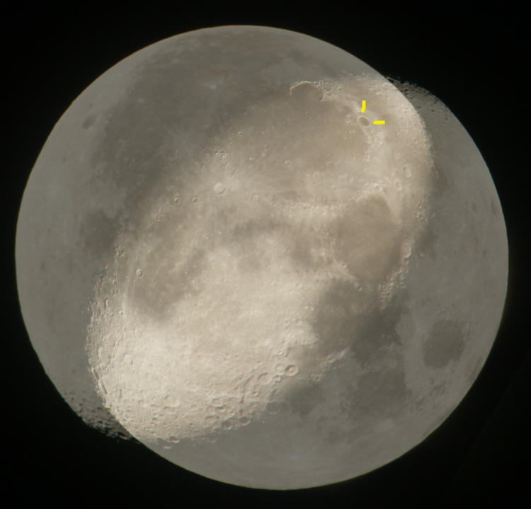
And to provide another illustration, we’ll take those two images and instead line them up with prominent surface features.

We already know the poles are pretty close, from the uniformity of the shadowed regions, so here’s what happens when you chose the crater Plato (indicated in yellow) as the anchor point. That’s not even close enough for government work.
How about if we use Mare Tranquillitatis and the landing site, the location and orientation of the first gif above?

That’s a hard nope, too. It should be clear that no amount of shifting or rotating will bring the two versions into a viable overlap.
I will note that some of the apparent shift is due to the tilted orbits of both Earth and moon, meaning the phase shadows will not line up perfectly because the sun isn’t dead on the moon’s equator; just like the seasonal changes in the angle of the sun on Earth, the moon undergoes a certain shift as well. Basically, all of this means that you shouldn’t really try to overlap different moon images and expect them to line up. But this is the kind of silly shit I do sometimes…


