Over at Why Evolution Is True far too many days back (time really has been getting away from me,) Jerry Coyne ran a post on how he, as an atheist, found ‘meaning’ in life. Surprising few who have engaged in such discussions before, religious commenter ajmgw saw fit to correct everyone’s impression, which Dr. Coyne featured in another post. For the edification of all, it reads:
The question of meaning is valid, but must be understood in a different way. How can meaning come from a mindless process, no guidance just time and chance?1 In that kind of a world an atheist cannot give a justification for a difference between good and evil2. If we are simply pond scum, the result of mindless processes over millions and billions of years, who decides what is right and wrong?3 The atheist cannot explain the existence of mind and morality4. In order to do so they unwittingly must borrow from the Christian Worldview5. As Greg Bahnsen said, “Like a petulant child they sit on their father’s lap and they reach up and slap his face.” According to the atheistic worldview, right and wrong are the results of chemical processes in our brains, a by product of survival of the fittest inherited from our common ape-like ancestors6. In that case one doesn’t even have free will, but the chemical processes are in control7.
I apologize for all the little numbers in there, which I added myself – they are bookmarking the responses to come below. But first, the overall observation that, as happens so often in discussions with religious folk, this entire comment is nothing but assertion, and rather presumptuous and arrogant assertion at that: “This… is what atheists believe.” A couple of them are largely true, in that a majority of atheists may hold some form of agreement with them, while others are completely false; you might find someone who makes such a particular claim, somewhere, but none of these – not one, not at all – has any association or relation to atheism, or even secular humanism. The practice of assertion is a common one, and will be tackled in detail in an upcoming ‘But how?’ post, so for now I’ll simply point out that assertion, without any facts or reasoning to back it up, is worthless. One might as well pronounce themselves King of the World for all the value that it provides, and anyone with any reasoning power whatsoever will generally treat them as equally infantile. It’s funny how few religious folk actually comprehend that.
Much worse, though, is the simple fact that all of these have been addressed, many times over, for quite a few years now. I myself have tackled most, if not all of them, primarily through the ‘But how?’ posts, and I want you to appreciate the irony here, because this happens very, very frequently: the religious folk that make such assertions have never actually bothered to ask. Never looked it up, never considered that there might be a different answer than what they want to believe (or perhaps were told by the gibbering religious leader of choice,) never embraced the humility that perhaps there was more than met the eye, never even fed the curiosity, should it have raised its ugly little head. There was a certain undercurrent of satire when I created the ‘But how?’ topic for posts, because a depressingly small number of religious folk can ever be found actually asking questions.
So while considering it a largely wasted effort, I’m going ahead and addressing these points anyway. I have skimmed a couple of the responses from WEIT’s readership, but stopped far short of finishing, because I wanted to put down my own thoughts without being too influenced by others. This might mean you will see a lot of similarity, or it might not (I’d say the former is much more likely.) As of this posting, I still have not read through the majority of the responses, though I’m confident that there are quite a few thought-provoking entries over there, well worth the time.
One more thing: biology is not a simple field, and understanding something from a biological standpoint isn’t likely to be intuitive or easy-to-absorb without some previous knowledge or a certain amount of dedication to the premise – in other words, it serves to explain things extremely well, but only if one tries to comprehend. Again, probably wasted effort – open minds are not something that religion encourages in the slightest.
Anyway, let’s dive in.
To begin with, “meaning” in this context is a philosophical term, poorly defined and even more poorly understood. It is apparently important to religious folk, despite the fact that very few seem to demonstrate any grasp of it. No “meaning” – as in, personal goals or expectations or even end results – is promised in biology or any of the sciences, nor is there anything that demonstrates any necessity of such. We have desires, certainly, and we find them of varying importance, yet all of them can be shown to have value in keeping our species alive. And that’s how it works: if some trait, which can easily include an emotional kick towards certain behaviors, provides a benefit to survival and reproduction, then it stands a higher chance of being passed along to offspring. That’s evolution.
Just to be perverse, I have to point out, yet again, a simple observation. Everyone who uses the meaning argument seems to assume that their own religion is the only one; they never, for instance, seem to consider that every other religion in the world promises its own meaning. Some of them find meaning in subjugating females, sacrificing animals, self-flagellation, magic underwear, and other such profound topics. Chances are, back in the history of anyone’s own religion sits the meaningful pursuits of slaughtering infidels and pillaging the neighbors – as long as it’s a meaning, it’s cool, right?
But let’s go back to understanding meaning in the first place. The religious want to believe that anyone’s existence must be defined by intent, and the intent of a creator at that; lacking this must result in an aimless and unrewarding existence. Funny, however, how many human traits hold the same throughout every religion and lack thereof, and appear without any prompting whatsoever from holy texts and careful instruction. We can argue that the creator imbued meaning automatically into every human, but that would include atheists too, so the argument falls flat; meaning, in this context, must be obtained through devotion at least, but probably also a knowledge of scripture. Animals, therefore, cannot have it, even though they seem to be doing just fine – only humans can be nihilistic and aimless, one supposes.
So we start with the basics. Take two individuals of any kind of organism that possesses enough of a nervous system to make simple decisions. One, through random mutation, gains a desire to avoid death, and the other lacks it. Which one is most likely to survive? Okay, that was easy enough, now let’s raise the stakes a little. One gains an interest in cooperative behavior, the other doesn’t. Now who is more likely to survive? One gains a desire to care for their offspring in the early stages, the other doesn’t. Since these are traits gained through genetic mutation, they can pass along to their offspring. I hope I’m not going too fast.
Is this ‘meaning?’ Well, define that term in a useful way, and let’s see how it fits. Humans have a lot of basic desires, impulses within their lives – food, sex, cooperation, and so on. We find such things important through, yes indeed, the makeup of the brain and the actions of the chemicals within; we know this because we’ve found a lot of them, and have seen the results when the system doesn’t work as usual. We don’t rationally choose the precise time to become aroused for sex, and in fact, the sex drive is so poorly regulated that this routinely causes problems – even for the religious. A crying baby sets us on edge, regardless of whose it is, and we’re motivated to try and halt the crying – usually through meeting the infant’s own immediate desires like food or a clean diaper. Works pretty damn well, doesn’t it? Find me the scripture that says, “Thou shalt not tolerate the caterwauling of the moppet.”
“But those aren’t meanings!” protest the indignant religious folk, and it’s true enough – neither is anything that they offer as such themselves. In their usage, living without a meaning would make life pointless and desolate – which must logically be applied to the vast majority of the world that does not share their particular religion. Not to mention, such a thing should be responsible for making people flock to religion to suddenly gain this wonderful purpose in life, rather than simply satisfying inherent urges and instincts. Funny how the number of religious folk is actually dropping worldwide.
So, to get around to number 1, what does arise through “time and chance?” Well, take a look at all the things that people claim as meaningful in the first place (again, you have to ask, rather than assume you know what it must be.) The answers are as diverse as, “raising my children right,” “being successful,” “making a difference,” ” traveling the world,” “perfecting my art,” and, “climbing Mt Everest,” while the day-to-day goals can get as trivial as “making ends meet,” “finishing this project,” “getting a raise,” “affording a better car,” and, “going someplace interesting on vacation,” to say nothing at all about the unvoiced meanings that a lot of people nevertheless pour a lot of effort into, such as, “getting laid this weekend,” “making obscene amounts of money at anyone else’s expense,” “having my team win some pointless championship,” and even “getting back at my coworker for what she said” – not to mention, “getting all the spics and niggers out of the country,” and “finding any way that I can to demean as many others as possible because it’s too much effort to improve myself.” I shouldn’t have to point out how many of these goals are held by religious folk who supposedly already have a meaning to their lives.
All of them, quite simply, are extensions of survival behavior – improvement and competition are obvious factors, and so are social cohesion and raising offspring. By itself, ego is more properly defined as trying to remain competitive. As a species we have a strong drive to explore, which is a great antidote to a changing environment, and even racism has roots in kin selection, the promotion of the most closely related genes. And the reason we see such a wide variety of ‘meanings’ throughout our species is that these drives are unspecific, and easy to appease in a variety of ways. Evolution produces a net average gain, but not a constant one and without any need to be specific. On the other hand, if we were designed to be this way, how can we even have a sex drive for anyone other than our spouse, or fall prey to drug addiction? What kind of a shit design is that?
Number 2, the conflation of ‘meaning’ and ‘ethics/morality.’ First off, note how many religious behaviors, now and especially in the past, are considered unethical and even reprehensible – things like class consciousness and gender discrimination, beating children and taking slaves, slaughtering the neighboring tribes and avoiding shellfish. It’s in scripture! How can one possibly be ignoring or avoiding this guidance?! Yet, ethics isn’t actually about following rules; it’s about social cohesion and cooperation, a pretty simple instinct possessed by a ridiculous number of species – amazingly, the ones that gain the greatest benefits from being that way (funny how that works.) Religious guidance obviously wasn’t enough to prevent witch hunts and genocides, and in fact, was directly linked to many such occurrences in our species’ history. Culture defines ethics – as long as it fits in with the instincts and desires we already have. And since we also have ego and competitive desires as well, there’s often a clash – again, something that a designed species shouldn’t fall prey to, wouldn’t you think? But also noteworthy in here is how often churches have exploited these tendencies and clashes, rather than raising us above them.
Number 3, how can pond scum make ethical decisions? Well, we’re not pond scum – a millisecond of acute observation would have revealed that, but yes, I know the question is asked in a manipulative and hyperbolic way, courtesy of the ethics that religious meaning has provoked. Every species above the bacterial level can take action based on external stimuli, and the more complex the species is, the greater the variety of responses – astounding how those relate, isn’t it? But even plants can turn to face the sun. Ethics/morality is fostered by the instinct to get along, to maintain a strong cooperative ‘tribe.’ It can easily be seen where the demarcations of ‘tribe’ lie, as well, and the radical difference in behavior towards those outside of this tribe. But even if we disregard this entirely, it’s not like ethical decisions require some outside guidance of any kind. “If I hit him, he won’t like me, and may try to hit me back, or not share his food, or otherwise become a competitive factor. But if I’m nice to him, he may share food when it’s scarce, or protect me from others.” I mean, holy shit, are we supposed to be so vapid and aimless that we could not figure such things out on our own? What kind of fools does this question even assume us to be?
[I have to point out that the only fools assumed to be here are the ones without the religious guidance – it’s that ego thing again. Coming from those who cannot form a simple chain of logical thought. Seriously. Atheists are often accused of being nasty and demeaning, but it’s a wonder that this kind of religious condescension doesn’t result in a lot stronger kickback; can anyone claim that it isn’t deserved?]
Number 4, atheists not explaining mind and morality. Well, we’ve already tackled the latter, and the former isn’t an aspect of faith, but of philosophy; it’s not exactly in the purview of atheism any more than it is geology, nor is it related to morality in any way. However, it’s still been addressed thousands of times, mostly pointing out that it’s horseshit – seriously, can’t anyone that uses this hoary old argument type words into a fucking search engine? Either way, let’s start with having a firm definition of ‘mind’ in the first place and see if that even exists; the religious want to equate it with ‘soul’ and thus claim that it’s independent of the brain and the rest of the body, but that has obvious (one would have thought, anyway) issues with brain damage affecting the ‘mind.’ Philosophers and occasionally sociologists define mind as ‘self-awareness,’ which is pretty easy to explain without supernatural influence – indeed, a ridiculous number of species have it to one degree or another, because it’s what a nervous system is there to foster; what else would anyone think this is for? Why have a sense of touch and pain if nothing could be done with the info?
If anything else is intended with this badly abused term, I’ll simply say this: define it. Define it rigorously enough to fit how it is used, such as how humans have it and nothing else, or whatever. The very act of doing so should, if anyone is intelligent enough (and honest enough) to even be posing the question in the first place, demonstrate that the concept has way too many issues to be a factor in anyone’s argument.
Number 5, copying christians. Heh! This comment is so ridiculously implausible that it deserves more than minor rebuke, which I’m being kind enough not to take advantage of. Putting it quite simply, secular humanism even exists because the religious worldview (not just the christian one) is corrupt enough to be hugely detrimental to ethics and, for that matter, any kind of guidance. I’m not even sure what the commenter is thinking with this, but I suspect it’s a couple of the commandment-style guidelines such as, “Don’t kill,” and, “Don’t steal.” That these are common facets of every culture, including those far removed from christianity and even the abrahamic religions, seems to have escaped critical notice. And as pointed out above, there are a hell of a lot of things permitted and condoned in scripture that we have now, thankfully, considered unpalatable and even wildly immoral – shame we didn’t get to it sooner, before so much strife was caused directly in the name of so many religions. I am being far too kind, really – this kind of utter fucking bullshit needs to be highlighted, again and again, because far too many of the religious like sweeping all the horrendous portions under the rug and then immediately saying that scripture is an ultimate guide to behavior.
A small observation about the quote that falls at this point in the comment. Religious folk are inordinately fond of quotes, and this one serves double duty: quotes are a form of appeal from authority, in essence pointing out how this learnéd person has a view that everyone should hold, and the quote directly addresses ultimate authority itself. Except, this authority cannot be shown to exist in any form, and is remarkably absent from any actions that can be ascribed to it – which is the whole point of atheism. There is no face to be slapped here. While trying to paint atheists as petulant (and themselves, by extension, as humble,) those that use such quotes never tumble to the fact that their entire worldview is one of remarkable self-importance based on assertions, at best, and excuses for the complete lack of evidence. Yeah, humble as shit.
On to number 6, right and wrong are chemical processes in the brain. Yep, got it in one – I told you that the commenter got a couple of them right. To be more specific, the evidence that we have about the structure and function of the brain is pretty damn overwhelming, while the evidence to the contrary is… nonexistent. Bear in mind that not even scripture lays any claim to a mind/brain duality, and the concept of ‘soul’ is quite loosely defined; a ridiculous number of people, atheists among them, don’t realize how many concepts are not outlined in scripture in any way, being only interpretations that have been fostered by churches and theologians in the time since.
Note, though, that the commenter has contradicted themself. While maintaining that right and wrong are unknown to atheists (and, presumably, those of the wrong religions as well,) now we see that right and wrong are properties of being human – those silly atheists maintain that it’s a property of the development of the species rather than being endowed by the creator because humanity is too stupid to figure out consequences on its own. This kind of double-dealing happens a lot, but at least it’s a bit closer to recognizing the reality that our prisons are not full of atheists…
And finally number 7, we don’t have free will, just chemicals. Close, really – we have laws of physics, and no demonstration that the body or mind or whatever can thwart these. Once again this is philosophical, and in fact the entire concept of ‘free will’ was created that way, likely from religious roots because the structure of omniscient/omnipotent creator, one that has a master plan to boot, quickly makes the actions of mankind utterly pointless – and of course, we are supposed to be pushing meaning here. You have to sit here and wonder what, exactly, religious folk are trying to convey. On the one hand, we are supposed to follow every precept outlined by this creator, on punishment of everlasting punishment in most cases, but ‘free will’ is an important facet of not being an automaton or puppet – I suppose slavery or, at best, coercion is so much better (and worthy of praise somehow.) From a religious standpoint, atheism is the ultimate expression of free will – and thus reprehensible. Do I pretend to understand how this works? I do not.
Much worse is the part that no religious person, ever, responds to, which is the alternative that is being proposed by secular humanism in the first place: do what can be rationally determined to be best, for us and everyone else. If anyone wants to maintain that we have minds and we have free will, fine, no problem – use them, in the best manner possible. This does not mean holding up a strangely absent authority to buttress one’s standpoint only when it’s personally convenient, and it does not mean finding some self-importance or ego-stroking from the practice. The whole point of ethics and morality is that they define how we treat others, not our own status – that, by extension, will be defined by others based on how much they respect us. That’s how it works, and what that word actually means in the first place. Which is the funny thing about all of this: atheism and humanism have nothing to do with eradicating morality or what-have you – just with eradicating meaningless and unsupportable authority, which is usually wielded in a remarkably selfish manner.
Now, if that’s not long enough, we’ll examine a couple of the many aspects that are missed within the attitudes often displayed by religious folk. The overriding one is that meaning, however you want to define it, is personal; I don’t expect anyone else to see the importance in what I find to be meaningful, and I don’t look to others to provide any back to me. Nor is meaning something that has to be beneficial, progressive, or in any way socially acceptable – even though our evolved traits often guide things along these lines anyway. The idea that meaning should be something on which we can pass judgment is just another manifestation of ego, and a useless one at that.
While we’re talking about passing judgment, let’s take a peek at the difference between words and actions. While expressing the idea that meaning is what makes life worthwhile, far too many religious folk don’t seem to grasp the concept. Scripture was used to condone slavery for a very long time, and still gets wielded to support all kinds of bigotry. Only recently, and not in near enough countries yet, women have stopped being treated like second-class citizens; we’ve still got a long ways to go with sexuality and gender identification. The overall message coming through is that these people don’t count; despite the fact that anyone was born that way (and thus, presumably, intended as such by god and all part of that master plan,) they don’t deserve the chance to pursue this all-important meaning. And as I shouldn’t have to point out, it’s not just an expressed opinion, as religious fuckheads continually, and with great effort, try to push through legislation to maintain this second-class status for those of whom they do not approve. Yeah, that’s a meaning we can all do without quite readily.
Even if we just fall back to the meaning that is usually intended in such circumstances, there’s not a whole lot to be derived from it. “Glory to god,” and all such variations isn’t really inspiring to a lot of people, I’m sorry to say – some even find this mindless obsequiousness to be demeaning, especially in the face of having some progressive goals for those living right here on earth instead. Let’s face it – any form of higher power doesn’t need our help at all, and if we feel so bad about ourselves that we think sucking up is the most important aspect in our lives, well, therapy might help with that. But not everyone is that pathetic, and not everyone is going to fall for the arrogant assertion that such a state is somehow superior – especially not when the very concept of a god, any god, is so devoid of evidence, laden with issues and contradictions, and completely unnecessary to either explain the world or live a fulfilling life. The religious answers to these points have always been sophistry at best, but rarely ever get beyond making excuses and simply repeating assertions, which makes it especially amusing when such folk want to offer up what must be important in life.
* * * *
Further examinations on some of these topics (you know, that atheists have never tackled):
Meaning
What does it mean?!
Like we mean it
Denihilism
Bleak?
Evolved traits
Friends with benefits
How to bake a human
But how? Part four: Religious belief
Morality/Secular humanism
You don’t look a day over eighty
Consciousness
But what if it is broke?
Free will
Free willy
Free if you can get it to work
Nuke it from orbit. It’s the only way to be sure
Buried at the crossroads
Isn’t that the real truth?
And just ‘in like vein’
How about a little fire?
I wonder why?


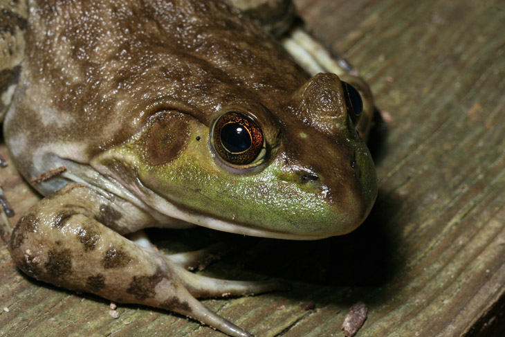
 Remember when I said that it would be interesting to see if the fishing spider managed to live peacefully in close proximity to the frogs? Of course you do – forget I asked that. Well, checking it out late last night, I found that something had changed since my last sighting a few nights before. I didn’t see this happen, so I can only speculate, but when I got this photo, a green frog was sitting not two meters away.


 There’s a limit, however. When a friend comes to visit, one who has been shooting longer than I have, that routinely visits places like Belize and the Alps, and her most treasured travel accoutrement is a selfie-stick… well, it’s hard to keep the bile from rising.
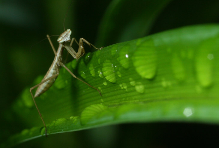
 To say that the front garden is loaded with baby mantises now is selling it short – it looks like an invasion, and one does not have to look hard to find them anymore. In fact, it’s a challenge to find a plant that doesn’t have one on it, including a potted flower on the steps, which is an indication that some of them had to cross the steps to get there, making me even more self-conscious of where I walk. But at the same time, a lot of arthropod species reproduce in vast numbers because the loss rate is high, the newborns being too vulnerable to survive on average. If each offspring has a 5% chance of survival to adulthood but 100 are produced in a brood, this means five will (again, on average) make it through. I’ve seen several hatchings now, and despite the large numbers at first, by the time egg-laying season rolls around I can only find two or three at best.

 While I’m still on the subject of motherhood, I’ll just throw this one out there. The fishing spider (Dolomedes tenebrosus) that I first introduced a month ago disappeared for a while, only to be found again a few nights back. Just this evening I photographed her again, and suspected that she looked a bit smaller in the abdomen than before;