Note: I’ve had this is draft form for several days, tweaking it and waiting for a good opportunity to put it up; I try to rotate and space out posts, and just recently put up another of the numbered series posts. Then this morning, Jerry Coyne at Why Evolution Is True posted virtually the same sentiment, and now I look like I’m copying him. So here it is anyway.
* * * * *
This one is almost an extension of the ideas put forth in the agnosticism episode, and also reiterates portions of the Pascal’s Wager post, but there’s more to it than those ideas. It seems, at least in this country, any outspoken atheist is very likely to receive the challenge, “But how can you be so sure there’s no god?” – or any variation thereof. So let’s play around with certainty and confidence.
First off, recognize that the question itself comes from the cultural perspective of a large number of people being religious – it arises far less in countries with a lower percentage of the devout. This is unsurprising, but many people are unaware how much culture is responsible for attitudes towards gods, and life’s meaning, and how important it is to have a phone that takes pictures. The question is a broad assumption, from a standpoint that something supernatural is a given, and that those who fail to see the importance or likelihood of this are somehow radical. Taken from the perspective of science, logic, or really, anything else not weighted by assumption, the question gets turned the other way: what evidence does someone have to propose a god in the first place? What effects can be seen, what properties does such a hypothesis explain, what function is it, what does it predict? Everything in science operates on this simple principle (which is why it is taught in schools,) and from this perspective, all religions have a long way to go.
But again, while I throw these questions out there for contemplation, that’s not the purpose of these posts – the points need to stand on their own, not merely challenge other perspectives. And indeed, there is an underlying problem with being sure there’s no god, in that we can never be sure of anything (though the weight of the evidence may make us pretty damn confident,) but worse, there is no such thing as negative evidence – there’s simply the lack of positive evidence. There is a common saying, known especially among UFO proponents and conspiracy theorists, that says, “Absence of evidence is not evidence of absence” – something can still exist even if we don’t know about it. At least, that’s what the saying seems to imply, but it’s both true and false. The sentence really should be, “Absence of evidence is not necessarily evidence of absence,” which makes it a lot weaker to use as a proverb, actually highlighting the flaw within. Because the only thing that’s evidence of absence is [drum roll]… the absence of evidence. I know we’re out of toilet paper because there is no toilet paper on the shelves. And while someone might try to argue the difference between a narrowly defined set of circumstances like toilet paper ready at hand, and a supernatural entity, the point is just the same as the null hypothesis that science starts from, indicating that positive evidence is the only thing that has value.
The whole idea of supernatural entities (I purposefully try to be vague to accommodate every concept of god and religion that exists, because someone always whines) stems from culture, and nowadays largely from scripture. And when the word ‘scripture’ is used, too many people automatically fill in their own favored example and ignore all others, but this is an unnecessarily narrow view. Since we’re supposed to be talking about a supernatural being that created all life on the planet, considering only one example is a bit biased; nearly every culture across the globe has/had their own creation stories, all claiming to have been imparted as Truth™ from on high. The broad assumption of most religious folk is that everyone else has it wrong, but this means that a majority of cultures on the planet are following mythology, imagination, delusion – call it what you will. So not only do we have the basic logical conclusion that it is easy to be completely mistaken about divine influence, we have the conundrum that every culture insists on their own special, “chosen” status but most of them had to have been completely forsaken by the supreme deity/deities. It’s hard to examine the plethora of religious belief across the world and make any claim that they have any common origin at all, especially when monotheism is a very recent concept, less than 2,000 years old and still not wholly embraced.
(By the way, the survey results that show atheists scoring higher on religious knowledge, on average, than religious folk ties in directly with this, even when many people get the cause and effect reversed. The knowledge of how radically incompatible religious belief is across the globe, indicative of serious problems with claims of divine inspiration, is what helps foster atheism – a little learning is a dangerous thing.)
We can, of course, look to scripture itself to try and determine accuracy, and by extension divine information, but unless we treat this as a foregone conclusion and pay attention only to the ‘hits,’ we find scripture to be so woefully inaccurate as to be incapable of proving its authenticity. And this isn’t just a matter of metaphorical usage, couching things in terms that the people of the times could understand, or even translation error, all of which have been proposed to salvage the provenance of scripture from the damning of reality; it would have been phenomenally easy to provide accurate accounts of creation, the nature of the sun, or even the shape of the planet – it’s what we would expect from information imparted by a deity. Yet not one scriptural tale got any of these right, among countless other examples – some of them border on the laughably naïve. Once there is any inaccuracy, of course, the accuracy of any other portion becomes questionable as well, to the point where it’s easier to simply investigate the world for ourselves. The disturbing thing is how often the devout will actually resort to claiming that their scripture is still completely accurate, and it’s reality itself that’s got it all wrong – and then whine that they deserve respect for their beliefs.
It should be noted that the routine actions of gods within scripture are something we see not the faintest trace of nowadays, implying that the direct interactions were abandoned wholesale in favor of hiding, for whatever reason. The various explanations put forth to explain this range from free will to Master Plans, almost all speculative since scripture is silent on why this change occurred (the ability to see the distinction between the actual content of scripture and the imagined explanations adopted as doctrine is possessed by few religious folk, by the way.) The idea of a deity which changes its mind implies not only imperfection, but a lack of omniscience and/or omnipotence.
Which leads to a further issue. Predestination is obviously a bit of a problem for religion, because it removes all influence that religion has, but worse, it makes an omniscient deity beyond our ability to grasp. Omniscience and immortality are a recipe for total inaction, in fact the total cessation of thought – what can there be to do that is not already known? What can be imagined that is not already proscribed? One cannot even connect one thought to another since it is already done. Obviously, humans cannot have thinking processes that resemble this in any way or we’d go neurotic immediately, and in fact, it makes existence (ours or a deity’s) to be completely pointless. Without omniscience, of course, a deity’s plan is an intended goal, but still up for revision.
Perhaps we can ignore scripture, for whatever reason, and contemplate the posit of an unspecific deity, going the theistic or deistic route – one that is responsible for creation and/or moral judgment but has no specific attributes. The first problem that comes up is, without scripture or organized religion, what is making anyone propose such a being in the first place? While various theological arguments have been forwarded, all of them have flaws, some so egregious as to render them ludicrous (actually, I find that “most” is the operative word here.) It’s not really hard to make any proposal sound logical, but logic is a funny thing – it only works in very rigidly defined circumstances, and it requires solid information as a starting point; logic is actually just the patterns of cause-and-effect run into abstraction. The primary test of a logical posit is the “If/Then” statement: If A is true, then we should expect to see B occur. Any posit not based on evidence and not providing any prediction that can be tested is not logic at all. Claims that “everything must have a beginning” or “the role of mankind is to seek perfection” are mere assertions, unable to be supported in any way and not demonstrated anywhere in human experience. It’s just as easy to say, “everything must have an end,” trashing the idea of an immortal soul or deity, and this is no different, and no more logical, than the counterpart.
Quite often, a preferred deity is said to be at work in the mysterious or unknown aspects of physics, such as quantum variation or even just coincidence. If there is no distinct physical law describing the phenomenon, that is where a god has chosen to flex their might – this is derogatorily known as the ‘god of the gaps’ argument. There are two distinct problems with this. The first is, it’s a great example of what I’ve called unevidence, claiming ignorance of a cause as support for any favored idea – “we don’t know,” somehow being translated into, “therefore god.” Amusingly, this actually implies that our knowledge is complete up to the realm of the supernatural, an attitude that no small number of religious folk get quite upset about when they interpret this as coming from sci-ence. But the second problem is that it posits a deity that bears no resemblance to the one they want to believe in, one so incredibly weak that it seems a waste of time. Maybe it’s just me, but praying for quantum decay seems somewhat out of proportion when breathing on something provides millions of times the impact.
The natural end of things – in other words, physics – explains how things work amazingly well. We can trace nearly everything back to four physical forces, and the interconnectedness of it all is both astounding, and exactly what we should expect to see with a lack of supernatural influence. This manages to explain everything from the behavior of stellar matter down to why we have a desire for morality. The very reason why anyone makes the various ‘god of the gaps’ arguments is because physics works so damn well. It is even possible to see why religion has been adopted into cultures, the evolutionary influences that make us prone to such beliefs. Again, we come to the scientific approach, where the hypothesis not only explains why something occurs, it gives us the ability to understand human motivations and see how they tie into other evolved behaviors – and seeking understanding is one of those prime human motivations anyway.
Now for the fun part, because we haven’t even touched on whether religious belief is a good thing or not – all we’ve dealt with so far has been plausibility. However, there remains the separate consideration, even if some deity could be proven to exist, as to whether religious belief or practice is actually beneficial. Most people don’t even think about this, assuming that if it’s supernatural, it’s good, but these are not synonymous in any way. And so we must consider whether the behavior fostered in religious folk is actually providing a benefit (which is a really hard thing to objectively support) and whether any such benefit cannot be achieved without religion (which no one has made the slightest case for yet – blind assertion is not an argument.) The fact that “religious violence” is a common phrase is pretty damning all by itself, but the perpetual history of religious persecution, privilege, judgment, and war is something that there’s really no need to belabor. Even if we accept the premise that these are tendencies of humans, religion has not tempered these to any useful degree, and the frequency of religious motivations among so many conflicts demonstrates inarguably that religion cannot sanely be said to even make people pause and consider. To all appearances, it makes them even more murderous by providing a belief in divine justification.
That would be more than reason enough, all by itself, for any reasoning person to completely ignore religion, even in the face of real miracles – obviously the deity isn’t too concerned with mankind, so why worship such a thing? But we can even, for the sake of argument, ignore all of that and stick just to individual, local behavior and see that nearly every religion spends more time promoting privilege and creating dividing lines than fostering any goodwill between humans, placing emphasis on faith and in-groups much, much higher than beneficial actions. It is solely through the constant repetition of “religion=good” that we can even believe such a thing, because rational consideration doesn’t actually support the idea. Moreover, it’s childishly easy to promote good behavior, far more efficiently, and without any baggage or threats whatsoever. It’s not like we have to obtain it only as a fringe benefit of religion.
But that, admittedly, has nothing to do with whether a god exists or not. The final aspect that I’ll tackle here is just the practical one: does the existence of a deity, or the mere belief in one, provide anything of value to us as a species? And pardon me, but I’m going to crassly dismiss the personal angle, just as I won’t consider the music someone likes to count as providing a benefit to us as a species – we’ll stick to something measurable. And taking that scientific angle again and looking for the explanatory and predictable nature of the hypothesis, we find virtually nothing that religion predicts; in fact, we find the very distinct lack thereof being claimed, somehow, as a benefit, something we can’t fathom but must nevertheless be good. No religion the world over served to explain much of anything, even as it went into great detail about creation and history and meaning and moral guidance – we’ve spent the last five centuries proving all of them both completely wrong and worthless as moral guidance. The assertions that we would be even worse as a species without religious influence have been proven wrong by the higher social standards of countries with low religiosity – in fact, the direct correlation with religion and lower social welfare, while not explaining which caused the other or indeed if either is causative, still gives a strong indication that benefit is not a factor. And then of course there’s the repeated demonstrations, now and throughout history, that religion negatively influences tolerance, education, medicine, and science, often extending into censorship, persecution, bigotry, and violence. Aside from the lack of benefit (which is putting it mildly,) we are left with three possible conclusions about gods from these facts: either there is none, or any that exist don’t give the faintest damn about what humans do in their name, or they’re simply shitheads.
If we take everything above into consideration, however, there’s simply one conclusion that fits every part of it without the need of special circumstances, explanations, proposed properties, or philosophical manipulations: there is no god. While anyone may decry such a definitive statement, especially from the perspective of stating a negative, the attempts to refute the above points have been rickety structures of sophistry and supposition. Probability can only be based on available evidence, not imagined scenarios, and this is how many atheists have arrived at their confidence.
This is in stark contrast with the certainty of the faithful, which usually relies on assertions and selectivity – when it’s not simply emotional affirmation. Examining probability or logical consequences rarely ever enters into the picture; these cannot charitably be said to form the backbone of religious certainty in the same way that I’ve laid out above… which actually makes the topic question itself, when asked by anyone who claims a faith, to be rather hypocritical.
Can the conclusion that there’s no god be wrong? Of course – anything can be. But seizing on the possibility and making this a foundation of any argument is hardly objective, especially when every religion can be wrong as well, and every law of physics, and every concept of electronic theory, and every belief about who our parents really are. It’s why we go beyond mere “maybes” to look at probability and predictability in the first place. We accept that germ theory explains a significant percentage of illnesses because it works, and while it could be wrong, such speculations really don’t have any effect unless we find the evidence that shows that it is. That’s confidence.


 The image above is the belly of course, not quite the classic hourglass but close enough to get the job done. The markings work better than you might imagine, since widows usually sit belly-up in the web so the marking is obvious. My main subject is a female, able to be told by the size, shape, markings and, if all that wasn’t enough, the pedipalps. The males, seen in an archive image at left, are radically different, and I suspect remain unidentified in most encounters. They’re significantly smaller, and their chelicerae are inadequate to penetrate skin in most cases, so the threat is virtually nonexistent. The threat from the adult females is pretty low too, since they purposefully avoid contact and areas of human activity. To get bitten, you pretty much have to pin one down without going so far as to kill it, which is a rather narrow range of conditions for an accidental encounter. Much as I crawl around in prime environments and actually handle spiders, I might not ever have been bitten – the one illness that I originally attributed to a black widow bite is now highly questionable. This is true of many suspected bites, since a large variety of things can produce the same wide range of symptoms that spider bites are reputed to have – there are no key symptoms that point directly to spiders, and entomologists maintain that if you didn’t actually see the culprit, the chances are low that whatever reaction you’re having came from a spider.
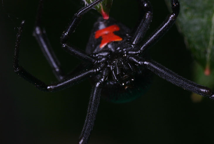


 The oak tree in the back yard ended up dropping most of its acorns before the leaves became very attractive, and because all but one branch are well enough above my head to make framing decent images difficult, I got nearly nothing out of it this year. When I found this one remaining acorn, I dodged around a bit to frame it against the sky, unable to get a position that put better light on the nut itself. When the broad vistas aren’t really up to snuff, you can still go in close for selective bits of color, or isolated subjects, and I’ve done a lot of work on those skills (notice that I did not say I was adept at it or anything.) You can produce nice seasonal nature images even in the middle of a city, if you’re choosy about what’s in the frame and don’t think that every image has to be a wide view.
 I wanted an image to communicate how many acorns had littered the yard – seriously, the squirrels are going to die of obesity-related illnesses – but found the straight-down perspective to be a little boring, so I laid on my side and went for a different angle. Again, this could have been taken anywhere – the entire frame could be hidden under a book, but the proximity of the acorns is enough to indicate that there’s a lot of them.
 I was about to pick up a plastic storage bin out in the yard today when I noticed a little crab spider perched on it, so naturally I went to get the camera. He (yes it’s a male) was amusing himself by trying to

 I didn’t assemble the dependable macro lighting rig, since it creates a large apparatus that cannot fit in any bag and takes a couple minutes to break down, so I amused myself with shooting macro in natural light, wide open at f4. You can see the effect this has above on what is probably a pearl crescent butterfly (Phyciodes tharos) – while measuring maybe 3cm across the wingtips, most of the specimen isn’t in focus at all. When restricted in this way, you can always select a perspective that works with such a short depth-of-field, such as the one at right. The grasshoppers were everywhere, and this one peeked up at me from among the flowers, one of the few that held still at my stealthy (okay, not terribly) approach. Nothing but the eyes had to be in focus, and in fact, not even all of the eyes, so this view from the blunt end seems to work for me. Not everyone is going to agree with my approaches towards images or composition, and that’s fine – there’s no right way to do it, and style is a matter of preference. So is what is about to come, which is inadequate warning that we’re going in for the serious closeups of even more icky things.


 In fact, this has allowed me to get some better portraits (for a given definition of “better,” anyway) of the adults, who previously were too shy to allow really close approaches, but in the throes of protective motherhood they practically climb onto the camera. This is the same specimen as the one at top, and the one seen in