One of the traits of photography, regardless of film or digital, is that it does not capture the range of light intensity that our eyes do. This makes photographs display increased contrast, and often it destroys detail or color rendering in either highlights or shadow areas, or both. It’s one of the trickiest things about obtaining a proper exposure, and frequently requires some careful adjustments or supplemental lighting. This is most especially true with images showing both sunlit and shadowed areas, or when aiming into the light.
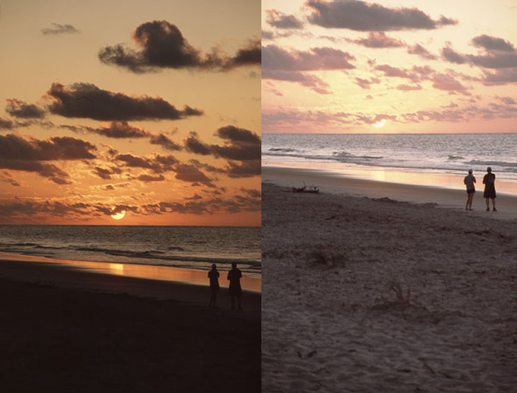
At top is a recent example from our trip to Hilton Head, two images taken a second apart. You can see that they’re aimed slightly differently, and this meant that the camera was obtaining an exposure reading from areas of intensely different light levels. The sky takes on a nice, rich and detailed appearance in one, but loses all foreground detail, while the other washes out detail from the sky (both, by the way, taken without compensation on Canon’s Evaluative Metering setting.) This is typical, and represents the choices that photographers have had to make for decades, even with newer films and digital sensors.
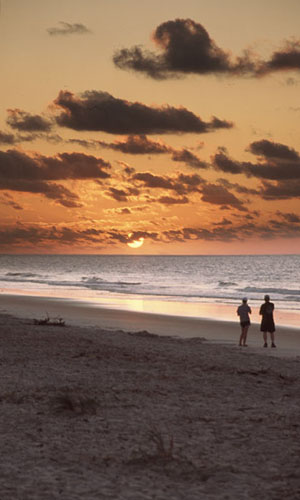 There are tricks that can be used to help alleviate this, but often the result is unnatural-looking and awkward. There are lens filters called graduated neutral density, which are basically tinted through half of the glass, the remainder being clear – the tinted half goes over the brighter portion of the image and is used to reduce the light level closer to that of the darker portions. The problem with these is that one rarely has a nice straight horizon, and when it is present, the fuzzy line between the tint and clear portions of the filter would show unnatural transitions in the resulting image. Most photographers left such filters alone and simply avoided the situations that suffered from too much contrast, watching for conditions that alleviated the problem.
Another way to control contrast was done in the darkroom with techniques called dodging and burning, which means selectively lightening or darkening, respectively, the portions of the frame that required it. This was (and is, for those who still pursue the wet print, which is really quite fun) useful only when the negative captured the necessary details in the first place, but since the issue was the limit of film’s dynamic range, you can’t reproduce detail that does not exist in the negative. If the bright areas have bleached out too far, there’s nothing to work with.
Enter the digital darkroom, and a technique now included in many programs called high dynamic range (often abbreviated HDR.) The basic method of HDR is to take two examples of the same scene at different exposure settings, one that captures the brighter areas (highlights) and another that captures the darker areas (shadows.) A tripod is recommended, since the images should match as close as possible, but the resulting images are digitally blended to capture the best of both. Many software packages offer this now, but I’ve done it here manually since I’m using an older program (Adobe Photoshop 6.0) that’s been serving me just fine.
Blending the details just right is actually tricky, and easy to screw up (like in the image above.) Sometimes the results are fine for those who aren’t used to evaluating images, but are plainly visible to anyone that’s had to cope with disparate light levels, and are distinct evidence of digital manipulation. In other words, don’t think everyone is going to be fooled. Having been shooting since before digital existed at all, I’ve watched the change of attitudes towards this with some amusement. When it first arrived on the scene, many photographers treated digital as a gimmick, permitting a “bad” photo to be corrected without having to learn proper photographic techniques. In a way, this was true, but not even close to the extent that it was disparaged for it. A good starting point was necessary, since digitally correcting a truly bad photo takes its own set of skills, one possessed by far fewer people than could simply take a good image in the first place, not to mention a whole boatload of time. But as I’ve watched, HDR has started to become an “acceptable” technique among professionals, rather than a gimmick.
 Now, I’m torn on the issue, personally. Generally, the resulting image represents something not seen in nature, presenting light conditions that really don’t exist, and often cannot. In these times when removing people, trash, or distractions from a scene can cost a photojournalist their career (not just their job,) it seems hypocritical to freely accept a blatant technique of selective imaging. And one of the skills that I’ve learned, and teach, is to work with the light that’s there, or find ways around it. The really good images from the top photographers are often the result of careful planning and being on location for just the right moments – it’s what makes those images special. The prevalence of altered images makes these accomplishments cheaper, and indeed hurts all really good images. It takes virtually nothing anymore for someone to cry “Photoshop!” at an image, even one that saw no such editing, because the media is saturated with alterations, and this makes those special efforts barely worth it anymore.
At the same time, how much different is this from selecting highly saturated or low contrast films, or using fill-flash and reflectors, all common traditional techniques? At what point does an image cross the line from representing “reality”… or has it ever? When I scan even a film image, is correcting the color cast that the film displays cheating or not? Who should judge, and what criteria should they use? Personally, I treat editing very seriously, and only do subtle color and contrast tweaks overall, things that could be done routinely in the darkroom without special preparations. I occasionally do more serious work, and have liked the results, but in my mind they are always gimmicks, and achieving the effect without software is much more satisfying. And, I always represent manipulated images as such.
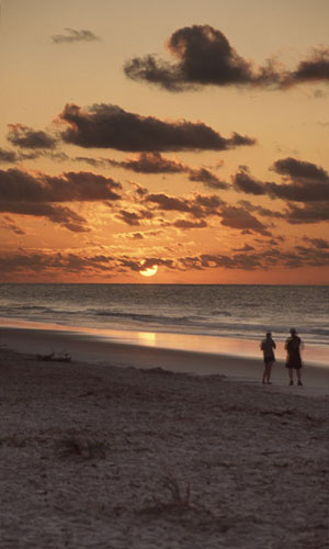
Now, a quick lesson. What makes the bad image (to the right of the text, above) not work? Notice the apparent light levels from the sky and the waves, which almost seem to match. The water takes on a glow from “within,” because it obviously cannot be reflecting the sky. Reflections in water are always darker than what they’re reflecting. Even the glitter trail, the reflection of the sun in the wet sand, is brighter than the sun itself. Especially telling is how the clouds right on the horizon get lighter and less contrasty, for no apparent reason. This is what a graduated neutral density filter often looks like, or too abrupt a transition between the blended frames (the culprit here.)
Alternately, the better version (on the left of the text above) seems much less unnatural. The transition, the blend between the two images, actually extends from middle of the cloud pack down to the clump of beach grass on the left – this kept the waves more accurately dark against the sky, and made for an almost invisible transition. The sand getting just a little darker with “distance” (actually towards the center of the frame, vertically) seems completely natural. But, did you catch the faint doubling of the couple in the frame? ;-) (This would have been easy to fix, but I liked the subtle telltale for my purposes here.)
Let’s look at a different example, one that, to me, is more acceptable to use. Feel free to argue with me about it if you like ;-)
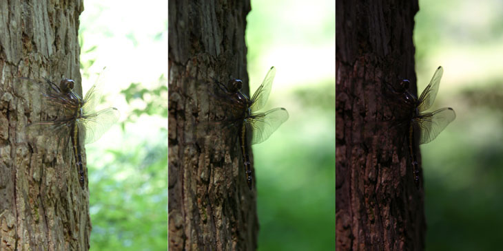
You may recognize the dragonfly, and I did mention that I purposefully took several frames just to experiment with this. The difference in exposure between the left and right frames is roughly three stops, which is significant. I chose to blend three frames for this because of the difference in the background light levels – notice the rich green low in the center frame, but the highlights get blown out too much. At the same time, the depth-of-field in the image on the left is actually too high, making the background speckled rather than blurred.
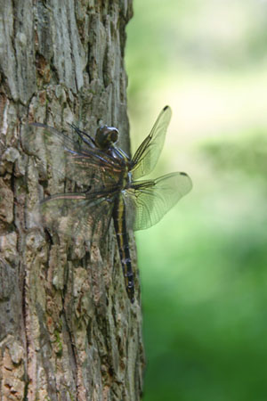 So with those, you can see what got used from each in the resulting image here. Notice how the background blends easily and, while there’s still a blowout of detail into pure white, it’s much less noticeable and harsh. The wing details remain present and sharp, and nothing has gone too dark. Now, in these conditions, I would have been unlikely to get the depth-of-field looking this way, since the depth needed to get the wings on both sides would have rendered more detail from the background, but this is hardly something that jumps out even at experienced photographers and editors. Capturing lighting like this in nature is difficult, since bright sunlight falling on the dragonfly would be necessary to keep it so close in level to the background, but such light would increase the contrast and the shadows of the bark. I could accomplish it easily with a strobe unit and softbox (I had the strobe, and even used it for one image in the other post, but not the softbox.) The result doesn’t look unnatural, and doesn’t represent impossible conditions, even if they would be rare. Still, I prefer to leave the HDR to others.
By the way, while I don’t really consider this a knockdown or particularly compelling image (I hate that the wings closest to us disappear among the bark,) I wanted to point out something to you. See the dark patch of the middle background? I intentionally positioned the camera in height so that this would fall between the wings, rather than touching or overlapping them. Very subtle, but it’s little interactions between the subject and background that can affect how well the image comes off, so keep your eye on such things. It was a simple matter to bump the tripod up a little to accomplish this, and it works much better. My students hate it when I’m this nitpicky on their images (I’m the same with my own,) but while I don’t really believe in the “perfect image,” I think trying to get as close as you can is the only thing that makes one improve.


