


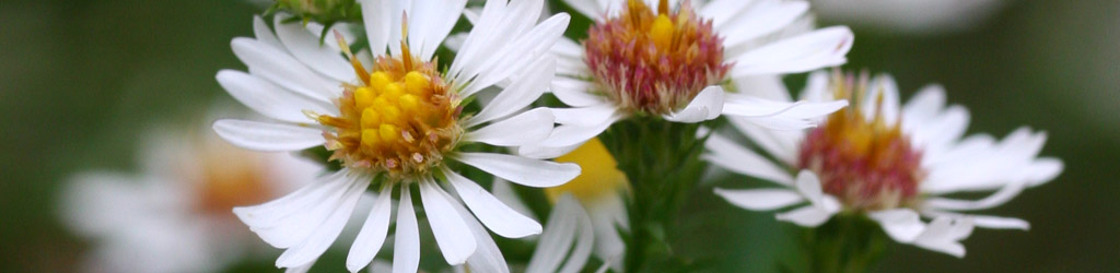

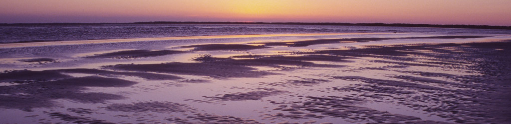

 Today’s Monday color was shot exactly one year ago – tomorrow. I say this now so you have time to find a gift.
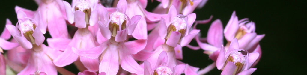
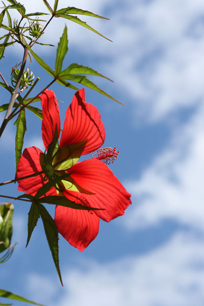
I almost used this for a previous Monday color, because that week was when I introduced the page of editing tricks that features the same image (meaning this is not its first appearance,) but then I had that other shot which merited a mention on white balance, so it was topical.
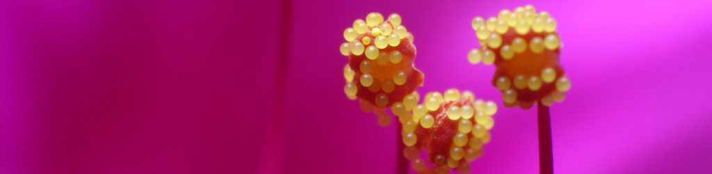
A brief note on positioning here: subtle changes can make significant differences in the photo. If you look closely at that blossom, you can see that the textures of the petals are very distinct, especially at the top – the light angle was just right to create some shadowing from the natural ridges, and thus give the flower a bit more definition and shape. It takes real effort to notice things like this, and I’ll be honest: I was concentrating on framing that flower against the clouds after I noticed the natural glow, and capturing the textures was only incidental. Still, it illustrates that a very slight change of angle can add some subtle enhancements to your images at times. Just something to be aware of while you’re, you know, concentrating on all that other stuff at the same time.