One of these days, I may start a new series of posts regarding compositional elements, because there are a lot of them, and knowing what they are can help you structure images instead of simply capturing them. But there’s a problem with this, because teaching composition is tricky – there are no rules, no formulas to follow every time. And many of the compositional elements that appear in my images are used because they appeal to me, and my (if you’ll pardon the phrase) artistic standards. I never want to bog people down with more photographic mumbo-jumbo, since there’s enough already in simply understanding how the camera works, and compositional elements are merely descriptions of something that “works” for our aesthetic sense. But for now, I’m simply going to talk about the ugly stepsister of composition, cropping.

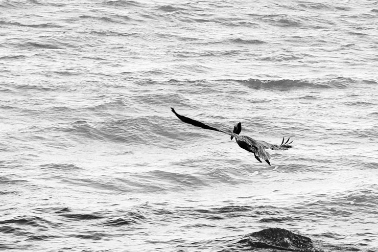
This is an example image I took a few years back, and almost discarded. It was a grab shot as a pelican launched itself away at my approach, and the color in the original is truly hideous. But when I converted it into black & white and tweaked the contrast a little, it became much better. Then, I cropped it down to the horizontal composition you see here, from a frame that was probably 20-30% wider. Shooting animals from the back only works in limited circumstances, because as humans we prefer to see faces, and backs are, to us, a rejection. But here, it sends a message of heading out over rough seas, of isolation, and potentially of challenges ahead. I can’t be sure, because I know what conditions this was taken in and am thus biased, but the position of the pelican’s wings might say something about gusty winds, and the contrast may give the impression of overcast skies. Into the teeth of the gale, as it were.
I cropped to position the pelican at this point in the frame, with the wings working a line between opposite corners, something I’m fond of. The blotch at lower right, directly below the pelican, gains the appearance of a rock, and the legs and head position seem to say the pelican has just launched itself from there. It hasn’t, but in photography, what is actually the case and what the image seems to convey can be two different things – accuracy is not a necessity.
I included enough empty space around the pelican, especially above it, to communicate its isolation and to give it “space to move” (an important element for moving subjects,) and while the portion of water in the frame isn’t significant, it’s empty enough to serve the purpose. There’s not much more to be said than that.
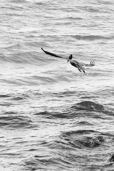
 And now we see a different crop. More of the waves below the pelican become visible, and these have an even rougher feel, and slightly confusing. Now we know we’re not dealing with a rock underneath, but the distinct shapes almost seem recognizable, and the viewer may take a moment to frown at them before deciding they really are just waves frozen in time. But in this crop, they have become an element of the scene, almost a subject in themselves.
Notice, now, that the lack of space ahead of the pelican takes away the idea of the beginning journey. Instead, the pelican being higher in the frame causes it to soar above the angry waves, untouched by the turmoil below. There’s even a break in contrast, occurring just underneath the bird, that mimics the ground and sky – and the bird rides firmly in the sky, brighter and by association more welcoming.
The vertical composition lends emphasis to height, as opposed to a horizontal which, of course, emphasizes a broader expanse, more of the open horizon, even with no horizon visible at all. So now, we don’t have a perilous journey like we did above, but the emotional idea of soaring above the turbulent, dangerous water. Both from the same photo, dependent only on the elements included and where in the frame they fall. The top composition has one subject, the pelican, in a setting that evokes condition. At bottom, there’s two subjects, the pelican and the angry waves, and these are selected and emphasized by the crop.
And there’s a more subtle lesson in here, too: don’t frame too tightly when taking the original photo, because you may eradicate useful elements or take away opportunities to reframe for a different emotional perspective. In fact, whenever you can, shoot a variety of layouts of a compelling subject, using your zoom lens to good advantage.
So, which is better? Well, that’s really up to the viewer, isn’t it? They might identify more with one emotional message than another. Your choice as a photographer is to decide if you want your own vision and message to be the only one the viewers see, or if you like the idea of seeing which one of several gets a better response from people on average. I’m fairly good about switching from horizontal to vertical layouts as I shoot, depending on what I think the subject warrants. But I’ve also, like in this case, tried switching after the fact and created some really interesting effects from experimenting.
One more thing. For typical sales, like to individuals for decorative purposes, you’re often much better off sticking to an aspect ratio that matches common frame sizes, so people can easily fit your image into an 11×14 frame, for example. This can be limiting. Many published sales don’t have such restrictions, except for cover shots, but it’s often better letting the editor do the deciding, and simply sending the entire image. If you’re framing your own, be it for a wall-hung print or on a website, you have the ultimate freedom in choosing an aspect ratio that works best for the image. Both images above are roughly 2×3 aspect, which works for very few commercially available frames – it’s equal to 8×12, or 11×16.5 inches, neither a common size. Trimming the image, of course, changes the purpose of the cropping to some extent, so it has to be done judiciously – or you include a custom-cut mat (not a bad idea.) Just something to bear in mind when doing your cropping.
If you look around the site, you may be able to recognize how the elements fit into the frame and what I was after. Most are cropped to some small extent, specifically to emphasize the elements I chose. It’s a tool that can do a lot for your photos.


