


I find it hard to believe that I never actually tackled this in a separate post before – I guess I kept thinking I’d done it early on, and have certainly touched on it in numerous posts. But it’s such an important part of photography that it really deserves its own specific, detailed treatment.
 First and foremost, and something I teach my students right off the bat, is that photographs by nature have increased contrast over what we see through our eyes. They have a narrow dynamic range, a term that straddles the border between explanatory and pompous. We all know, for instance, that dogs can hear higher pitches than we can, and perhaps you know that we only see a narrow spectrum of light, unable to discern infra-red and ultra-violet ourselves, much less gamma rays or microwaves. Well, the camera’s much worse than we are, partially because of sensitivity, but mostly because of the limitations of the medium. You can aim right at the sun and get a shot (not recommended actually,) but printed on paper or glowing from a monitor, it will never make anyone look away in tears – it will simply be white. The image has to dump a lot of brightness levels just to work.
This means that it’s easy to have a photo where different parts are both too bright and too dark. Most especially, this occurs in bright sunlight, which reflects the most light right back to the camera, forcing the exposure meter to try and handle that and thus leaving behind the shadowy areas. Anyplace where a distinct shadow is visible can demonstrate the property too, and this is most noticeable when the shadow falls across someone’s face, from a tree branch or a hat brim. Generally, this means such bright conditions are, despite common belief, rather poor for photography and should be avoided, but there are uses for any kind of lighting conditions. More important is recognizing that the camera is going to increase contrast and being able to spot the situations where this will be bad for the image, which takes a little practice.

Hazy or overcast days produce very low contrast lighting, since the light is scattered by humidity and comes from many directions, producing very diffuse shadows to none at all, and subjects therefore gain fairly even illumination. While this means the light is dimmer, the shadows are often the same darkness as a sunny day while the highlights not nearly as bright, meaning that the two are closer together and, regardless of where exposure is obtained, can more easily fit within the dynamic range. The same scattered light effect can be done with artificial lighting, through the use of multiple lights, reflectors, or diffusers of some kind. The idea is to get light from more than one direction so highlights and shadows get reduced or eliminated. When doing this, especially with multiple lights, one can produce shadows of whatever intensity works best by varying the effective strength of the lights from different sides, often as easily as moving one light source further away from the subject.
A broad guideline is to match the subject matter to its opposite in light conditions: if the subject is high contrast in light or reflectivity (significant differences between bright and dark portions, but not necessarily color,) go with low-contrast light, and of course if the subject is low-contrast, that’s when a bright direct light source can bring out more detail. An example of the former is a flower garden in full bloom, varieties of bright petals and dark leaves or shadows – these typically benefit from soft diffuse light to prevent overexposure of the white petals or harsh black areas of shadow, and to keep the colors in the richest ranges. While on the opposite side, something as simple as a textured surface makes use of bright, high-contrast lighting to accentuate the shadows produced by the texture or shape – this is where black & white photography gains the greatest edge as well. This might mean coming back to a subject later on when the conditions are right, but a little planning can do a lot for the resulting image.

Which is sometimes not the best thing – as noted in previous composition posts, you want the viewer’s eye going to your subject, and not necessarily anything else; you must direct their attention. So contrast in the background itself, like a red soda can alongside the forest path, is to be avoided if you do not want the distraction from your main subject. Even well out of focus, prominent contrasts can detract from the image. Ideally, of course, your background should have virtually no contrast at all if you want to keep attention focused on your subject, but this can be hard to accomplish.
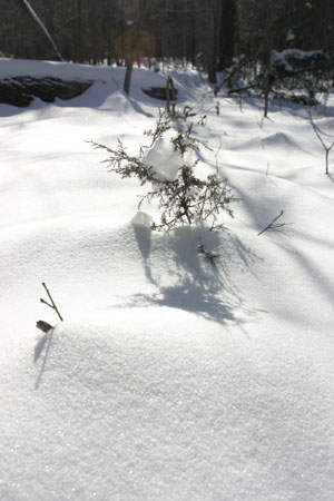
Then there’s contrast as the subject itself. Contrasting focus – sharp subject, blurry background – is what depth-of-field is all about, but there are also contrasting patterns and the break in pattern, the contrasting subject that appears different from the rest (one oddly-colored leaf on the tree,) and so on. Sharp contrast can provide a texture that the viewer can practically feel, while the subtle shadows from the shape of a cloud or an ocean wave may produce a pleasant, mellow effect.
The camera allows a limited amount of control on its own. Back in the olden days (and still today,) films had different levels of contrast and could be selected as the subject demanded, while digital cameras have the ability to change contrast settings on the fly. If your camera features multiple preset parameters, it’s often a good idea to have a neutral middle-of-the-road setting, then one for low contrast, and one for high contrast – this way you can pick what will work best for any particular subject, or even experiment to see if one works better than another. Again, you would use the reduced-contrast settings for a high-contrast subject, to offset the potential problems. These will not overcome the limited dynamic range of photography, but they can help mediate it a bit.
There’s also the simple trick of fill flash. When natural light is bright but casting deep shadows, firing off the camera strobe can illuminate these shadows a bit and lessen the contrast. The strobe will never get as bright as sunlight, and the range is limited, but it can soften the shadows to a point where they look acceptable. A reflector to bounce sunlight in from the far side can do much the same, but of course it has to be aimed, hard to do without an assistant or fancy stands. In the image at the top of this post, I was aiming up from underneath the beetle, where natural light had produced mostly shadow, so the flash provided necessary detail. Note the shadows underneath the insect, and the highlights on the legs, pincers, and eye.
Then there are the few manipulations which can be used after the image has been captured. Saving the image in RAW mode (in camera) sometimes gives an edge on handling contrast, but not to any great extent that I’ve found, and the increased memory usage can slow down both actually getting the image (from internal processing time) and downloading and editing – personally I stopped using RAW and stuck with JPEG at no compression, and concentrate on using the right light. High Dynamic Range (HDR) techniques, which combine multiple images exposed for at least highlights and shadows separately, can overcome the media-induced contrast, with two caveats: all images should be taken from the same vantage point, focal length, and position (usually meaning a tripod is required,) and experienced photographers and editors can usually spot an HDR image a mile away – light simply doesn’t behave like that. Take note, too, that both of these approaches can do nothing for portions of the image that have exceeded the limits; once the highlights have gone to pure white, or the shadows to pure black, nothing is going to bring them back.
So pay attention to the light and shadows, and with experience, you’ll know what conditions will work best for any given subject, and gain the control you really want.
