 On Sunday, the temperature topped 22°c (72°f,) making me break out the sandals for the first time since November – they’re my summer footwear, if I’m wearing anything at all. I had a student, and these images came from our session out scouting conditions and planning for the busy season come spring. It was easy to believe it was here already.
Then came Monday, with the temperature plummeting below freezing and producing sleet and snow – nothing serious, but certainly a far cry from the previous day. Putting up these images is almost an act of defiance, as I sit here with cold feet and a runny nose (the computer resides in the coldest corner of the house) – kind of a, “pics or it didn’t happen” attitude.
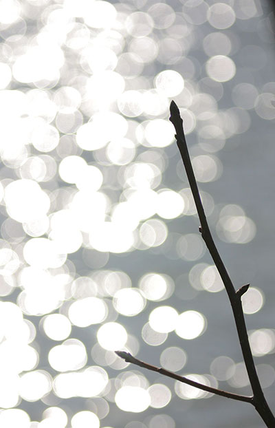
This image is taken against the reflection of sunlight in the background pond, aperture wide open to render the sparkles as circles (from the shape of the lens element) instead of polygons (from the shape of the aperture opening.) The term for this line of sparkling water pointing towards the sun is ‘glitter trail’ – or at least, it is now. Formerly it was used for Liberace’s concert tour…
I don’t like to shoot a lot when I’m with a student, since this is their time, not mine – I’ll typically only do it when they’re in pursuit of their own images, as kind of a side activity and so they don’t get the impression I’m hovering over them watching everything they do. In some cases however, like this one, the point is to work together and bounce ideas off one another, seeing how many different ways any subject can be approached – everyone has their own style, but inspiration is always a useful tool. I purposefully offset the glitter trail to one side to reduce the direct glare into the lens – you can see the negative effect this can have with the lowermost bud. Then as I did the post-processing crop for this image, I specifically put the base of the branch right in the corner, because I prefer that kind of framing.
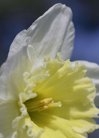
 In some places the daffodils are in bloom, a species that often gets snowed on from the mid-latitudes on northward. I had gone low to put some complementary sky color in the background, and cropped this one much tighter for a semi-abstract feel – you still know what it is, but now it’s more dramatic shapes than simply a flower blossom. The light angle is a huge help here, not only sharply defining the rumpled texture of the petals, but also throwing a shadow behind the pollen organs that makes them stand out brightly. Almost unnoticeable details like this can make one image more interesting than the others, even when we may not be really sure why it is.
Once again, I’ll emphasize being willing to get into weird positions to create a better composition. I was lying full on my side, head almost on ground, to get the upwards angle necessary for this framing – to say that I get dirt stains and damp patches in odd locations on my clothing is an understatement, but the way I see it, big fat hairy deal. I occasionally carry kneepads and ground covers with me just for these purposes, but they’re cumbersome, so it isn’t often. I never worry too much about how I look to anyone – this is what I do. What’s funny is watching the students emulate me, no longer self-conscious about looking weird, or perhaps suddenly realizing how much decorum has held them back from creativity – only kids roll around on the ground, right? But if it helps you create a better image, something different and compelling, go for it. Discomfort is fleeting.
Now, this next bit came up while I was putting together this post, sparked by another student who is into black & white work. There are many ways to tackle this from a digital standpoint, not just from converting to greyscale. Digital images are composed of red, green, and blue dots (RGB colorspace,) separated into channels. Selecting just one of these channels and deleting the other two can produce quite interesting effects, depending on the colors within the original image, and I tried it out on the daffodil pic for giggles.
 This is just the blue channel, converted to greyscale after deleting the red and green channels. White is composed of all colors, and receives an equal representation among all three channels, so the mostly white bloom still came out bright. But yellow is the complementary, or opposing, color of blue in RGB space, so whatever is yellow tends to go darker in the blue channel, making the central trumpet stand out in greater contrast – more so than in any other channel, and much more so than simply converting the whole image to greyscale. The problem is, the blue channel tends to be the poorest in terms of quality, and why this is I cannot say right offhand – it could be typical of digital RGB files, or just a trait of my camera. But the sky especially went grainy and a bit blotchy, faintly visible at this resolution but truly ugly in larger versions. I could ‘shop this out easily enough for an arteestic print, but it still makes using solely the blue channel to be a little challenging.
I had no sooner mentioned to the student that he should keep an eye out for just such subjects when this next critter was spotted, taking advantage of the day.

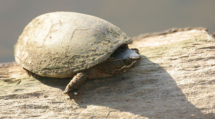
This basking mud turtle, likely a stinkpot (Sternotherus odoratus,) was remarkably patient with us, allowing some very close approaches without bolting from its sunbathing spot into the water, though I was using a long lens for this particular image. With any wildlife, get a few frames from a distance when first sighting it – the ‘proof’ shots, as it were. Waiting until you get the perfect framing may mean the animal bolts before you get that close, and you end up with nothing. This turtle did, eventually, duck back under, but not before we’d gotten within 2 meters – surprising, since most won’t allow anyone within 10 meters or more, and I’ve spooked some from better than 20. I’m aware that anyone reading might think it cruel that we chased the turtle back into the cold water after it got warmed up and should have left it alone, but it must be said that turtles weather far worse conditions than this, buried in the mud of the pond and lake bottoms – their systems handle it just fine, so we can’t judge from our own human perspective too readily. Living as it did on the edge of a housing development where people walked their dogs all the time, it would probably fare better being a bit more cautious, anyway.
The bright sunlight produced a lot of contrast, throwing deep shadows, so this image is assisted by some fill lighting – I mounted the flash to throw a little light into the shadow areas and brighten them up a bit, rendering them only half as dark as they had been. The turtle wasn’t going to be so cooperative as to raise its head enough to get sunlight onto an eye, which would have been much more dynamic a frame, and this was also as low as we were going to get without sinking into the mud of the pond bottom ourselves. You take what you can get.


