… can know how far they can truly go. That’s the way the saying goes, anyway – I’ve always felt that encouraging people to exceed their limits wasn’t the wisest of proverbs, but at least it gives them something to put on a tombstone.
However, I am vaguely motivated to put up even more photos, to see if I’ll set a new record this year, because the only person I’ll compete with is myself. And while I could always toss up some images for the sake of it, I’m aiming for content that has at least a little interest, that has something to say in some manner. But what to do? Monochrome comes to mind, but I’ve tackled black & white numerous times before and even have a whole gallery devoted to it, so no. Maybe if I went in entirely the other direction? I do already have that image that I did an experiment on, sitting in the blog folder awaiting a time to tackle it, so maybe I’ll do an extended post on it? Yeah.
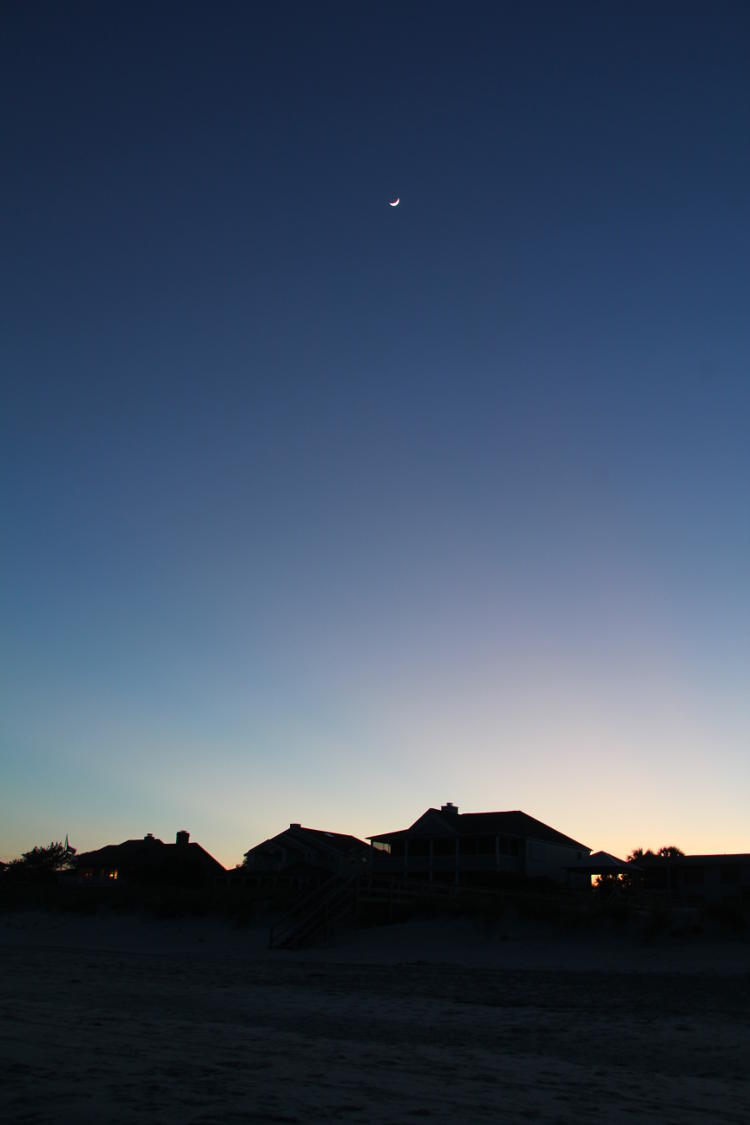
This is the deal. While sorting photos some time back, I noticed the barest hint of color coming from the sky in this dusk shot, taken while in SC earlier this year – the skies were too clear much of the time. But I was curious to see what happened if I boosted saturation in GIMP. This is something I rarely ever do; I have some in-camera settings to compensate for low contrast days, but for the most part, I tend to keep my images ‘as-shot,’ or occasionally tweaking the color more towards white light (rather than the blue-ish light found in deep shadows, for instance.) Bot sometimes the color just needs a boost, and this rarely exceeds a setting of “20” within the program. 20 what? you ask, and that’s a good question. Percentage, maybe? What’s being measured here? I don’t know, but the max is 100. So let’s slam the throttle against the stops.

Because the image was so muted in color in the first place, this doesn’t look too far out of line (especially when we’re bombarded with over-amped colors from much of our media.) It certainly accentuates the bare hint of sunset colors on the horizon there, but overall, it might only be a hair past what people would accept as ‘normal.’ We’ve started something here.
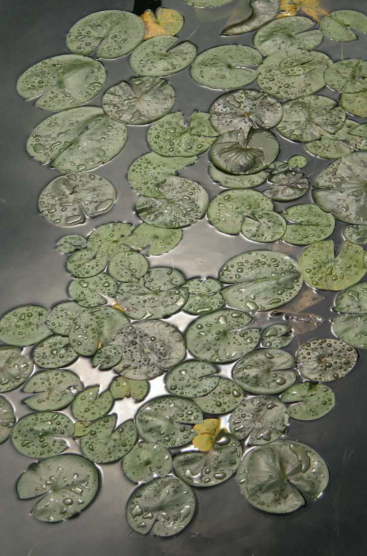
What’s funny is, I find nothing lacking in any of the images that I selected for this experiment – they were chosen for the limited palette, but the palette is natural, the product of the subject and in some cases (like here) the lighting and angle. But there’s no better way to make a photo seem bland than to compare it against an oversaturated version.
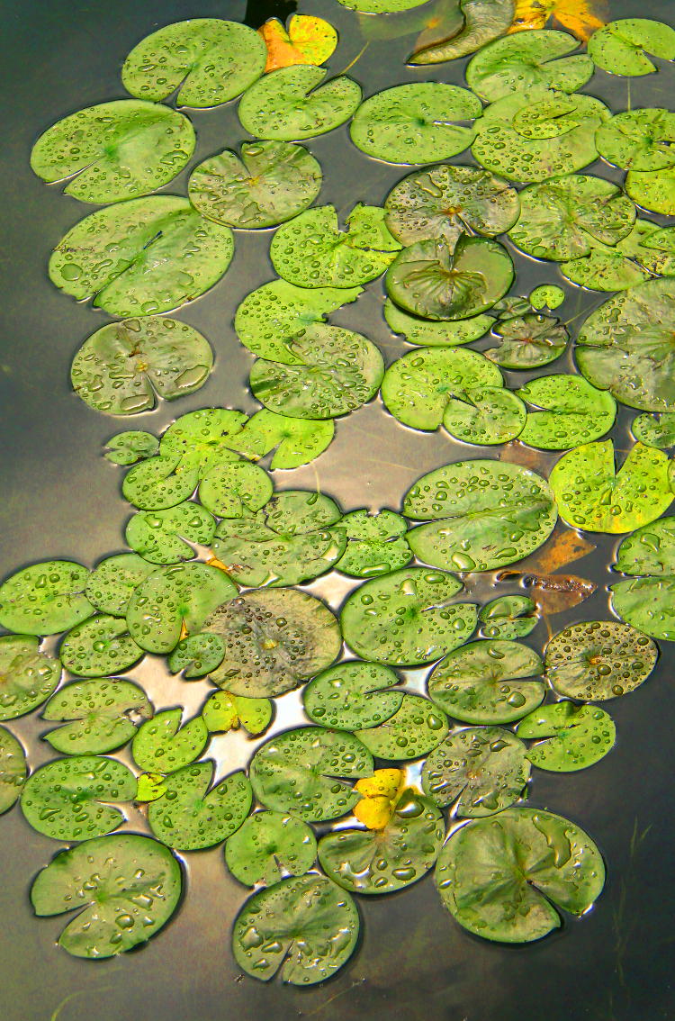
In most of these cases, I not only pushed the slider to 100, I did it again, going between 40 and 100 on a second pass depending on how much grain started to appear. This is noticeably harsh now, but still retaining the look of a photo – much farther and it becomes a painting in a head shop.
In some subjects, there are more colors than we would immediately detect.
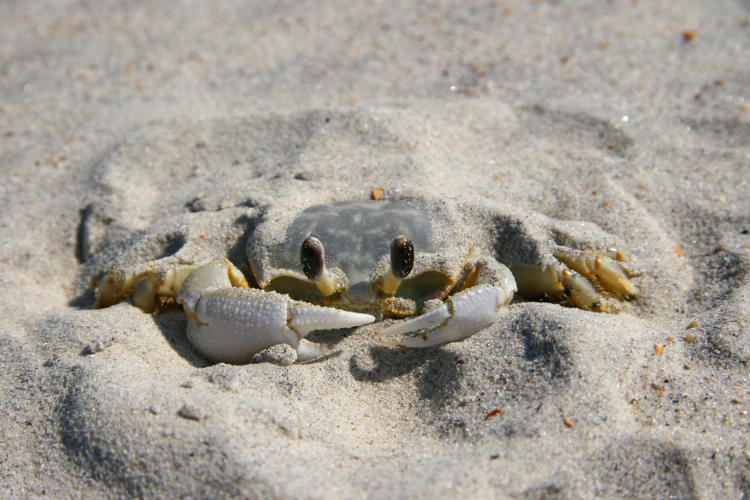
Sure, there’s some yellow on the legs, and a hint of blue in the carapace perhaps, but the sand itself is ‘grey.’ This is only a half-step away from monochrome by itself, and rendering it as such wouldn’t make anyone look twice. In fact, even treated it with the high-contrast method that I posted about earlier eliminates enough detail that it virtually becomes unrecognizable. Nope – we’re going t’other way.

Definitely too far, but the colors are complementary at least, and it makes us realize that there are other colors in there. Let’s do it again! (This is getting so exciting!)

This marsh rabbit was in open shadow not long after sunrise, so the light is still a bit blue, but that’s okay right now. The effect wouldn’t have been as interesting if I’d corrected back to neutral white light, because the greens would have become stronger. We need them muted a little.
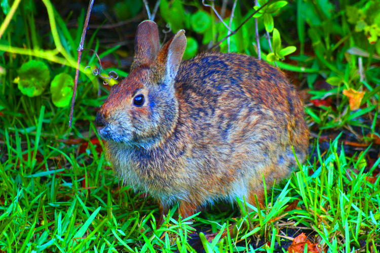
Yeah, wow, we could certainly do without the glaring foliage, but the rabbit looks good with a bit of indigo accenting, doesn’t it? Something for breeders to aim for.
I had to recrop this next one.

The gator itself was fine, but the loose organic debris in the water was colorful enough in the original to become unmanageable when boosted, so I cropped most of it out.
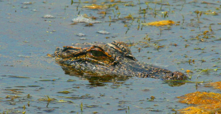
I rolled this one back to 140 or so, because the water was starting to get all pixelated. But I’m reminding myself that I have to live someplace where I can see these guys are a more regular basis. While I know an awful lot of people that consider living close to such reptiles to be horrifying, those people are all dweebs – gators are supremely cool. Look at those textures!
And a last, fun one, even though we just had this as a post subject.
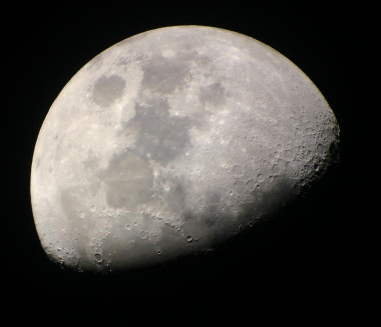
This was taken back 10 years ago with the telescope that I had then, since sold. I’ve picked up another now, a little smaller, but as yet haven’t tackled the photography end of it, because so far my collimation efforts haven’t been up to snuff and focus is not ideal. It’s on the project list, so be patient (i need to order a proper collimating eyepiece.) This image, I admit, has undergone a slight color tweak, because there was a hair too much yellow in the mix, though I can’t say if this was courtesy of the atmosphere, the telescope used, or my camera settings. Whatever – it worked better with a trivial shift.
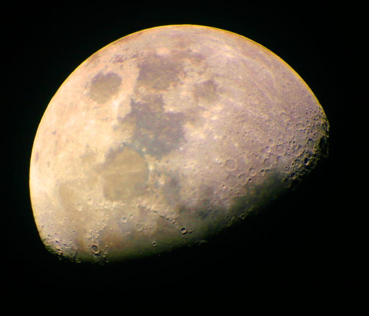
I had read somewhere that astronomers have done this kind of oversaturation just to figure out what elements are present in the surface itself, because they’ll all produce a different spectrum, so the colors are enhanced to magnify the distinctions. Is the green dominance in the terminator region indicative of anything? It’s possible – our sun puts out more light in the green spectrum than in any other color, and as a different wavelength it may have the greatest effect in shadows where there’s no atmosphere, but then again, it might also be an artifact of the image itself – a camera thing that isn’t real. One of these days I’ll do some tests above the atmosphere and compare them.
It remains the slow season of course, so new photos will be more scarce, but I do have a small handful of recent macro images coming, that I may yet add to. But before that, we have our weekly storytime.


