This is somewhat of an odd one, but actually pertinent to not what you take photos of, but how you use them afterward. It’s something that I face constantly, mostly subconsciously, when doing the blog, so let’s bring it out in the open now.
If you’re doing a gallery show, or a book of your own or something similar, you can pick and choose the formats, the proportions and ratios (height:width,) and even the media that you like, which can give you options for dynamic range and textures and so on. But most of us don’t do that often/at all, and instead we’re displaying photos on social media (*blerk*) or on websites and blogs and so on. And these often impose subtle influences on our work, which we can take advantage of with a little forethought.
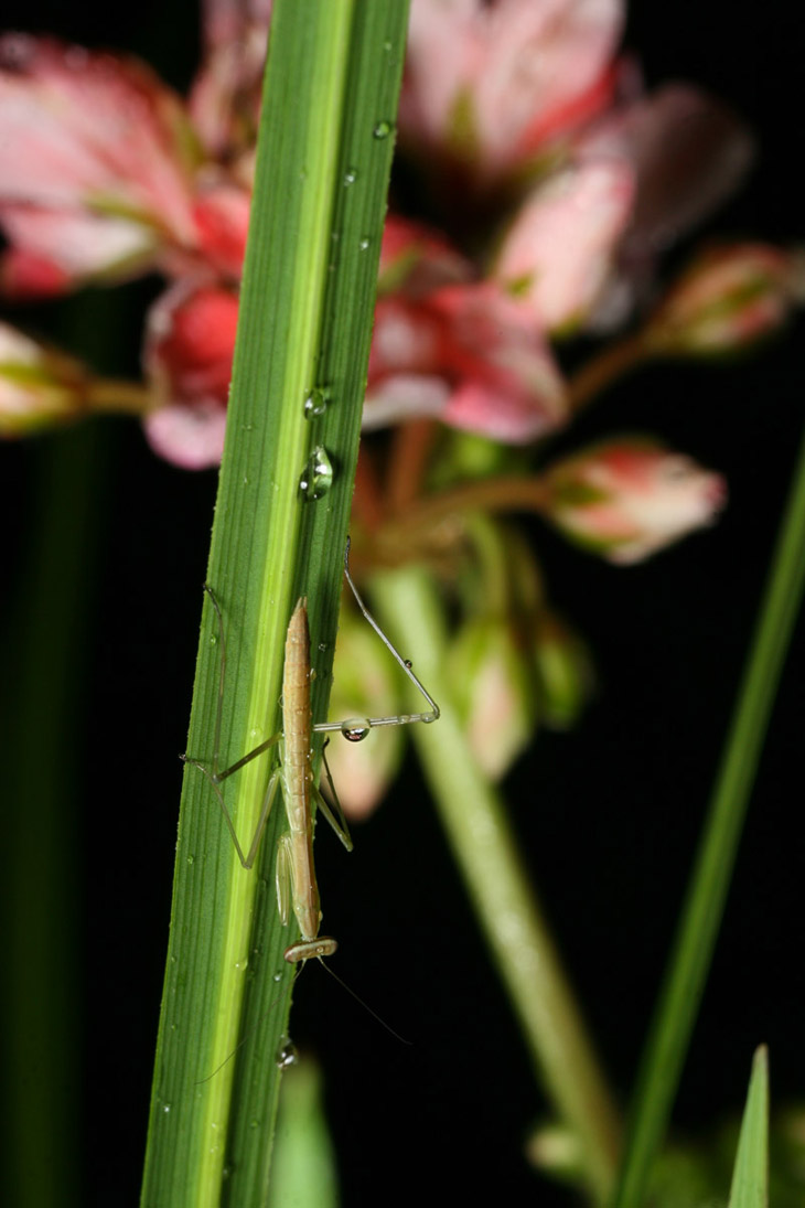
For instance, while computer monitors tend to be horizontally-oriented, the ‘landscape’ idea of width being noticeably greater than height, smutphones are most often the opposite, held vertically largely through force of habit (also influenced by the software thereon.) This blog, like many, is a columnar layout, which tends to favor vertical photo layouts over horizontal – I can keep the same pixel-width for most images to ‘fill’ the column, but for horizontal images, this means the vertical dimension (and thus the overall size of the image) is smaller. So vertical images just display larger and more impressively, which doesn’t bother me too much because I lean more towards vertical compositions anyway. Panoramic style images, where the horizontal dimension is better than twice the vertical, suffer the most of course.

This has an affect on the subject matter, because while the original photo may have been composed horizontally and well-balanced to use the frame to advantage, when constrained down to a particular display, the main subject might get reduced down so much that it has minimal impact, perhaps even losing crucial details. Then, we end up deciding if we chance this to keep the strong composition that we created, or crop the image down, losing various surrounding details, to enlarge to subject/focal point enough to retain the details of that. I do this too often: trying to decide if I want something fartistic (keeping the stronger composition) or illustrative (allowing more detail to be seen on the subject.) It often depends on the point of the post – what I’m saying with it, what I need to show, and so on. Even with insect subjects, I often try for portrait angles and decent layouts, including the surroundings dynamically and so on, but when it comes to trying to illustrate, the composition often goes out the window to slap a subject in the center of the frame with little else to be seen.
And of course, if we’re trying to accommodate smutphones (I’m usually not, because they’re stupid and because I write too much to hold the attention of the smutphone crowd,) then we’re further constrained by the layout and the size of the screen itself, not favoring anything at all where the detail drops smaller, just because it simply won’t be seen. Yes, the user can pinch and scroll and get the effect we might have been after, but this is a) if they choose to make the effort, which isn’t the case too often, and b) if the effect isn’t altered or even ruined by ‘zooming in’ on small portions of the the image.
A little cheat in here: On the occasions that the image displays a lot of detail that simply doesn’t work well when constrained by the online dimensions, you can upload a much larger version to reside on the server and provide a link to this that anyone can click on. That way they can get the full effect as desired, but you don’t wreck the page layout.
Scrolling can be an issue. An image with a strong composition and a vertical layout can lose the impact when it stretches offscreen so the entire image cannot be seen at once, and because of our left-to-right, top-to-bottom culture, photos with the strongest part of the image towards the top almost present a disappointment through scrolling – the act doesn’t reveal any surprises, any improvements. It’s sometimes better to compose in such a way that the strongest element is towards the bottom of the frame, so the act of scrolling results in a discovery of sorts.

Worrying too much about this is pointless, however; there are too many formats, too many ways to see something online, and getting the same effect from all of them is impossible. We can’t require a browser width or ratio, we can’t force someone to use their phone horizontally (which is a shame – more on this in a moment,) we can’t pick image sizes or dimensions that work either way. And usually, the impact isn’t significant no matter what we do, amounting to a minor affect on impact and impression to the viewer – we can aim to give our images an edge, but it’s a minor little edge.
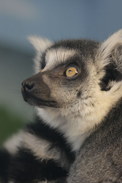
 Less-than-column-width images, which may be placed alongside text (or ads or whatever,) present their own little foibles. Many images have a ‘direction,’ most noticeable if there are eyes in the image looking left or right, but even just the subject placement or the lines of the composition can influence us to believe it’s facing ‘left.’ As such, we typically want the direction to lead us ‘into’ the page or text, facing the center rather than the outer edge, though on occasion (like a book layout,) such implied direction can lead us on to the next page. Overall, however, picking the placement of the image to take advantage of this direction is better. Know, too, that people will usually see the image before they read the text alongside, so if the text really should precede someone seeing the image, don’t place it alongside, but above – sometimes well above, if the ‘surprise’ or ‘reveal’ is crucial.
[I have this thing constantly where, with text alongside of an image, I want to convey a description or idea before moving on to the next image, but don’t always have enough to fill the adjacent column space. This means either injecting a page break, leaving a big empty space below the text to get to the bottom margin of the image, or getting more wordy to fill that space. Sometimes both.]
I find myself now, while out shooting, thinking about how I’m likely to use particular images and trying to accommodate those uses. However, I also recommend being open to other uses as well, because we may always run into a client that requires a different format. While many subjects might lend themselves towards just a vertical composition, we can lose a sale if the image won’t work horizontally. Also, as I discovered when shooting weddings, the common print sizes restricted how I could use the frame: an 8×10 print is a different ratio than the camera produced (which translates more to an 8×12,) so ‘filling the frame’ would prevent it being used as an 8×10 print without cropping off something crucial, so shooting a little wide – letting the subject be a little smaller in the frame and including more space outside – allowed for cropping to common print sizes, as well as occasionally converting a vertical composition to a horizontal one, and vice versa. I’ve even discovered after the fact that they sometimes work better that way.
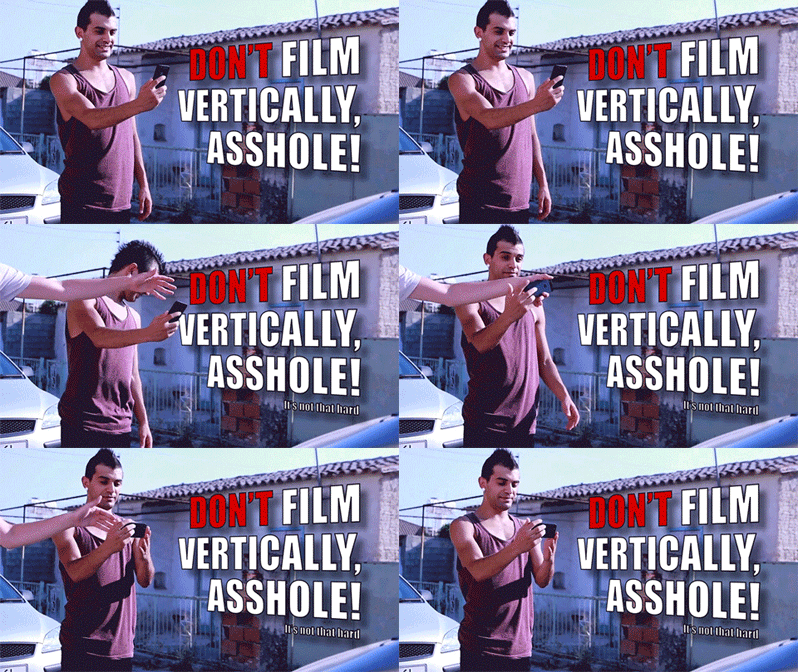
 However, shoot video horizontally. Always. All video players are horizontal, so playing a vertical video always results in large blank areas to the sides, as well as reducing the video detail down to the shorter dimension of the player. So what if the subject is vertical? Every last filmmaker has been coping with the same idea for the past century and has always made it work, even making their screen ratios wider, so we can manage to do the same. Use a vertical pan if necessary, but turn that goddamned phone sideways.
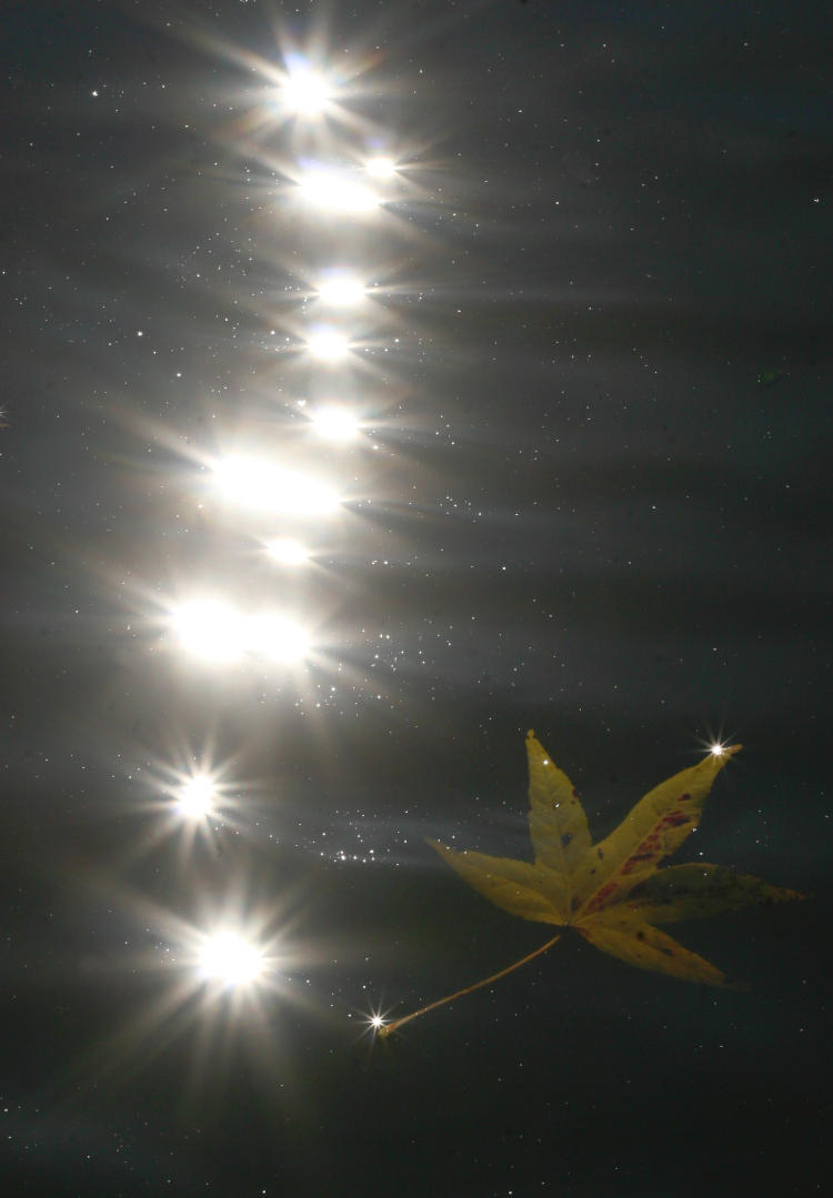
Something that’s almost impossible to accommodate is dynamic range and gamma. Dynamic range is the range of brightnesses available throughout the image, from pure black to pure white, and gamma is closely related but refers to how the monitor/screen/jumbotron renders it. Everyone doing photography should have their monitor pretty carefully color-corrected and adjusted for the best gamma results, but this doesn’t mean that every viewer has done this, or even knows what it is. [One of the reasons that I recommend against judging exposures by the LCD on the back of the camera is that gamma is often not ideal, nor is it adjustable.] So while we may have an image that relies on subtle variations, these may be lost to an unknown percentage of viewers. There’s not a lot that we can do about this, other than either avoiding using such images or simply not worrying about it. The third option, which I employ from time to time, is to tell people how much they’re missing out if they can’t see all the details…
Edit 03/27: I can’t believe I missed this, but there’s a concept that’s used a lot and demonstrated to have a noticeable impact, and that’s the “strong open, strong close” idea. Basically, it helps to open and close our post/page/gallery/etc with compositionally, artistically strong images – good first impression, good last impression. Of the two, I’d say that the strong close is more important, and something that we can ‘build up to’ through the other images or text. And of course, the larger these can display, the better – not the place for a half-column image. As with everything, this shouldn’t be treated as a rule, but having the tendency is better than not having it at all. We can choose our images, and even the pacing of the text, with this in mind.
Are there ideal dimensions? Like, how big should an image measure? In short, there’s no simple answer – smutphones of course have ridiculously small screens while monitors have been getting far larger, diverging the display options tremendously. I’ve fixed a maximum width for the blog at 750 pixels, up slightly from the old standard a few years ago of 730, and I could probably go larger easily, but something to remember is that even people with huge monitors don’t often use a browser at “full screen,” nor are a lot of websites capable of accommodating this anyway – many are constrained in pixel width (which I don’t recommend, because it serves to keep your site displaying small when the monitors get bigger.) When sending by e-mail, my maximum dimension is 1200 pixels, allowing people to see detail as needed while still not glutting an inbox with enormous file sizes. When hosting one’s own site, bear in mind that space is potentially an issue, but even if ‘unlimited,’ load times for pages or galleries or even back-end stuff grows with larger files, so best not to go any larger than necessary. Especially when uploading to any outside hosting site, know what the display dimensions are and keep your images (and most notably videos!) sized close to this – perhaps slightly larger to account for their compression algorithms, but definitely do not upload full-resolution, full-size images or video to such hosts – all you’ll do is waste time and space. Even for websites, keeping the resolution down below a certain level helps prevent ‘right-clicking’ and image theft, especially of anyone thinking of making a print from your work.
All that said, I hope that this at least provided some pointers and guidelines, and if I missed anything, don’t hesitate to say so. Good luck!


