Recent tasks brought this one to mind, an aspect of composition that can have significant effect but often remains entirely subconscious, so let’s talk about the subtle and tricky topic of impressions.
First off, I’ll say that from my own perspective, I more often stumble upon an image that provokes a certain impression, more so than I’ll actively aim for it, much less create it; there are certainly circumstances where I recognize the potential and intend to incorporate it, but it’s more often that I’m reviewing images afterward and am struck by how it makes me feel, or what it seems to say, or most especially, what the subject’s expression makes us believe they’re thinking. When it comes to wildlife, this is usually entirely wrong, but that doesn’t mean that these impressions still can’t serve a purpose, even just for amusement.

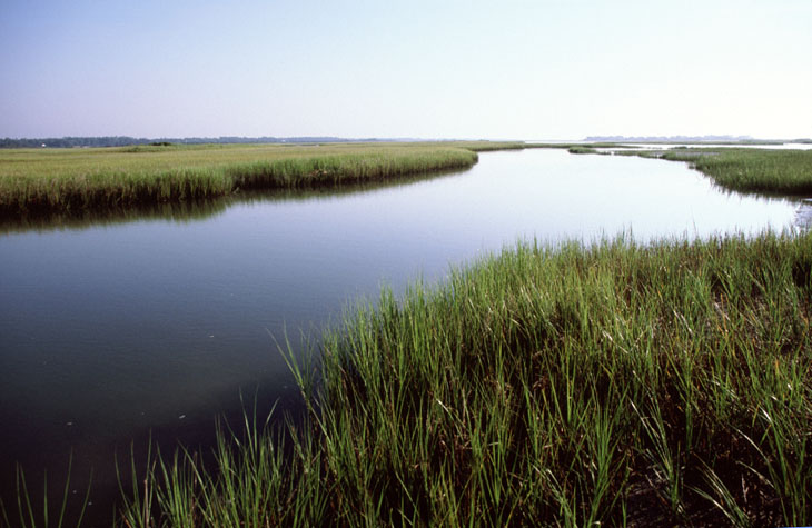
The first portion of this that we’ll tackle is the disconnect. While we know where we are and what’s happening when we’re taking the photo, the conditions and surroundings and so on, the viewer only sees what we’ve included in the frame, which can be representative of the true conditions or not, as we see fit. It’s often not too hard to present a placid and pristine natural setting by studiously avoiding having any aspect that says otherwise within the frame, never revealing that right behind us runs a major interstate highway, for instance. What goes to the edge of the frame goes on forever, is what I’m fond of saying – not quite accurate, perhaps, but the idea is that the viewer believes what they see represents what was there.
And this can be important to just about any kind of photography – we don’t just see the subject, whatever it may be, but the setting as well, and this should carry the impression that we want to convey. A hawk sitting on the edge of a building is no longer either nature or wildlife photography – I say that not from arrogantly defining the terms, but only from how others will view the image. But it works fine to illustrate urban wildlife encroachment, or adaptation, or simply surprise – what’s that doing here? But overall, even if we’re only illustrating the markings of a reptile, the image works better if the setting expresses an accurate habitat.
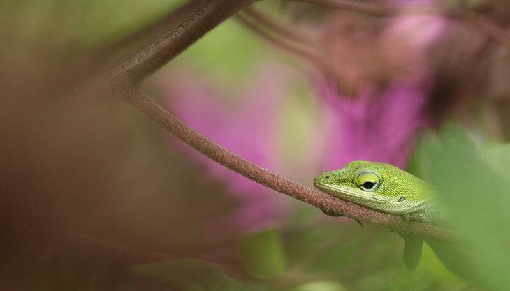
Then there’s expression, and while it is often challenging enough to get a human model to effectively communicate, “pleasantly surprised,” this is exponentially harder to produce from any animal subject; it’s usually a serendipitous discovery rather than an intentional effort when capturing the image, especially when such a large number of animal subjects do not use such expressions in any way. Yet there are still some things that we can do to help this along, changing our shooting angle or watching for the head tilt or shift of eyes. A simple little thing like the head shifting forward slightly can convey intensity of attention. And of course looking upward is positive, optimistic, unthreatened (unless there’s some aspect of ‘cower’ involved,) while looking down might be predatory, or disdainful, or simply depressed. It can help a lot to recognize how we might interpret these things as we see them. Take it from me, however: getting down to eye-level with your subject greatly improves your chances of generating a specific impression.

The initial task that brought this topic to mind illustrates many of the factors involved. A friend needed paired images that said, ‘True,’ and, ‘False,’ but should ideally be matching, abstract yet interesting, and easy to discern quickly and from a moderate distance – there were additional details in that they couldn’t be mistaken for any other images that we were already using, in colors or shapes, but the initial criteria were tricky enough. I mean, what image comes to mind when you think of, ‘True?’ And of course, I have no such categories in my stock folders and could only pick through thousands of images trying to find ones that could be interpreted in those ways, mostly in the Scenic/Abstract folders.
[Was I successful? Well, we’ve settled on a handful of images that can work, but I don’t think either one of us is satisfied yet, no images that make us say, “Yeah, that works!” I’m still not just keeping my eye out while reviewing images, but thinking of potential new concepts as well.]

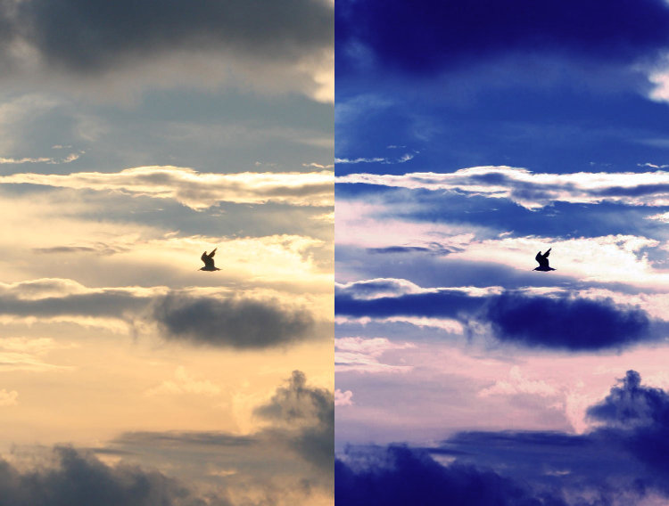
It’s often easier than that, though. Light color expresses temperature pretty well, since we know (subconsciously, mostly) that overcast days limit the red and yellow spectrum of sunlight, so light that is mostly blue spells out, ‘cold.’ Which also means that orange light is considered, ‘warm,’ something that too many TV and film directors use rather hamhandedly. Contrast and shadows provide their own impressions, sometimes of direct sunlight or, ‘being in the spotlight,’ sometimes specifically not. Blurring means motion or speed, also communicated at times with windblown hair or fur. Sunrise conditions almost always say, ‘quiet,’ among anything else. And if you’re planning on expressive images of abandoned buildings, you’d better bring along a little doll to discard into a corner someplace.
Okay, try to avoid the clichés when you can, but admittedly, clichés can still express what you need them to, and if the idea is to provide an immediate and unmistakable impression, sometimes a cliché is handy. Monochrome images dance exuberantly back and forth across the border between ‘trite’ and ‘expressive’ – simply converting to B&W often isn’t enough by itself, but selecting the right image for it can definitely work.
Being able to recognize something that provides a distinct impression is very handy for accent pieces and background illustrations – for art prints on a wall of course, but also to hint at an underlying mood. Yet, for commissioned works or advertising purposes, you often have to create those impressions. Just street photography can be tricky in eliminating all of the factors that might provide a negative impression (if that is not your explicit goal): trash, worn paint, cars that need work, people who are obviously not happy, and so on. When shooting weddings, I knew I had a roughly thirty-second window of capturing the couple’s first dance, when the guests were all looking on with smiles. Past that time, attentions wandered, people turned away or started quietly conversing among themselves, even sneaking a little food, and having that in the shot simply doesn’t work. And believe me, your eyes will go straight to that one person. For any photography, spotting the subtle little distractions and keeping them from your frame is important, but doubly so if you’re trying to foster a distinct mood or idea. You have to see everything, as well as nailing your timing. Candid groups of people can be especially hard, and photographers may often take lots of frames hoping to capture one where nobody is forming a distraction to the overall idea.

We can’t forget what you can do in post, either. If you need to foster more of an impression than the original provides, or simply see the potential, a little editing in the program of your choice can make a huge difference. The parts above about color temperature and contrast will likely provide most of what you need, but some selective lightening or darkening can alter things nicely, something that cinematographers know all too well. And here is where you can occasionally remove those distractions that you missed when taking the photo. I’m never a fan of altering images beyond cropping or slight color corrections, preferring to get the intended image right the first time, and so I don’t push people in this direction, but at times it serves a purpose. Always remember that changing images that contain people is inherently asking for trouble, and alterations are widely frowned upon for journalistic uses, where it becomes “editorializing’ rather than ‘witnessing.’ Tread carefully, but preferably, not at all.
So there are some ideas to get you started, but by no means a complete list or the best examples (I never claimed to be perfect.) It’s often trickier than it might seem, but when it works, you know it. Give it a shot, and be creative.
[And if you have any decent ideas for ‘True’ and ‘False,’ let me know.]


