


 Let’s take another look at converting color images into monochrome. It’s not very often that I’m out with the intention of shooting images to be converted, and I never switch the camera over to monochrome mode; instead, during sorting or editing I’ll pick a handful of images that look like they might fit the bill and see what comes up with the conversion and a little tweaking. So in this case, we’ll use one of the shots taken at Driftwood Beach on Jekyll Island, seen at left. Monochrome images make use of contrast above all else, and this image was taken as the rising sun was transitioning from low-contrast light, diffused by the thicker atmosphere at the horizon, to the high-contrast light of bright sun in clear skies – we can see the sharpening contrast in the textures of the rough sand and the trees against the sky. I consider this a moderate level of contrast, not the best candidate for monochrome, but it has promise, especially in the variety of textures. So we’ll start with simply wiping out the color by converting the image to greyscale.
Once again, we’re in Adobe Photoshop, in this case Creative Suite 5, usually abbreviated to CS5. Most older and all newer versions can do the same thing, but there may be subtle difference in the displays and menus. But since not everyone wants to drop a ridiculous amount of money on the egregiously-overpriced Photoshop, there is GIMP, which is a free, open source package that can do just about everything Photoshop does, and the Curves function is included. There are also countless online alternatives that may work, since numerous software packages now emulate the core functions of Photoshop, but most of these require Adobe Flash, which really should be destroyed so I’m not suggesting that you use them.
So as we see below, just converting the image into black & white doesn’t give it a lot of punch. It can be better, and it’s not hard to do this – it just takes understanding where it lacks it and how to manage it. Also bear in mind that this is my opinion of what works, and yours might be different, but you can still glean a good idea of how to achieve it with these techniques. Our biggest problem right now is the range of light levels in the original is a little narrow, with very few areas approaching either full white or full black – most of it is in the middle tones.

So, not only are we going to stretch the range of light levels in the image, but we’re going to move some of them out of proportion to the others – inducing greater or lesser changes in some narrow ranges to produce selective levels of contrast in certain portions of the image. We can do this without any kind of special selection tools or masks or layers, working solely with the Curves function. Here’s my tweaked version:

Better? I like to think so anyway – without the warmer and softer colors, it has a stark and desolate look, with the angle of the trees and the shadows lending an idea that something oppressive is/was off to the right, almost a post-nuclear kind of thing. But even if you would prefer a different effect, here’s how to tackle it.
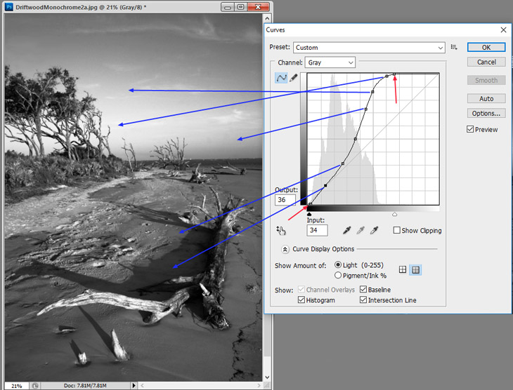
First off, the opening state of the Curves tool has a straight diagonal line across the graph, still visible here in grey, while the curvy black line represents my changes from it. Behind it all, the grey ‘mountain range’ is a histogram that basically shows how many pixels of each light level exist in the original image. Note how the range stops short of the right side of the grid, which is the brightest side – pure white is the right edge. This means no pixels in the original image came close to peak brightness. It isn’t necessary to have a full range in any image, but it can often help in monochrome, so the first thing I did was move the corner markers in a bit, pointed out by the red arrows – you can also just move those pointers along the bottom of the graph immediately below the gradient bar, the ones that line up vertically with the end pointers. This is the same thing as increasing the contrast of the entire image, making the brightest tones (which aren’t very bright) extend a lot closer to full white, and the same at the dark end at the left side of the graph, though the image didn’t need a lot of help there.
Now, the selective part. Each one of those dots on the curved line represent a point I selected on the original just by clicking on it, then pulling it into a new position with the mouse; the blue arrows are not the direction that I moved the points (in most cases this was simply ‘up’,) but instead the areas of the image that were affected by those positions on the curve. Near the top, I wanted the sky to become much brighter behind the standing trees to enhance their contrast, but it had to blend in with the rest of the sky so the difference didn’t appear abrupt, so the curve still had to be pretty gentle overall, otherwise some sections might have appeared ‘airburshed’ or even taken on the appearance of different clouds – in other words, if you need to preserve the gradient tones, the curve needs to be smooth. In my previous example, you can see a lot sharper changes made, a real roller-coaster along the curve, but that’s because the image had almost no gradients, instead having sharp transitions from distinct clouds that I wanted to enhance.
The arrows near the bottom of the curve are controlling the shadows, and after the initial changes, the shadow of the main piece of driftwood was too deep, losing almost all detail in that area, so it was brightened up to keep the idea of, ‘shadow,’ and not, ‘black paint.’ Also, the differences between the dark, wet sand and the dry sand near the treeline was getting a little harsh, so some careful adjustments were made to keep the two close enough in range that they didn’t appear weird.
[A quick observation here: you’re seeing the high tide watermarks, but notice how the tracks and disturbed sand are still present in the lee of the main log in the photo. This shows that the very shallow foam edge was blocked from further advancement by the log, and too shallow to do much by seeping around the sides. The band of lighter, disturbed sand below the waterline further down the beach (higher in the frame) is likely from seagulls and crabs foraging for the shellfish left behind when each wave retreated.]
So there’s an example of controlling contrast for just the effect you want. It’ll take some practice, and not every image will come up to par when doing this, but it will give you a lot more control than simply converting to greyscale or editing within the Contrast functions. Give it a shot.