For this week’s slide, I had originally chosen a rather stark, almost monochromatic frame, then remembered that a couple of years ago I started the Monday Color posts at exactly this time to counteract the grey winter conditions, and so that slide will appear much later on. You know, when we’re overloaded with color and need to offset that, rest our eyes…
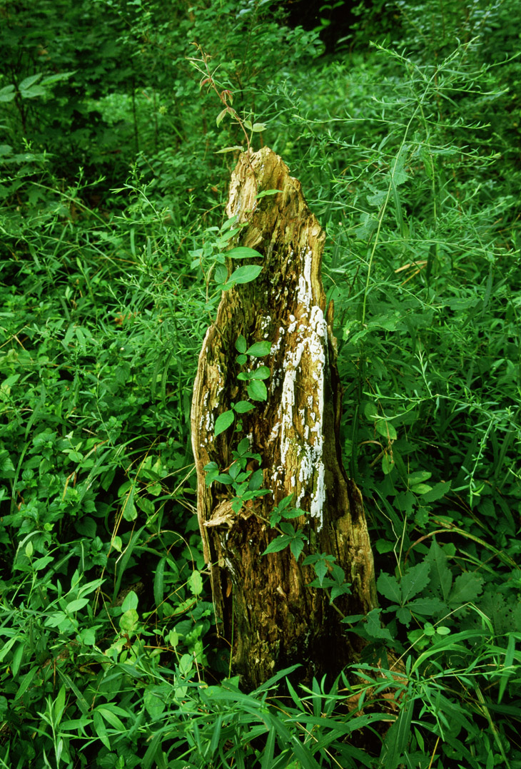
I would probably shoot this a couple of different ways now, but sixteen years ago I tended to be a little more straightforward. Even then I knew better than to center all of my subjects, but now I might go lower and do more depth, something like that. Who knows, maybe I had considered it but the background just wasn’t working that way? It’s easy to imagine that the deep green setting seen here couldn’t be maintained with a wider or lower perspective. I can remember where this was taken (alongside the Neuse River north of Raleigh) but not every detail of the landscape…
What captured my attention was the artfully-draped vine, setting itself off against the colors of the stump. It’s a lot like, if you decided to paint such a subject, you’d arrange the vine in exactly this manner, so capturing it when it occurred naturally was a necessity.
This is Fuji Provia, by the way, and a pretty close rendition of the colors – Provia could really kick the greens and blues for the nature photographer. Velvia was even more saturated, but sometimes overly so, and at ISO 50 it was a bit limiting at times, so Provia was my standard workhorse film.


