So, yeah, it’s been a little longer than I intended to go between posts – the idea of having two Monday colors back-to-back is, I admit, additional motivation to get something up. I wanted to say that it’s a good thing I’m not paid for this, but that’s not exactly true; getting paid for posting would be quite nice, actually. It’s a good thing no one is depending on me to produce content routinely, where I could lose the pay if I failed, but I’m happy with the ability to let it go when nothing is stirring in my mind.
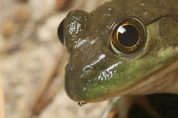
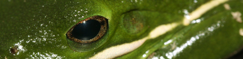
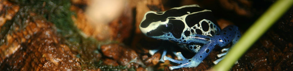
And suddenly, I have several things to post about, so they’ll all be jammed into this one. We’ll start with the frog above, a resident in the pond I’ve been (ever so slowly) working on, still unidentified. This photo is not a crop, but actually full-frame, taken at night while it was dazzled by the headlamp – yes, I really did get that close, notable because the two frogs in the pond are notoriously shy and do not allow close approaches if they’re aware of it. This is good, because it means they’re unlikely to fall prey to the red-shouldered hawk in the area, but it also means daylight pics are next to impossible. We’ll come back to this in a minute.
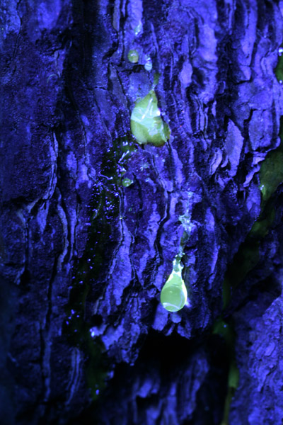 Last year, I played around a little with a UV flashlight, attempting to find local species that fluoresce under ultra-violet light. Scorpions do this remarkably well, but we don’t have them around here. I was prompted to try again recently by reading about how many spider species reflected UV distinctly, but this is different from fluorescence. Most flowers reflect UV, but we simply don’t have the eyes to see it, and it is assumed that the spiders with that trait have it because it attracts insects just like the flowers do. UV fluorescence, however, is the trait of absorbing UV and re-emitting the energy in visible (to us) light – no flower that I have found does this, but the sap of longneedle pines does, as seen here. And a few arthropods have this trait, sometimes in a selective pattern, but so far I’ve seen very few, primarily covered in that previous post. One exception was a small, rust-colored arachnid that I’ve seen frequently but had a great deal of difficulty getting a decent image of, a relative of the harvestman or daddy-longlegs – this one was distinctly fluorescing in a pattern around the legs, but at the time I spotted it I was without anything to capture it within (stupidly,) and by the time I returned it was nowhere to be seen. If I nab one I’ll be back with the images.
The funny thing about scampering around with a UV flashlight is how many false alarms occur. Many synthetic materials fluoresce quite well, and it isn’t until very close inspection that it can be determined to be just a bit of refuse. I’ve stumbled onto bits of fishing lures, and this particular one had me thinking I’d snagged a bit of fungus before I got a good look at it under high magnification.
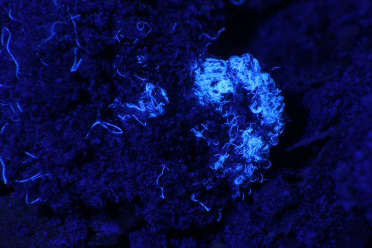
From a normal viewing distance, this was just an indistinct glow, but once I got the serious lens on it the true nature became obvious. Under visible light, practically nothing at all was to be seen.
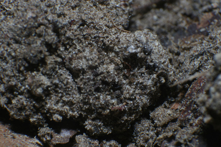
If you look closely, you can just barely make out the pattern of fabric in one spot. The previous owners of this house had a dog, and let me tell you, no matter how old and ratty the cover of a tennis ball has gotten, it still lights up brightly under the UV light.
But not everything was a false alarm. I had been keeping an eye on this cluster of insect eggs but it appeared that any further emergence was unlikely; on a whim, I aimed the UV light at them.
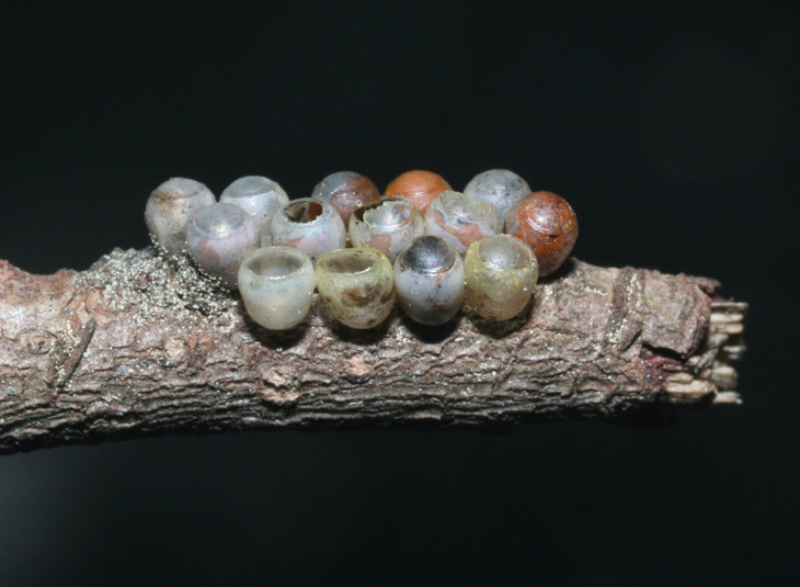

Given the variety of fluorescent response, I get the impression that this is evidence of a fungus rather than a property of the eggshells, but I’m just guessing right now. On the contrary, the fluorescence of this other egg case looks far more of an inherent property to me.
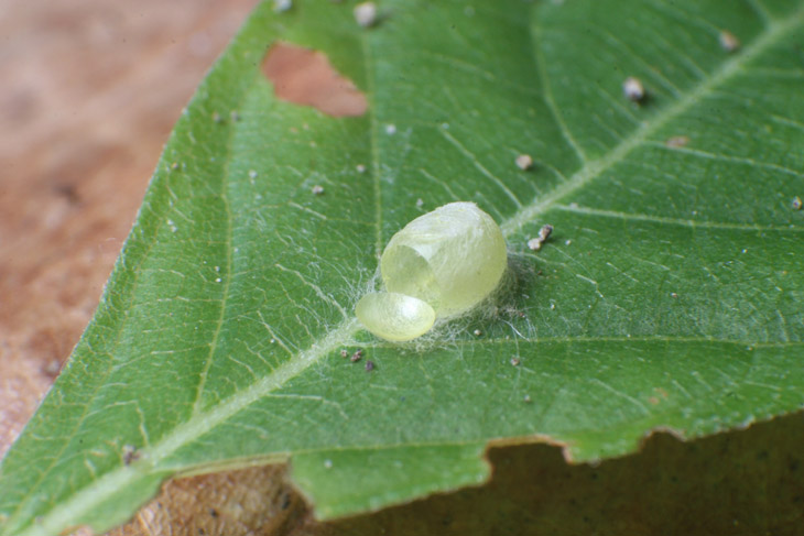
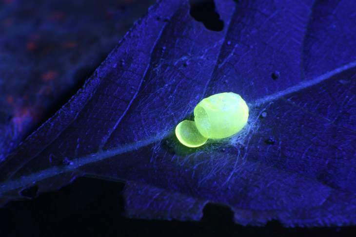
This one was probably the strongest non-synthetic fluorescence that I’ve found so far. It’s still not a scorpion, and if anyone wants to mail me one, please don’t hesitate. A little warning would probably be a good thing, though…
The coolest discovery, however, was this one.
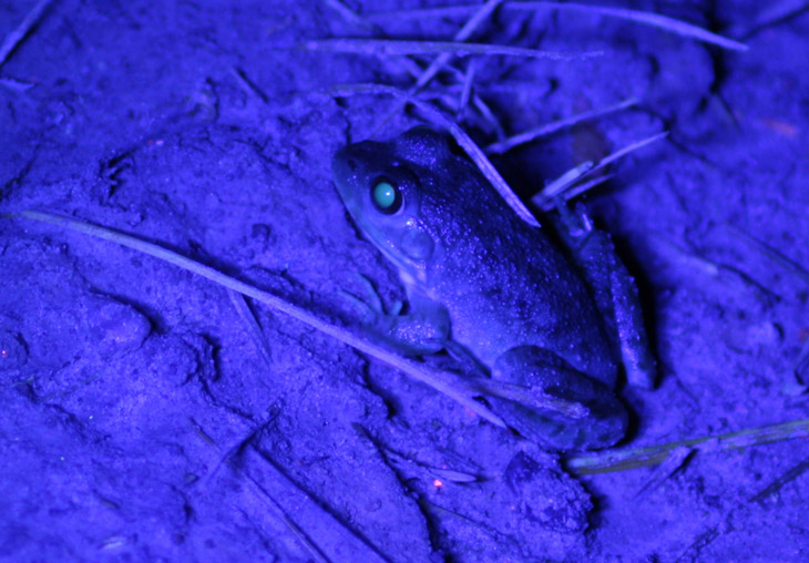
I can’t begin to tell you why this occurs, but you have to admit it’s pretty slick, isn’t it? This took two attempts, because I needed to set up the tripod for a long exposure, and the frog bounded off into the water when it heard a sound too close for its liking. The orange speck, by the way, is evidence that the utility companies marked some lines in the yard with fluorescent paint recently – let me tell you, that stuff shows up so distinctly it’s scary.
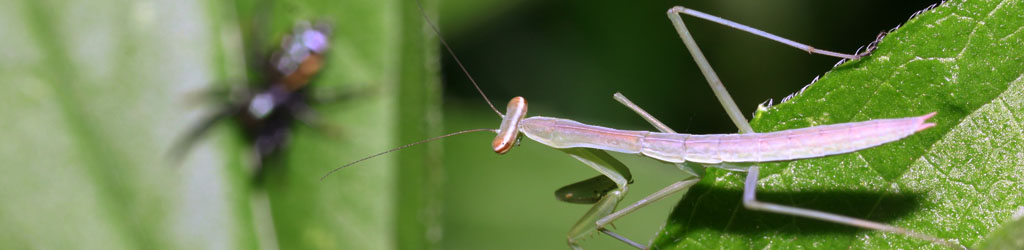
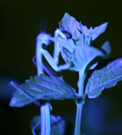 Of course I had to see what happened with my resident praying mantises; they appear to be a tad more reflective than the plants, but nothing spectacular. And of course, expecting them to hold still during the long exposure time is a foolish pursuit.
I have been purposefully avoiding posting more photos of the mantids, trying for a little variety and believing there really can be too much of a good thing, but it means I’ve been blowing past some of the better images of the little spuds that I’ve been getting. Not this one, of course. We have had seven or so residents, primarily sticking to certain areas but with a random amount of rotation. Just recently, several appear to have moved on, so my ability to find models has been reduced. The one you are about to see is a new discovery, or potentially one of the ones from the front yard that wandered into the back. It would be nice to be able to tell them apart, but even if I somehow got a dab of paint or something onto them, this would be an unnatural thing to appear in photos, and they would simply discard it with their exoskeletons on the next molt. Even size isn’t a useful guide, because they can undergo an abrupt increase immediately after a molt, and most of them appear to be eating quite well.
 So, this one was spotted tonight traipsing around on the sea oat plant soon after I’d watered it, and I shamelessly coaxed it immediately next door onto The Girlfriend’s prized calla lily, where it took its cue like an old pro and provided several fetching poses right atop the fading blossom (I hadn’t even put it there – you gotta love cooperation.) This one is medium sized, which means about 6 cm in body length – there are both far larger and far smaller examples in the yard right now. Some of them must be getting towards final instar, the breeding adult phase, and I feel confident that we’ll have at least one egg cluster someplace in the yard to keep an eye on next spring. I’ll just have to locate it…
Oh, you don’t think this is all that “fetching” a pose? Well, even the supermodels have to warm up before they drop the goods on you. What about this?
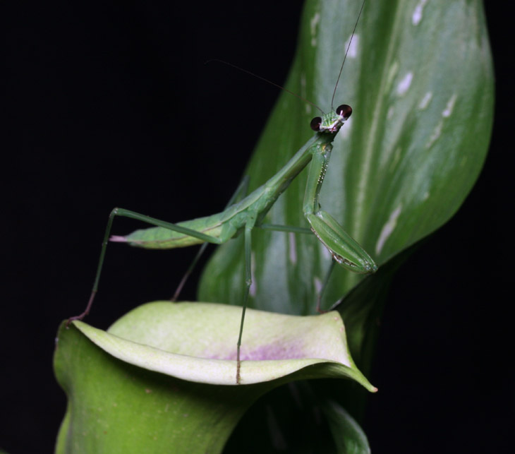
That there’s grace and poise, that is. An impish tilt of the head with that innocent smile and those eager eyes – not everyone can pull this off. Sometimes greatness is undeniable.
Seriously, this mantis craned around looking at the sky several times, including straight up. Since this was night I can’t imagine what it might have been seeing, but it did more peering around than I’ve ever seen from the species.
It’s still quite muggy here, having been several days since the last rain and rarely hitting the dewpoint at night, so I brandished the misting bottle and gave my model a brief shower. While this sometimes causes mantids to seek cover and sometimes causes them to come out for the moisture, this one scampered right to the topmost leaf and sat up stroking the air as if trying to climb into the mist. I’m starting to think there was something wrong with it.
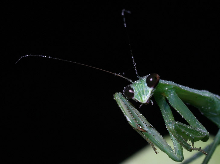
Perhaps it was possessed with the spirit of someone, and was trying to communicate. I’m sorry to say I didn’t get it.
A large, brown mantis has been inhabiting the day lilies out front for several days now, despite my warnings. When I was working on the car a few days back, I was right next to the lilies and walking back and forth, and I looked down to find the brown one waving at me as I went past. Naturally I stopped, and it came out onto a leaf as far as it could in my direction. Intrigued now, I reached down, and the mantis clambered aboard my filthy hands happily and used me as a bridge to go to the next plant over, then did the same beckoning routine. I ended up going in, cleaning up, and bringing out the camera for this dramatic pose.
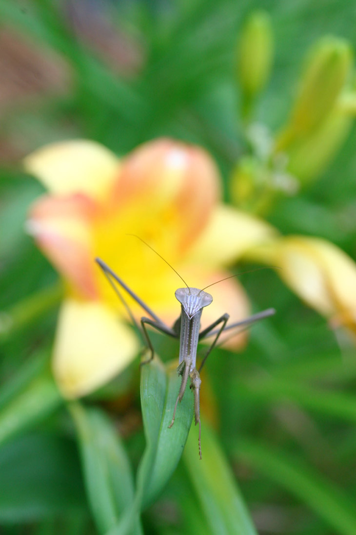
This is the arthropod equivalent of walking in slow motion towards the camera while an explosion occurs behind.
This particular mantis, one of the few I can tell apart from the others, has been remarkably blasé about my presence with the camera, though it’s still possible to spook it at times. It’s been such a good model, though, that when I came across a katydid trapped in the web of a spider far too small to do anything about it, I collected the captive and perched it on the day lilies only a short distance from this mantis – naturally, I was sitting nearby with the camera. The encounter did indeed take place, but my model here missed the pounce and the katydid leapt away and vanished.
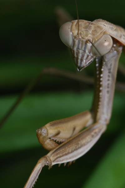 Sometimes, the angle and pose come together just right to produce an evocative expression from, really, a species that can’t actually change expression. The tilt of the head and the shape of the eyes, even the dipped antenna, just says to me, “Boah, you got a permit for that?”
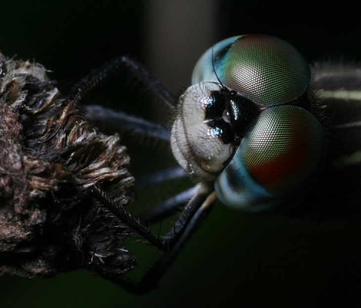
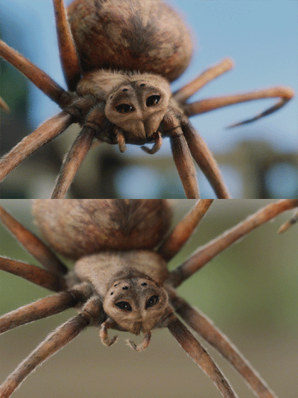
And speaking of justice, this image isn’t done it by display here. What I mean to say is, at this resolution you can’t see half of the detail that was actually captured. This is once again full-frame, and at some point I’m going to do this as a big print – I don’t decorate with my own shots very often because I get tired of seeing the same thing, but this is one that I don’t think will suffer that fate.
I’ll take a moment to point out here that light angle can mean a lot to your images. Of course you want to see detail, but direct light is boring, and it takes some degree of sidelighting to bring out the shapes and contours of your subject. Finding the right angle can be tricky, and I can only half credit this one to knowledge – I have some spider pics from a few days back where crucial details were lost in shadow. If you want to tackle macro work, you should definitely be looking at a flash bracket that gives you lots of flexibility (and, take it from me, isn’t too heavy or awkward.)
But back to the detail, which can be seen with a tighter crop of the same frame. This is still only about half of the actual resolution, but it shows enough, I think.
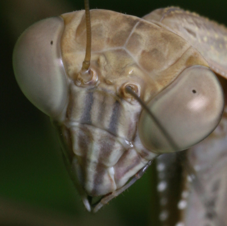
My model was unavailable for a precise measurement, but I checked with another that was comparably-sized; the distance across the eyes is about 7mm, or the width of a pencil. Gives an idea of just how small those ommatidia (eye facets) are, doesn’t it? So how big should I make the poster?
Potentially Related Posts:




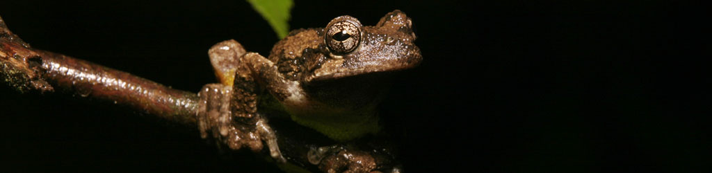



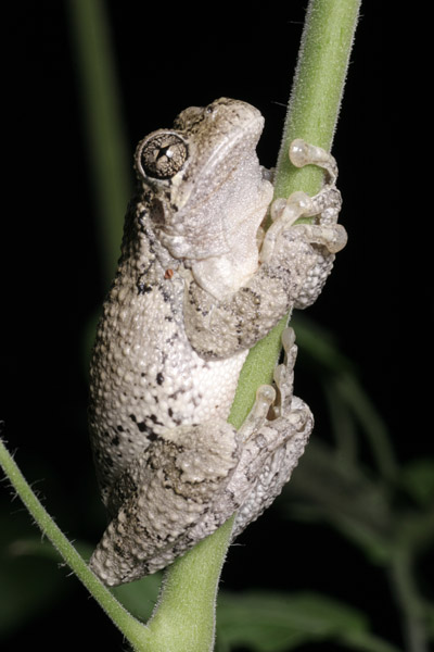 The other night, a Copes grey treefrog (Hyla chrysoscelis) was found clinging to the stem of a cherry tomato plant on the deck, producing a pose that seemed to be evocative of something, but I haven’t pinned down what – perhaps I should hold a caption contest (you might as well send one in – with the dearth of comments you’re pretty much guaranteed to win something.)
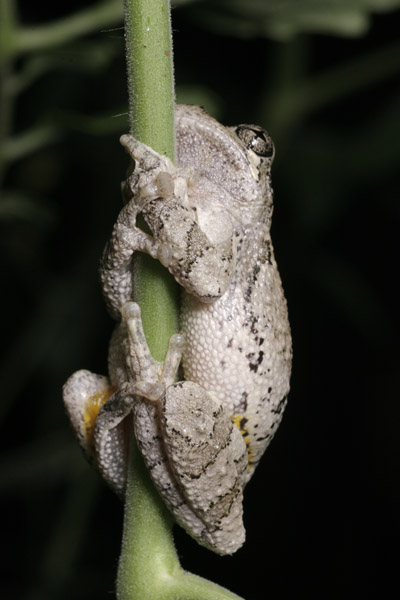 I am identifying this as a Copes grey treefrog, but visually, they are impossible to tell apart from a common grey treefrog; the reason I offer this identification with such supreme and unflagging confidence is that, from the calls that I hear during the rainy nights, this is the only species that seems to be in the area. Copes have a higher-pitched call, possibly from sliding down slippery tomato stems. The underside shot, which I was obligated to obtain, doesn’t have half of the expressiveness of the one above, but shows off the clutching posture much better.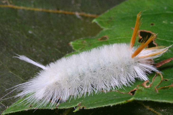
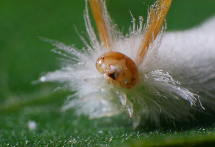
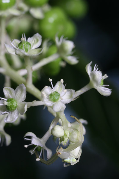 And finally, it’s not a complete week without spiders, so I offer a subtle crab spider hanging out on a pokeweed blossom. This one is considerably larger than last year’s, though still barely noticeable – in fact, well-nigh invisible unless you’re specifically looking. The pokeweed has been just about the only thing blossoming in the yard that could attract the crab spiders, which is a shame because I happen to like them – I’m going to have to plant some prime flower species for them next year, generally white or yellow blossoms that they can camouflage themselves within. The pokeweed flowers are very short-lived, and what happens to the spiders after the flowers become berries, I have no idea. No, that’s not true, because I’ve seen them ballooning across the yard to different hunting grounds, and even intersected one in mid-trip last week. The area plays home to crepe myrtle trees, which come into bloom at this time of year and sport white flowers (as well as purple,) so I imagine they have plenty of feeding opportunities once they alight on the right perch. Maybe I’ll have to go examine some of those flowers closely…
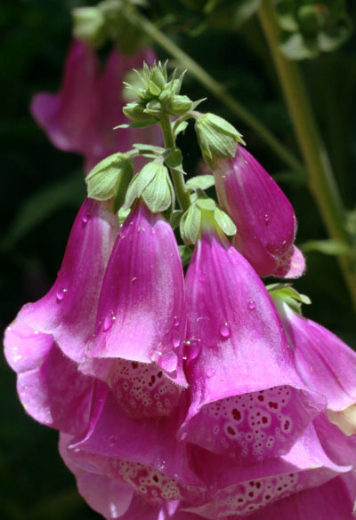 So, for this Monday color we have an image that’s faintly unsettling to me. Not for any peculiar associations I have with the Digitalis family (though in truth we haven’t gotten along since that incident at the airport,) but because the color seems off, and not able to be corrected in any way. It has the appearance of something that had originally been shot in monochrome, like in the ’40s, and was later colorized – just not quite there, not ringing true. For instance, look at the leaves and stems at the base of the blooms; that hue of green lacks vibrancy and authenticity. In most cases when seeing this, I would tweak the color away from blue, but then that seems to change the color of the blossoms away from an accurate rendition of those. And it’s possible that the greens of this particular plant really were this hue.
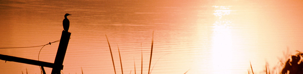
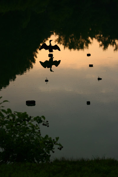 Most of the time recently, the skies are so clear at sunrise that they’re boring, lacking in rich colors and clouds to throw some textures into the mix. But this morning looked like it was going to be different, so I trotted over to the pond to see what would develop as the sun came into view. While the sky did not quite produce the qualities that I was hoping for, I received the cooperation of a double-crested cormorant (Phalacrocorax auritus) which has taken up residence in the pond now, sharing it with a great blue heron or two, a green heron, and a cluster of Canada geese.
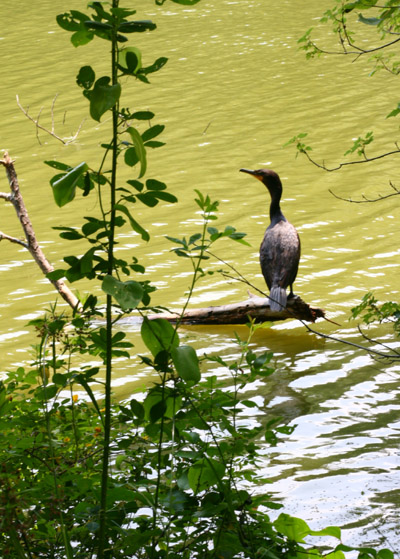 A few days back when I’d first spotted the cormorant, it was sitting quite close to shore on a log, and wasn’t terribly concerned with my presence, though it was plainly aware of me and likely would have preferred that I not be around. So far everything I’ve been able to get has been backlit, which is a shame, because cormorants have the most brilliant jade green eyes. It’s curious, actually; most of the raptors have yellow or brown eyes, and for the songbirds brown is the norm. Sandhill cranes have orange eyes, white ibis have blue, wood ducks have red, but cormorants are the only ones with green eyes to my knowledge (which, it must be said, is not comprehensive by any stretch.) If I don’t manage to get any close and well-lit shots showing the eyes soon, I’ll dig out some slides that I have which illustrates the color nicely. In fact, probably much better than the digital camera does – the color register of Fuji Provia and Velvia film beats the hell out of any digital camera or setting that I’ve come across, and if I had the ability to process it at home conveniently, I’d probably be using film more often. As it is, it’s getting difficult to find processing services, and more expensive – at some point I’ll do a post about “convenient mediocrity.”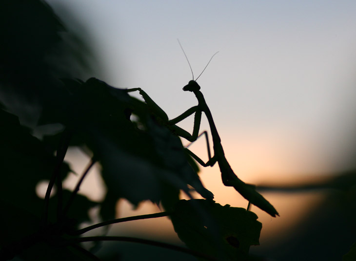
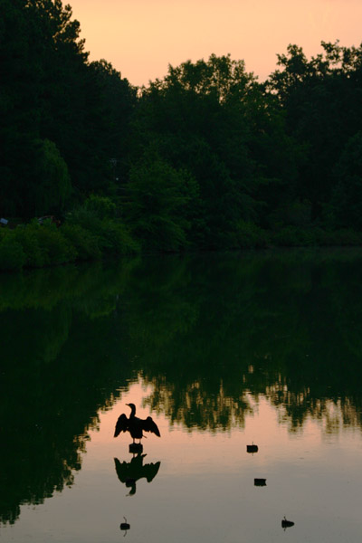 I’ll leave you with another version of the cormorant poses – still trying to decide which one I like the best. This one was tweaked a little to bring the background trees slightly brighter, giving a little more texture to the whole image. I’m wondering if I should have tried using fill-flash for this one as well, to bring out a little detail from the bird rather than rendering it a simple silhouette, but I’m not sure the flash would have produced enough light for that distance. I need to think about these things while I’m shooting, though, and not afterward when I’m looking at the images…



 Oh, look – “Adobe Flash has yet another security issue and is automatically disabled to force you to update it. You know, for your protection.” Is anyone buying this bullshit?