Anyone who’s ever dealt with livestock housed in a barn knows about the wicked unbalance of energy involved: it takes a lot more effort to remove the shit than it did to deposit it. This is an apt analogy for addressing theology.
Jerry Coyne and the various commenters at Why Evolution Is True had a great go at this, but it’s been burning in the back of my mind since then, and I simply felt like treating it in detail. And this will be long, as foreshadowed above, because it takes no effort to emit inanity that looks good, but it takes many times that to show why looks are deceiving (many times no effort? Isn’t that still no effort? Let’s ignore my writing weaknesses and move on…)
I am shamelessly copying Prof. Coyne’s quote direct, since I’m not going to fetch the book in question and spend even more time screwing with it, but this does mean any inaccuracies within it are not mine. This is intended as a critical-thinking exercise; what I’m covering here can be applied anyplace throughout the book, and many other places besides.
The book in question is The Experience of God: Being, Consciousness, Bliss by David Bentley Hart, considered one of the best theological arguments for god and/or religion, at least among those who already believe in the christian god. According to Prof. Coyne, it all reads like this particular passage, but quite frankly I don’t care – unless it is purposefully intended as either satire or a caricature, the issues with this passage are manifest, and context isn’t going to improve it any.
The essential truth to which Lonergan’s argument points is that the very search for truth is implicitly a search for God (properly defined, that is). As the mind moves toward an ever more comprehensive capacious, and “supereminent” grasp of reality, it necessarily moves toward an ideal level of reality at which intelligibility and intelligence are no longer distinguishable concepts. It seems to me we all really know this in some sense: that we assume that the human mind can be a true mirror of objective reality because we assume that objective reality is already a mirror of mind. No other comportment toward truth as a desirable end is existentially possible. The ascent toward ever greater knowledge is, if only tacitly and secretly and contre coeur, an ascent toward an ultimate encounter with limitless consciousness, limitless reason, a transcendent reality where being and knowledge are always one and the same, and so inalienable from each other. To believe that being is inexhaustibly intelligible is to believe also—whether one wishes to acknowledge it or not—that reality emanates from an inexhaustible intelligence: in the words of the Shevanashvatara Upanishad, “pure consciousness, omnipresent, omniscient, the creator of time.”
The first thing I will say is that, from a long history of reading stuff of this nature, the style of writing now triggers my bullshit detector right off the bat. Grandiose, assertive, and unequivocal – all warning signs that the writer is not presenting arguments intended to convince the reader, but statements aimed at appeasing those already in agreement; this can be said of virtually all theology. Still, plenty of people read this with great delight and find it convincing, so herewith, a detailed breakdown of why many others remain unconvinced.
The essential truth to which Lonergan’s argument points is that the very search for truth is implicitly a search for God (properly defined, that is).
Ignoring, for the moment, that curious caveat of “properly defined,” what Hart is expressing here is that mere curiosity implies god – a pretty substantial statement, especially when I can picture a puppy playing with a windblown leaf and a hawk shifting its head back-and-forth to determine if the movement it just spotted indicates prey. We have plenty of reasons to examine our environment to determine what’s happening, and the functionality of this can hardly be ignored. Yet, with the inclusion of the fatally-overworked word “truth” (twice, mind you,) Hart is attempting to elevate such basic behavior into a property of transcendence.
As the mind moves toward an ever more comprehensive capacious, and “supereminent” grasp of reality, it necessarily moves toward an ideal level of reality at which intelligibility and intelligence are no longer distinguishable concepts.
A quick, dirty aside: I’m fairly certain Hart intended to say that intelligibility and intelligence could not be differentiated from each other, and not that both words have lost their meaning, but that’s the way the sentence is structured ;-)
Ignoring that, there’s lots of contentious elements within here. Gaining intelligence, in the form of “ever more comprehensive grasp of reality,” does not in any way imply that ultimate knowledge is the goal or even possible, any more than my breaking into a run will “necessarily” bring me to light speed. Certainly, we seek knowledge, but a quick comparison of people you know will demonstrate that some seek it more than others, while few believe in any way that there’s a saturation point.
That’s not even the main thrust of the sentence, which outright says that knowledge will reveal reality itself to be intelligent – otherwise we couldn’t understand it; that’s the conflation of intelligible and intelligence he alludes to. The history of science shows this to be not just a vast assumption, but a peculiar one as well: if anything, our expanding knowledge has revealed that the universe, despite its complexity, is remarkably simple, governed by four fundamental forces and extremely predictable processes. This is exactly what theologians are so desperate to deny, but a mere assertion isn’t any kind of rebuttal to the years of research we have that establishes this simplicity.
It seems to me we all really know this in some sense: that we assume that the human mind can be a true mirror of objective reality because we assume that objective reality is already a mirror of mind. No other comportment toward truth as a desirable end is existentially possible.
While I have run across the occasional moonchild that expresses such sentiments, it’s safe to say this is far from a viewpoint we all hold – some of us find it to be vapid nonsense. No one has to assume the mind can “mirror reality” to seek understanding, only that it can produce an accurate enough model to provide functionality to us. Yet we also find it enormously entertaining when our minds are fooled, as with optical illusions or, really, any work of fiction to be found. It is these very works of fiction that give an indication that it is not objective reality that is so important to us, but the appeasement of a wide variety of desires despite reality – this runs the gamut from fantasy to drug addiction, romance novels to video games. If anyone did, in fact, consider these mirroring objective reality, that’s what we call mental illness…
But, “No other comportment toward truth as a desirable end is existentially possible.” This sentence, a definitive pronouncement based on vague and arbitrary terms, is a linguistic failure. “Truth” is of course the golden child of all religions, yet its usage invariably refers to something that we cannot establish or even quantify, certainly nothing so bourgeois as evidence. While “existential,” in philosophical terms, refers to the subjectivity of meaning, as in the stuff that people search for – which by extension indicates that anything is “existentially possible,” since it’s up to the individual to establish it for themselves.
The ascent toward ever greater knowledge is, if only tacitly and secretly and contre coeur, an ascent toward an ultimate encounter with limitless consciousness, limitless reason, a transcendent reality where being and knowledge are always one and the same, and so inalienable from each other.
Let me proffer another analogy: this is just as nonsensical as saying that the act of eating is the ascent towards consuming the entire universe. Religious folk do so adore their superlatives and absolutes, and I can only consider this a mark of insecurity, the quest for something that cannot be surpassed or beaten. If we stop to think about it, though, what would we really get from omniscience, or as Hart puts it, limitless consciousness and limitless reason (I suppose he thought he was being gauche to use the simpler word)? Nothing left to discover, nothing able to surprise us, nothing remaining to see or do or experience in any way? That sounds like a recipe for ultimate stagnation to me, but then again, I’ve actually thought about the consequences of such concepts, rather than simply stringing together unsurpassable abstracts to foster feelings of awe.
And, holy shit, contre coeur!? This alone earns Hart the Pompous Fuckhead Award, since the term means simply, “reluctantly.” That’s all – no subtle nuances or unique properties. What possible purpose could there be to supplant a common word with a (misused) French term, except to try and dazzle the reader with worldliness? Seriously, this is a strong indicator that the writer is not motivated by communication or understanding, but by the desire to be seen as learnéd. Not a good sign at all.
To believe that being is inexhaustibly intelligible is to believe also—whether one wishes to acknowledge it or not—that reality emanates from an inexhaustible intelligence: in the words of the Shevanashvatara Upanishad, “pure consciousness, omnipresent, omniscient, the creator of time.”
“Whether one wishes to acknowledge it or not.” Do you like that? It’s Hart’s feeble attempt to make anyone who challenges his overreaching and unsupportable statements feel self-conscious about their motives. And this is supposed to be one of the better arguments…
But who, anywhere, believes that “being is inexhaustibly intelligible” as claimed here? There’s a huge difference between, “there’s a lot more left to learn” and, “the whole universe is able to be understood.” Events long past are likely well out of our reach, and plenty of neuroscientists express doubt that we could ever fully fathom even our own minds. Yet, there’s two relevant items to consider. The first is, we can never assume that we cannot learn about anything in particular, because that halts inquiry. The second is, it’s pretty astounding what we have learned, and a great deal of this is due to understanding simple properties. But this statement from Hart is a variation of a common religious pout: “science thinks it can answer everything!” Ignoring that no one has ever claimed any such thing, we should recognize the hulking, loathsome hypocrisy of this accusation coming from anyone who then pronounces their belief in the ultimate meaning, intentions, or nature of the entire universe and any supernatural realms, especially their own part in it.
[Another aside: there can be no such thing as a “creator of time.” Time is change; without time, there is no change, and thus no creation. Not to mention that no one has presented the least evidence that establishes such a being – but this doesn’t stop them from pronouncing it with the utmost confidence.]
Disregarding that, the only way that Hart has even introduced that an intelligence is to be found is by claiming that the very act of learning can only find intelligence. Or at least, if we look hard enough. This one’s more subtle, but he’s saying that only those who are really smart can find god – it’s inevitable!
That pretty much sums up every bit of theology I have ever found: assertion and self-affirmation. When it is important for someone to justify their belief in any god, this kind of writing serves not just to appease them, but throw in a little ego-stroking as well. Go back up to that part about the mind “mirroring reality,” and thus reality mirroring the mind – this is implying that if we can think about it, then it’s really true (this is a variation of the ontological argument, by the way.) How incredibly self-indulgent is that?
What many people fail to consider, I believe, is that intellectual and intelligent are not interchangeable. Hart throws out bold pronouncements in a seemingly-erudite manner, attempting to give the impression of a seasoned academic, by extension conversant with all facets of knowledge that might apply to this topic – of course he considered the biological and the epistemological angles! Yet he has assigned overblown transcendent properties to the very simple trait of seeking cause-and-effect – something that many other species possess to varying extent, and that we have numerous studies detailing quite extensively – and then uses these abstract properties to extrapolate a universe of intelligence. This isn’t even the common fallacy of equating correlation and causation, and makes the corrupt slippery slope argument seem feeble; Hart is claiming simple emotions point undeniably to something even larger than physical laws – yet undetectable by physical means. One wonders what he could make of jealousy…
If, however, we look for something useful in here – let’s say, a manifestation of this universal intelligence, or a way it can be used, or how this answers the question of the one true religion – we won’t find anything. This is the difference between emotional supplication and functional knowledge, and why theology will remain forever in the back of the class, sending illiterate text messages. Even if we, just for the sake of argument, assume everything Hart has proposed here is accurate, what can we do about it? An ultimately pervasive intelligence, one of pure consciousness, doesn’t really provide anything for us, does it? To be of even personal affirmation use, it would have to have some other property, such as answering prayers, or giving us everlasting life, or somehow being benevolent – not just intelligence, but intent and empathy, at least – none of which Hart has even attempted to support. The huge chasm between most of the sophistry-laden theological arguments and the gods that people want to believe in goes unnoticed, even though it’s pretty much like saying that we can soon travel to other stars because gravity.
The worst thing is, coming up with this kind of shit isn’t even hard:
“Since we are made up of molecules that came from stars, it stands to reason that our souls bear this connection, and thus not only do we have portions of souls from beings long past, stars themselves are the sources, and have souls themselves.”
“Pain is a common factor of life, even among the lower animals – it guides us away from harm and towards more beneficial actions, which can only result in an ultimately painless existence; therefore seeking pain is a path towards freedom from pain.”
“Some of mankind’s greatest emotions come from sports and competition, and we could not have these traits without both intent and purpose; therefore, we must assume that god approves of playing games.”
Seriously, I could do this all day. Infuse a bit of flowery language and a whole shitload of assertions, throw in a touch of ego-stroking, and people will eat it up as sophisticated, transcendent wisdom. I don’t have to be smart, I just have to be smarter than my audience, and spoon-feed them some affirmation. Because they’re not looking for functionality at all.


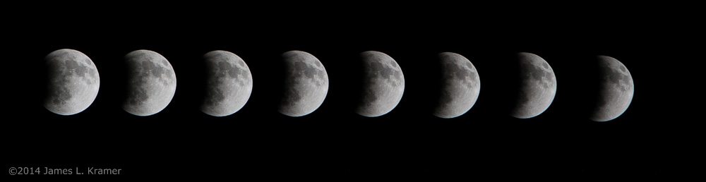
 A couple of years ago, I captured a particular sequence of images that didn’t quite cut it, as far as I was concerned, and I’ve been trying to get a better set ever since. This evening, I was successful.


 I am changing my tactics slightly with this post, in that I am announcing Earth Day early, so you can actually plan to do something or call in sick or whatever strikes your fancy. If you needed more warning than this, well, that’s your problem – get a decent calendar next year.


 What I have been mostly after was more detail shots of praying mantids hatching, and the park hosts several egg cases in locations I’ve memorized now. So far, no luck – one definitely displayed the debris that told me I was too late, and a couple of others seem to indicate likewise, but I’m still holding out hope I can add some nice images this year. But while there, I grabbed some other frames as I explored.
 I’ll provide a couple more images of those blossoms, taken only a few days apart – if you know what these are, feel free to comment. I tried numerous different search terms for the color of the latter stages seen here and couldn’t turn up anything at all. Of course, I’m a guy, so my color vocabulary is limited – I resisted the urge to call these “beef-colored.” The leaves haven’t developed far enough yet to use as a guide, and even searching under “inverted flowers” turned up nothing that looked close. Trees have never been my thing.


 I decided to try and answer a couple of questions raised in the post about the


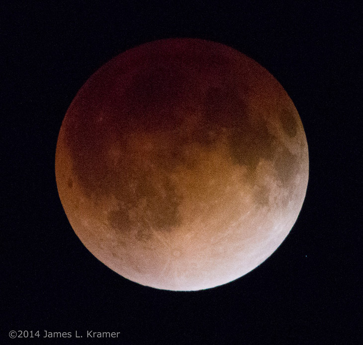
 By the way, there’s another form of light that can fall onto the moon, called earthshine, usually visible only with a thin crescent. At such times, the sun is almost behind the moon from our vantage, shining largely on Earth at the same time (meaning the Earth would be gibbous when seen from the moon.) This light is reflected off of the Earth and shines on the night side of the moon, reflected back to us here on the night side of Earth. It is, not surprisingly, quite dim, so exposure times to capture it will almost always result in blowing out the sunlit portions of the moon. The best time to capture this is with as thin a crescent as possible, and the only times to see the moon with a night sky in those phases is right after sunset, or right before sunrise, waxing or waning crescent respectively.