This one was inspired by this recent post, but let’s look a little closer at using photos for illustration.
While all of photography might be considered illustration to some extent, there’s also a more specific purpose, separating it from genres such as portraiture, journalism, art, and so on. If it helps, the idea is to visually represent something explained in accompanying text, or provide a good example for identification. Advertisements, of course, provide illustrations of their product, and some images are aimed not just as displaying some subject, but invoking a mood or environment at the same time.
Yet, those ‘excluded’ topics above can also be illustrative in many ways: a portrait can include elements of hobbies or interests, and photojournalism often provides a portion of a story. Even tourist shots can fit the bill if one thinks in the right terms. One thing I often tell my students is, the photo stands alone. It doesn’t matter how hard it was to get a particular shot, or how limiting the conditions were (even those these can make good backstories); the image is strong or weak on its own, without excuses or explanation. The same can be said for choosing what and how to shoot; does the image convey the conditions or locale adequately? Does it give the intended impression? If someone sees just the image, how much can they infer from it, and does this match with your expectations as the photographer? Note that your expectations are not necessarily to be accurate – it’s just fine to give an impression that belies the reality.
The hardest part of this is recognizing the subconscious cues we can take from images. Overcast skies reduce the reds and yellows, the contrast and distinct shadows, and so we’re able to spot images taken in such conditions – even when we can’t always put our finger on why we get this impression. Shadows can produce certain moods, especially in how they fall across faces. It can take time to realize what factors are at work in our own images, and the best advice I can give is to look at a lot of photos, especially the ones that provide the strongest feelings (good or bad,) and try to pick apart what visual aspect produced the effect. Imagine it in different light, or with a different background; plot the colors you see, not the colors you interpret.
All of that reflects how any image can be an illustration, something that evokes a mood or tells a story. But what about the very specific uses mentioned earlier, where the point is to give a visual to the story or text? What are the more effective ways of going about this?
Knowing your subject can help a lot. If there’s anatomy or behavior unique to a species, flora or fauna found only at this locale, even a particular style favored by this artist, then you know what to try and illustrate, at least. Very often, simply catching something happening puts you ahead of the game, because the image is no longer just “this,” but a slice of life – I know I’ve shot more than a few images of behavior I didn’t recognize at all, to research it later (and learn something in the process.) This approach doesn’t let you prepare as much as would be ideal, which I’ll touch on shortly, but at least you’re getting something that could be used in more places than just a ‘portrait’ of the subject.
The ability to portray a subject in different ways is useful, and again, this may take looking at a lot of images to get the feel for it. Food illustrations are often in soft, yellow-orange lighting in a cozy setting, communicating relaxed and comfy – imagine how poorly it would work to see food in a clinical setting instead. Product photos often go for dramatic lighting and angles, even using lens distortion to enhance the perspective. Travel images (I know this will come as a shock) display ideal vacation weather, but think about this for a second: the photographer not only had to be present for the right sky and clouds and surf conditions, but have the light angles pinned down and just the right amount of attractive ‘tourists’ in the shot. Illustrations often rely on what’s not in the image to help sell the idea.
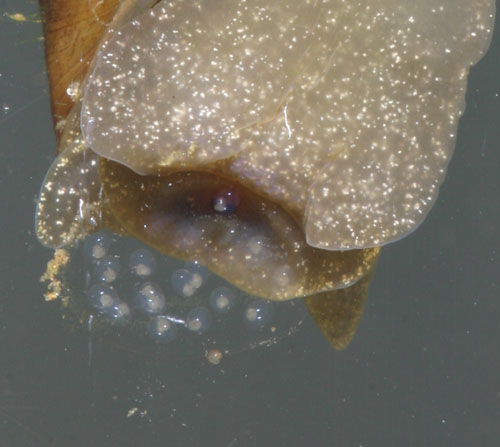
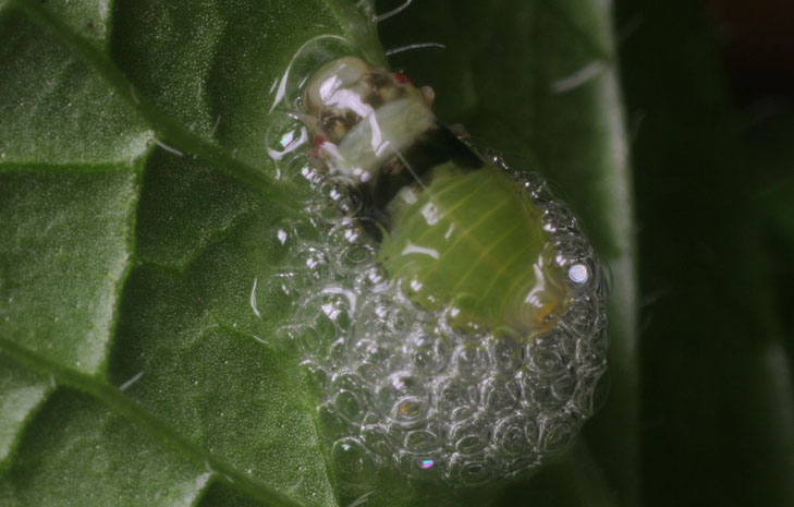
Not surprisingly, if you intend to illustrate something, it should be very clear and distinct, yet you might be amazed at how easy it is to miss this. Backgrounds should be undistracting yet appropriate; key details should have good focus and necessary contrast (which means not too much or too little.) For instance, insect wing veining shows up against a brighter background, but the iridescence from the transparent membranes requires a darker one. Shooting from eye-level is enormously helpful for any subject that has them, from pets to children to reptiles – it’s no surprise that I crawl around or climb on things a lot, but every photographer should recognize the value in this.
Which leads into the next part: take a lot of images. Subtle variations can make large differences in the overall effect, and some things may not be immediately apparent in the viewfinder or even the LCD preview, especially if a flash is being used. It rarely hurts to approach the illustration in multiple ways too, if possible – choices are never a bad thing. This doesn’t just mean layout, but also consider changing focal lengths (which can affect distortion and perspective,) aperture (which affects background blur,) lighting color, and perhaps even the mood or setting you chose initially.
Depending on how serious you are about illustrations and how often you might have to tackle them, you may end up needing a lot of equipment – lighting and its accessories foremost, but also backdrops, props, braces and supports, and so on. I have several items I use for mini-studios for insect work, and I’d have a more dedicated studio if I had the space (mostly to save the setup and teardown time.) I’m always focused on the money-saving end of things and rarely see any need to pay for professional equipment when anything else can be used instead – my reflectors are often sheets of paper or matboard, diffusers are fabric or white plastic bags, and supports are stiff wire with alligator clips attached. Such efforts apply very well when you only have to produce illustrations on occasion.
The more you do it, the more techniques and tricks you learn, like using petroleum jelly on plant stalks to prevent an insect subject from passing a certain point, stretching a bit of nylon stocking over a lens for a soft-focus effect, or putting small items on a lazy-susan turntable to change shooting angle easily – a variety of different books to stack beneath changes the height quickly too. Very often, you’ll be forsaking spontaneity for staging, candid for controlled – not everyone likes this idea, but it’s hard to produce good illustrations, routinely anyway, without it. This is where slowing down and considering the end result provides the greatest impact.