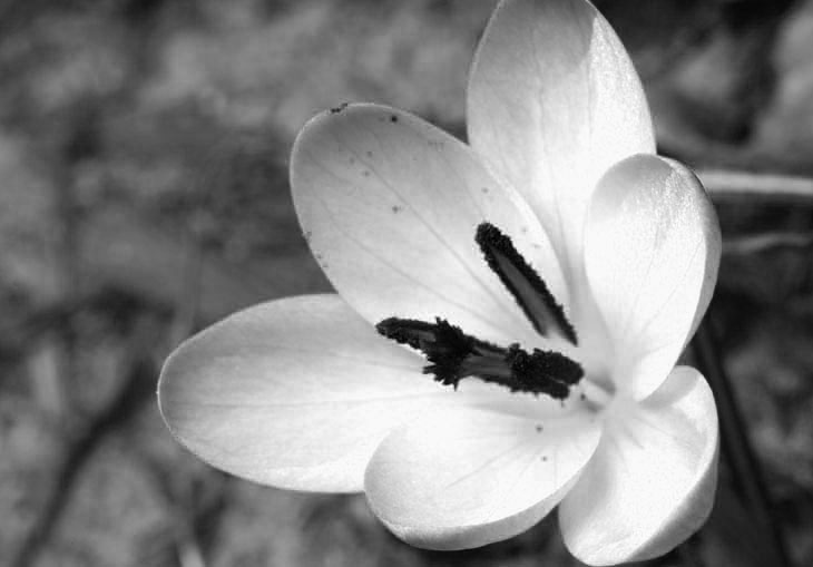
No exact species for this one, just a crocus planted by The Girlfriend’s Younger Sprog at the old place last year, a welcome bit of early spring color while nearly everything else was dismal. But for giggles, we’ll boldly defy the topic and go monochrome, in a special way.

This is the same image, converted to greyscale, but with one important distinction: it is solely the blue channel. The red and green channels, the others that comprise RGB image files, have been deleted. I discuss this is greater detail here, but basically, some images look better in monochrome when only one channel is used. Most times it’s not the blue channel, which tends to be blotchy (on the cameras I’ve used anyway,) but in this case it had a distinctive effect. The complementary/opposite color for blue is yellow, so in the blue channel, anything that had significant blue in the original image will appear bright, while anything yellow will appear dark. Thus the deep contrast between the purple petals and the orange pollen. Since the original image wasn’t very contrasted in brightness, simply converting it to greyscale with all three channels produced a lackluster effect. Just one of those things to experiment with.
I still like the color version better, though.


