


I’ve been slowly building a small collection of experimental monochrome images and figured they might as well show up today, because who wouldn’t appreciate more grey on a Monday? Plus, it’s been a while since the last one, though less so if you count the crossovers…
Anyway, here’s what I’ve come up with. Promise you won’t laugh.

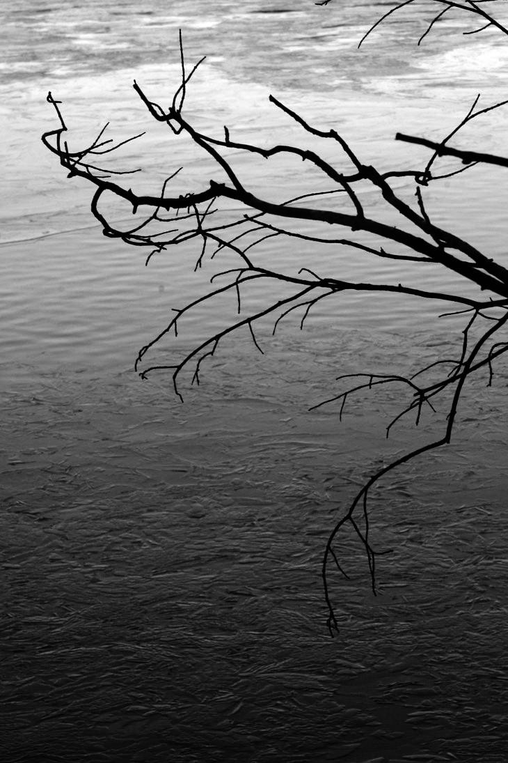
I don’t remember exactly what I did for this one, since it was a while ago, but from playing just now, I believe this is a blend of the Green and Blue channels after doing the channel separation thing, though I also did a little constrained contrast tweaking and dodged the area around the gulls to make them stand out slightly better. The color original is here, by the way. Each channel had strengths in different regions of the frame, so to bring it out the way that I liked, I couldn’t pick just one, but the main focus was certainly the contrast around the obscured sun.

The color register of the original is a little wonky, coming from a slide film that didn’t mesh well with conditions, but selecting just the Red channel worked out. If your monitor gamma is adjusted right (or at least, like mine,) you should just see the windows on the shadowed side of the lighthouse (this being the Currituck Beach Lighthouse in Corolla, NC.)

Juvenile green treefrogs (Hyla cinerea) have a distinct iridescence to their skin, especially when seen close, and the Blue channel was the one that brought this out, this time around – many times, the Blue channel is blotchy and low in detail, which can still be seen if you look at the background.

I did the light coming through these giant leaves as an abstract, many years back, I think in the butterfly house of the Museum of Life & Science, but it does okay in monochrome too, the Green channel this time. The original was all green, which might make you think that the green channel would be overpowered, but it all depends on the shade of green. Actually, few things that we might photograph come up in the unadulterated hue of green that makes up the RGB spectrum, so the channel usually doesn’t get too contrasty. Red is another matter, though.
This one is also just the Green channel, though the original is monochromatic blue in tone. Just goes to show you…
[Actually, I boosted contrast a little too. Sue me.]
Now a demonstration.
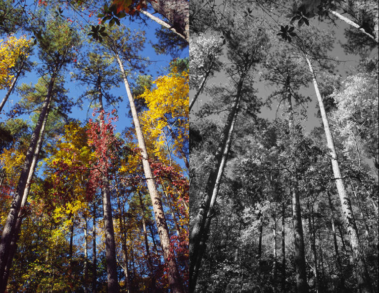
The one on the left is the color original of course, a slide from over two decades ago within Duke Forest, while the right side is just converted to greyscale. Now let’s look at what only the Red channel does.
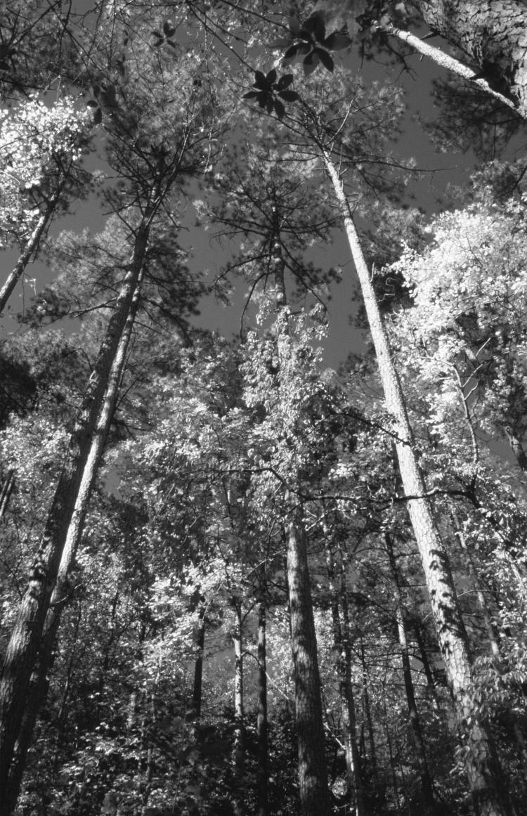
Definitely added a little more contrast in appropriate areas, and gives more of the impression of fall colors than just using greyscale. This is why I always encourage experimenting.

I liked the stark effect of this one. The original had very yellow leaves, a bit backlit, so using the Blue channel meant that the leaves dropped into darkness (Yellow is the opposite/complement of Blue in the RGB scale) – except where the white light shone through, since white is all of the colors at ‘full strength,’ the tops of their ranges. I tweaked contrast a little to make it starker and more otherworldly.
[By the way, I tried out many of the images on that linked page with channel clipping. Some had less of an effect than you might think, while others have appeared before as monochrome versions.]

I was thinking I’d shown more of this castle previously, but apparently not, or at least I can’t find it if I did. This is Squire’s Castle in Ohio, done in just the Red channel to drop the details of those rock walls to the lower registers. Is it ominous, foreboding, or creepy? That’s kind of what I was trying for, starting from the imposing perspective of the original, but I’m not the proper judge of whether I succeeded. I’ll take a lack of comments to indicate that I did a fantastic, in fact insuperable, job of it.
And my favorite, at least from this round of experiments.
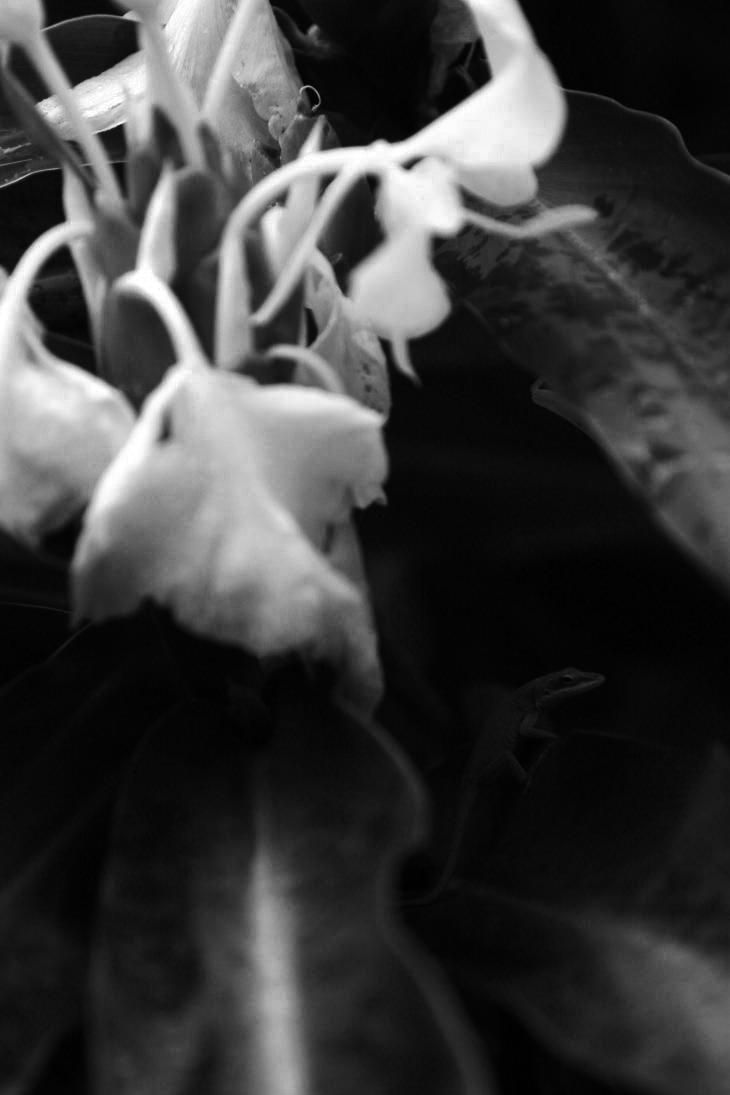
So, one of the things that I intensely dislike about the new LED monitors is how sensitive their apparent gamma is to viewing angle – look at them from a position above or below the ideal perpendicular sightline, and the brightness changes drastically, so I have to remind myself while editing to sit at the right angle. This one is supposed to be very subtle, but if I slump a little, the Carolina anole (Anolis carolinesis) in there practically vanishes, much more so than in the original. This is the Red channel, by the way – the anole almost completely disappears in the Blue channel.
There – that should satiate those greyscale cravings for a little while. Unless you’re really weird.