


Which, for those of you too slow on the uptake, is short for, “Desaturation Saturday,” dedicated (mostly) to monochrome images, also known as, “Sat de sat,” “Sabato senza colore,” and, “Quit relying on your stock images you lazy shithead.” Yes, once again we’re completely defeating the reason you bought that high-end color monitor (of course you’re viewing this site on a proper desktop computer) and showing off nothing but grey. Mostly.
It all began when art teachers couldn’t master color developing in the darkroom and made black & white into something edgy, back before “edgy” was even a term, though they totally would have adored it if it was. It gained a lot of traction when photographers found they could call their nudes “art” because they were monochrome, and museums actually bought it. Eventually it became de rigueur among art directors who use the term “de rigueur” unironically. And here we are.
[Now, this is a little creepy. This post was about half written when I did a search to find something I’d covered previously, and I discovered this post from last year. Really, I had forgotten completely about it, and these images, edited over a period of several weeks, were only intended to be put up during the slow season when I needed a post and hadn’t been shooting much – the weather right now is seeing to that quite handily. So, we have an entirely unintentional callback, which you won’t believe and I don’t care.]
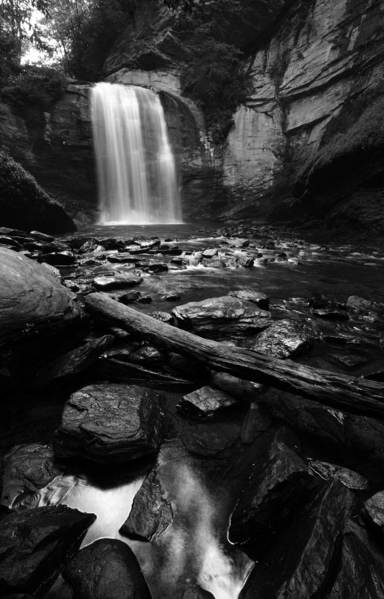
We’ll start with one from the ancient depths of time, back before the continents took shape, or at least, back not quite two decades during my time in Florida. Close enough.
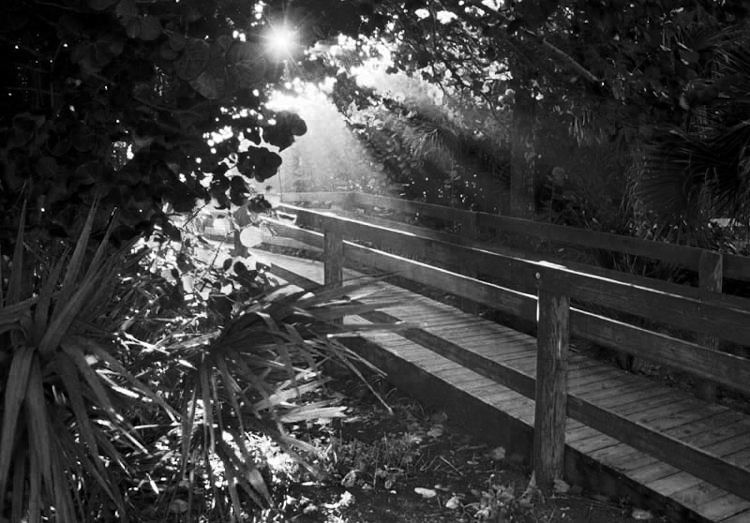
I liked the way this image was composed, and the light levels, but the color print film that I was using for it was not at all right for the subject, or perhaps any subject – my scans weren’t even impressive, and no amount of editing brought the image where I liked it. So I went mono, using the red channel for this one, with a slight and very selective tweak to contrast.
[Two notes here. First, I’ve found contrast adjustments work much better using the Curves function than anything else, because you can determine where the brightness of any aspect should be – midtones can come down while the rest isn’t moved, for instance. As with any editing, it should be subtle, or you may end up with curiously flat and unnatural tones in sections. Second, film behaves slightly differently in channel clipping. With digital, a particular channel (usually Blue in my experience) can get ‘blocky,’ as if overcompressed by jpeg algorithms, making it a bad candidate for being the sole channel chosen to convert to monochrome. With film however, any channel can and often does get grainy, but usually all three will in equal amounts, and when converting to greyscale, graininess is often just fine, mimicking the monochrome films of old.]
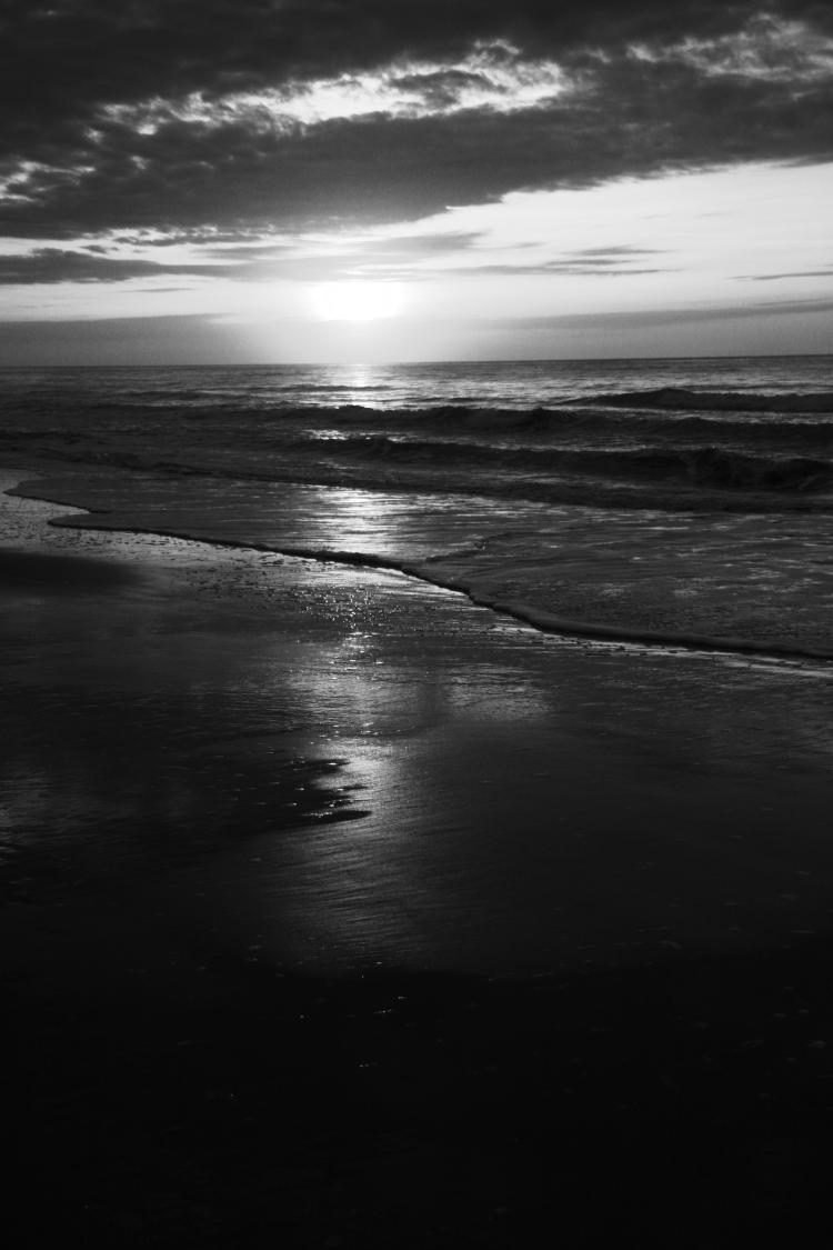
We’ll continue with the red channel for a bit.

If I recall, either of the other two channels (Green and Blue) did okay here, but red gave the best contrast, which is often the case. I’m not sure I did any contrast adjustments, since the original was already in a great range, one of the reasons I chose it for this treatment.

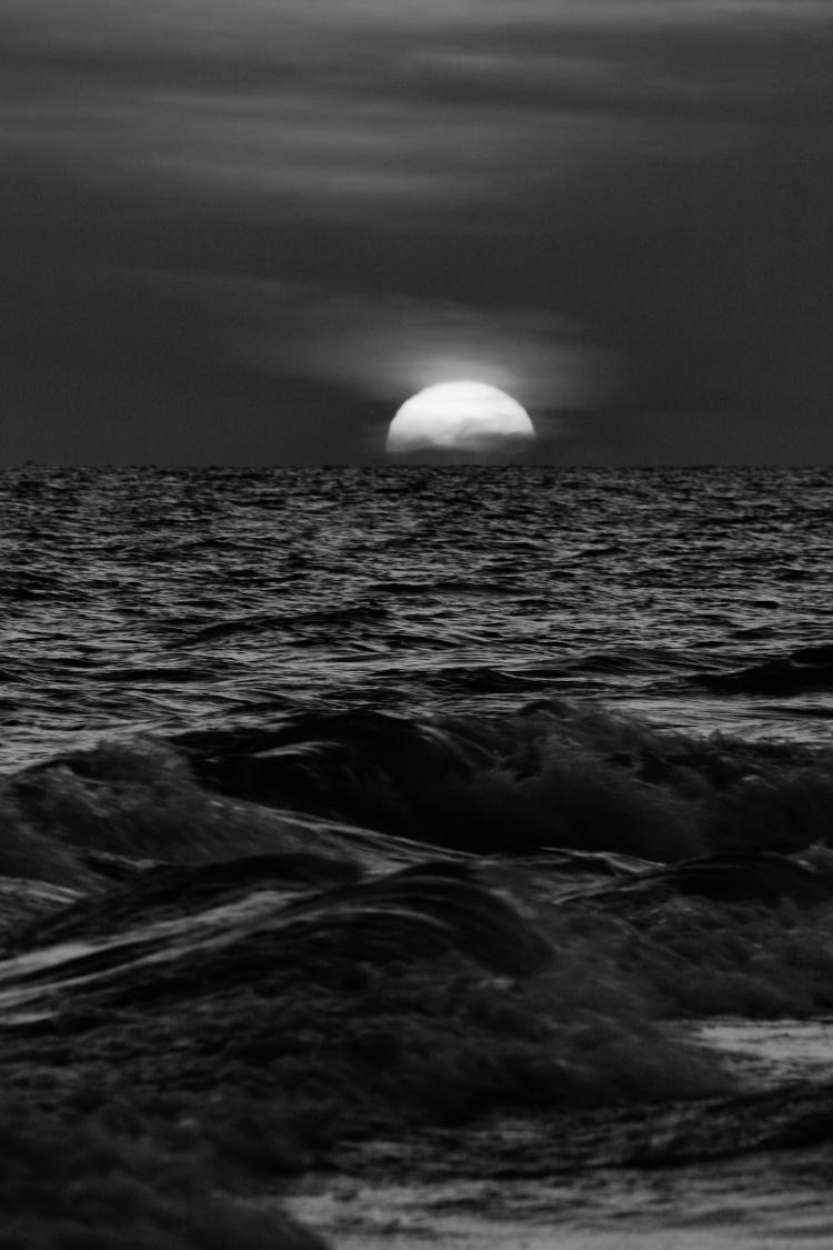
Any of the channels rendered the lake and the egrets the same way, but the Red kept the subtle cloud variations in the sky.

I always check just to see, but it was no surprise that Red won out on this one, since the clouds were pink and the sky deeper purple. The other two channels simply destroyed the bright contrast from the clouds.
Before we leave the Red, we’ll have a curious example.

It works, stark silhouettes against an impressionistic background. But I never realized how curious the original was until I was comparing these back-to-back, which we’ll see here in an animated gif (pronounced, “JAY-peg.”)
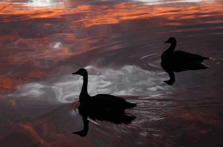
Now, the original looks a lot more like I choose selected areas of a monochrome shot to add an orange tint to, but there really was a band of almost pure monochrome across the original digital image, courtesy of the layered clouds selectively catching the predawn light. I’d never really noticed how unsaturated it was.
Now we switch to the Blue channel, because sometimes it works.

You can see the original here, for comparison. The Red channel brought out that blossom to the left better, but not the others, while the Green channel made the leaves brighter than I liked. The bright blossoms draw the eye, making The Boogs (you know, the cats – have you been here before?) almost a secondary subject, but they’re not too subtle.
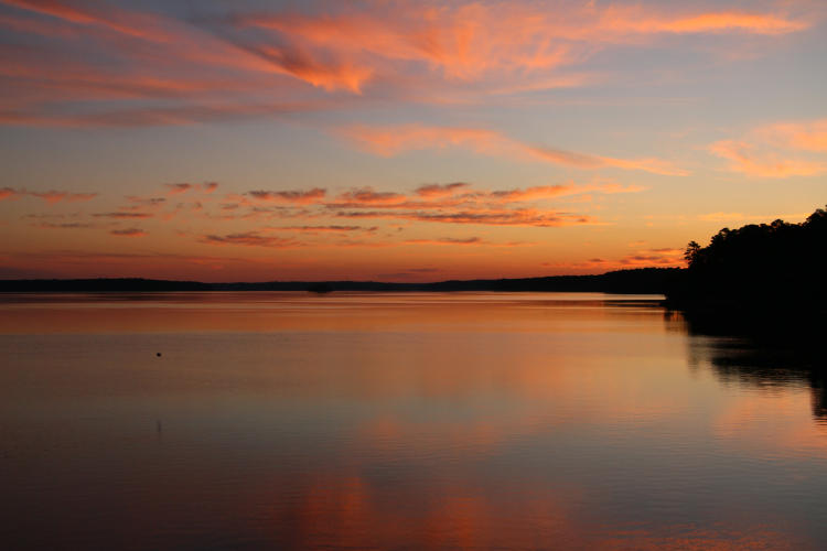
But as I said, most times Blue doesn’t work well, and can produce very muted results. Example:

Pause here and just let the mood sink in, establish a nice impression of the conditions. I’ll add a little space below.
Space
Gimme some
… space
Ready? Okay, now we go to the Red channel.
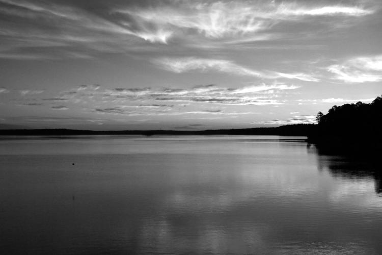
Different impression now? They’re really the same image, which is this one:
This gives an idea how the different channels are represented, but really, the best way to see this is to do it yourself.
Now we’ll start playing around with a little more advanced technique.
You may find that one channel has a fairly good effect, but a little too high contrast, while another is too low but enhances a certain aspect of the frame. Whatever will you do? Well, since the channel clipping method presents each in layers, instead of choosing only one, you choose two, one atop the other, and then adjust the opacity of the top layer to let the lower one bleed through, combining the two in an adjustable manner. That’s what we have here, the Green channel letting the Blue show up a bit to render this in the way that I liked best. This is a vertical variation of the one seen here, by the way (a canvas print of which, left over from the gallery show, sits above my desk here in Walkabout Studios, which technically is my desk – I don’t even have the whole office.)
Another variant of the same method.
This time it’s the Red and Green channels, tempering the blowout of the Red channel from the bright yellows and oranges of the sky while keeping most of the contrast. The original already had good contrast, especially on the sand (the reason why I choose it – it’s much easier to do high contrast monochrome if you start close at least.)
One more? Kinda similar, I know.
This is Green and Blue – the Red channel was way too bright in the sky, and even the Green channel largely rendered the sun as a pure white semi-disk, so the Blue channel tempered it down to allow the clouds in front to be seen. But since the opposite of Blue is Yellow in RGB color space, the largely yellow sun was very dark in the Blue channel, so the opacity change could go too far very easily.
Note, too, that you can also do contrast/Curves adjustments in individual color channels, whether you adjust the opacity or not. Go wild.
Now we depart from monochrome for a pair of examples that I was playing with at the same time.
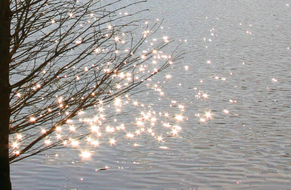
The original was much wider than this, including the whole tree and the horizon, but that meant the starbursts in the glitter trails (courtesy of the smaller aperture) were made far too subtle, so this is a tight abstract crop to enhance them – as well as boosting the Saturation all the way up to the top setting, which worked only because the saturation of the colors was already pretty low to begin with. I’m quite pleased with the result.
But, it’s a shameless editing job. I mean, even more so than what I just said. Let’s compare:

The original had a few stray weeds and branches poking into the key parts of the frame, and I eventually decided to simply clone them out – which took a while, given the complication of the background. But it came out better than expected, almost no indication that they had ever been there, and now it looks like I added those branches to an original image that lacked them. Which I take as a vindication of my efforts, but I’m easy to impress [“No duh, Al…”]
But while we’re at it…

Since I snagged this shot as the osprey passed almost directly in front of the sun, the only thing that I did with it was to increase the Saturation to full – and then did it again, with a slight tweak to contrast to render the osprey a bit darker. The rainbow bands were already present, a glare effect from the sun and the lens (which is considerably less than I would have expected – the Tamron 150-600 really does have excellent flare reduction.) It would be easy for anyone to see this and assume that I’d added in all the color, trying to be surreal, but all I did was enhance it. Still, for that very reason, I probably won’t be using this in any fartistic manner, unlike any of the others in this post.
Anyway, that’s a few pics for the slow season, and perhaps some ideas. If you feel so inclined, I wouldn’t turn down funding for a trip to Florida or Costa Rica to produce more current and interesting content. I’d even provide you with exposure in compensation…