Or, if you’re less hip, you might know this as black & white, or monochrome, or greyscale (grayscale, what-evah,) or einfarbig. There are a lot of ways to accomplish it, but the first thing to consider is what you’re after. In times past, all photography courses required not only shooting in B&W, but developing it as well. I won’t knock this in the slightest – there’s something very cool about developing and printing your own images, and darkrooms are easier to set up than you might think – but it isn’t really a staple of either mastering photography, or of doing it ‘artistically.’ Yet, there are circumstances where it works very well, and knowing how to use it is another aspect of composition.
 I am not a master of monochrome by any stretch, so this won’t be a definitive guide, but I can still provide some pointers. The first is that, more than with other approaches, your key factor is contrast. Actually, contrasting light levels, since colors can provide contrast too. Note that it doesn’t have to be high contrast, and in some cases, the gradual shading from light to dark, otherwise known as gradient tones, can look pretty good in monochrome.
This means that you’re on the lookout for two conditions: first, where the light is harsh, most especially from one direction, and producing distinct highlight and shadow areas. Bright lights at night are a favorite, if a bit overdone. Second, conditions where the shadows drop off gradually, sometimes where the light fades around a curved or textured surface, or changing tones in the sky. In some cases contrasting colors will actually work, but this is tricky, because when the color hues are removed, the contrast is reduced and sometimes eliminated completely. While blue and yellow contrast wonderfully, when converted to greyscale they might even match in brightness and lose much of their distinction. However, a little further on I’ll talk about some tricks to use for color contrast.
By the way, there are multiple reasons why B&W is used for night scenes. Mostly it’s because that’s what we expect to see, since our color vision disappears in low-light conditions, so much of our night vision is in grey tones anyway. Another reason is that the film noir style of photography and cinematography exploited these traits of monochrome films, so we’re culturally conditioned to see such as art. There’s even an evolutionary aspect, believe it or not, in that we see shadows as hiding something, perhaps dangerous, so dark patches are viewed as mysterious and spooky, and thus this mood becomes an integral part of such images.
Achieving monochromatic shots is easy, even digitally, but making them look good requires a little more attention. While not every image needs hard contrast with distinct areas that are completely black, and completely white, there are plenty of times when you want to accomplish this, more than the conditions warrant. Simply converting to greyscale, or shooting on B&W film, often isn’t enough – you’ll need to help things out a bit. In the film world, this may be choosing certain films, pushing film (shooting and developing at a higher ISO than rated, which increases contrast,) printing with filters, and even tweaking both chemicals and developing temperatures. Digitally, this could mean increasing the contrast settings of the camera, which I don’t recommend because you have little control over what details may be cut off. The better way is in digital editing, and my preferred technique is by using the ‘curves’ function.

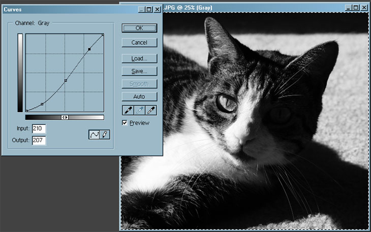
With curves, you are provided with an X-Y graph that plots all of the brightness tones in the image from full black (bottom left) to full white (top right,) and can change these tones as you see fit. Sliding a corner point in either direction controls where the detail drops into pure black (or white,) while changing the line in the middle controls the brightness of any particular tone in between. Shown here, I made the overall image darker – notice how the line departs from the diagonal that would cut straight across the middle – but made the darkest tones even darker (lowest dot on the curve) while bringing the brightest points back up a little from the initial curve (higher dot, creating a slight S-curve.) This increased the contrast a bit as well, but allowed the shaded eye of the cat to remain faintly visible, my primary goal. In some cases, you may not have your shadows dropping all the way into blackness, so you would slide the lower left corner point more towards the right side, causing the darker portions to drop off faster and produce those nice black areas you’re after. It takes some practice, but this gives the most control as far as I’m concerned.
A quick side note: You can adjust curves in color images too, for the whole image (in which case it adjusts the brightness levels like we’ve just done) or for each individual channel, which renders that color with different brightness and contrast as desired. When your image has a distinct color cast to it, this is the best way to correct it. I do this very frequently with digital images, because no camera that I’ve ever handled renders accurate colors every time, and white-balance functions are fairly haphazard as well. But, adjust your monitor to get accurate color first!
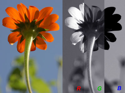
 Another fun trick is channel clipping. Any digital color image is rendered into a channel for each color, in most cases Red, Green, and Blue (where those “RGB” references keep coming from) – or maybe even Cyan, Magenta, Yellow, and Black (CMYK – “B” was already taken by Blue who got there first.) You can open the Channels window in your editing program and click on each channel to see what the contrast levels are in that color register alone – sometimes this produces a much more interesting tonal shift than simply converting the image to greyscale. If you find one that you like, simply delete the other channels and keep the one, though you might have to convert this single channel alone into greyscale depending on your program. The right side of this image is each channel rendered into monochrome, illustrating how different each appears for the same photo. It might even help to convert into CMYK (if the original is RGB of course) and try channel clipping there to see if the effect is more to your liking. And of course, you can adjust the curves in the remaining channel as well.
When using monochromatic film, there’s a ‘curves’ style trick too. Many people are confused to know that there are color lens filters specifically for black and white film – what possible use would these be? But as that image illustrates to some extent, when you use a green filter, everything green remains pretty bright, while other colors get darker because they’re largely filtered out. In this way, you can enhance the contrast between colors. A blue filter on a blue sky will make the sky lightest while darkening the clouds slightly, and may cause the clouds to just about disappear against the blue sky, while using a yellow filter will make the blue sky very dark (there is little yellow to let through) while keeping the clouds pretty bright, and really makes the clouds stand out.
When doing your own lighting, like in studio work, you can control the rendition of highlights and shadows as you see fit, at least to some extent – it helps to do a few test shots to see what kind of tonal range you’re capturing from your film or digital settings (and by no means trust that damn LCD on the back of the camera.) This way, like in the image at top, you can set the light angles and intensity to achieve the shadows and tones desired. Most people would say that the light is coming solely from the right of the image, but this isn’t entirely true; a fill flash was used off to the left to control the details in the shadows. Note the details and even highlights visible on the “shadowed” side of the camera. Without the fill lighting, the contrast would actually have been too high and produced a much different effect.
That image, by the way, was something I did as an illustrated photography term. In days of photojournalistic yore, there was a bit of advice on getting results: “F8 and be there.” What it meant was, don’t worry a hell of a lot about camera settings; it’s more important to be ready for the action. Using what I had on hand at the time, I tried to illustrate this with an old classic camera and a globetrotter’s pocket contents – and yes, the camera is set at f8, even if it is a little hard to see. I also feel the need to point out that one of those foreign coins in the top image is actually a game token – look for the face of Sylvester the cat ;-)
But it’s not art…


