


I did the ‘Monday Color’ topic years ago, and a version of this post title too, but it’s time for a revisit – it says so right here in my personal blog topics calendar. Which is a good thing to have if you want to, you know, post regular topics (not looking at anyone named Bugg, here.)
Anyway, the color:

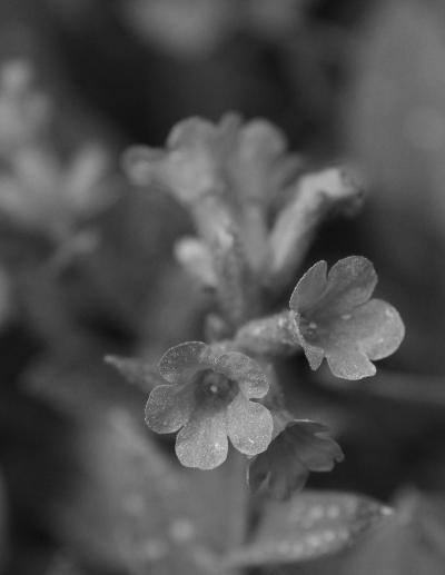
These are blossoms of a ‘Little Star’ lungwort, (Pulmonaria genus I believe) that we found at the NC Botanical Gardens. There still wasn’t a whole lot of things in leaf, flower, or bloom yet, and due to their closing down for reasons unmentioned, won’t be anything more visible for a while yet. As you might be able to tell, the flowers aren’t very big, but they certainly were vivid, which prompted me to try playing around with monochrome again. First off, we’ll go with simply converting to greyscale.
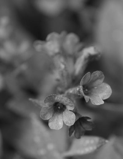
 Blerk, no. Wholly unimpressive. There was contrast in the colors, but not in the brightness thereof, so neutralizing the color registers made it too bland, which is why it’s often not the best idea to simply convert the image to greyscale, or desaturate, or however you manage it, in-camera or after the fact in an editing program. However, we have better tools in our arsenal, or at least, we do if we’ve been reading the previous posts on the topic or checking out the webpage (I have – have you?)
Let’s try the trick of converting each color to its own layer and looking at those.
 Red channel. Nope. Slightly different from just greyscale, but not enough to merit any attention. Moving on.
 Green channel. Almost completely indistinguishable from greyscale, even though the majority of the image is what we’d call ‘green.’ It’s a dark and muted green, not vivid, which means both the intensity of the green pixels is lower and there are a lot of other color pixels contributing to that register. But of course, we should expect a better response in the last channel.
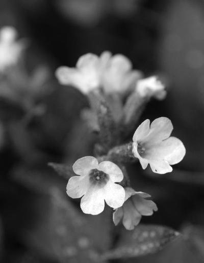 Blue channel. Yeah, that’s the kind of contrast we’re talking about, and what we should expect if the dominant color in the frame is such a rich blue.
But… it might be considered a bit too intense, going a little bright and losing some of the petal detail, which was actually provided by shadows in the other color registers. There are still tricks to be played, however: with layer opacity, and layer masking.
Imagine if the image is painted on a clear surface, and you can have several of them stacked precisely atop one another (the ‘layers’ bit.) By changing the opacity of the top one, we’re in effect making the layer more and more transparent, like a tinted version, so the details of the layer beneath may show, and the amount of opacity dictates how much of each, so we can blend the two together by controlled amounts. Yet we might not want to blend all of the details between the two, and choose to keep some details from any layer at full-strength. So that’s the layer mask bit.
If you wipe away only part of the image in an upper layer, the layer beneath it will show through there only, so we can selectively have a bit from the top, and another bit from below. When you apply a layer mask, you then paint onto the mask itself with either white or black – white to keep the active layer, and black to ‘erase’ it and let the lower layer show through, but the best bit is that you can put it back by painting in white again, and fog the edges by using an airbrush, and so on.
So what we’re going to do is put the green on top, and drop the opacity down enough to keep some of the petal detail but mostly let the brightness of the blue layer’s petals show through. This also muted the darkness of the surrounding portions of the frame, taking away the contrast that makes monochrome work better, so then we’ll add a mask, in this case wholly white, and then paint the mask in selective areas with a broad airbrush in black, totally eliminating the green layer in those places to let the darker portions of the blue layer show through. It’s easy to make a mistake here, and easy to correct: just switch the color of the airbrush back to white and paint over your mistake, redoing it at will. Now let’s see what we get.
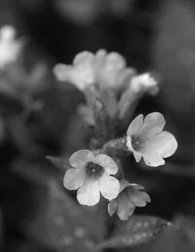 Now we have not as much contrast from the blossoms, but more detail and shaping, while retaining the dark shadows all around because they’re solely from the blue layer – no part of the green layer is visible around the outsides of the blossoms. You can also make it slightly easier by putting the blue layer on top if you like – I did it this way simply because green was already on top (after completely deleting the red channel, of course) but it also made it easier to change the opacity of the green layer to maintain just a bit of detail in the flowers.
So let’s review it. What we have here is mostly the blue channel, but the green is laid over top, just for the flower bits (everything else masked into invisibility,) and then the intact green bits are made more transparent by changing the layer opacity, until they’re adding just a little more shaping to the flowers. All of this can be adjusted to taste, and of course, you can do lots of other effects in images with the same technique: tweaking colors selectively, smoothing out textures or age wrinkles (the way I was first shown how to use layer masks,) and so on. Layers masks are a great blending and editing tool, even if you’re doing that no-no of combining multiple images together to add details that were never captured in the first place. If you haven’t tried this yet, well, now seems like a good time, right?
And yes, I still prefer the color version too, but this was a good exercise, so I chose to illustrate it.