It’s been a slow couple of weeks for finding topics of interest for some reason, which hasn’t helped with my resolve to top the number of posts done in 2011 (2012 was well short, and I’ve already passed that mark.) It’s one of those things that I don’t worry about too much, because I’d rather post because there’s something that I want to cover, not to hit some arbitrary number or a personal goal – it’s like the “personal best” idea used in sports, one of the dumbest things I’ve ever heard but then again, it’s uttered by sportscasters, so…
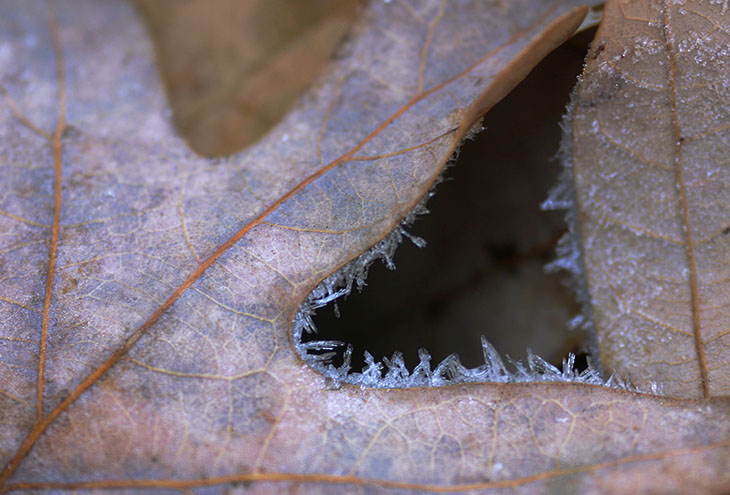
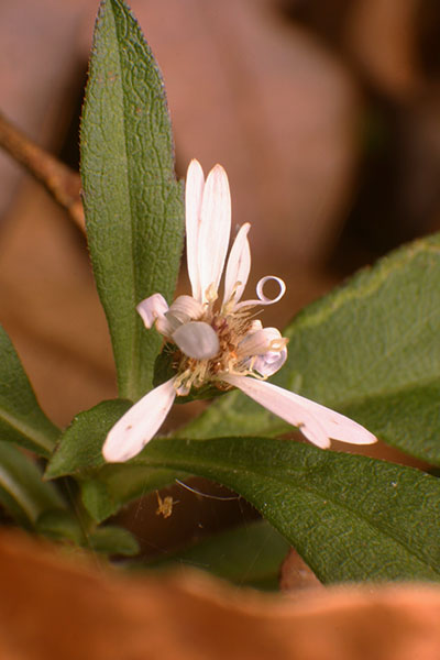
 Anyway, I still think the frost image above could be better, and if I get out tomorrow morning early enough we’ll see if I can improve on it. I feel the same way about the picture at left, even though this was a re-shoot; I’d taken one the same time as the frost pic (well, not exactly the same time, a talent I haven’t yet mastered, but a few minutes later,) but the flower was in full sunlight and that was making the contrast too high to get the best results from. The petals were blown out to pure white in ‘normal’ exposures, and the rest became too dark when that was controlled for, so I did it again while using the softboxed flash. I’m pleased with the leaves in foreground and background – the flower really was poking up through the leaf litter – but the petals seem off. They’re not only a little too symmetrical, they’re closely matched with the green leaves behind, seeming more, I dunno, geometric than we’d expect. Maybe it’s just me. I do like the prominence of the curled petal, which is why I chose this position and angle.
And that brings me to the main topic of this post. The frost pic at top was the sharpest one I got from several different leaves chosen for the effect – there were others that I liked much better as subjects, but working at high magnification handheld in deep shade, I didn’t nail those shots. With the flower, the whole image could change with a subtle shift in position; I could have shot in horizontal format, which would have worked better going wider and using the more leaves as setting, keeping the flower towards the left of the frame so it was ‘facing’ out over the leaves. A little higher and the foreground leaf would have disappeared, and might have taken away from the idea that the flower was struggling up through the clutter (which perhaps still isn’t communicated all that well – I’m biased because I know what the conditions were.) Other angles would have minimized or obscured that curled petal, just like the other petals that are barely noticeable. And of course, the lighting was important.
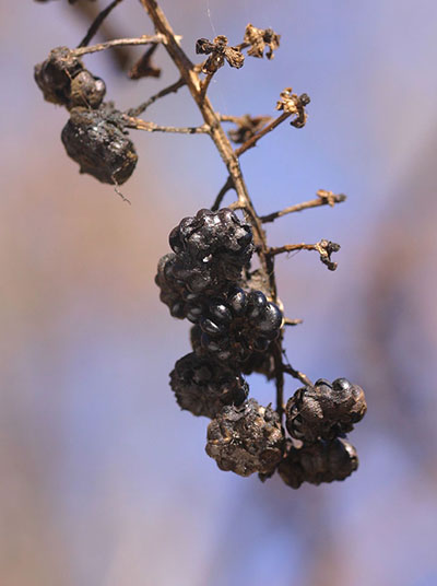
 This is what’s so hard about teaching composition, because countless different factors come into play for any image, and that’s just considering one style of shooting, of which everyone has their own. It’s easy to overwhelm new photographers with loads of compositional elements, and no way to define which should be used for any particular image or approach. Here, some dried pokeberries (genus Phytolacca) had produced an interesting effect with the shiny black seeds poking through the decrepit remains of the berries – somehow, the mockingbirds did not discover them this year. But, just using the posts on composition that I’ve made so far, how many different elements were actually used here?
Position – To see both the emerging shiny seeds and the dried husks took a specific angle. Also,
Background – The soft pastel colors came from aiming up at the sky, which also eliminated
Distractions – Other portions of the plant and, much much worse, the nearby chain link fence were all too easy to have in the pic.
Focal length played a small role. The macro lens was necessary to get the detail, but it also affected the depth of field which helped blur out the branches in the background.
A subtle one is perhaps only apparent when I tell you about it. The shine of the seeds is only going to come with a distinctive light source, but the direct bright sun of the day was producing too much contrast, so a white cloth was held up just out of the frame to the left to provide reflective fill lighting – this is especially noticeable in the shine on the underside of the seeds, which were in deep shadow otherwise.
And finally, I cropped the image a little to get the framing just the way I liked it.
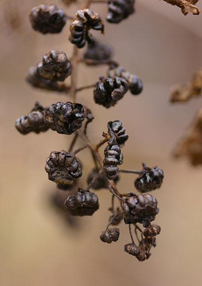
 It’s not just one image, either – I shot the same subject under a diffusing cloth to simulate light shade, in hazy conditions on another day (seen here,) and at night in completely controlled lighting. I used other portions of the plant or the lawn as backgrounds and even hung a few leaves from a wire close behind for the night shot (because the flash wasn’t going to travel far.) They all produced their own effects – some quite nice, some completely useless. If you ever wonder why photographers take a lot of shots or even seem obsessive, it’s because subtle changes can produce different effects on the image, and perhaps only one choice among numerous variables will net the desired results. Of the two shown here, you likely think one is better than the other, and this may or may not be in agreement with me. This preference thing comes into play when selling shots too, because editors have their own opinions, and uses may dictate certain things – while this latter shot might be more useful to show the conditions, the other might work much better solely because of the blue background, since it has to play nice with any other images in an article or post. This even comes up when I decide what to use here on the blog, and dictated the order of the images that appeared in the previous post.
It’s not unreasonable to ask how one goes about knowing which compositional elements to use for any given shot, and there isn’t a simple answer or formula for that. The first recommendation is to keep shooting, because experience tells you more than anything what will work and what won’t. But it can also help to sit down with an image and hash out the different elements that could have been used – what would fill lighting have done, or should I have come back when it was hazy? How many different backgrounds could I have managed with this subject? Does it even show what I wanted it to show? This changes compositional elements from a memorized list, which isn’t likely to work, into associations with previous subjects or conditions. Soon enough, you start seeing subjects and knowing that it’s going to look better from a lower angle, or with light coming more from the left, even before attempting the shot. And while it can be difficult to predict just how the camera will render it, because they don’t ever produce exactly what our eyes see, you will also know how that several shots at different f-stops will give a variety of effects, and that different approaches might yield some pleasant surprises. Compositional guides and tricks can be helpful, but there’s no substitute for learning how they work on one’s own. And that means practice.


