I’ve been playing around with photo editing, and decided to toss up a few more monochrome images because, you know, the weather’s turning grey and so you’ll want to see… even more… grey… that’s not really making sense, is it?
Too bad, I’m plowing ahead anyway!
 Some of these are relatively recent, some of them are much older, but all of them are fantastic! No need to exercise your own judgment – I’ll just go ahead and provide your own opinion to you, because you obviously need it.
Sorry, the last election got to me a bit.
If you’ve looked at previous posts regarding monochrome, you know what channel clipping is, so it makes sense when I say this is a blue-channel version, which brought out the best contrast. By the way, I’m really sorry that I didn’t have the audio recorder with me during this session, because the weight of the geese on the ice was producing the most wonderfully weird sounds – my best guess is from distant cracks shifting and chirping against one another. There’s no way I could describe it or compare it to anything, so my goal is to capture it again one day, but I realize this is pretty unlikely.

 The image above is once again solely the blue channel, and this is somewhat typical of the results when using just blue – it tends to be the darkest, or at least it does for most of the images I shoot, anyway. It can also go pretty muddy at times, producing blotches in gradient areas, but this time around it came up sharp – this just might be a trait of the lenses I’ve used (all lenses bend different wavelengths of light by different amounts, and while some of them are good at correcting this within the lens array, not all of them are.) Regardless, the snail shell attracts attention while the head of the snail becomes much more subtle, and the whole thing gets moody. When Hollywood finally gets around to doing a film about a pathologically murderous snail, this image is here to guide them in producing the necessary ominous effect.
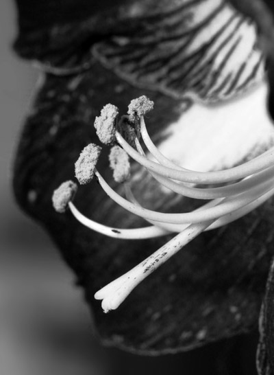
Meanwhile, you’ve seen a variation of the image at right before, but this time I went with just the green channel – it produced the right level of contrast from the pollen and the petals. Just converting to greyscale really wouldn’t cut it, because the red of the petals was almost as bright as the pollen itself, but since it was a nearly pure red, using the green channel eliminated almost all of the brightness from them.
A quick note here on framing and cropping, while we are still waiting patiently for me to finish the podcast on composition. It helped a lot to keep the pollen heads within the lines of the petals, letting their edges frame the focal point of the image, and the preventing the edges of the petals from being cut off by the left side of the frame helped convey a more ‘complete’ idea. And in this crop, there’s a subtle emphasis diagonally across the image, the lines of the petals emanating from top right while the pistil points towards lower left – this was completely intentional; I tend to ‘work the corners’ when I can.

This one is subtle but I suppose not overtly so (“overtly subtle” – yeah, I need to work on my writing skills, thanks for pointing that out, now I feel worthless.) Using the green channel darkened the bright pink, or mauve or taupe or puce or whatever, of the azalea blossoms while brightening the main subject, reducing the contrast and so increasing the subtlety. I could have sworn I had posted color examples of these flowers the same year I took this, but cannot find any, so use the first image here to get an idea – it’s the closest I can get.
But now, let’s take a look at where the color channel thing produced a significant difference.

Same image, hard as it may be to believe; on the left is the green channel, and on the right is the blue channel, while the original colors of the flower can be seen here (and in the rotating header images if you’re patient enough.) Though remarkably different, I haven’t decided which one I like the best, so feel free to cast your vote. What with districting and the electoral college and all that, it will do you no good at all, but at least you’ll feel that you’re part of the process.
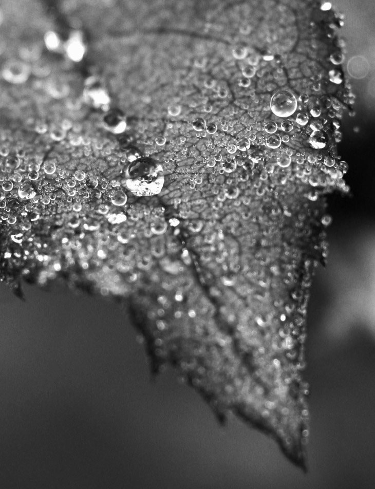
 You can see a color version of this pic here, or at least one that was taken in the same spot, just framed a bit differently – that one has more color than this one did. But the stark lines of the grey leaves were interesting, so I converted it to see how it fared.
Finally at bottom, one from many days back, actually taken the same morning as this one. It’s green channel again, and was definitely in the running for the month-end abstract, but I have some others I could use and it dramatically closes out this greyscale post. Handheld in early morning natural light, the aperture was wide open at f4, so I had to pick the particular drops that I wanted in focus. I think it worked out well, myself.