


 I know we’ve all been looking forward to this holiday for the past month at least, so we gonna fire it up now! Today for Do Some Creative Editing Day, we’re gonna tackle some simple photo tricks.
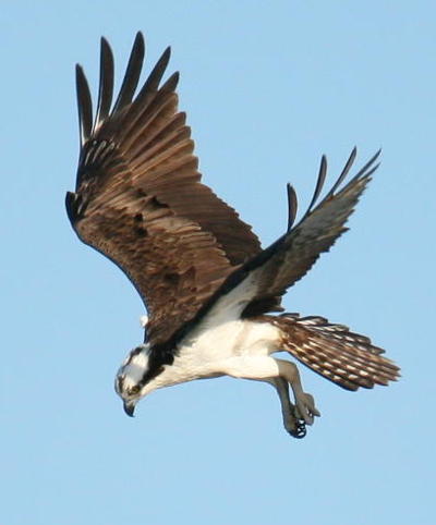
I’ve covered converting images to monochrome before, more than once actually, and our first exercise is an extension of it. It’s best to start with an image that already has us going in the right direction. It’s funny; I had looked at the osprey (Pandion haliaetus) image to the right recently (which you undoubtedly recognize from a previous post,) thinking that I’d like to use that strong contrast in a new way, and boom! Here we are at DSCE Day (pronounced, “Doosh,”) by the most amazing of coincidences. Since those linked posts, I’ve changed over to a Linux operating system, which means that my photo editing program is no longer Photoshop, but GIMP now (which is still available for free for Windows and OSX too.) GIMP doesn’t have a simple function for deleting channels, but it’s almost as easy, so we’ll cover that variation now.
If you can go into each channel and reduce them to nonexistence through the Curves function, which was one recommended method of channel clipping, it reduces the overall brightness of the image as well, making it harder to achieve the contrast you want. But I’ve just stumbled on a better way (it’s funny: advice on the internet is easy to find, but good advice is a little harder.) Go to Colors/Components and select ‘Decompose,’ and when it asks, choose ‘RGB’ and ‘Decompose to Layers.’ This creates a new image where the color channels are instead separate layers, visible through the Layers palette. It’s an easy matter to select the visibility of each layer (the little eye icon) to see which layer/channel has the best contrast; just remember that, because they’re now layers, the top layer has precedence if it’s visible (Which means that the Red channel is what you first see as the image opens.) Once you’ve determined which channel has the contrast that you like, simply right-click on the others and delete them.

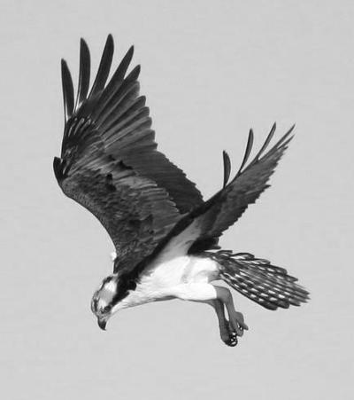 The individual channels might look a little blotchy here, which is where GIMP probably suffers against Photoshop’s abilities, but then again I didn’t open this image in Photoshop to see how it fared. For our purposes here it doesn’t matter, because we’re going to wantonly eradicate those registers anyway. Right now it’s an acceptable monochrome image, but lower in contrast than we might like to see, and much lower than we’re going to take it, because we’re going for a different effect now.
We now go into the Colors/Curves function, and increase our contrast in a very specific way.
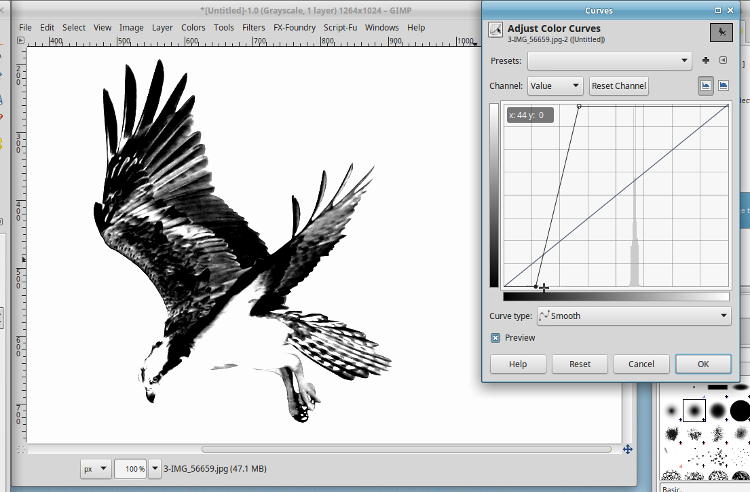
Move both the upper right and the lower left pointers inwards, but just left/right, and not up or down at all, increasing contrast – see the nearly-vertical line in the graph (the 45° diagonal was the starting position, but we want the one with the little circles on the ends.) It’s hard to describe exactly what we’re doing here, in terms of brightness and pixels, but basically we gave it a smaller number of positions to fill between full black and full white, so more of the ‘bright greys’ became ‘white,’ while more of the ‘dark greys’ became ‘black.’ Whatever – don’t ask questions, just do it. But deciding where to do it – how far to take either of those top and bottom positions – depends on the image and the effect you’re after. I liked this one, but yours may differ.
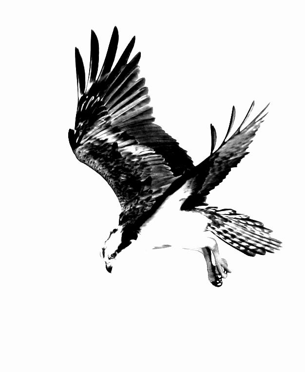
The effect is very stark, almost reducing the image to pure black and white – some of the feathers and the legs retained some grey, but that was because they already inhabited that range the we reduced the entire photo to. There’s just enough detail to betray that it’s a photo and not a pen-and-ink sketch, but not by much.
I played around with a couple of others, too.
 The American toad (Anaxyrus americanus) above was first seen here, while the green treefrog (Hyla cinerea) at right made its debut here. For the treefrog, however, the white of the belly showed up as well, without being a nice distinct shape that filled out the form, so I just trimmed that out, overpainting it in black. The treefrog clearly has more greys in the end result, while the toad really could be reproduced solely in black ink; all that would have to be fudged is some greys along the nose and near the eyes. Both of these, by the way, were possible because the light was distinctly from one side and so the shadows were deeper and the shaping distinct.
More experiments are below, where I added a wrinkle. I almost never touch the Saturation palette, because usually I’ve gotten it where I wanted in-camera, and it’s easy to over-saturate an image and have it look cartoonish and, frankly, edited. Even in the camera, I have a setting with slightly increased saturation only for those days when the light is weak and low-contrast, which would make the colors a little weaker too; it just adds an edge. However, if the resulting image has very narrow color registers itself, not too far away from monochrome to begin with, boosting saturation can produce a richer effect, even though plainly edited. The one below is a experiment of seafoam, taken during the recent SC trip.
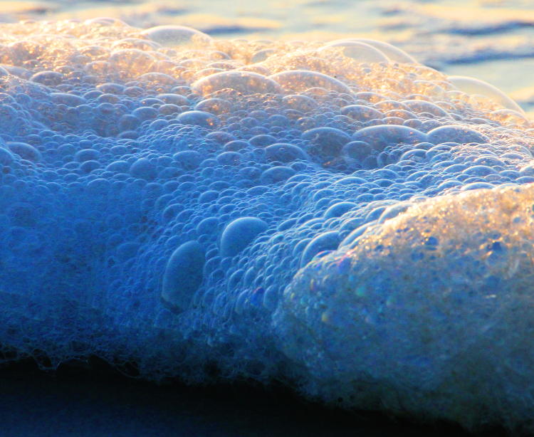
The contrast between the sunlit and shadowed portions was very narrow, while the bubbles were distinct, so boosting the saturation way up just gave it a moderate amount of color. And then it got the high-contrast greyscale treatment:
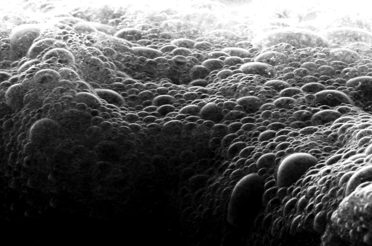
Slightly different crop, because it was now the shapes of the bubbles, and not the contrasting colors, that made the focus of the subject. And then we do it again, with an image originally found here.

Only by comparing it with the linked version can you tell that saturation has been radically altered – as far as it could go, in this case – because there was very little color to begin with. It seems perfectly feasible as a natural image, but those out-of-focus dewdrops gain a bit of depth to them. And now the monochrome.
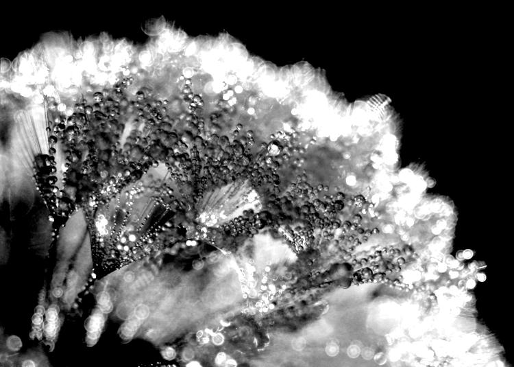
Had you not seen the original, it might have been a little difficult to tell what you were seeing here, I suspect. I probably should have popped this one up first without the link, but I don’t feel like rewriting the post now.
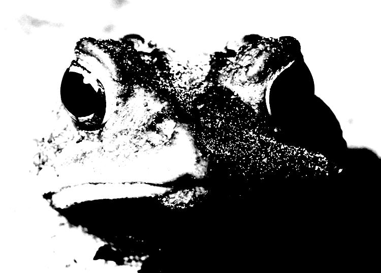
 And our last one, not just another amphibian, but another green treefrog to boot. This one is from the gallery, as well as the exhibit this past winter, and presently decorates the hallway here at Walkabout Studios (in its original form, not this one. Maybe I’ll add it later one.) While the two images above used the red channel for best contrast when converting to monochrome, I went back to the green for this one, which rendered it pretty pale even before the alterations. Really, it works in color or monochrome – it all depends on what you’re after (or how much you believe that monochrome must mean, “high art,” a viewpoint held by far too many people with artistic airs.)
So go celebrate this wonderful holiday and experiment on your own, see what you can come up with. Skip the routine filters and effects that come prepackaged with any editing program, and try to whip up something on your own. Have fun!