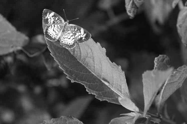
I’ve had this one sitting in the blog folder for a few weeks, waiting for me to feature it, and now seems as good a time as any, since I missed the really cool date to do so. If by ‘really cool’ we mean, ‘might have been a neat coincidence if it weren’t for the fact that we could never know, but were far too late regardless.’ You know, that meaning.
Y’see, way back in the early days of building my stock images, I snagged a shot that I particularly liked, featured here; nothing fancy, but seemed (to me at least) to have a simple charm and nice contrast. So when I saw the same species again in a similar position, I grabbed it. I knew it didn’t have the strength (or whatever) of the first, but it was a nice reference back. And then, when about to do this post, I decided to check the original, which was done on slide film back when I lived in Raleigh, and I knew it was shot at the head of the Neuse River. The labs often included a date on the slide mount, but that would only tell me when it was developed, not when it was taken – EXIF info in the jpeg files is one of the nicer advantages of digital. I was curious to see if it was anywhere near the same date, which is not as farfetched as it might seem, since the species is only going to be active for a few months of the year anyway.
Alas, the date on the mount is 6/29/00, so it was taken sometime before then – probably within two weeks, given that I developed my slides pretty quickly and I was doing as much shooting as I could in that time. But that’s still a ways away from August 8th, the date of this one, so we missed the 20 year anniversary by several weeks. Damn.
But then, because the contrast was nice and I was experimenting, I decided to play with the color channels again and convert it to monochrome.

This was done by converting the image into the Channels and using just the red one – the method to do this with Photoshop and some of its derivatives can be found here, while the GIMP method can be found here (I should update that web page with this I suppose.) Did a great job of making the butterfly (which is a pearl crescent, Phyciodes tharos) stand out more, but without the color comparison the contrast is high enough to make one believe it was a white butterfly instead.
But the first was still better.


