


I said in the previous post that we’d done two outings in the past week, and this is evidence of the second – there will probably be a little more about it along later. Right now, we’re going to examine how I fared with a particular goal for this one, which was monochrome; given the light conditions and the lack of foliage and so on, I decided it was a good time to tackle some black & white images. However, I don’t shoot in monochrome, unless I’m using film, because digital allows some creative approaches that we’ll see below.

The exposed roots of trees bordering the water (this is Eno River State Park) make an obvious choice of course, but the contrast came up better with channel clipping – in fact, almost all of the images here use channel clipping, though some have additional edits done. The sun was bright, thus producing bright highlights and distinct shadows, which gives contrast that works better for monochrome, and for this frame, I selected only the blue layer because it had better shadows in these conditions. And I like the root ‘dipping its toes into the water.’
I believe this is the same tree:

In this case, however, it was the green channel that looked best. In my experience, the red channel tends to have the best levels when used for B&W images, green following, and blue often the worst, trending towards blotchy and weak. But there’s a possibility that was only with the old Canon DReb and 30D bodies; I’m using the 7D now, and the blue channel has been quite useful, at least for this outing. We’ll have to see if this holds true in more conditions.

Often, monochrome images do better with a boost in contrast to use the full range of light levels available, but this one needed no such thing – the light was already contrasted enough, and the use of the blue channel again heightened that slightly (given that the more prominent colors in the original frame were dull greens and browns.)
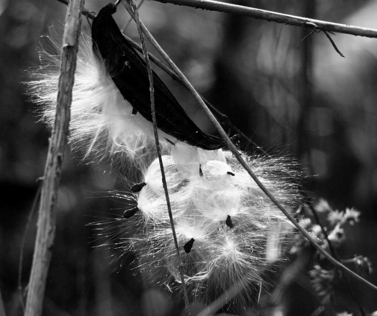
Another blue channel choice without further editing, with the backlighting illuminating the milkweed seeds pretty brightly – this one does well in color too. There was a hint of greenish hues from the background, so the green channel naturally rendered them lighter, and I liked them being darker better, so blue was the choice. Not so with the next one though.

Here, the green channel carried it again, because the blue rendered the overall frame too dark, but I tweaked contrast very specifically to keep the details of the sparrow where I wanted them. It took me far too long to determine that this was a white-throated sparrow (Zonotrichia albicollis) though, because they only have this coloration in their first winter. I almost mistook it for a savannah sparrow, but they have a distinct ‘mustache mark,’ one of the many terms specific to bird identification. I’m not a big fan of the little birds and haven’t tried memorizing what can be found in the area, and believe me, when looking through the Sibley Guide to Birds, you’d be amazed how many are ‘almost but not quite’ identical to this. Sheesh.
Slightly easier with the next one, but only slightly, even with the original color image.

The eastern river cooter (Pseudemys concinna concinna) bears more than a passing resemblance to the very common yellow-bellied slider, and in some cases (like this one) the distinguishing traits aren’t that distinct, but I’m using the low-profile shell to pin this down as a cooter. It’s one or the other, anyway – what, you writing a biography? The blue channel was good, but a very selective yet harsh increase in contrast made it better, and the rim-lighting from the sun behind the turtle helped – I was careful to keep most of the texture of that broken log. I was also a little surprised to find this one out basking, but we honestly haven’t had a lot of cold weather this year (yet, anyway,) and this day was only a little chilly, so this guy took advantage of the sunlight.
Now some contrasts in contrast.
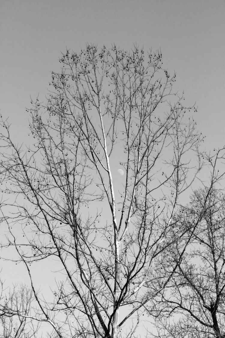
A few of the American sweetgum trees (Liquidambar styraciflua) on the river’s edge were showing very pale trunks, as well as being sidelighted by the afternoon sun, so of course I had to use that natural contrast and didn’t tweak this or the next one at all. Really, the only reason I can identify this is because the gumballs, the spikey little seed pods of the species, are still largely attached to the branches, nature’s own holiday ornaments. The sky was clear blue, so the blue channel rendered it quite light, with the prime contrast coming from the trunks and shadows thereon. I was lucky enough to find a trees without too much interference from branches of the neighbors, which is often tricky. But now let’s look at the red channel in the same conditions, albeit a different tree.
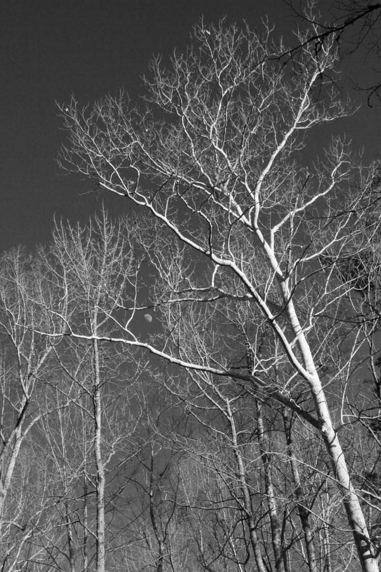
Actually, I had thought this one was the same species, but I don’t see the gumballs, so I’m leaving it unidentified for now. Using the red channel for this (which had more visible pale trunk lines throughout) worked better for the details, even though it almost blended in with the neighboring trees in hue, but the questing shapes of the limbs still helped to make it stand out a bit.
I’m assuming you did not fail to notice, however, that the moon appears in each of these tree images. Yeah, I’m in a rut – I’ll try not to post too many more moon photos for a while, unless they kick ass, but I’ll take the opportunity to point out that both of these required specific positioning to put the moon where it was among the branches – that meant traipsing around on the sloped banks of the opposite shore (both of these were shot across the river) until I could get the right angle. It’s that kind of elaborate effort that brings me the big bucks, let me tell you.
And our last one for today.
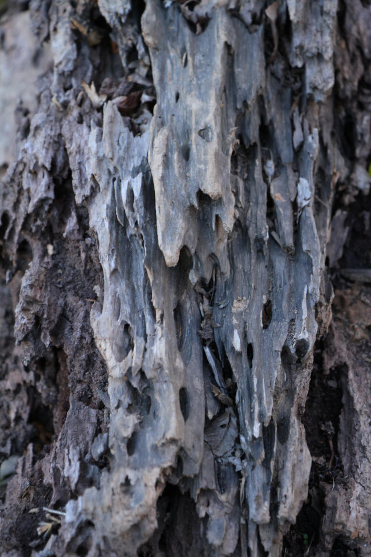
Okay, directly alongside the others, it’s probably obvious this is not actually greyscale, even if it is almost monochrome all by itself – I might have pulled off the deception had all the rest of the images been brightly colored. But yeah, I liked the textures and the lack of color was already there, so this one made the cut even if it is cheating, because it’s my blog and so I got it in with the judge. Which is me. Who is also just about the only reader too. Exclusive, that is.
But as a winter exercise when there’s not that much to shoot… well, it kept me busy, anyway, and gave me a little more to post. That’s good enough for now, and I can say that because, again, I’m the judge…