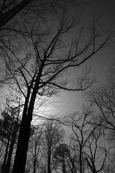
 I’ve been meaning to do more cleaning of the blog folder, which is where I stash images prepped for posts before they’re actually uploaded, and on occasion I decide against them, for one reason or another; I end up not writing the post, or the narrative (such a grandiose word for this shit, isn’t it?) goes in another direction, or something along those lines. I often leave them in the folder with the idea that they might come in useful further down the road, and occasionally this happens, but not often, and I finally decided to clear out the junk drawer, as it were, and simply deleted a lot of them.
A handful of them, however, were still interesting enough to post (says I,) though a few had been sized for the olden days, when vertical compositions were often ‘less than column width’ as seen here. I largely stopped doing this because a) it made the images seem too small in the layout, and b) it requires having enough text alongside not to introduce big gaps into the pages, and I would often end up trying, nay, endeavoring to creatively lengthen, expand, or elucidate to maintain balance – not like I need any help at all being wordy. Anyway, I called this one “Chiaroscuro” after the artistic concept, which means, “bright darkness” – I know, what’s a peasant like me doing trying to use or even understand fancy cultural terms? Beats me, which is probably why it sat there unused for so long…
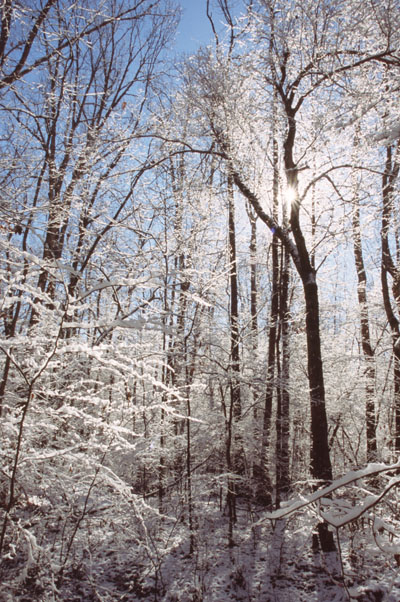 There’s also the idea, with half-column images, that they should face ‘properly’ with the text – this one leans leftish, so it should be to the right, while the one above is the opposite. This could also make for juggling the posts a bit, because at times I’d end up with vertical images that all leaned right and I couldn’t alternate like this. Does it make the slightest difference to anyone? Probably only me, but at least it shows that some thought goes into these posts, even if, again, we’re using far too elaborate a word to describe the guttering candle within my brain.
I’m not absolutely sure and I’m not going to go searching right now, but I think this one dates from before the blog was actually started and is on slide film. We had a wicked blizzard for this latitude and I was effectively snowed in, so this came from traipsing around in the woods adjacent to where I lived. It had been a heavy, thick, wet snow that adhered to everything, piling up as much as a few centimeters even on thin branches, a real winter wonderland kind of thing – but of course I couldn’t get to anything more photogenic than this.
Has this been enough space?
How about now?
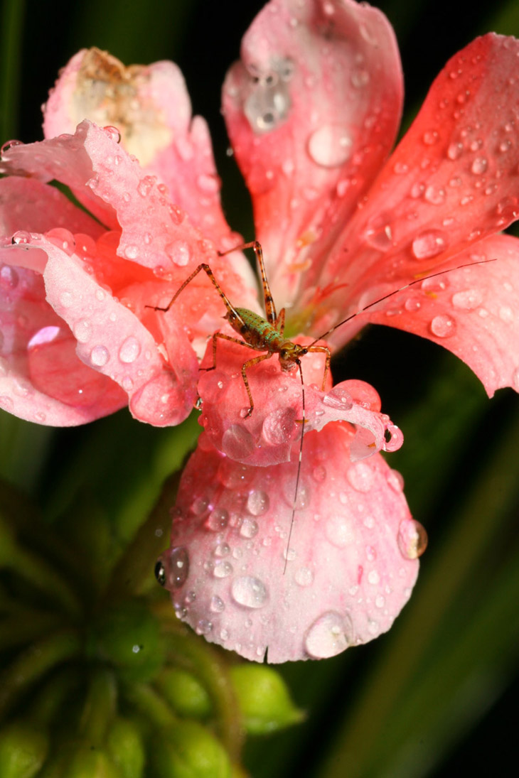
I ended up using the monochrome version of this some time back, so the color version just sat around. It does illustrate something that I often struggle with, which is/are botanical subjects with less-than-perfect petals or leaves, little ugly spots that distract attention away from both the subject and the overall mood – and which disappeared when converted to monochrome. But the colors remain nice, and those antennae were damn sharp…
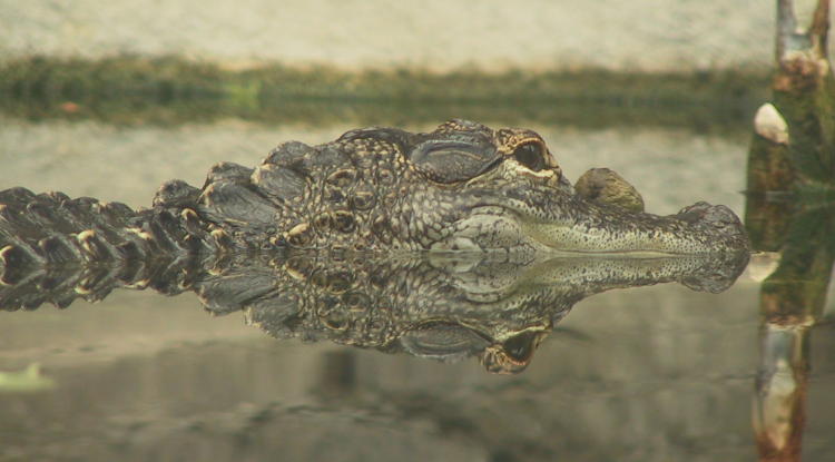
There was a thematic purpose to this image, but I’ve long since forgotten what it was. I like the symmetry – look at that lovely pattern right in the center of the image – but there are a few too many distractions, like that pole thingy in front. Maybe I’ll crop the original tighter, make things bigger, and revisit this later on…
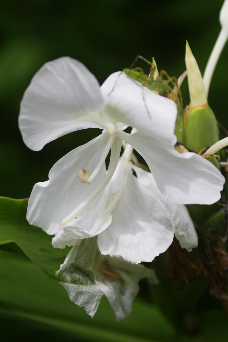
Just a nicely-shaped ginger lily from the botanical garden, even if there are some old petals down near the bottom. I was trying for some misdirection, though, and I don’t think it carried as well as intended. Here’s the follow-up anyway:
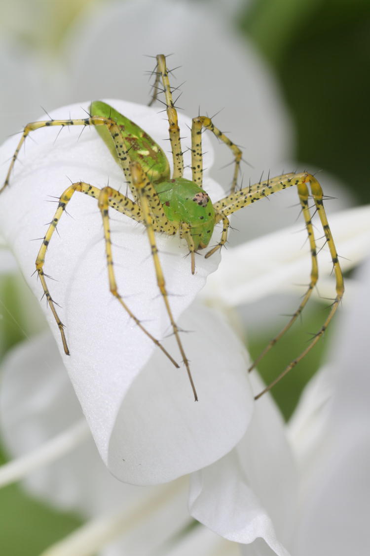
Imagine, though, that the flower was viewed as normal, so a handful of centimeters across nestled in among the cluster of leaves. The green lynx spider here was certainly very subtle unless you were paying close attention to the things that ‘didn’t ring true,’ like those little threadlike legs dangling over the top, and then you realize she’s there.
I’m not exactly sure what the little hairs/spikes/daggers on the legs accomplish, save for making them look badass. I don’t think natural selection really works that way but, you know, maybe…
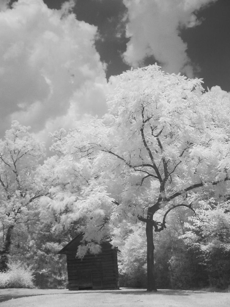
This is in infra-red, from back in 2007 when I was on that kick. While I liked the way the tree rendered here, the rest of it seems a little… discordant, maybe? Just not quite cutting it, and thus decided against for the various B&W posts that have come since.
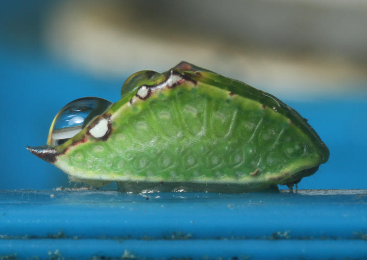
I was busy with other subjects when I ran across this little guy, and did a quick shot with the intention of coming back when I wasn’t busy and tackling it in earnest, but it was gone on my return. I’ve never seen anything like it before or since (this dates from 2021,) and this tight view from low enough allowed a hint of the legs to come through – I’m pretty sure it’s a larva, and I suspect a caterpillar of some kind, but I haven’t tried searching it out either. The blue comes courtesy of the rain barrel, of course, and the water drop gives some indication of size.
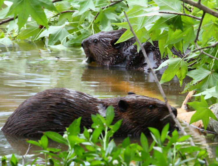
Much as I liked this image, I think I used something very similar for the thumbnail display of the accompanying video when I posted about the beavers last year, so this was an unnecessary duplicate, and no thematic reason has occurred since.
And finally,
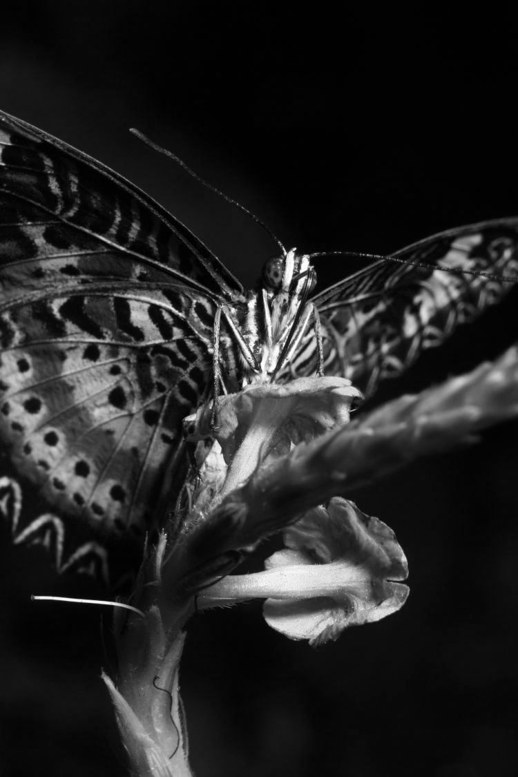
I threatened to do this a couple of weeks back when I posted the color version, and you have now discovered this was no idle bluff – if you were caught unawares, you have no one to blame but yourself, though the Republican party can be used too because they never get tired of whining about persecution. Not just converted to monochrome, but through selective color channels – this is the Green and Blue channels in a specific ratio (I think 40% opacity in Green, but don’t quote me on that.) This allowed for the best balance of contrast in the wings while making the head and thorax bright.
So, that cleared out a few, while you know what tomorrow is, right? Shouldn’t be too hard to figure out…


