I like this title, because if you try to pronounce it correctly, you’re mispronouncing it. Which is because it’s time (finally!) for the annual tag roundup! Tags are those little reference words at the bottom of the post to help you know what the content is and save you the trouble of actually reading the post, unless you have a poster of a certain nature, in which case they are also snotty commentary on the content, or highly questionable humor, or some obscure reference that only thirteen people in the world (none of them readers of course) would recognize. And each year, we choose a small selection of the tags that have only appeared once and recognize why they have only appeared once. It’s also a subtle (not really) way of drawing people back into older posts. With that warning being all that’s required by law, let’s plunge ahead, shall we?
probably get hit by a meteorite – The law of averages needs better enforcement, I’m thinking.
it’s not just a phase mom – The family photos that soon get hidden away.
Spanish moss? How dated! – Some redecorating did indeed take place, and we’re fine with that.
right on prom night – Seriously, don’t pick at them.
fussy fussy fussy – along with, “need more spiders,” and, “or maybe slugs.” Perhaps a little forewarning is in order. And a slick watermark.
really really questionable definition of humor – Along with, “samson was a fat fuck.” I blame my parents…
hopped up on corn dust – Some have to ham it up for the camera. Not me, of course…
yes that was on purpose – Okay, probably not subtle at all.
licking her will get you nowhere – Also, “or Out of Africa.” I’ve nothing to add here.
the water was cold – Excuses, excuses.
awwww – It says quite a bit, I think, that such a tag has only appeared once, but I’ll try to remedy that.
Hey Sailor – Also, “booty call.” Worse than trying to study in college with a ‘popular’ roommate…
I just don’t choose to – I mean, give me a real challenge…
puppy dog eyes – You should know by now this is a setup.
do you recognize this skin? – As well as, “you silly man.” Listen, you’re not going to get better warnings than these.
just the one taking the pictures – It’s journalism…
chili I could see – I mean, sure, even if we’re only talking about what provoked it…
but the brow’s about right – I’m not that limp-wristed, though. Not that there’s anything wrong with that…
Unimportus bloggeri – Or perhaps, Daguerrotypus creeperi. I don’t know, have at it…
Now, we take a look at the ‘special’ holidays that we all celebrated this year (right?)
Lock Teasers Day, January 9th
If It Goes Another Day You’re A Worthless Excuse For An Amateur Naturalist, February 18th
Make Noticeable Progress on a Project Day, March 29th
Overcome Absurd Obstacles Day, April 24th
Dumfroot Spaglokkit, the inventor of shutter lag, May 25th
Is that…? No… Is It? Day, June 18th
Create Meaningless Content Day, July 29th
Now You Know It Could Be Worse Day, September 24th
International Enough is Enough Day, October 27th
Harvest The First Of The Citrus From The Greenhouse Day, November 16th (you should know that we still haven’t picked the last yet.)
Question The Value Of One’s Own Judgment Day, December 29th
What, no August? No, no holiday for August last year, strange as that may seem. Perhaps there will be two this year…
Meanwhile, if you want to check out the previous tag roundups, well, they’d be found here:
2015: Tagged
2016: Tagged again
2017: Papa’s got a brand new tag
2018: So what did 2017 hold?
2019: Do not read tag under penalty of law
2020: Tagginses! We hates it forever!
2021: Tag ’em and bag ’em
2022: I don’t mean to tag, but…
2023: Tag me with a spoon
2024: You’re a Grand Ol’ Tag
2025: Something tagged this way comes
Man, I’m glad I can just copy and paste most of that from the previous year…
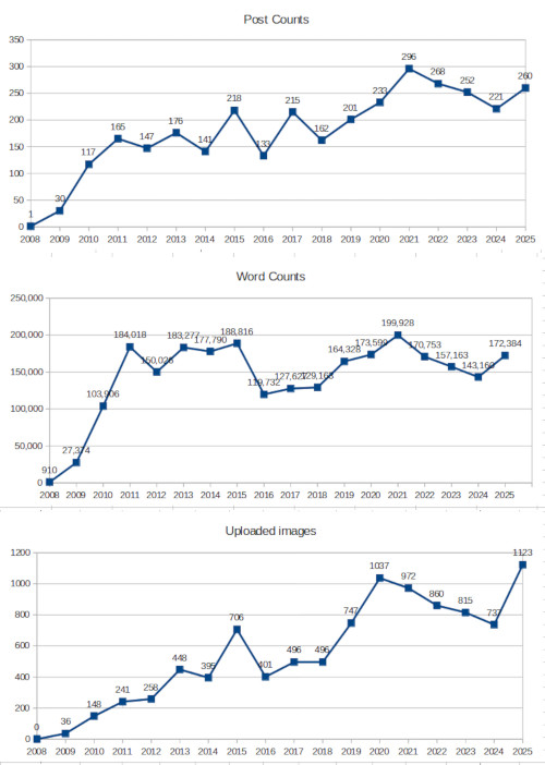 We brought the site stats up much, much better in 2025, with a post count of 260 (coming in third behind 2021 and 2022,) and a word count of 172,384, about average, bringing the total for the life of the blog up to 2,573,954.
But the image count was a new record at 1,123, beating out 2021’s total by 86 images, and I can confidently say the credit for this is due to Walkabout Estates Plus itself, brimming with photo subjects as it is. We did no special trips last year at all, being too busy with both selling the previous Walkabout Manor and doing work on the current one, so the vast majority of those images was within walking distance of the door. May had a total of 171 images uploaded by itself, though this still didn’t beat October 2020’s record for a month at 192.
Also worthy of noting was video uploads, coming in at 35 for last year alone, thanks to mostly the wood ducks and the nutrias. It was never my intention to branch out into videography seriously, because it’s more of an investment in time and equipment and so on – I just want to be able to capture behavior when it seems appropriate, but the opportunities have abounded this year, so here we are.
2025 was also a year of remarkable progress, especially when I look at posts from the beginning of the year. Then, I was speculating about whether I’d have to build a blind to even see the wood ducks from a distance, and whether or not they’d have the faintest interest in the nest box we constructed, as well as how much effort it would take to get better shots or video of the beavers, the first of which I’d captured in February. The year closed with not just evidence of the nest box in use, but multiple broods of wood ducks coming up into the yard, and beavers coming virtually right to my feet – as well as the discovery of nutrias visiting, then expanding to a brood of five young (and two adults) making themselves at home with inordinate boldness. Not to mention a snake battle to the death literally, actually, at my feet…

It is safe to say, I am in my element, and I’m incredibly lucky to have The Girlfriend, who shares in (most of) my enthusiasm for all the critters to be found – as well as making the move to the new Walkabout Estates even possible, it must be said. 2026 is also off to a fierce start – I have umpteen video clips to edit together into a coherent whole, and keep adding to them, so those will be along eventually.
All in all, I can’t complain, and can’t feel like I’ve been slack. As always, we’ll see what the future holds.
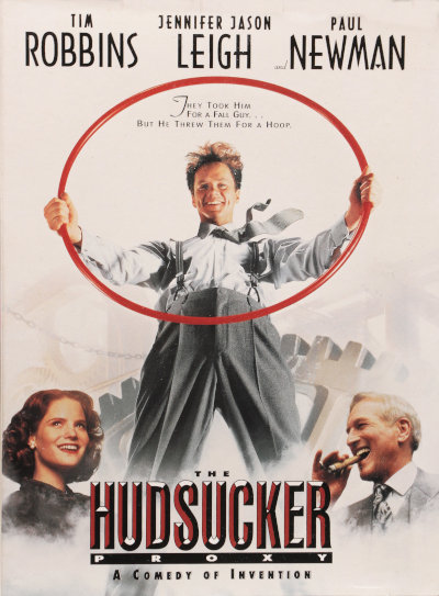 The Hudsucker Proxy takes place in December 1958 in New York City, and bears the style and feel of the “rags to riches” films of that time period. Even better, it replicates many of the classic characters of the era, with no bad performances from anyone; Jennifer Jason Leigh as the fast-talking, streetwise journalist Amy Archer is simply fantastic, and listening to her rip off her dialogue (damn near monologues, most of the time) is delightful. Tim Robbins plays the lead as Norville Barnes, a naïve Muncieite newly arrived in the city and hoping that his new idea (“You know… for kids”) will propel him to success. Robbins has the face and voice for parts like this, but makes his transition to self-confident executive without quite leaving behind the naïvete, and he handles this adeptly. Paul Newman serves as the cynical and conniving Sidney J. Mussberger, the newly-appointed head of Hudsucker Industries who has to find a way for the board of directors to maintain controlling shares, and selects Barnes to fulfill this plot.
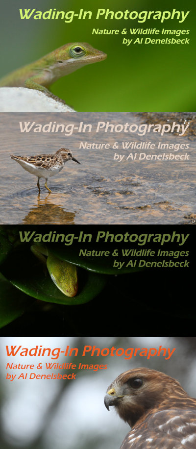 It’s actually been a while since I’ve changed them, and the last versions were done in Photoshop. I’m now using GIMP, which opens Photoshop files just fine, and have even loaded the obscure font that I like to use (Eras Demi ITC.) Except that Photoshop never could render that font in italics, so I had to
 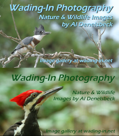 The top one, for instance, had more contrast, a bit of clutter from the branches, and necessitated laying in a drop-shadow behind the text to delineate the edges more – I’m still not entirely sold on this one, but I’ll probably print it anyway. The bottom one is fine, but I made a small change: the background to the right, where the text goes, has been dodged a bit, lightened from the original image to let the text stand out better – you can compare it to the left side, behind the woodpecker, to see how it originally looked. It’s very subtle and doesn’t look altered at all, so it works for me.
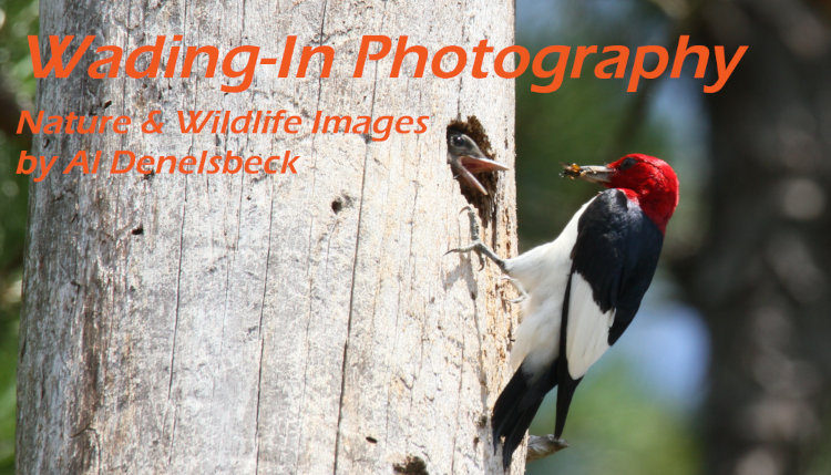
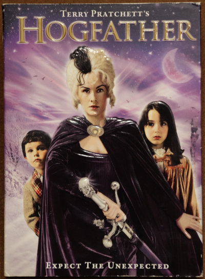 The movie in question is Hogfather, based on the novel of the same name by Terry Pratchett, an entry in the Discworld series. Now, this is a tall order in itself, since Pratchett’s writing doesn’t lend itself to easily making the jump over into screenplays, but one can be excused for being more worried that this was a serialization, of sorts, airing as a two-part episode on BBC television. I have to say, for converting a novel into film, this falls only behind Lord of the Rings in visualization, effort, and accuracy, while having a tiny fraction of the budget. Full credit goes to director Vadim Jean, but close on his heels is casting director Emma Style for putting together a fine collection of actors that fulfill their parts wonderfully. Getting Joss Ackland for Mustrum Ridcully (Archchancellor of Unseen University) was excellent, but Michelle Dockery (Downton Abbey) as Susan and Marc Warren as the quintessentially creepy Teatime are near-perfect for their parts. Perhaps the only weakness in the cast is Corporal Nobby Nobbs, because Pratchett’s vague descriptions of him are bound to provide the readers’ own views that are next-to-impossible to fulfill anyway, though Nicolas Tennant nonetheless does an entertaining version.

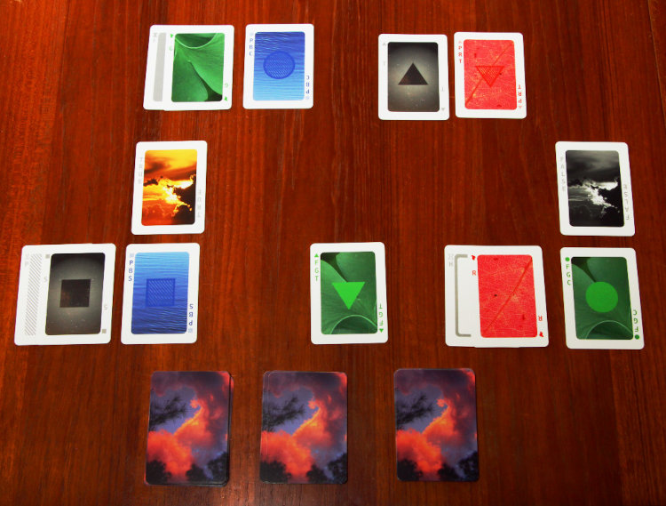
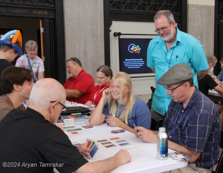
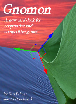 In the eleventh hour, Dan suggested “Gnomon” as the name choice, and it stuck. A gnomon is a three-dimensional representation, both as a shaft or column rising from a plane (which is why the shadow-casting piece of a sundial is named that,) and as the pointer within 3D software that helps represent and indicate the third dimension within the confines of a computer screen. Moreover, it wasn’t taken by anyone including web domains, had no bad associations that we ever found, and was unique. Within two days, we had the domain secured and the graphics of the tuck box for the new decks designed and ready to print. This was less than a month before the conference and we needed two weeks lead time to get a new run of cards printed.
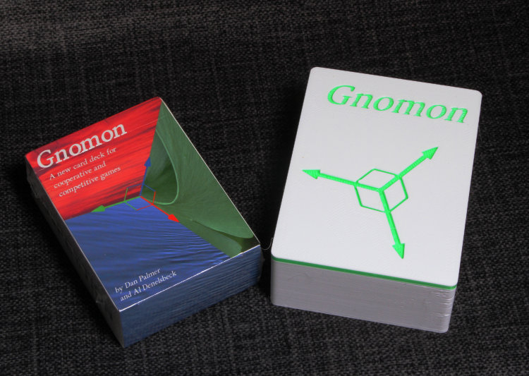
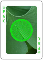 To begin with, we needed background images which in essence were the three primary colors, Red, Green, and Blue, and ideally would be apparent what they were when examined, but not distracting and mostly just being a background color. Within these criteria, however, they could not clash with or disguise the symbols which would lay over top of them, also in those primary colors, which meant that whatever we chose for ‘Blue’ could not be too close to the 16-bit RGB value of 0,0,255, because the symbol would disappear against the background if this was too close. They also could not have any shapes within that might be mistaken for shapes of the symbols and thus make it confusing in any way what the card represented. This might seem like we’re being nit-picky, but it’s easy enough to glance too quickly at a card and make a mistake when you’re involved in playing a game. Not too long into the design process, we realized that the RGB value for Green (0,255,0) was actually too bright to be used, and switched to 20,217,20 instead. The background color decisions kicked back and forth for a short while, and in fact, we ended up switching the Red image after the first test printing of the deck.
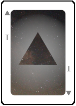 Also needed were cards to represent shapes of the symbols without any color at all, trickier that it sounds at first. So, a grey Circle, right? No, because that appears to be a Filled Circle, or even a Hollow one, so we needed a circle without any internal pattern. Eventually, we settled on a curious gradient shadow around the outside of the shape, over top of a starfield background, kind of doubling down on the ‘void’ concept. Because I do things like this, the center of the starfield image is actually the ‘center’ of the Milky Way, or at least the direction that it lies in Sagittarius.
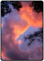 Among all of this sits what every designer and commissioned artist has to accommodate: the desires of the client. I submitted countless images for just about every aspect before we settled on what’s in use now, generally starting off with three or four choices but, for some, this went on for a while. Specifically, the image for the card backs was a challenge, since it had to be abstract and non-oriented, not easy to mistake for any of the face images, and not dominated by any one color. Eventually we settled on a sunset clouds grab shot that I actually obtained one evening while the selection process was ongoing. “Green,” however, was intentional manipulation, since Dan is a big fan of ginkgos and I knew he wouldn’t reject that one.