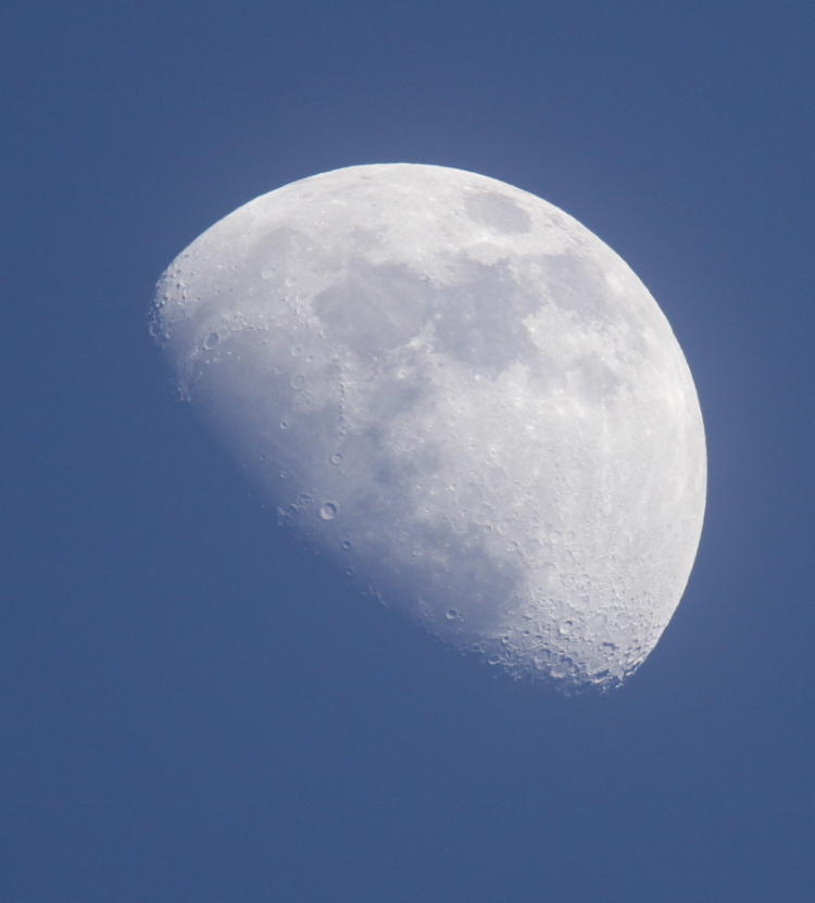
Intermission? Does this mean there’s, like, 25 more on the way? Actually, I have two potential topics in the category on my list of suggested posts, but this is more of overall observations that I was making the other morning, kind of a anti-‘But How?’ post. It will become clear in a moment.
I had observed some time after I started the Ask an Atheist page that very few people feel the need to ask atheists anything; they just assume they already know what the answer would be, with a degree of inaccuracy ranging from, “You’re not grasping the point,” to, “What the bloody hell made you believe anyone thinks like that?” – the condescension can run quite high within such subjects. And as I have remarked more than once when tackling some of the ‘But How?’ posts, such questions aren’t actually asked too often either. I am well aware that this hews far too closely to making any or all of these posts mere straw man arguments, answering a feeble caricature or parody of any real issue to make them easy to take down, but then again, I do see variations of these from time to time in various locations; I was active on several forums, sites, and newsgroups for years, before most of them devolved into pointlessness or inactivity, and have seen plenty of the arguments put forth by religious folk, so I’m going to assert that I am not, at least, completely guilty of knocking down top-heavy cartoon characters. I will also point out (if only to myself) that I have not shied away from addressing sophisticated theology, as well as philosophy, on numerous occasions, both here and where other people can be found. Just to get that out of the way.
Right now, I’m going to tackle some musings on why this is: why so few questions seem to be asked over something that is as important as the devout hold it – indeed, if it forms anyone’s worldview and shapes their actions, it is important, and not just to themselves. If you think about it, it’s immensely curious that something which bears so much emphasis across the world, providing the most impact on attitudes and decisions by a huge margin over anything else, is often arrived at/supported by/reinforced with/explained with some really trivial criteria – it isn’t hard at all to poke holes in most of the arguments and ‘evidence’ that I’ve seen, anywhere. And even when long, dense tomes are produced by theologians, it’s difficult to find anyone that even has a passing familiarity with the content; these are not being used to inform anyone in their own pursuits, but only as a rejoinder to any attacks on religious thought (yes, in much the same vein as this post – again, trying to remain self-aware.)
The first thought that comes to mind is the difference between ‘finding answers’ and ‘seeking indulgence.’ Answers are sought openly, with an honest curiosity over How or Why, and most especially, if any answer produces further questions, those are pursued with equal vigor. Indulgence, however, is a means to an end that’s already been reached; the goal is either to justify some pre-existing idea, or to satisfy some emotional desire, and these are often closely intertwined. However, this is falling for an ugly trap, because human beings are always driven and ruled by emotions – it’s simply that different ones have different affects on individuals, and attempting to find something universal, even among a defined group of people of any nature, is a fool’s game. The best that we might discover is a tendency – which may be sufficient, or it may not, and I’m leaning towards ‘not’ at the moment.
Nonetheless, there are quite a few factors that indicate that such things could bear a lot of responsibility. Virtually every religion on Earth has some explanation for what happens after we die, more than, “bacteria run wild in my body and someone else has to discard all my junk,” (and it occurs to me as I type this that it would be a lot easier if our possessions eroded away quickly with our passing – maybe I have to start considering more perishable assets.) And it’s no surprise why this might be – the life-after-death bit, I mean: avoiding death is a key factor in all life, and we have it as a background goal within our minds, far beyond a simplistic fight-or-flee reflex. So yeah, there’s a strong desire to avoid death even when it’s inevitable, making any promise of an immortal soul very appealing. And alongside that, as a social species we’re also concerned with fairness and justice, because we couldn’t be social without them, so post-mortem judgment is also emotionally reassuring.
But while we all have these feelings, they don’t produce the same bias regarding a belief in an afterlife, and the same might be said for any other aspect of religious thought (and countless other things besides.) While the above is one example, much of what I’ve tackled here over the years falls into the same general category: the evidence is superficial, sometimes little more than a soundbite, but that’s enough. Why? What’s the difference between those that find this sufficient and those that find this inane?
It would be easy to assume that there is a difference, perhaps intrinsically, perhaps just learned at some point (like how some personal experiences can have a huge impact on our lives and thinking afterward,) but this is dangerous, and unlikely to be correct – not to mention it fosters this concept of elitism, the idea that atheists, for instance, are smarter/better/more refined/sexier/possess cooler things than, you know, them, something that the various attempts to find a new label for atheism (“brights,” “free-thinkers,” etc.) starts to impinge upon. Hell, the idea of being ‘special’ is one of those factors that may influence religiosity – and yes, I have no doubt that some atheists, perhaps a lot of us, are influenced by the very same base desire. We’re certainly accused of it often enough, but you know, pot/kettle and all that jazz…
Yet there still remains the idea that, on average (perhaps even bordering on a defining trait,) religious folk do not question their beliefs, and in many cases do not even express doubt or the mere concept of fallibility. Often, the idea of religious fallibility is automatically extended to a god rather than remaining personal: of course I cannot doubt a perfect being! This concept being held, of course, without the faintest thought that we haven’t yet established a perfect being of any kind, and the fallibility part was simply on the human end, something that none of us has any trouble accepting. And there is no doubt that confidence and assurances are a mainstay of virtually every religion on Earth, drilled repeatedly into millions of sermons and pamphlets and almost the entire idea of religion in the first place; yes, culture does foster this more than a smidgen. Which is why I promote critical thinking over anything else; doubt is a remarkably useful function, because it makes us seek enough factors to give us confidence, as well as cutting the legs out from under those that would prey on our tendency to believe mere assurances. A simple practice of thinking, Does this make sense? and, Is there any other explanation for this? can reveal a world of deception, self- and otherwise. (You can add in, Who would profit from this? too, to round out the basic questions that should, as far as I’m concerned, underlie most of our thought processes.)
I tend to view this as the key difference between being religious and not – or at least, one of the key differences. We can see other countries that have much lower percentages of religious thought and activity, and higher too, and know that culture plays an important role, and this is certainly no surprise; the human tendency to take one’s cue from others is well-known and used extensively, especially in churches, especially in advertising (“millions of users agree!”) The attendant thought that starts some contradiction is that this, in itself, is a form of doubt, not trusting in one’s own choices but relying on others for more confidence, yet this doubt isn’t the same as that ‘critical doubt’ above, nor is it sufficient to start the questioning of religion itself. So we have the doubt that exists within atheism (or at the very least, self-provoked atheism rather than any instilled by parents or culture,) which causes one to question scriptural accounts and miraculous events and numerous realms of being and/or metaphysics that we can find no evidence for; this same kind of doubt seems to underlie much of scientific thought, perhaps provoking individuals on the path towards science in the first place. And then we have the doubt that causes individuals to ‘go with the flow,’ taking their cue from others and reinforcing the very culture that provokes/promotes such behavior. Often, such tendencies are positive, such as being in a well-behaved classroom or among a multitude of careful and considerate drivers, but it can go both ways, and history is full of examples. Are these distinctly different, and if so, why?
Admittedly, there’s a spectrum even within religious thought, so much so that labeling all of the wide variations as ‘religious’ is both too broad and runs the potential of being grossly misleading. I have seen extremely few people who actually believe all of the malarkey that their scripture delineates, and even among those that insist that every last word of their scripture is absolutely true (to the point of denying vast areas of scientific research, including simple physics,) they seem ready to ignore some of the most ludicrous passages about cutting hair and wearing clothes of two different materials – and more power to them, really, despite the easy target of their obvious hypocrisy. There are millions, theologians and priests among them, who find passages to be mere parables or metaphors, or just edits from some overzealous scribe in the past. I’m not sure anyone has ever attempted a poll to determine who actually believes in two originating humans in a garden, or a cycle of rebirth guided by past actions, and so on and so forth, versus how many simply pay lip service to the concept because they’re expected and encouraged to; I suspect it’s very few, to be honest. And such a poll would be nigh worthless anyway, because a significant percentage of those that don’t truly believe such things will not admit to such, even to themselves. While there are obvious reasons why anyone would not confess any doubts or disbelief within their own congregation, since ‘calm acceptance’ isn’t the most likely reaction that would be encountered, the aspect of self-denial is far more entertaining. Wouldn’t an omniscient being tumble to this immediately? Or do believers simply not ever make that connection? Maybe they believe that wishing despite disbelief is enough to satisfy the holy requirements…
But more importantly, how do we bring to light these differences, and especially start to eradicate the negative aspects of them? I personally have no desire to attack someone over their beliefs or eliminate religion or anything of the sort, though I am more than happy to point out that, if we can definitively show these to be detrimental in nature, then yes, we should eliminate them, happily, and never look back. But more to the point, we should be able to define our actions and even our worldviews in terms of benefit and detriment, not in terms of arbitrary labels and cultural associations from ages long past, nor be influenced by base desires or wishful thinking; the importance of any decision should help define a self-imposed examination and criticism. And I am under no illusion that this is an easy or quick thing to establish. But if there exists some key point of focus or effort, some facet of behavior to address or a better way of establishing the concept, I’d be delighted to know what it is.
As I’m wrapping this up, it occurs to me that maybe my initial approach wasn’t quite so incorrect after all (purely by happenstance): the questions that I’ve tried to answer were rarely ever asked, but nonetheless should have been, and perhaps this has been highlighting the omission in itself.


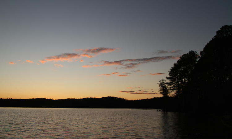


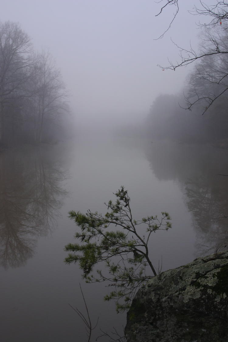
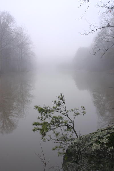 I’d left the exposure as normal to use the gloom, but it meant that what I captured was almost certainly a bit darker than what it actually looked like – the fog evened out both the sky and the reflections in the lake, so the meter read all of that and rendered it in mid-tones, that ol’ 18% grey that exposure meters are calibrated for. To the right is more likely what it actually looked like at 9 AM (though it’s merely the same image tweaked a bit brighter). It’s hard to describe this accurately, but bear with me. On a sunny day, the skies would have been brighter, but so would all of the rest of the frame, and the shutter speed would have shortened commensurately. Meanwhile, shadows would have been deeper, the distant trees themselves actually darker because they wouldn’t have been shrouded in fog, while the northern sky would have been blue, so the camera meter would have had a more average range to work with and would not have darkened the scene much, if at all, in attempting to expose for an average scene, as opposed to the largely light-grey scene that I had that morning. Make sense? Maybe it’d be better if I illustrate it more directly.
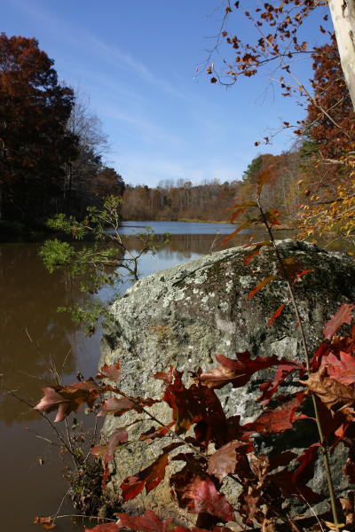 Same location a little over two years earlier, slightly different shooting position (like I said, the available perspectives were few,) and a little more foliage. More colors, more difference between the brightest and darkest areas, or ‘dynamic range.’ While overall this scene is notably brighter (the difference in exposure from the original at top is 1.66 stops, not quite four times as bright,) the average light coming from all areas is closer to a good middle, rather than everything being medium bright grey in the fog shot because the fog even eliminated almost all of the darkest shadows. Had I included more of the sky-reflecting water in this frame, like above, the exposure would have changed a little because of the additional brightness, but bear in mind that water reflections are always darker than the original because of polarization, something visible even in both examples of the fog shot.