From time to time I mention George Hrab’s Geologic podcast, as well as it being linked over there in the sidebar. I also make a regular contribution, which entitles me to receiving a weekly newsletter, of which I rarely read when they arrive but put off for later – sometimes, a lot later. The one that spawned this particular post dates from November 1st, but it contained an interesting set of questions (or one conditional question) that is fairly intriguing, so I’m shamelessly repeating it here.
The question is simple: What was the hardest you’ve ever laughed? But then he breaks it down into four categories:
Intended laughter – Like a comedy routine, specifically made to provoke the response;
Unintended laughter – Something spontaneous that happened without trying to provoke laughter;
church laughter – No, not at the silliness that gets forwarded therein all too often, but basically laughing someplace where it’s really frowned upon to be laughing;
Atmospheric laughter – Where it’s fostered and/or exacerbated by the response of those around you, like when a group of kids get the giggles.
And it occurred to me, sadly, that I couldn’t bring too many of these to mind, which is almost disturbing because I consider myself in possession of an active sense of humor – but then again, doesn’t everyone? And I know there have been times in the past that I’ve totally lost my composure in laughter, but recalling specific instances has been hard, and none of them seem too recent either. Regardless, let’s have a go.
Intended laughter – This one’s fairly easy. While Eddie Izzard is pretty consistent in being able to provoke laughter from me, the award must go to Billy Connolly, in a standup routine hosted by Whoopi Goldberg many, many years back. In it, he describes passing gas on an airplane in a devastatingly unique way, a painful simile, that never fails to start things cascading. I need to find this clip*.
Unintended laughter – Okay, bear with me for a moment, it takes some setup. Back in the nineties I had a pet ball python with a wire cage and a smaller terrarium within that would serve for feeding live mice to the snake: pop both the snake and the mouse within, so the mouse couldn’t escape, and let them be. One time, the mouse escaped within a second before I even got the top closed on the terrarium, and vanished, able to get out of the wire cage easily enough. I looked, but never saw any sign of it again. I had three cats back then, so I figured it was only a matter of time before the mouse was captured anyway.
Fast forward several hours, when I was meeting my cousin in his office to bring him part of his Halloween costume – he needed some hiking boots and didn’t have any, so he was borrowing mine, which I’d dug out of the closet just before heading over there. He tried on the first to see how it fit (we were the same shoe size, so it should have been fine,) but said it was far too tight. I protested, confused, but he said, “No, I think there’s something in there,” and jammed his hand down within. You can, of course, see this coming, because there’s no way to tell this story with the same amount of surprise we both had.
The mouse, apparently unharmed, ran straight up his arm to shoulder height and then vaulted off directly in front of his face, landing on the floor somewhere. The event itself and the recoil of utter shock and a little loathing from my cousin sent me into breathless paroxysms, worsened by the fact that he found absolutely no humor in it whatsoever (and his sense of humor was/is, if anything, more active than mine.) I spent at least a solid minute leaning helplessly against the door of his office while the mouse sat at my feet, right in the corner where the door met the wall, and I could do nothing about it. I don’t think he ever accepted my claims that I had no idea the mouse was there, but seriously, the boots were among a jumble of other shoes in the back of a closet some meters away from the snake cage, hours after it had escaped, so I doubt I can be blamed for not foreseeing this.
church laughter – Not a church, but study hall in high school, under a teacher that felt study hall should be used for studying and remain quiet; very subdued conversing was allowed, library consultation as it were, but no typical teen behavior. My friend, sitting in front of me and well known for being a cutup, turned around with a serious look on his face and raised his finger as if making a fierce point in a lecture. Knowing how out-of-character this was for him, I followed suit by letting my mouth drop open in stupid awe and fixating cross-eyed on the finger directly in front of me. Rising to the bait, he shifted his finger sideways to draw my attention along, and I obliged – in the opposite direction, at precisely the same speed and distance. The sheer spontaneity of it sent us both over the top, snorting and choking in a desperate attempt not to draw the teacher’s attention, which of course made it worse. Naturally, we would attempt several times to repeat this and never could match the perfection of it.
Atmospheric laughter – I’m not sure I could pin down any one instance as the best or hardest laughter, but environmentally, I would have to admit that our various story game sessions were responsible for more examples than anything else. I explain in great detail here, but in short, it’s a writing exercise where stories are begun and then passed around to be continued by others, who can only see the immediately preceding portion. Continuity takes a beating, and in the hands of creative people, the end results are devastating – these must, naturally, be read aloud without rehearsal by the originator of the story. It is entirely possible that the linked story about Paranoia and the meteorite counts as my hardest laughter – it certainly ranks in the top five – while I distinctly remember my cousin (the same as above) handing me his own story because he couldn’t finish reading it on his own; it involved a Star Trek team beaming anachronistically into the room – twice.
I have to mention one more related aspect. One of our circle of friends, I will call him “Dan,” has/had a tendency to completely lose his composure at random times, when something struck him as so off-the-wall that he could only go into the deepest of hysterics, a distinct paroxysm of gasping, red-face, tears, and inarticulate soft wailing sounds as he literally collapsed wherever he was, which one time was the middle of a fast food entry drive (I had to stand over him to watch for cars.) Notable about this was that, while others around could certainly see the humor of whatever had set him off, they could never understand why it struck him as that funny. In one memorable instance, something that I said which, out of context, was certainly bizarre, set him off, and I watched his seizures as a curious and impassive observer, simply unable to register the particular aspect that he found so hysterical. After a few moments, I said, “Dan,” eliciting no response, and several seconds later repeated it. After the third time, he managed to dramatically choke out, in a tortured rasp reminiscent of dying villains, “… stop… saying… my… name…,” the delivery of which, and the knowledge that I had been inadvertently contributing to the seizure, was enough to then send me over the edge.
All of these have been a while back now, and I can’t recall anything in recent memory that’s really tickled me that seriously. I would love to correct this but I don’t think you can make such things happen – the best ones are spontaneous. But I’ll keep you apprised. And I’d be more than happy to solicit anyone else’s stories, if I thought there was anyone reading…
.
*Ah, well now, look here – who’s ya boy? Starts at the key bit, but the entire routine is classic.
 In the post for September’s holiday, I mentioned that I had to get a shirt like that seen in the first gif (pronounced “œýø燔,) and indeed I did, for christmas – The Girlfriend spoils me. Now, are we gonna see my own gif appearing here at some point? Only time (and my variable level of self-debasement) will tell. Right now, consider yourself privileged to have even seen this…
 Now a few numbers, so my supervisors know I’ve been earning the abundant remuneration that I receive over all this. We had 201 posts for the year, a little short of the record – coming in third, in fact, behind 2015 (218) and 2017 (215.) I recently added a plugin for WordPress that lets me compare word count for the first time, and this year fell someplace in the middle with 164,000+ words – again, 2015 led the way with 188,000+. But somewhere in the past few months I broke the 1.5 million word mark for posts on this blog – that’s like ten or more good length novels. Frightening, isn’t it?


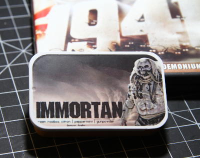 On top of that, I even have some ‘Immortan’ tea from


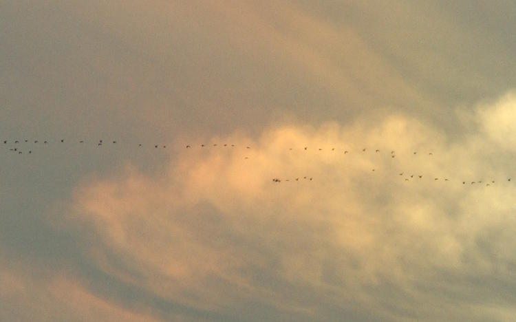
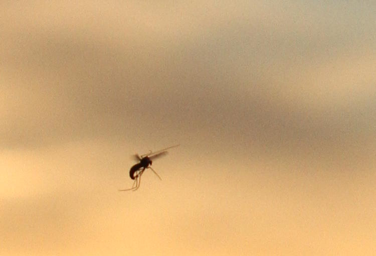
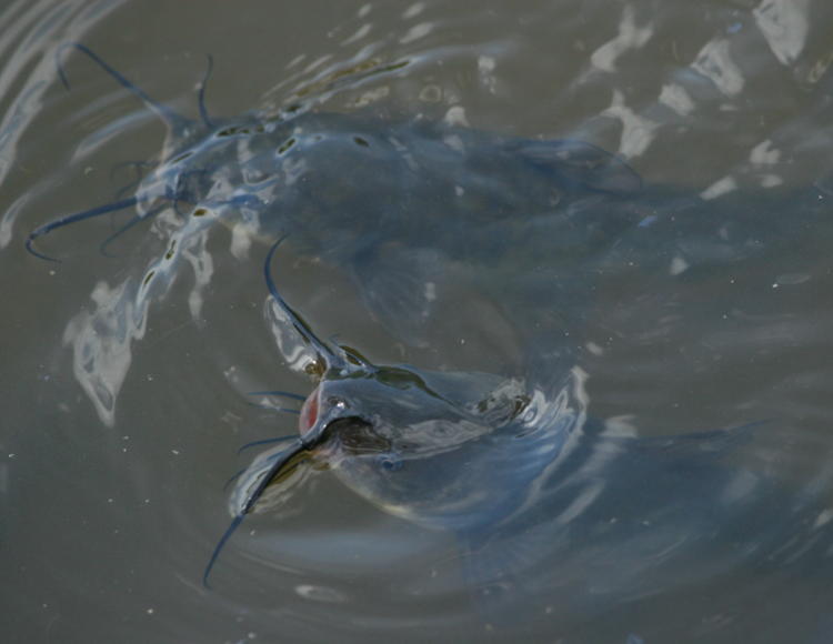
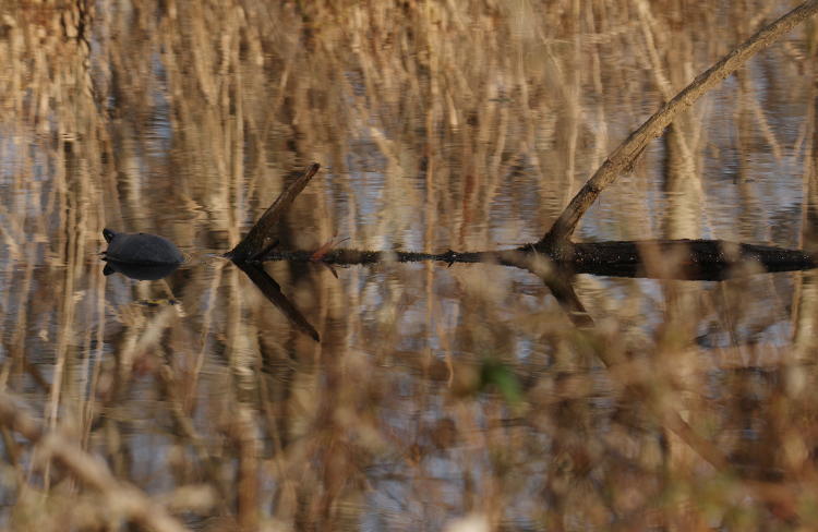
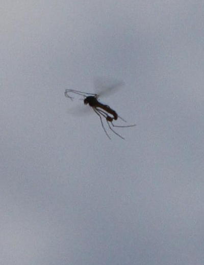 I didn’t put a lot of effort into trying to identify the species, especially since all I have are silhouettes in the approaching gloom and they all resisted my idle attempts to catch one in hand. I found the anatomy visible in my images to be curious; I’m almost positive those are not antennae out the front, but the forelegs, and you can compare