Every time there’s mention of the dire future facing us, whether it’s energy shortages or global warming or even potential pandemics, there’s one factor that always comes up, and that’s population density. World population hit seven billion in 2011, and is expected to hit eight billion in 2025 or so. Dwindling resources and the runaway effects of both population and energy consumption means we’re getting ever closer to a serious problem; in many parts of the world, we already have these serious problems, and depending on your perspective, this might be true for every place in the world. Very often, proposals to solving these problems reflect energy innovations, more efficient production of food, and so on, but these really are just treating the symptoms of the illness itself, one that will cause a serious crash unless cured: we need to not just slow population growth but, if anything, reverse it.
The population numbers above actually reflect a slowing birthrate, believe it or not – it only took 12 years to go from six to seven billion, down from the 10 years to go from five to six billion – but this is one of those statistics that get misinterpreted badly. “Population growth is slowing significantly, so we’re doing the right thing, right? We can relax?” No, not really – there’s a cliff that we’re approaching, and going over it slowly is the same as going over it at high speed; the point, of course, is not to go over it at all.
It’s easy to misunderstand the terms within the concept. Some people, perhaps a lot, reading the line up there about reversing population growth thinks this means to actually reduce the population; I actually witnessed one commenter in a discussion who accused advocates of wanting to kill off people. But population growth is not population – we can halt growth right now without doing anything drastic, just ensuring that the birth rate is not exceeding the death rate. Any geographic area has a saturation point where it can comfortably maintain a certain population of a species, a balance between available food and space, predation, illness, and other factors. The geographic area for humans is now the entire planet.
Nature can and will take care of this for us… but, we probably won’t like how this occurs. Starvation, pandemics, large-scale wars over resources and land, and even just the simple fact that every natural disaster will kill exponentially more people because the population is denser everywhere – these will help solve the problem all right. We’re kind of a weird species, because we’re social, but not entirely; as long as all those things happen to other people, we’re not too concerned about it, willing to ignore it or forget about it quickly. It’s a reflection of the importance we place on kin and immediate tribe, rather than on species. But it’s safe to say we can do better, and the easiest and most effective way is to halt population growth.
Easiest, perhaps, from a rational, theoretical standpoint. Again, as long as this applies to other people, it gets significant support – we often have no problem seeing the people who are “breeding like rabbits” in some poverty-stricken country and wondering what the hell is going through their minds. But when it comes to us, all of a sudden we have a right to have kids and no one can take this away or even has any right to tell us what to do. Actually, there’s no right either way; a right is a legal concept, provided by the bylaws of any government, and I’m aware of no bylaws that guarantee a right to reproduce – they certainly do not exist in this country.
But more, what this kind of response reflects is the reproductive drive within us as a species. It’s very strong, unsurprisingly, and has a tendency to bias our reactions – more than a tendency. Much more. It colors a tremendous amount of our lives, from how we groom ourselves in the morning to the cars we select to purchase, from our refusal to scratch ourselves in public to your Facebook profiles. Status, prestige, sociability, and many more related aspects of our behavior have a lot to do with sexual selection, the drive to appeal to a mate. We can’t escape from it.
We can, however, exercise the rational portion of our minds – especially when we realize that those emotional influences can make us react in ways that aren’t always worthwhile. One can always ask if it is important that we reproduce, but this doesn’t really address the issue, since the internal drive automatically makes it important – that’s what emotions are. Basically, someplace in the distant past arose the behavior to want to reproduce, and an organism that wants to reproduce will probably reproduce more than one that is indifferent; it doesn’t take long for this trait to appear throughout a population. An alternate trait, of finding reproduction distasteful or even just slightly annoying, isn’t going to spread as fast, imagine that. But this is all just the process of gene replication and propagation – it’s not any different from a trait to fear death. However, if we were to qualify reproduction not in terms of rights or desire, but usefulness, what then? Who can say that their genes are better for the species than their neighbors’ genes? Anyone with an ego, of course, but perhaps we can aim higher than that. Except that we can’t, because we don’t even know what most genes generate within the body. Most of the really notable accomplishments of humans, the things that we might consider important, don’t seem to be genetic at all.
Not to mention the myriad problems that can arise when we start down this path. Besides the bit that we cannot be objective in the face of our internal drives, it isn’t long (you have, perhaps, already reached this step) before we start to consider making the decisions for others, deciding as a ‘disinterested third party’ who would contribute more and thus should be allowed to reproduce, which starts getting a bit too close to the idea of eugenics. No, the decision can only come from within.
Which is not to say that we cannot promote perspective, and careful consideration, and the ridiculous consequences if we fail to rein in this drive. It’s not particularly hard to override the internal drives – we do it constantly when we select our diets or give up smoking, keep working with a headache or avoid smacking our obnoxious neighbor. Even our reproductive drives are encased in cultural expectations – what’s acceptable on a first date and where one goes to look for companionship. There is always a ‘right time, right place’ constraint in effect, and even birth control is just a method of gaming the system, satisfying the strongest portion of the drive while avoiding the new bundle of genes it evolved to produce. What is necessary is the recognition that most of the desire to have kids is just a property of selection – the strength of the emotion does not signify, in any way, its importance, only its effectiveness in getting through the process.
Some might argue that this is nature’s way – who are we to argue with it? The answer is, we’re species with brains, intent, and foresight, which nature has none of. There’s no goal in nature – things just happen due to simple physics, which is what predation and extinction demonstrate quite effectively, one would think. And yes, nature can indeed halt overpopulation, and does – what it doesn’t do is provide any mechanism to prevent it in the first place. All fires will, eventually, go out, but it’s often in our best interests to not let nature run its course in this manner.
We also had no problem with defying the natural order when we developed medicine and surgery, extending our lifespans and greatly decreasing the mortality rate of childbirth and infancy – it’s a little late to be waving the nature flag now. These advances are actually a very large part of the population problem, allowing birth rates to exceed death rates by a notable margin. Every benefit has a consequence, and this is what we face with longer life spans – we need to drop the birth rate commensurately. We may eventually develop, perfectly naturally, a reduced desire to reproduce, though again it’s hard for such an influence to propagate since it only does so through offspring. In the meantime, we can use our perfectly natural rational brains to note the issues and decide on what works best, avoiding the problems we can foresee rather than ignoring them. If there’s a legacy of being the smartest species on the planet, this would be a prime facet.
There are countless arguments that can be extended counter to this, and rebutting them all here would be impossible. The first thing to ask oneself is if the argument came first, or the emotional reaction? Because if it’s the reaction, someone is only playing puppet to their genetic history, trying to rationalize their simple instincts. It’s common knowledge that the first step in curing addiction is to recognize that desire is misleading, and not often in the individual’s best interests. Reproduction has exponentially more impact, since it affects everyone, not just the individual. As much as our culture treats such decisions as personal, they really aren’t.
If it helps, very little of what we are, the personalities we have, the intelligence we wield, comes from genes. The most important and effective things to promote, the greatest benefits we can offer, can be bestowed on anybody, regardless – which means reproducing our own genes has a tiny fraction of the impact of things like education and philanthropy. We can leave a legacy very easily, if that’s the desire – it doesn’t have to be our own kids, our family name, our (well, your, perhaps) strong chin. And is it better to raise a handful of children with our direct guidance (knowing that they’ll seek their own perspective anyway,) or reach a dozen or a hundred by teaching, advocating, or just financially assisting?
Such a perspective has to be far-reaching, of course, and this is one of the arguments that may be used in defense – we’ll never reach the entire world with this. But I don’t think we can really say this at all – we’re certainly trying really hard to reach the whole world with medicine and food and clean water, which few seem to think are wasted efforts. If just one culture can demonstrate how well population self-control works, then the proof is there to be seen. But it requires accepting the change wholeheartedly, without caveats like, “My kids won’t add much to the impact, ” or, “There are other people who should be restraining themselves.” It’s not a competition; we are all one species, and will all feel the impact if we can’t prevent overpopulation. Believing that others are somehow more deserving of the nasty effects is beneath us.
It is often argued that we will be expanding to the stars, or at least colonies on other planets/orbital stations/whatever; in many cases this is considered a direct consequence of our expanding population. But first off, this is kind of a ridiculous way of dealing with the problem, isn’t it? It’s mostly just an excuse to satisfy our drive for exploration. More to the point, there isn’t anyplace even remotely hospitable to us within reach; we’d have to manufacture an entire ecosystem, from oxygen to food sources, protection from radiation to adequate psychological environment… and the populations therein would be even more limited and constrained. We’d have to solve the damn problem before we could implement this method of dealing with the problem. While right here, we already have one planet that has everything we need, ideally suited to us because we evolved within its grasp. All we have to do is implement a little management, some self-maintenance. It doesn’t seem like a lot to ask.
 In abject denial of the actual readership of this blog, I must apologize for being away as long as I have. What with the Grammys, and the Superbowl, and Groundhog’s Day, and then all the celebrity activity, well, you know how it goes. The up side of all this is, of course, that I have so much to post about now!
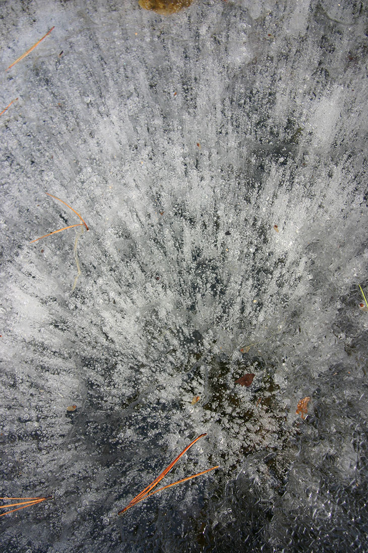
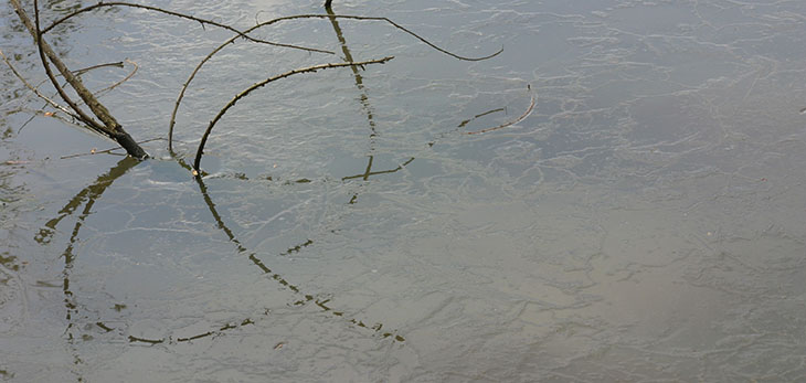
 Like most of the country, we’ve been having some longer spells of cold weather, a bit lower temperatures than normal for this time of year, but Monday popped up clear, sunny, and shockingly warm, hitting about 20°c (68°f) – a new student who had been aiming for a day with good conditions to meet contacted me at the last minute, and I headed out. We met near a pond, where the last vestiges of ice lent a curious texture to the water, while we wandered around without even jackets. A few turkey vultures (Cathartes aura) wheeled overhead, seeking thermals, as we talked about composition, framing, and contrast. I typically don’t take a lot of images while working with students, partially because I prefer to concentrate when shooting, but mostly because this is their time, not mine. There’s also a balance point, because when someone is after an image, they’re usually tuned out to anything being said and not absorbing too much; it’s better to sit down and talk theory for a bit before going out to apply it in practice. Some, however, tend to take their cue from me, and will seek out more shots if I’m doing my own, perhaps because it reduces the idea that I’m watching them and judging their approach. I’m pretty easygoing about it all; I’ll talk about what makes a subject stand out and how to use the surroundings to good effect, but not how they should approach their photography. Tastes and styles differ; I encourage students to embrace their own, and just help them achieve it.
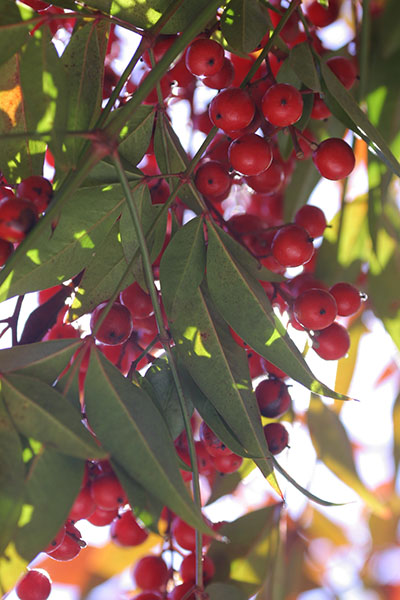 I will talk about creative approaches, however, such as going in behind these nandina (Nandina domestica) berries for an uncommon perspective. Aside from the curious view, there’s a sneaky little advantage to doing this: the conditions were bright and contrasty, and brilliant red subjects often go oversaturated in digital images with such light. When there’s no chance of a handy cloud or haze, you can find the shady side and prevent the color from becoming too vivid, giving a hidden, secretive air to the image at the same time.
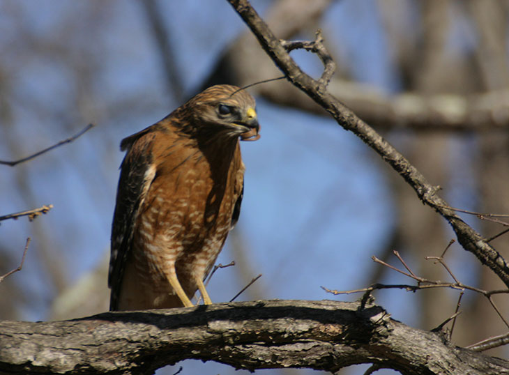
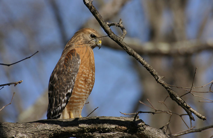
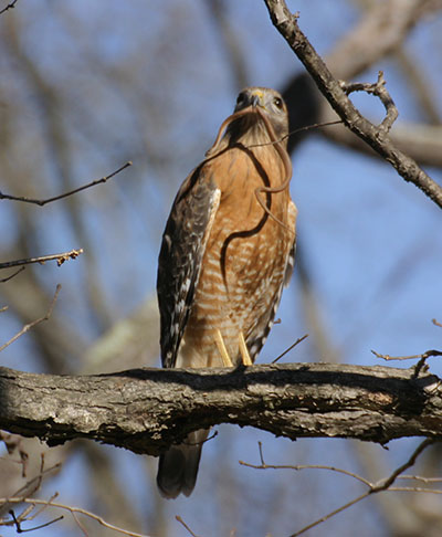 I’ve seen before the kind of dancing she did while grounded, and knew as she returned to another branch that she’d caught something. In this case it was a small